My project in Botanical Patterns in a Sketchbook: Conquer the Blank Page course
by Polina Oshu @polinaoshu
- 2,766
- 136
- 4
Abstract Composition
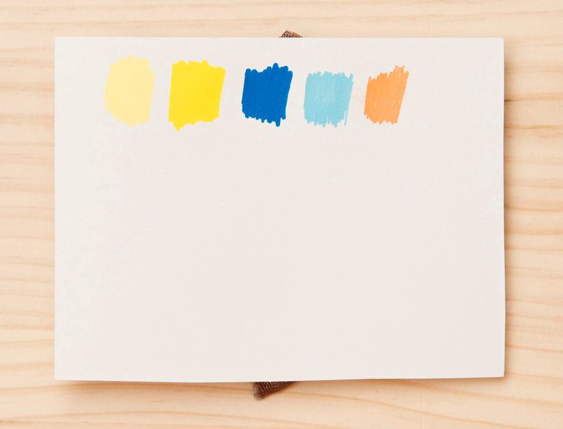
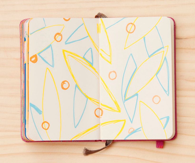
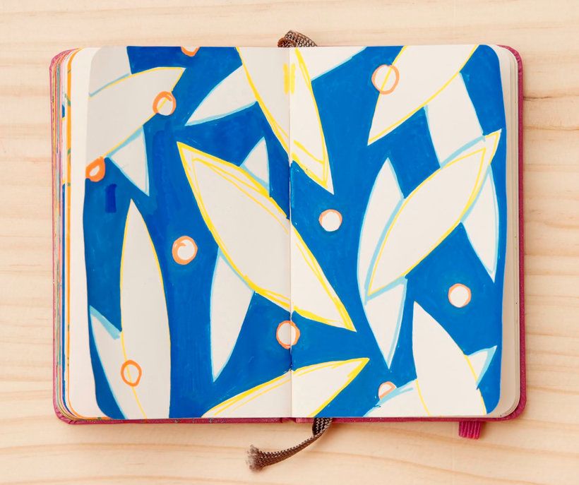
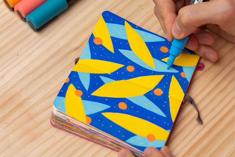
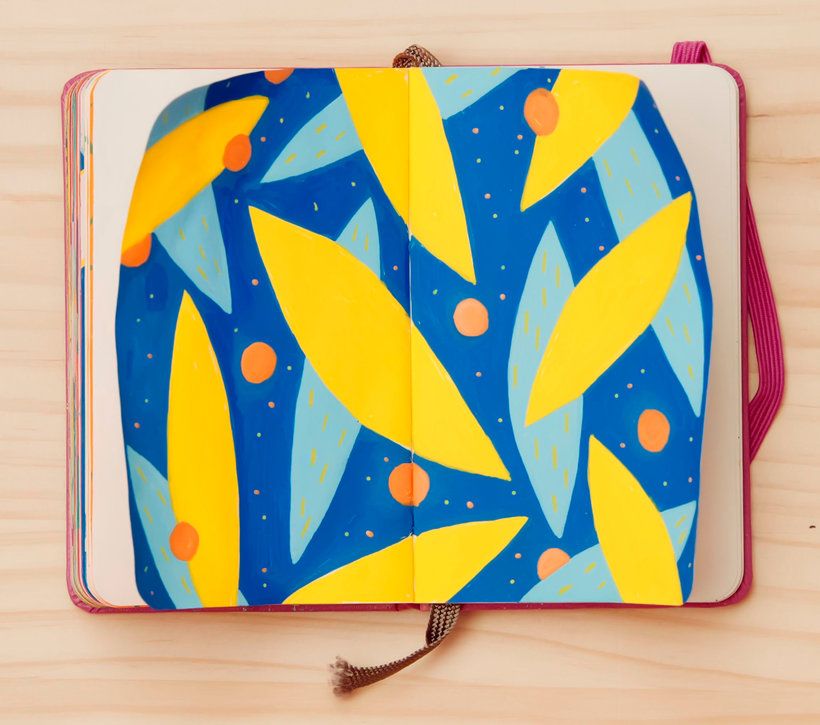
I've used yellow, dark blue, light blue and orange. I think it's a good idea that you use three to six colors at the beginning because it might be easier this way.
If you have a few rather similar tints in your color set, take them all and make color samples on paper to decide which ones you want to work on now, which ones resonate with you.
I've chosen yellow-orange colors of the sun – warm and energetic, and in contrast – deep calm, and cold blue colors of the night.
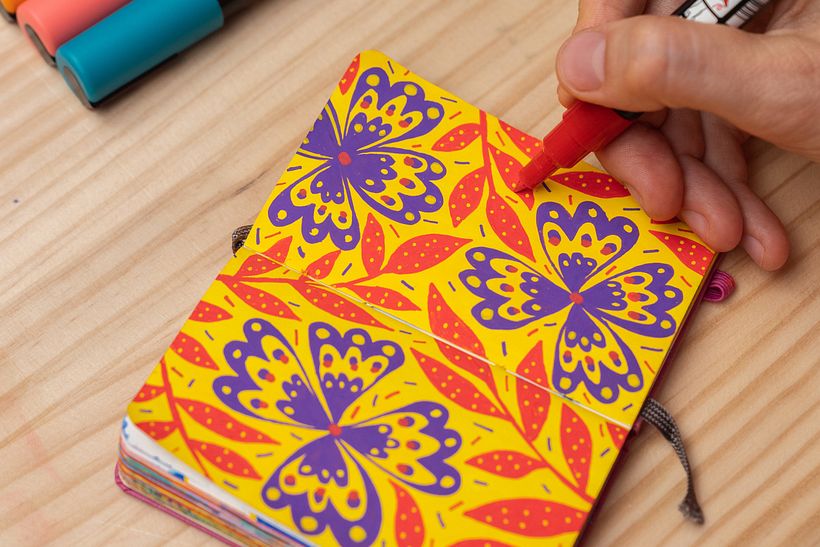
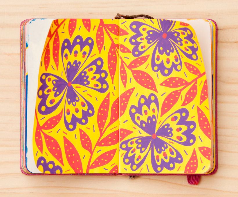
Big Blossoms
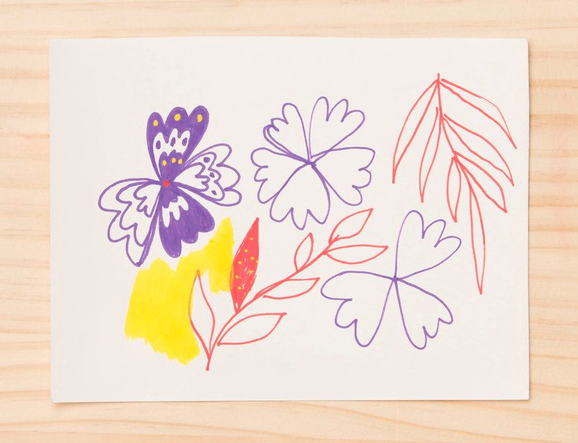
To create a good composition with the big buds I imagined a polka dot pattern with large dots and composed the flower's buds the same way.
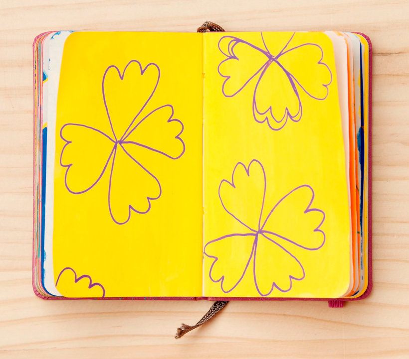
I drew outlines of 3-4 big buds trying to place shapes evenly over the pages. I crop the form with the edge of the page.
I filled the big empty spaces between blooms with little twigs.
Interlaced Plants
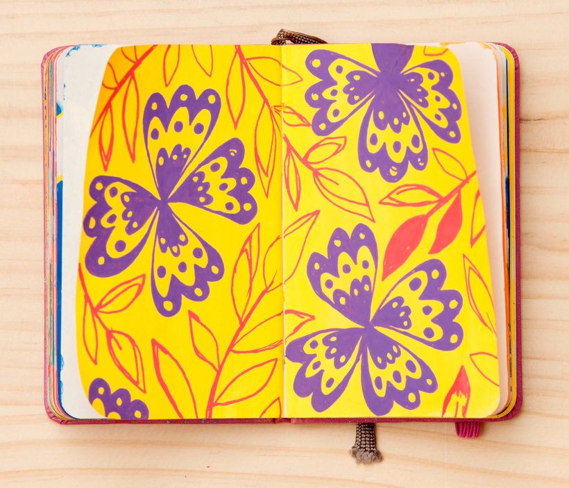
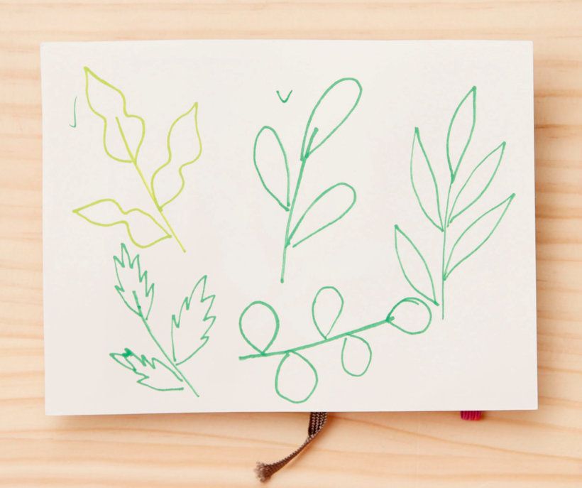
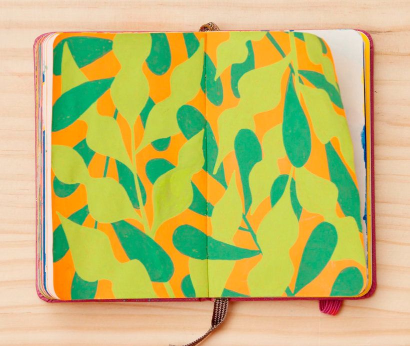
I suggest choosing different shapes of the leaves to increase shape contrast.
For example, I drew one stem with narrow long leaves and another with wavy a bit oval leaves. This creates a contrast of shapes and makes the rhythm more interesting.
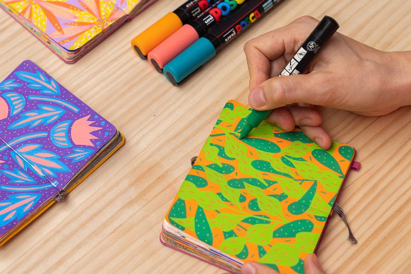
In the beginning I've colored the background with a wide tip orange marker. After I outlined the main shapes of plants
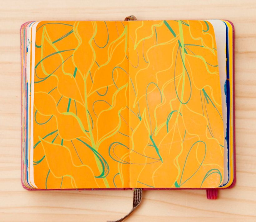
Coloring the leaves. I start coloring from the background to the upper leaves.

4 comments
zohor.krache.archi
This is sooo beautiful thank you for sharing :) 🌸🌼🍃🍂
checho_1
Plusthe greatness of simplicity and knowledge of color, good job !!
the great of simplicity and knowledge of color, good job !!
See original
Hide original
itatimg
PlusI am very grateful for your way of teaching... I have learned a lot with you... thank you!
See original
Hide original
martha.marshall
I really enjoyed this course! I want to keep practicing the concepts. Thank you!
Log in or join for Free to comment