
Exploring different styles of Posters
by daniela_gerstenmeyer @daniela_gerstenmeyer
- 1,490
- 43
- 2
introduction
I have developed 3 posters on the subject of coffee, based on the styles and techniques presented in the course. A Cuban-style poster, a poster with vintage elements and a poster based on the Bauhaus style.
I really enjoyed this course. Ingela Arrhenius is a wonderful artist who I really admire. She explains in a simple way, has good examples and gives help that takes you further and inspires you so much that you want to start immediately. I had so much fun realising the themes and always opening myself up to new ideas. Thank you so much, it was a pleasure!!!
Deliveries
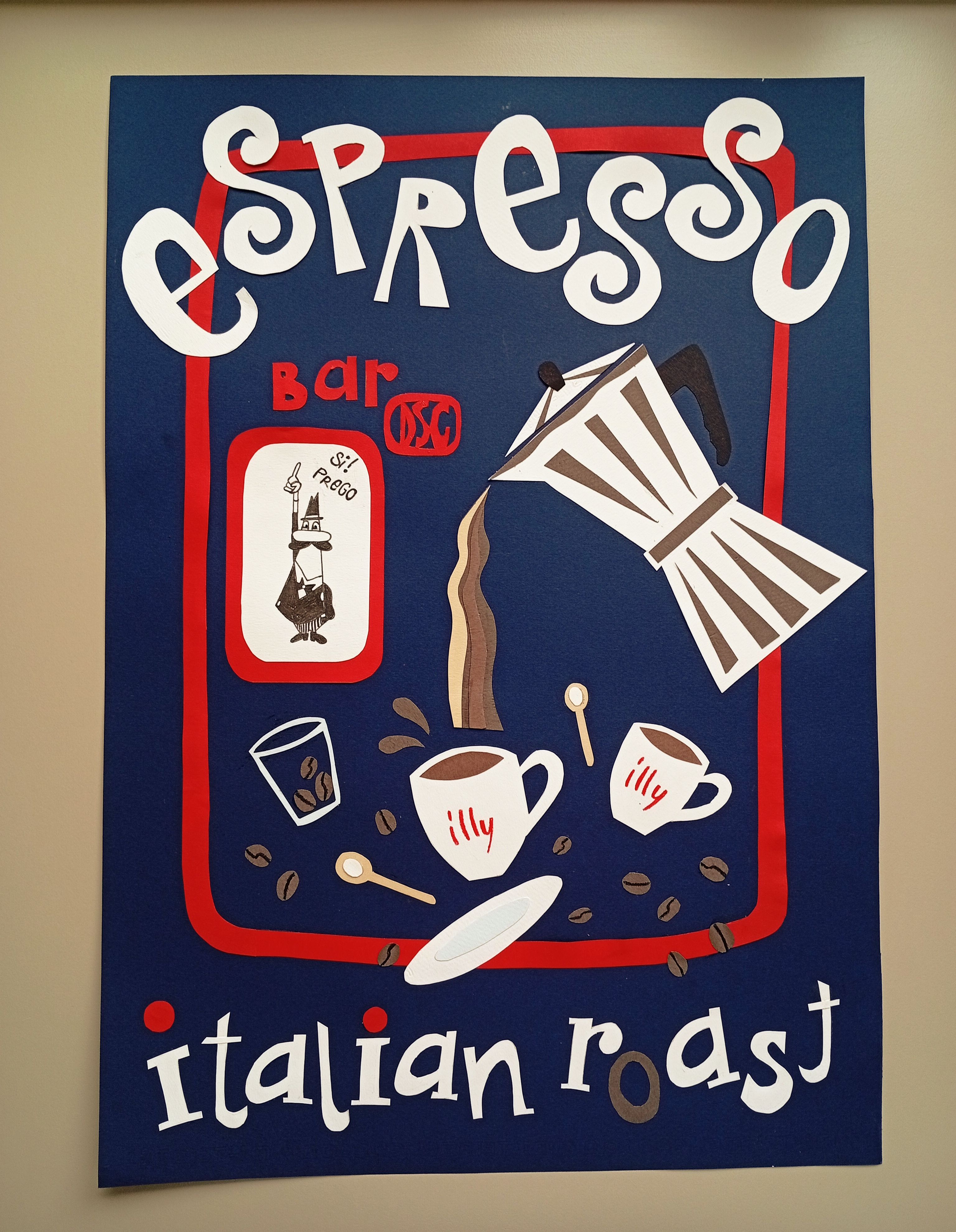
I worked with different coloured papers for the first poster. The other two were created in procreate.
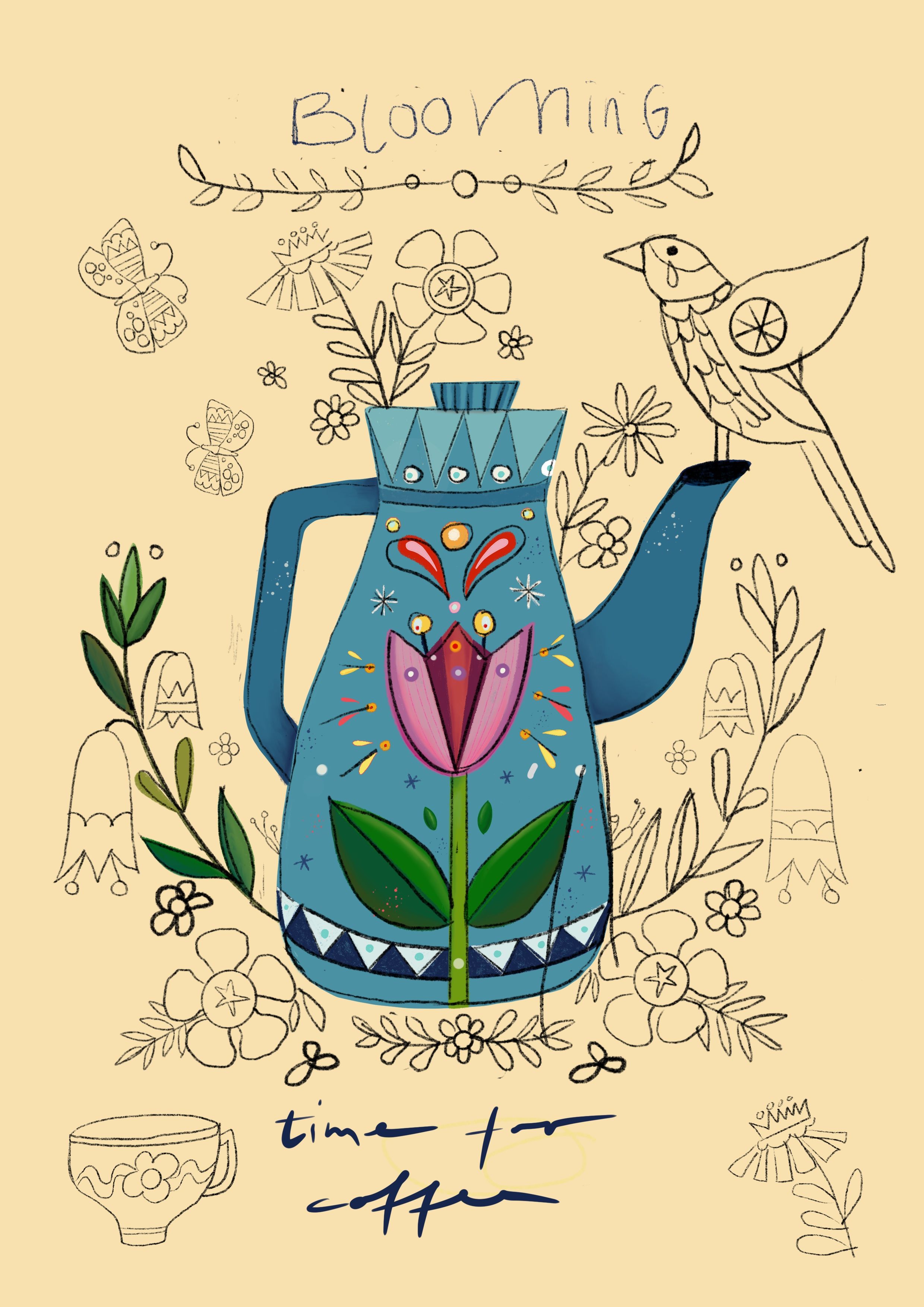
I show you a picture where you can see how the sketch gets more an more the final illustration.
Cuba Style Poster
The first poster shows everything I associate with classic espresso and an Italian bar where you can enjoy an espresso in between. It was designed with a reduced colour palette and focuses on contrasts.
Beforehand, I put together a small collection of fabrics for the images in my head, but the composition was actually clear from the start. I really enjoyed 'working by hand' with the paper and new ideas and details kept coming together during the cutting process. The poster is intended as a poster/sign for a bar.
Vintage Poster
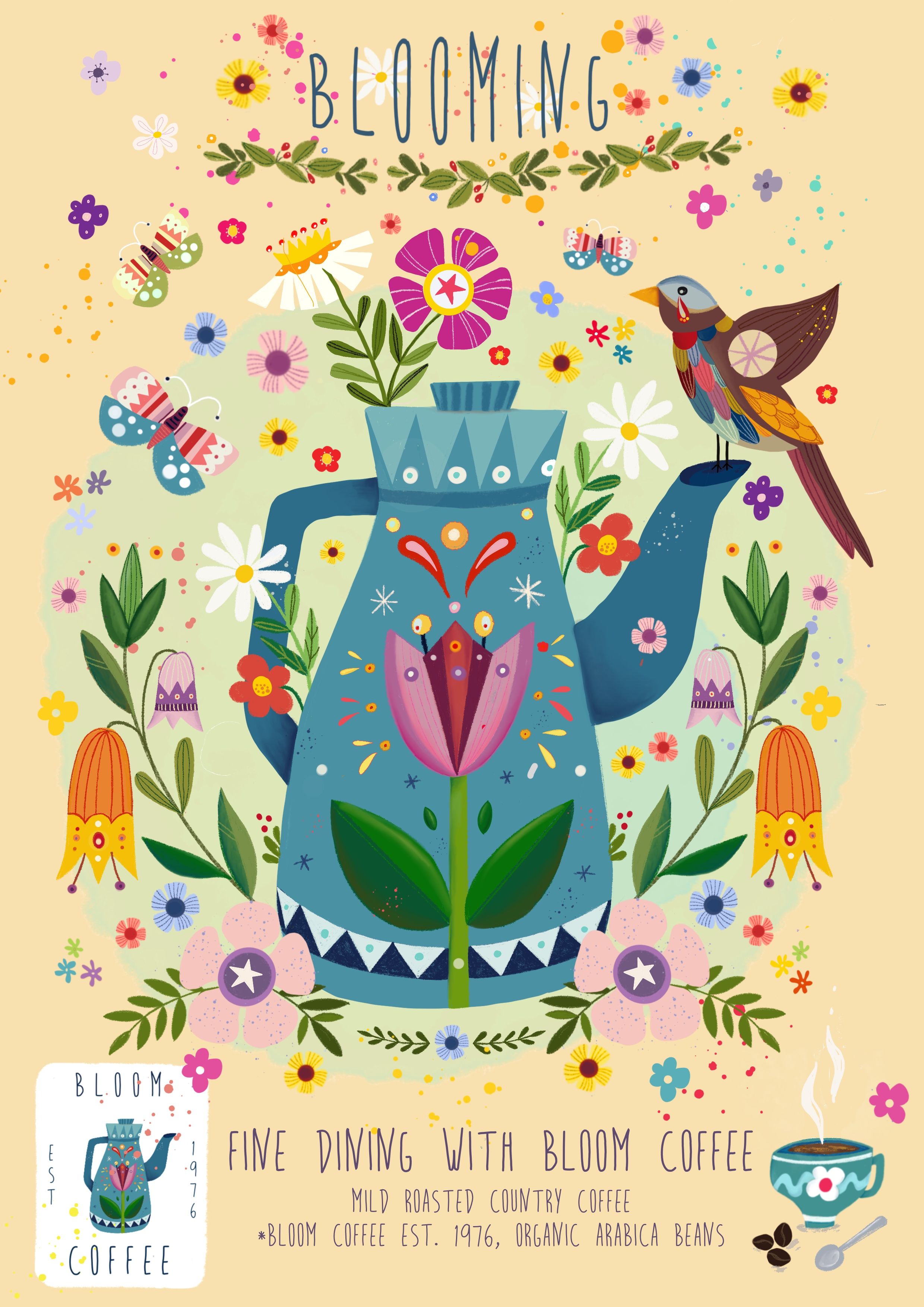
The 2nd poster is dedicated to my childhood, when grain coffee was my first contact with coffee and I felt pretty big.
I wanted to create a very colourful poster. The many details and colours of the flowers should literally explode and thus represent the theme of blooming. I was inspired by vintage elements and Scandi patterns and, similar to Folklore pattern, I focussed on symmetry.
The poster is ment as a product poster for a specially created coffee brand.
Bauhaus Style Poster
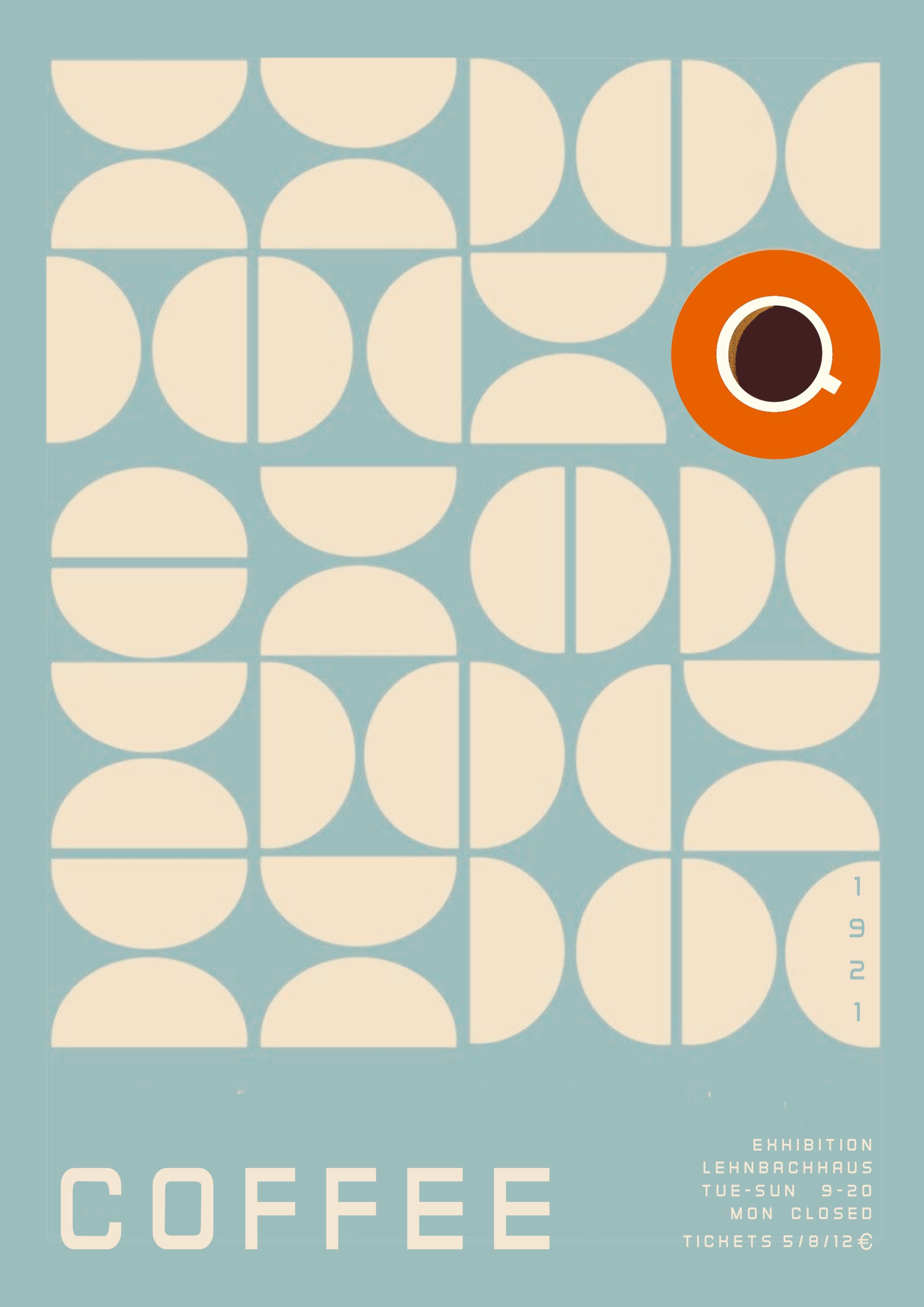
For the 3rd poster, I was inspired by Bauhaus elements and opted for a pattern of circles and semi-circles. The colour palette of the poster is basically reduced to 2 colours. The circular coffee cup (view from above) is a strong contrast to the rest of the poster and sets the focus.
It is designed as a poster for an exhibition on the theme of coffee. In fact, I'm still a bit dissatisfied with the realisation of the context. But as I really like the poster itself, I left it as it is. Sometimes shapes and colours just speak to us and don't need any further context (at least I hope so 😉)


2 comments
SO SO GOOD! You have really thought this thru and have created a unique poster for each occasion. Each style is perfect for its purpose and you have explained it so well. It´s cool that they differ so much but so stylish executed. Well done!
@hello_ingela thank you so much! ☺️
Log in or join for Free to comment