Data Visualization for Editorial Projects
A course by Diana Estefanía RubioGraphic Designer
A course by Diana Estefanía Rubio, Graphic Designer

Learn to interpret, create, and transform data into an attractive visual graph that communicates your message
If you want your designs to truly make an impact, you need to understand the information behind the data. That’s the theory according to designer and data visualization expert Diana Estefanía Rubio. For her, a designer’s job is to understand and interpret the numbers so they can convey their message through engaging graphs.
In this course, learn how to transform your data into powerful designs that speak for themselves. Follow Diana’s step-by-step process to create a data visualization graphic that you can submit to a publishing company and also share on your social media. By the end of this course, you’ll have all the tools to read, analyze, and transform data into an eye-catching graph.
What will you learn in this online course?
18 lessons & 19 downloads
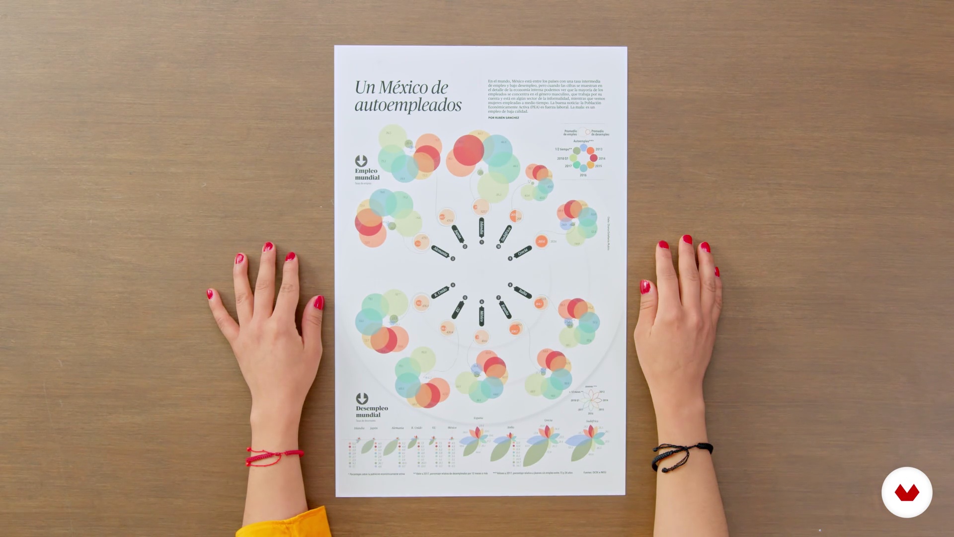
What Will We Do in This Course?
1 minute, 49 seconds

What Is Visualization?
7 minutes, 40 seconds
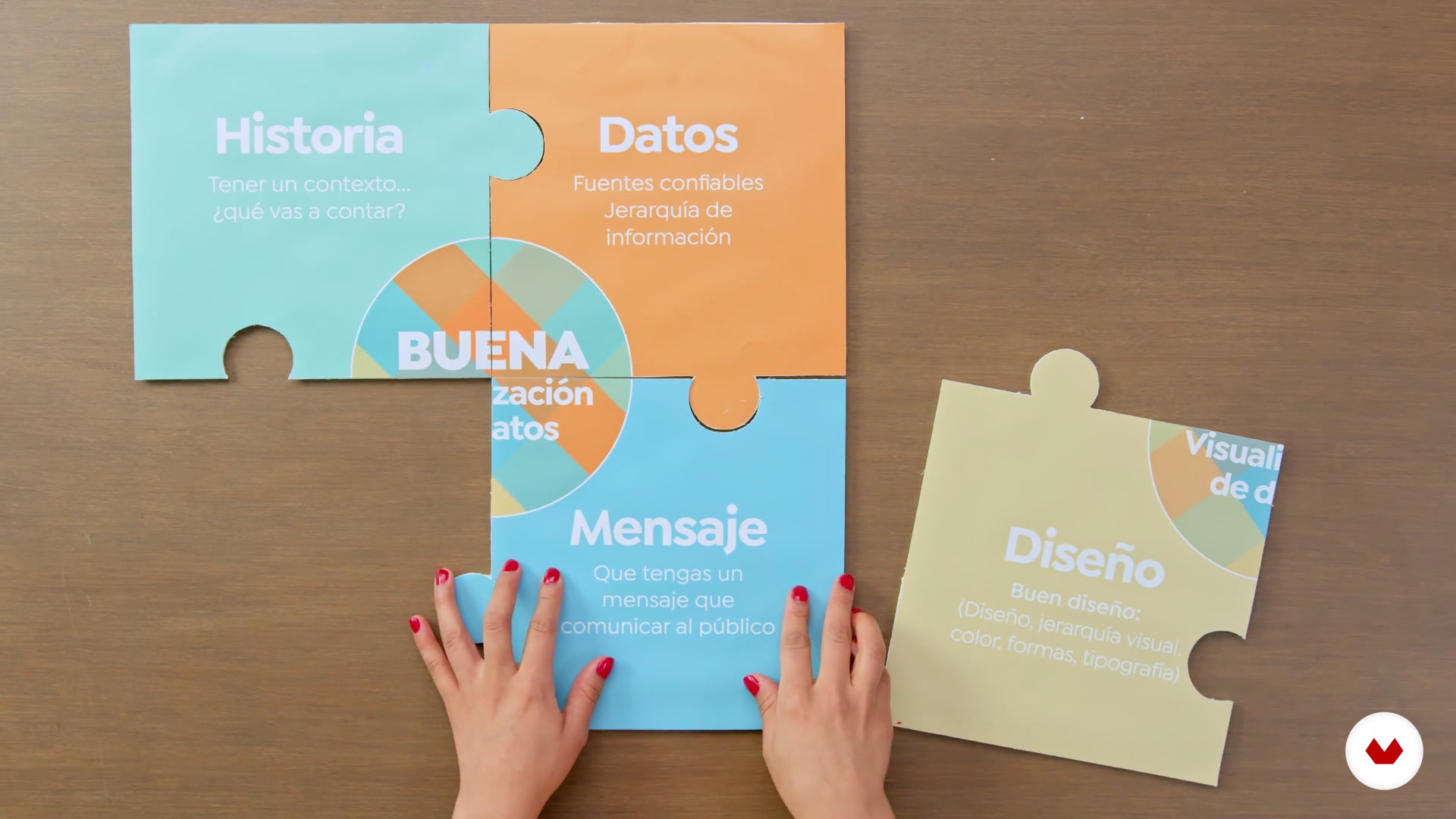
Ingredient Check
2 minutes, 2 seconds
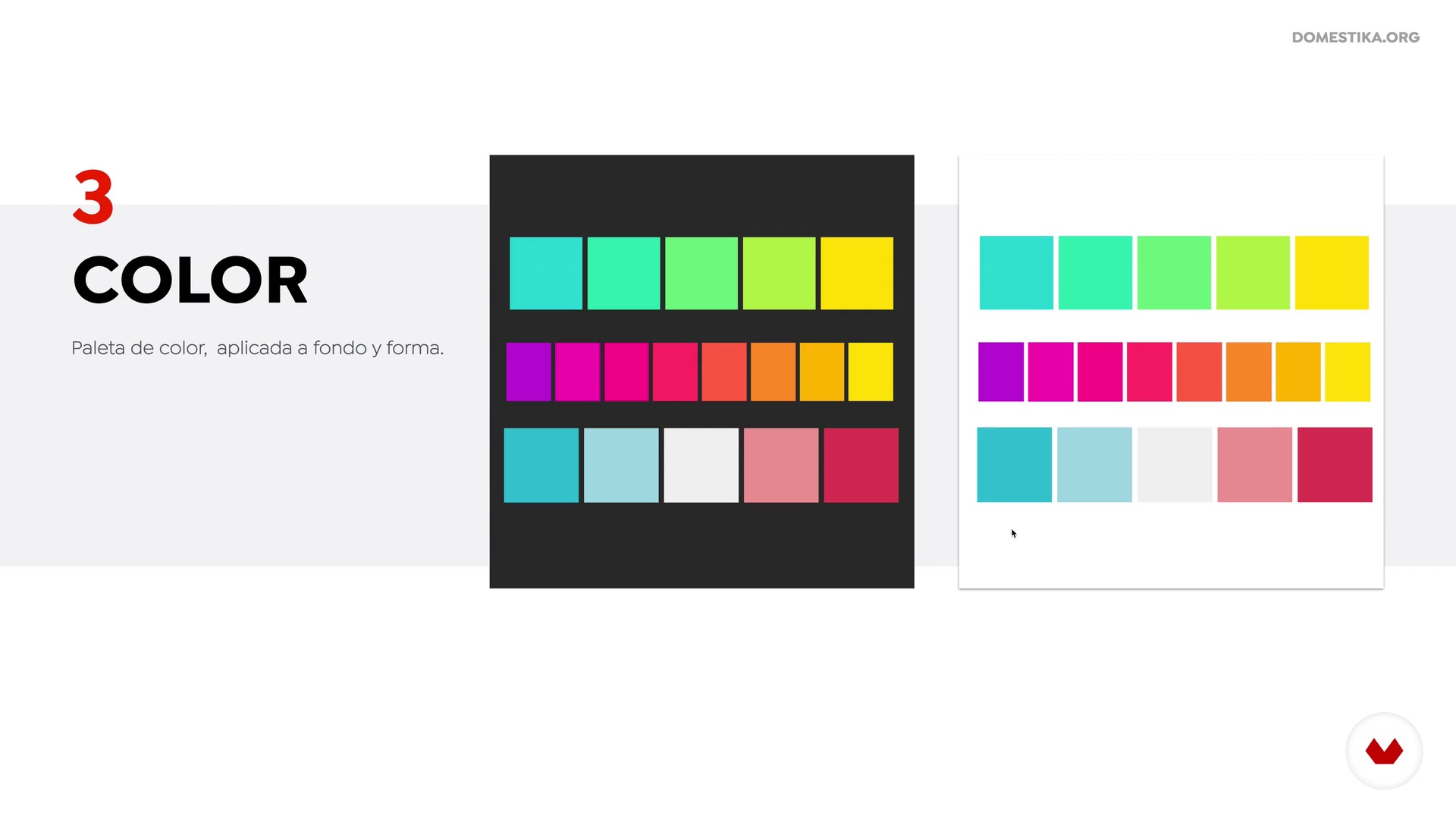
Our Visual Tools
9 minutes, 12 seconds

What Does Our Data Tell Us?
2 minutes, 15 seconds
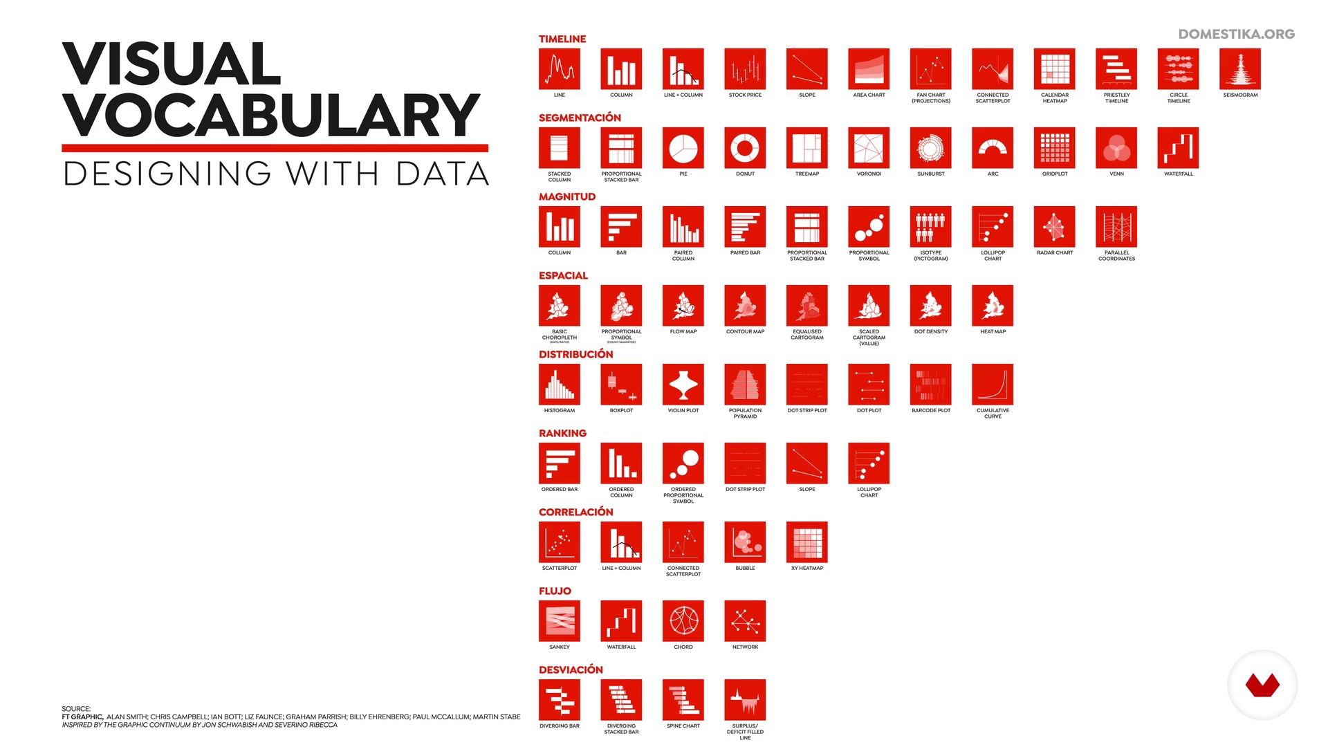
Visual Vocabulary
12 minutes, 5 seconds
What's included in this course?
Start by getting to know your teacher Diana Estefanía Rubio. She tells you about her background and professional experience in data visualization. She also talks about her different sources of inspiration ranging from designers to publications and gives you an overview of the course content.
Then, jump into the theory and study the definition of data visualization, its primary objective, and key components. Get familiar with the visual tools used for graph design and learn how to interpret numbers correctly.
Begin working on your final project by analyzing data and using them to create a rough draft of your design. Next, open up Illustrator and explore the main graph types and other features the program has to offer.
Switch gears in the last unit and focus on the aesthetics of your design. Experiment with typographies until you find the right one, try out different colors, and learn how to put the finishing touches on your graph by adding textures in Photoshop. Lastly, explore different avenues for publishing your work.
Recommended software & tools for this course
What is this course's project?
Create a data visualization graphic that you can submit to a publishing company and share on social media.
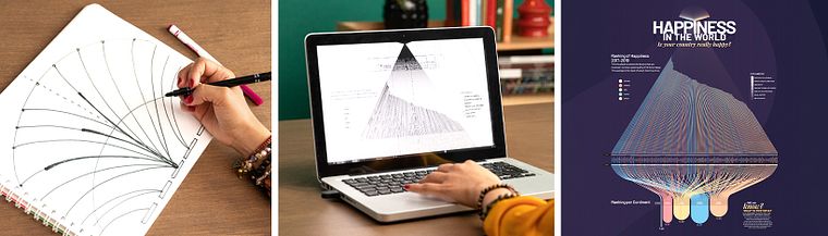
Projects by course students


Who is this online course for?
Graphic designers, information designers, data analysts, and marketers. Anyone interested in learning how to present data with a unique and attractive design.
Requirements and materials
To take this course, you need to have prior knowledge of data visualization and know the basics of Adobe Illustrator.
The materials you need for this course are a computer with Microsoft Excel, for reading data, Adobe Illustrator, for creating your graph, Adobe Indesign (optional), for the layout, and Adobe Photoshop, for the finishing touches.
Reviews
- 4 months ago
Me ha inspirado mucho el curso. He añadido más valor a mi currículum. Estoy muy contenta.
- 10 months ago
El curso te da otro enfoque en la infografía de edición, lo recomiendo como iniciación,
- 1 year ago
Interesante contenido.
- 2 years ago
Me parecio un excelente curso.
- 2 years ago
awesome! thank you!! I've been looking for some course as this, i'm so excited.

She also coordinates the Data Visualization department at Data Lab MX and is a professor of a Data visualization at the University of Central Mexico. Throughout her career, she has worked with brands like CNN International, Turner Broadcasting, Grupo Expansión, MMKG, and McMillan; she has also won several awards including the SND36 Award of Excellence from the Society for News Design.
Content
- U1
Introduction
- About Me
- Influences
- What Will We Do in This Course?
- U2
Before We Start
- What Is Visualization?
- Ingredient Check
- Our Visual Tools
- What Does Our Data Tell Us?
- Visual Vocabulary
- U3
Visualization
- Understanding the Data
- Let's Sketch
- Main Course 1
- Main Course 2
- Main Course 3
- Gathering Ingredients
- U4
Final Details
- Understanding the Typography
- Color Testing
- Final Touches, Textures
- Show Me Your Dataviz!
- FP
Final project
- Data Visualization for Editorial Projects
What to expect from a Domestika course
Learn at your own pace
Enjoy learning from home without a set schedule and with an easy-to-follow method. You set your own pace.
Learn from the best professionals
Learn valuable methods and techniques explained by top experts in the creative sector.
Meet expert teachers
Each expert teaches what they do best, with clear guidelines, true passion, and professional insight in every lesson.
Certificates
PLUSIf you're a Plus member, get a custom certificate signed by your teacher for every course. Share it on your portfolio, social media, or wherever you like.
Get front-row seats
Videos of the highest quality, so you don't miss a single detail. With unlimited access, you can watch them as many times as you need to perfect your technique.
Share knowledge and ideas
Ask questions, request feedback, or offer solutions. Share your learning experience with other students in the community who are as passionate about creativity as you are.
Connect with a global creative community
The community is home to millions of people from around the world who are curious and passionate about exploring and expressing their creativity.
Watch professionally produced courses
Domestika curates its teacher roster and produces every course in-house to ensure a high-quality online learning experience.
FAQs
Editorial data visualization is the process of representing information in magazines or print media through charts and infographics. Its goal is to communicate data clearly, attractively, and understandably to make visual interpretation and analysis easier in editorial contexts.
This course is aimed at people with intermediate knowledge of design or data visualization. Having basic experience with Illustrator and an understanding of graphic concepts is recommended to get the most out of the content.
You’ll need a computer with Adobe Illustrator installed, access to spreadsheet software like Excel, and basic graphic design knowledge. Having an interest in data visualization and editorial design is also helpful.
You’ll learn how to analyze data, pick the right chart, clean databases, create editorial visualizations with Illustrator, apply typography and color, and adapt charts for print and social media. You’ll also develop skills to distill information into effective infographics.
The course covers analyzing the type of data, the message you want to convey, and the available space. It teaches how to choose between bar charts, pie charts, proportional diagrams, and other options based on clarity and visual impact.
Yes, the course covers using spreadsheets to clean databases, remove errors, and select relevant variables, ensuring your visualizations are accurate and reliable.
Yes, you’ll learn how to build charts from scratch in Illustrator, customize colors and textures, apply typography, and export visualizations for various editorial and digital formats.