Information Design: Storytelling with Data in Illustrator
A course by Valentina D'EfilippoDesigner and Creative Director
A course by Valentina D'Efilippo, Designer and Creative Director

Explore the art of data visualization by learning to transform data into compelling and easy-to-read infographics
The art of data design is as indispensable as writing and storytelling— it allows you to create insightful representations of information that inspires a viewer to keep learning. Valentina D’Efilippo is an award-winning data designer and creative director, and has collaborated with companies and organizations like The Guardian, BBC, The Economist, Scientific American, the United Nations, Siemens, and Harper Collins, and more.
In this online course, Valentina takes you on a deep dive into the world of data visualization. She teaches you how to transform numbers and figures into striking infographics from scratch.
What will you learn in this online course?
18 lessons & 43 downloads

What Is Data?
6 minutes, 46 seconds
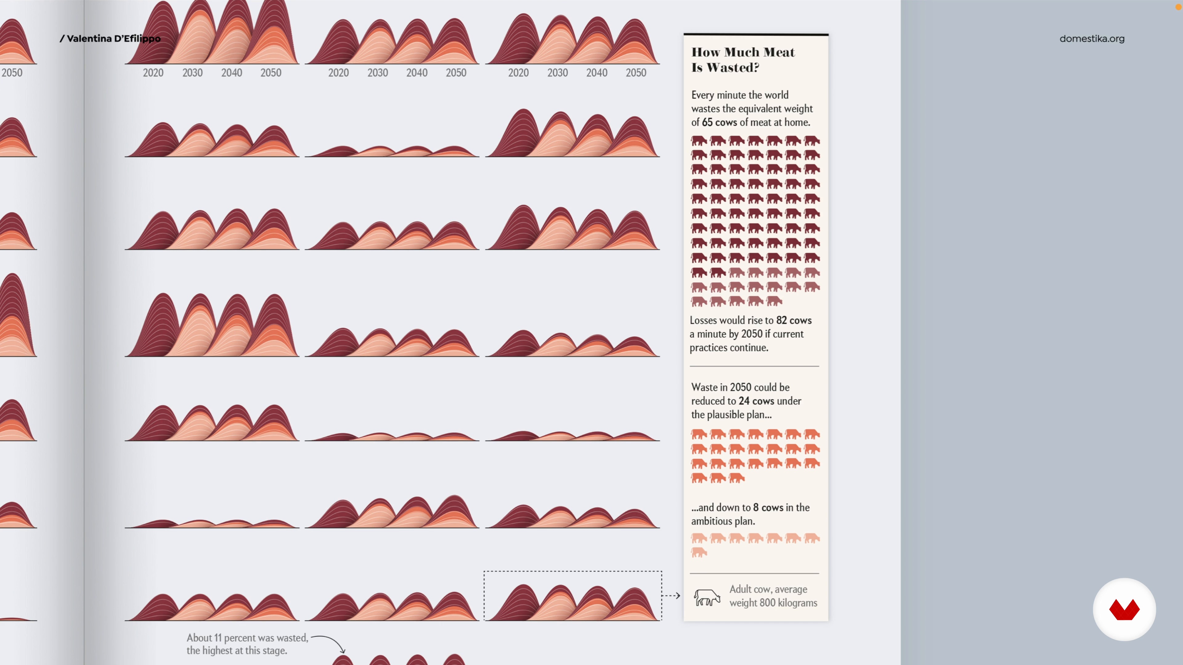
Visual Storytelling with Data
10 minutes, 8 seconds
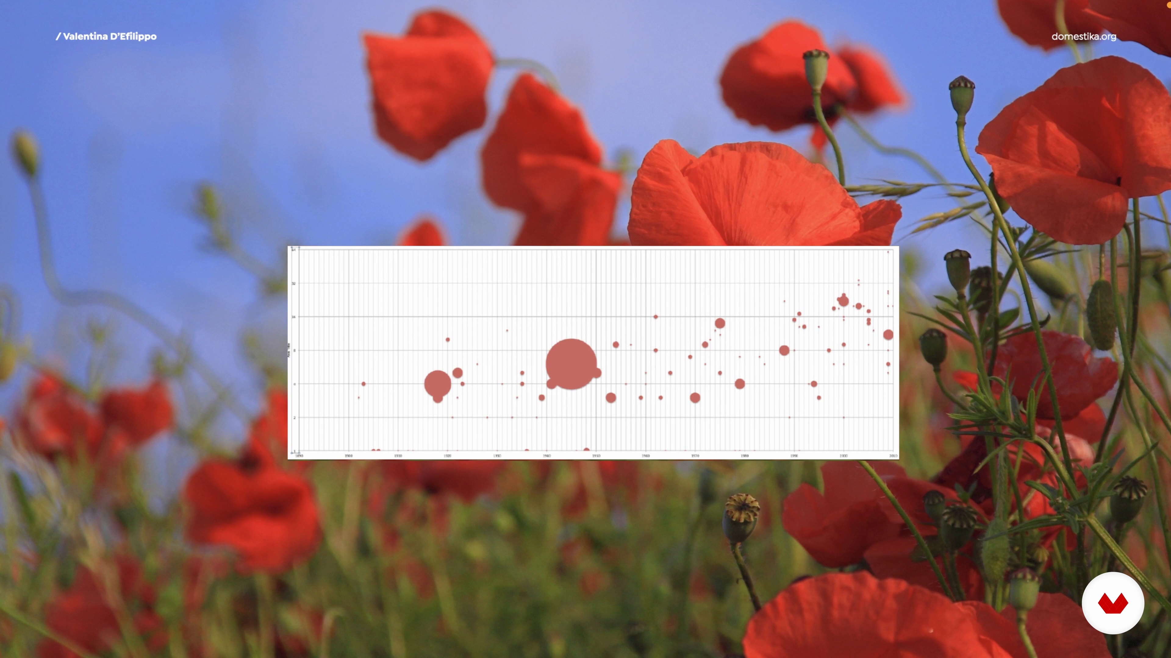
Data Design: Process Overview
12 minutes, 49 seconds
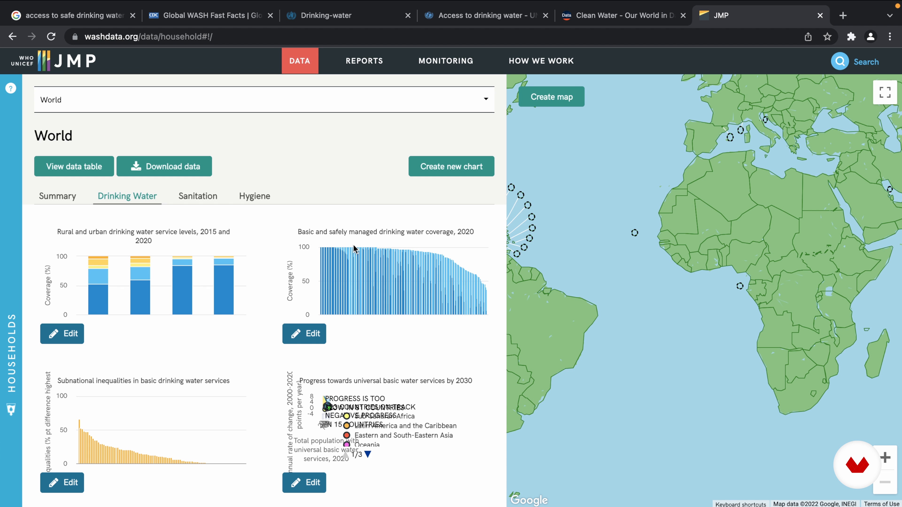
Where to Find Data
9 minutes, 22 seconds
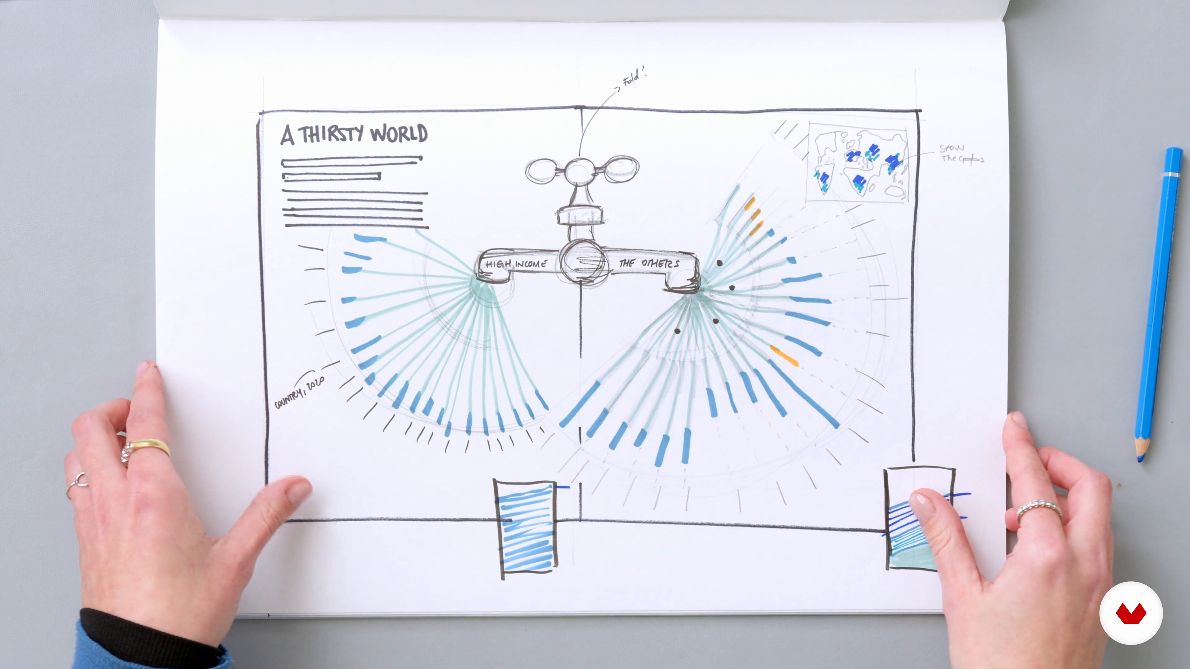
Transforming Data into Visuals
18 minutes, 45 seconds
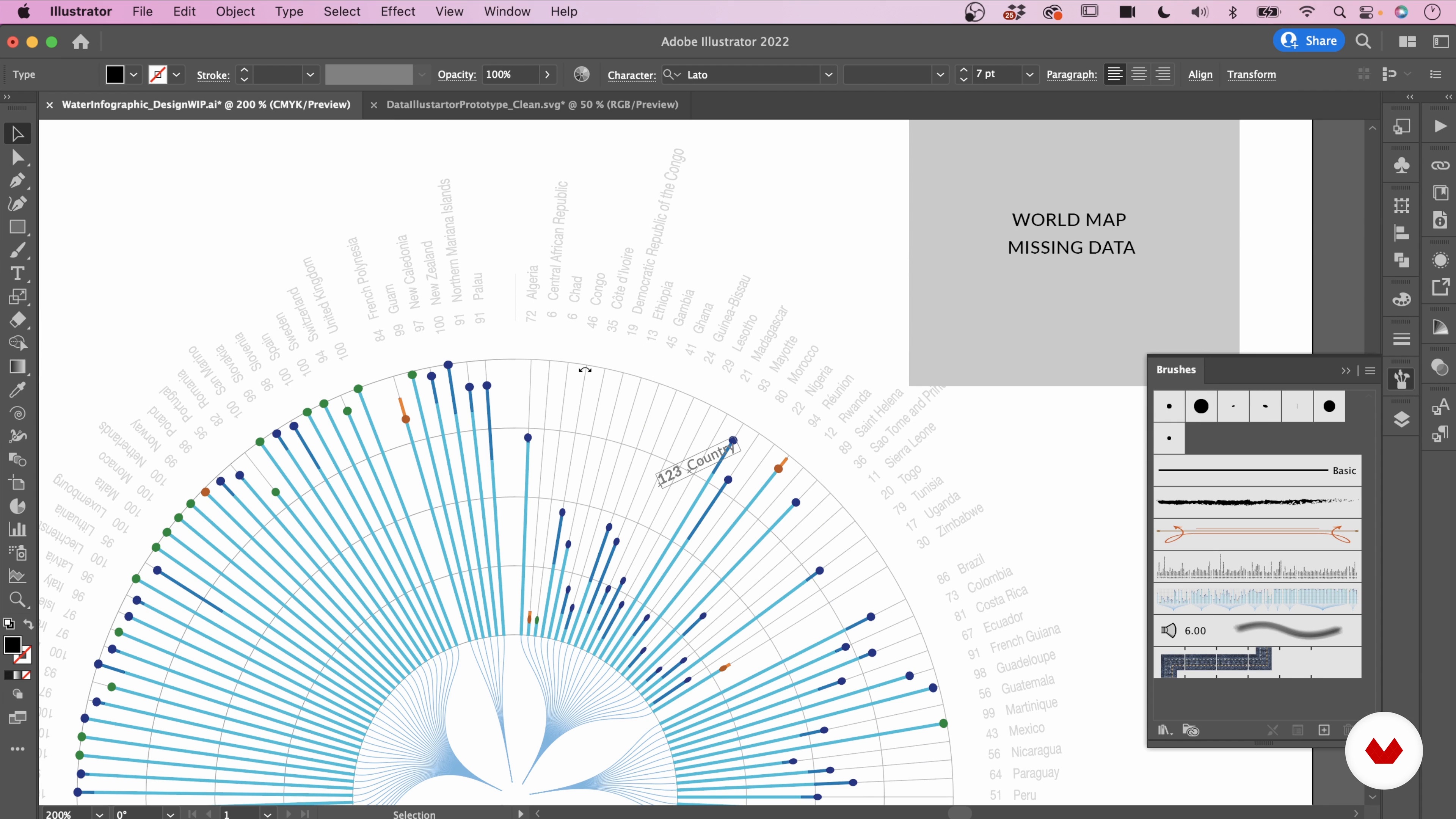
The Skeleton of Your Visualisation
14 minutes, 59 seconds
What's included in this course?
Meet Valentina D’Efilippo, designer and creative director, and your teacher for this course. Hear about her creative journey that led her into the world of infographics, and learn about her influences and inspirations.
Take a closer look at what data visualization consists of, and get an overview of the process behind gathering information and creating a design to interpret it.
Valentina teaches how to work with data by explaining how to source relevant information and prepare it in Google Sheet. Learn how to create a story based on the numbers, before sketching a design with a visual lexicon. Then Valentina shows you how to transform your sketches into a digital prototype.
Craft your final design by building the skeleton of the visualization, and lay out all its components. Next, see how to add illustrations and refine your layout, color, and typography.
To wrap up the course, Valentina shares with you some ideas on how to present your project for maximum impact, and gives some final advice on how to work collaboratively.
What is this course's project?
Create an infographic based on a multi-layered dataset of your choice, which communicates with creativity and clarity.
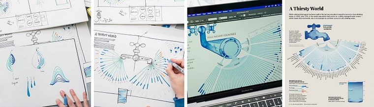
Projects by course students


Who is this online course for?
For anyone who wants to communicate numbers and statistics beyond the default of templates— visual thinkers, content strategists, marketers, developers, designers, and other curious minds will enjoy this course.
Requirements and materials
To take this course, it’s helpful to have basic knowledge of Adobe Illustrator.
Adobe Illustrator comes with a free trial – if you don’t currently use it.

Reviews
- 2 months ago
Very useful and informative. I enjoy it!
- 3 months ago
Very useful course. Clear explanations.
- 4 months ago
this is a great course.
- 6 months ago
helpful and interesting!
- 6 months ago
good

Over the last 15 years, she has worked with public organizations, start-ups, agencies, global brands, and news media. Her clients include The Guardian, The Economist, BBC, Wired, BBC Science Focus, Scientific American, Siemens, and BCG. In 2013, she published The Infographic History of the World, which is available in eleven different languages. The book is the first attempt to illustrate history and human evolution through data visualization and infographic storytelling.
Content
- U1
Introduction
- About Me
- Influences
- U2
Learning the Basics
- What Is Data?
- Visual Storytelling with Data
- Data Design: Process Overview
- U3
Working with Data
- Where to Find Data
- Data Preparation
- Knowing Your Data
- Transforming Data into Visuals
- From Paper to Pixels
- U4
Designing with Data
- The Skeleton of Your Visualisation
- Laying Out All the Components
- Crafting the Visual Display
- Spelling It Out 1
- Spelling It Out 2
- To Learn More: Crafting the Taps
- U5
Refining, Sharing, Collaborating!
- Refining, Exporting, and Sharing
- Collaborating!
- FP
Final project
- Information Design: Storytelling with Data in Illustrator
What to expect from a Domestika course
Learn at your own pace
Enjoy learning from home without a set schedule and with an easy-to-follow method. You set your own pace.
Learn from the best professionals
Learn valuable methods and techniques explained by top experts in the creative sector.
Meet expert teachers
Each expert teaches what they do best, with clear guidelines, true passion, and professional insight in every lesson.
Certificates
PLUSIf you're a Plus member, get a custom certificate signed by your teacher for every course. Share it on your portfolio, social media, or wherever you like.
Get front-row seats
Videos of the highest quality, so you don't miss a single detail. With unlimited access, you can watch them as many times as you need to perfect your technique.
Share knowledge and ideas
Ask questions, request feedback, or offer solutions. Share your learning experience with other students in the community who are as passionate about creativity as you are.
Connect with a global creative community
The community is home to millions of people from around the world who are curious and passionate about exploring and expressing their creativity.
Watch professionally produced courses
Domestika curates its teacher roster and produces every course in-house to ensure a high-quality online learning experience.
FAQs
You'll learn to analyze, organize, and visualize data using artistic and scientific principles, create engaging infographics, apply storytelling techniques, use tools like Excel, Google Sheets, RAWGraphs, and Data Illustrator, and develop both print and interactive data experiences.
This course is best for intermediate learners with some familiarity in design or data analysis. While it covers foundational concepts, prior experience with basic spreadsheets or graphic design tools is recommended.
You'll use Excel or Google Sheets for data cleaning and analysis, RAWGraphs and Data Illustrator for creating visualizations, and Adobe Illustrator for advanced editing. All tools are either free or widely accessible.
You'll learn to create bar charts, scatterplots, slope charts, small multiples, choropleth maps, circular dendrograms, and metaphorical graphics, along with techniques for encoding data visually and using color, hierarchy, and layout effectively.
Yes, you'll learn to source public datasets, assess their credibility, clean and organize data, and prepare it for analysis and visualization projects.
The course covers data storytelling techniques, including using visual metaphors, narrative structures, mood boards, and annotation strategies to communicate meaningful stories and insights through data visualizations.
No coding is required. The course uses intuitive data visualization tools like RAWGraphs and Data Illustrator, which enable you to create interactive and print graphics without programming skills.