Data Visualization: Design Infographics in Illustrator
A course by Marco GianniniData journalist and Information Designer
A course by Marco Giannini, Data journalist and Information Designer

Learn how to communicate complex information through meaningful data-driven images
Infographics are an important tool for helping people to understand the world, inspire deeper thinking, and even take action. Marco Giannini has worked as a data journalist and information designer for over 20 years, exploring ways to connect data with images to make clear, memorable, and dynamic designs. He’s the founder of creative studio, Dataspoiler, and has worked with organizations including the IUCN and WWF.
In this course, he teaches you how to make infographics in Adobe Illustrator as you dive into the different types of infographics and their potential. Learn how to examine and organize data, explore design possibilities, and see how to apply what you learn to future projects. See how to translate data and numbers into meaningful and engaging images.
What will you learn in this online course?
20 lessons & 27 downloads

The Basic Structure of a Layout
3 minutes, 13 seconds
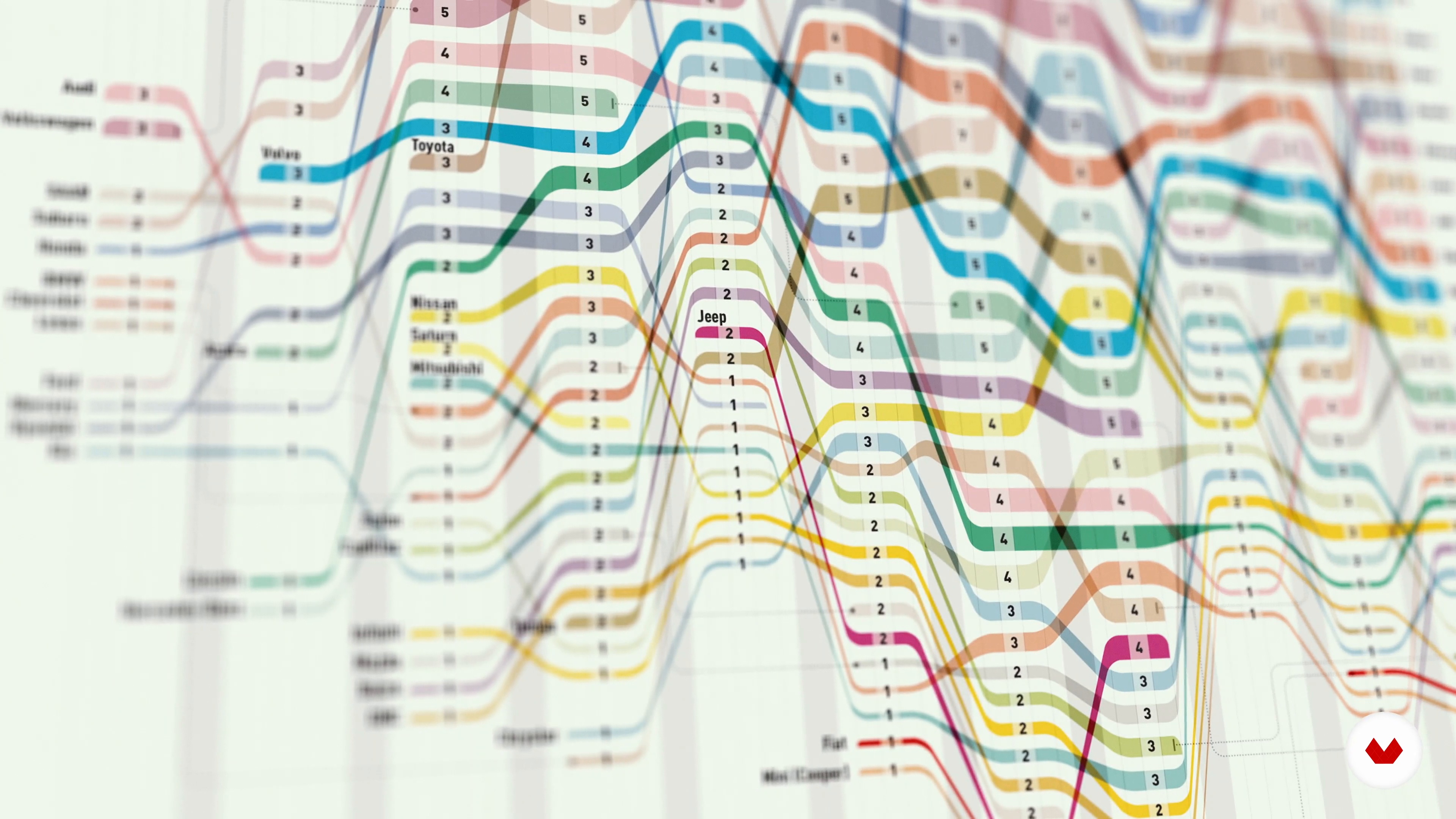
The World of Informational Graphics
4 minutes, 45 seconds
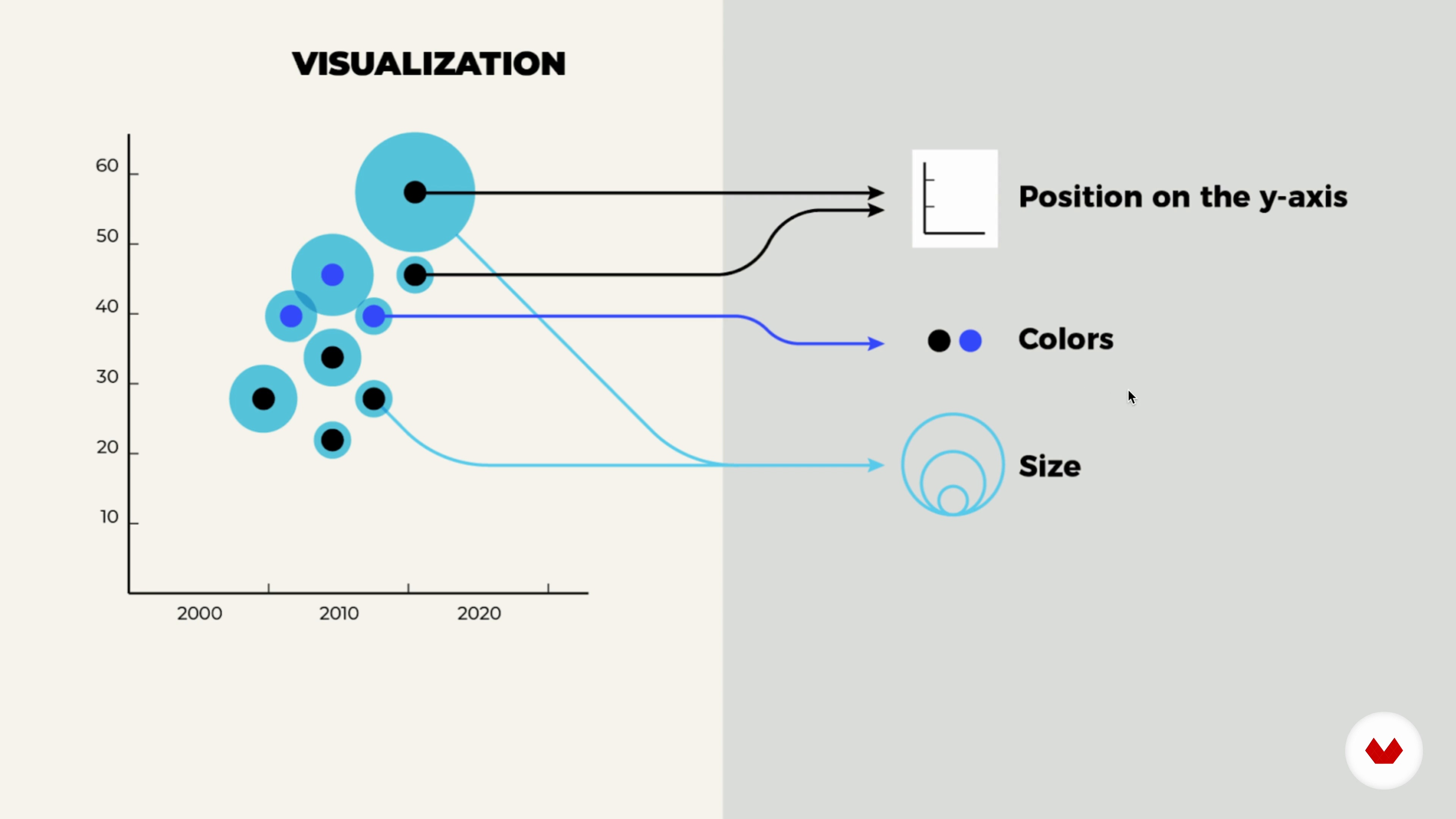
The Language of Visualization
6 minutes, 18 seconds
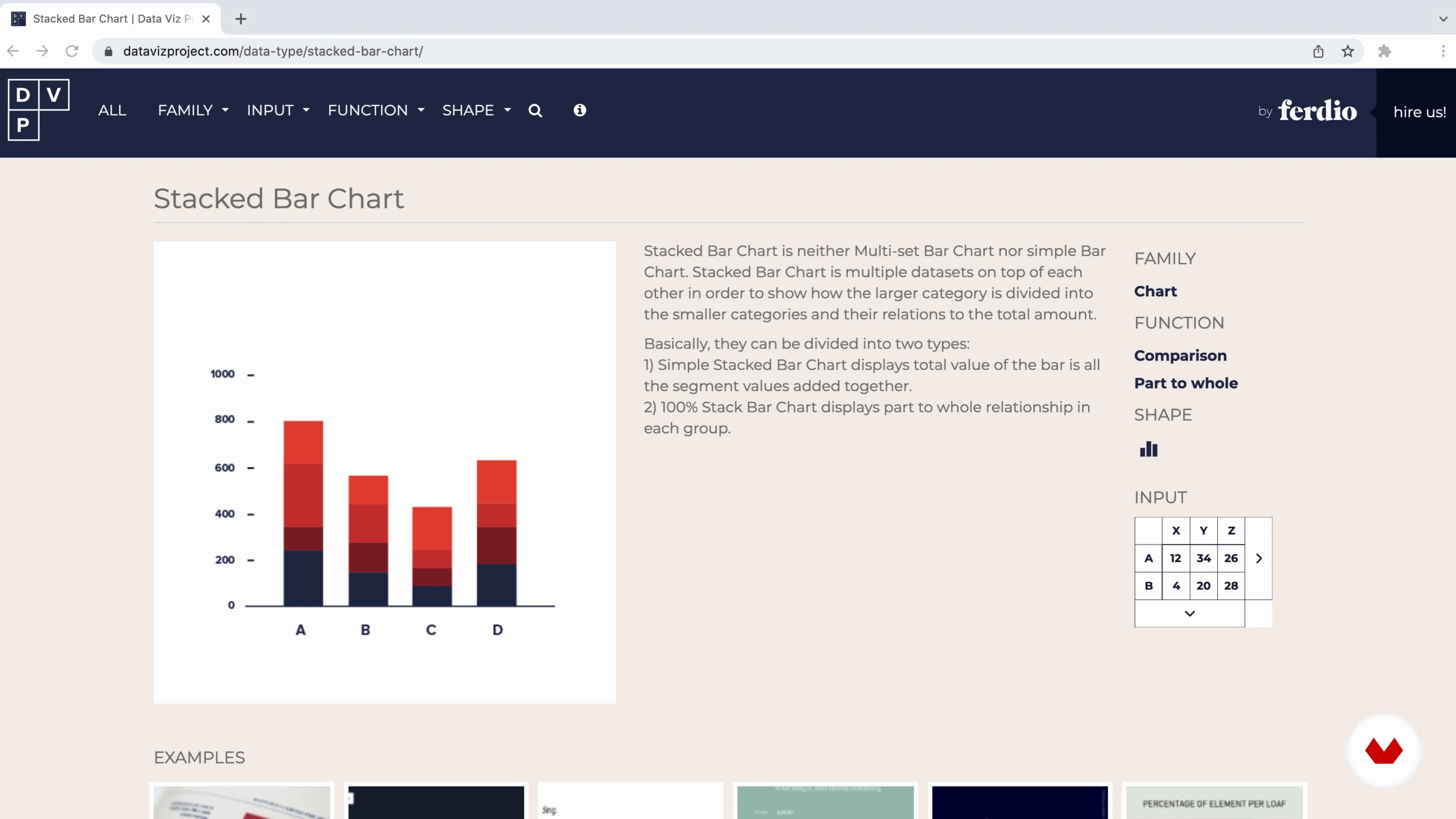
Elements of Visualization
9 minutes, 1 second

Adapting to the Audience
6 minutes, 1 second
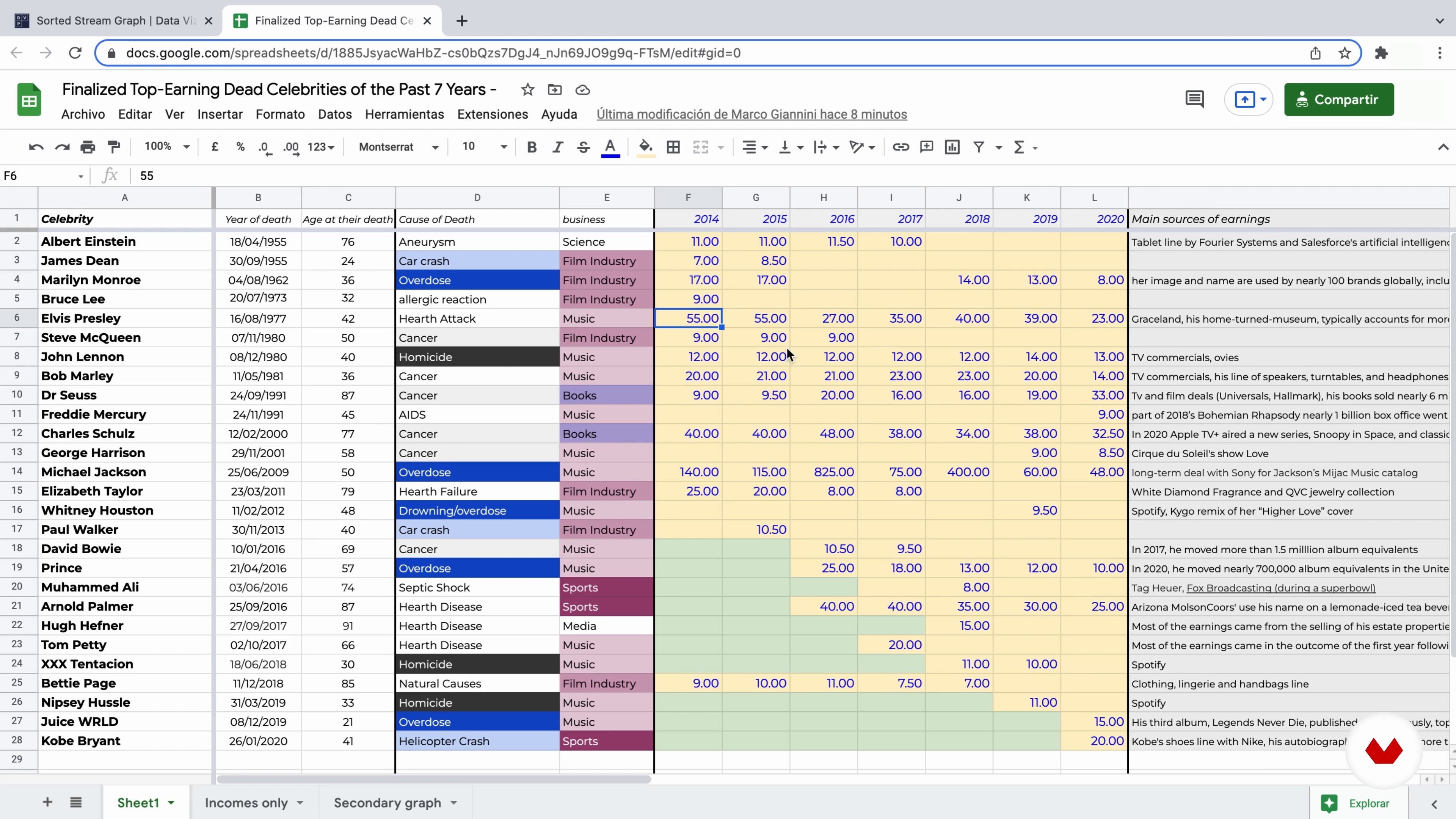
Data Analysis and Spreadsheets
11 minutes, 41 seconds
What's included in this course?
Meet data journalist and information designer Marco Giannini as he discusses his 20 plus years in the field, what he’s learned, and how the sector has developed. He also talks about what he admires in his profession.
Delve into what infographics and data visualizations are, along with their potential, goals, and possibilities, as you explore your course project. Discover how graphic images can serve as a type of language, then Marco goes through each data element and how to use them in the best way. Learn about the differences between infographics depending on the audience and user context.
Examine data, working with tables and spreadsheets, to organize and understand the information you’re dealing with. Then, Marco teaches you methods for creatively sketching out ways to represent it. Transfer your sketches and data to Illustrator and begin the design process. Next, add color and any other details before taking care of the final touches and seeing how to include secondary graphics alongside the main visualization.
Explore different potential style variations and alternatives. Marco then provides you with an essential guide on choosing infographic styles and content for future projects. Learn when to favor more visually-expressive illustrations over fixed, standard charts and diagrams. End the course with Marco’s tips on how to present your work, whether to clients or on social media.
Recommended software & tools for this course
What is this course's project?
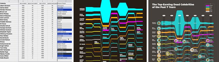
Create a visually appealing infographic consisting of numerical data. The teacher works on an infographic about ‘the top-earning dead celebrities of the past five years’, but you can apply techniques and principles to any topic you like.
Projects by course students

Who is this online course for?
This course is for anyone interested in infographics and data visualization - from curious minds to professionals.
Requirements and materials
Basic knowledge of Adobe Illustrator is required, along with the software installed on your device.

Reviews
- 2 months ago
Muito bom
- 5 months ago
The course information was interesting and pretty easy to follow, however the captions on the video were not accurate and if I had trouble understanding the presenter I couldn't use the captions to clarify as they were often incorrect and didn't make sense. However the content itself was good and it was helpful to go through the process step by step
- 9 months ago
Learnt a lot
- 10 months ago
Great stuff.
- 10 months ago
otimo

Since he started in his field, Marco has experimented with many types of information visualizations across various projects; from newspapers and magazines, to websites and apps. In 2018 he founded his own agency and creative studio, Dataspoiler, and has since worked with international organizations, communication agencies, publishing groups, and exhibitions. His clients include the IUCN, MSF (Doctors Without Borders), WWF, Aurum Press, and Bracco.
Content
- U1
Introduction
- About Me
- Influences
- U2
Understanding Infographics
- The Basic Structure of a Layout
- The World of Informational Graphics
- The Language of Visualization
- Elements of Visualization
- Adapting to the Audience
- U3
The Data and the Design
- Data Analysis and Spreadsheets
- Sketching Out Our Creativity
- Designing in Illustrator 1
- Designing in Illustrator 2
- Fine-Tuning the Graphic 1
- Fine-Tuning the Graphic 2
- Final Touches 1
- Final Touches 2
- U4
Further Arguments on Infographics
- Potential Design Variations
- The Choice of the Style
- The Choice of the Content
- Visual Encoding vs. Fixed Chart Types
- Exporting the Infographic
- FP
Final project
- Data Visualization: Design Infographics in Illustrator
What to expect from a Domestika course
Learn at your own pace
Enjoy learning from home without a set schedule and with an easy-to-follow method. You set your own pace.
Learn from the best professionals
Learn valuable methods and techniques explained by top experts in the creative sector.
Meet expert teachers
Each expert teaches what they do best, with clear guidelines, true passion, and professional insight in every lesson.
Certificates
PLUSIf you're a Plus member, get a custom certificate signed by your teacher for every course. Share it on your portfolio, social media, or wherever you like.
Get front-row seats
Videos of the highest quality, so you don't miss a single detail. With unlimited access, you can watch them as many times as you need to perfect your technique.
Share knowledge and ideas
Ask questions, request feedback, or offer solutions. Share your learning experience with other students in the community who are as passionate about creativity as you are.
Connect with a global creative community
The community is home to millions of people from around the world who are curious and passionate about exploring and expressing their creativity.
Watch professionally produced courses
Domestika curates its teacher roster and produces every course in-house to ensure a high-quality online learning experience.
FAQs
You will learn to design effective infographics, create motion graphics, use geometric drawing techniques, visualize complex data, and master tools like Adobe Illustrator and Google Sheets for newspaper, social media, and institutional communication.
This course is best suited for intermediate learners with some experience in design or data handling who want to deepen their skills in infographic creation and advanced data visualization techniques.
Basic familiarity with Adobe Illustrator and spreadsheet tools like Google Sheets is recommended, but the course will guide you through essential techniques and workflows for infographic design.
Topics include infographic design, motion graphics, geometric drawing, data visualization, chart selection, color coding, audience adaptation, hierarchical mapping, and using Illustrator and Google Sheets for visual storytelling.
Yes, the course covers designing infographics for newspapers, illustrating breaking news stories, and adapting visualizations for journalistic contexts.
Absolutely. The course teaches infographic strategies for social media, internal communication, and B2B workflows, helping you adapt designs to different audiences and platforms.
You'll work with Adobe Illustrator, Google Sheets, and learn techniques for Photoshop and Adobe Flash to create, organize, and export professional infographics.