Infographic Design: Combine Art and Data
A course by Thales MolinaDesigner and Illustrator Specialized in Infographics
A course by Thales Molina, Designer and Illustrator Specialized in Infographics

Explore the world of infographics and learn to build visual narratives from start to finish
Infographics are a great way to condense and visually express complex information. If you're looking to get started in this exciting world, then designer, illustrator, and infographics specialist Thales Molina, who's worked on publications such as Mundo Estranho, Superinteressante, and Popular Science, is the perfect person to guide you on your journey.
In this online course, learn to produce creative infographics and master visual narratives. With Thales' help, discover how to transform texts, images, and data into graphic pieces that tell captivating stories.
What will you learn in this online course?
13 lessons & 25 downloads
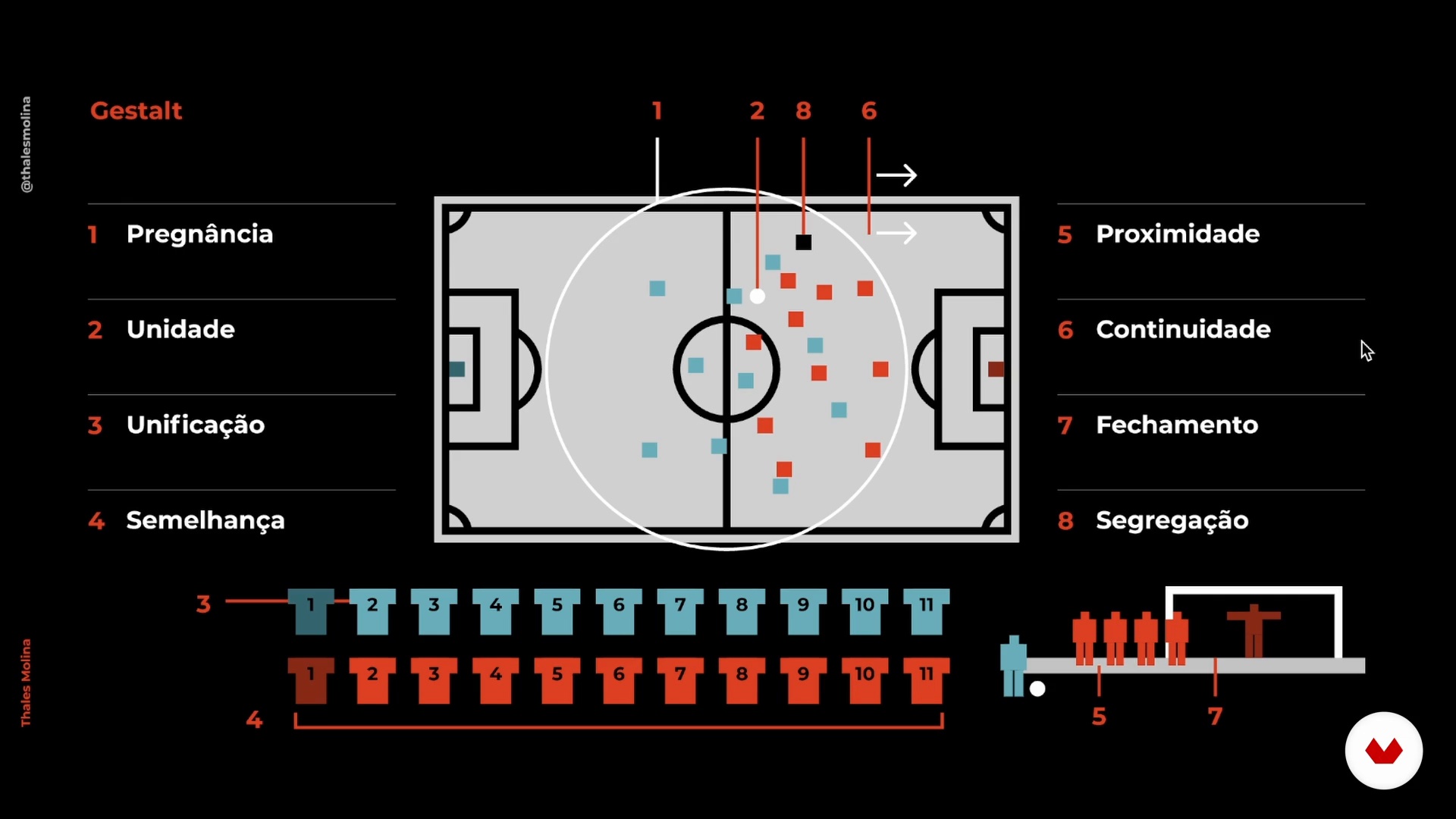
Gestalt laws
5 minutes, 39 seconds
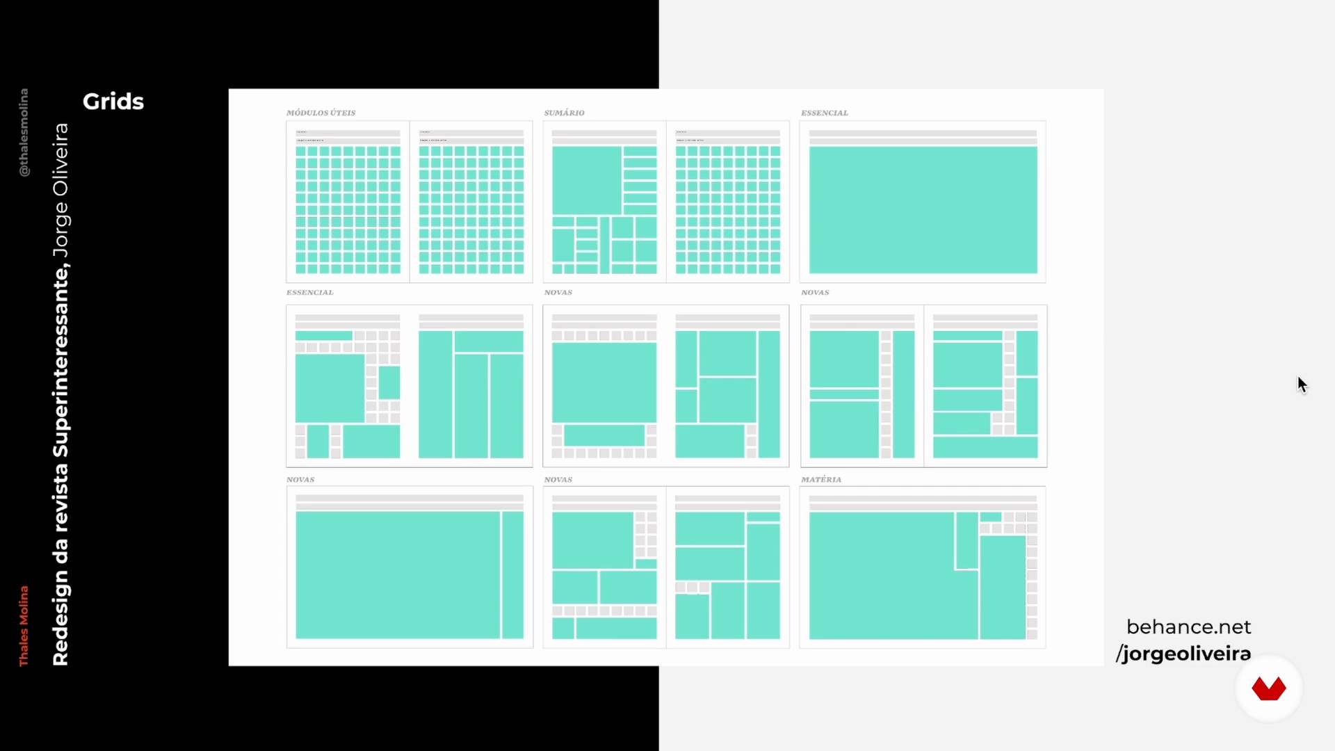
Grids, modules and hierarchies
4 minutes, 58 seconds
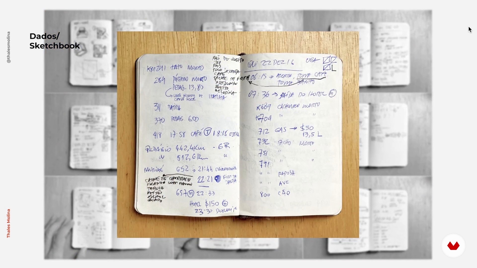
Where to get the data and where to look for references
5 minutes, 50 seconds
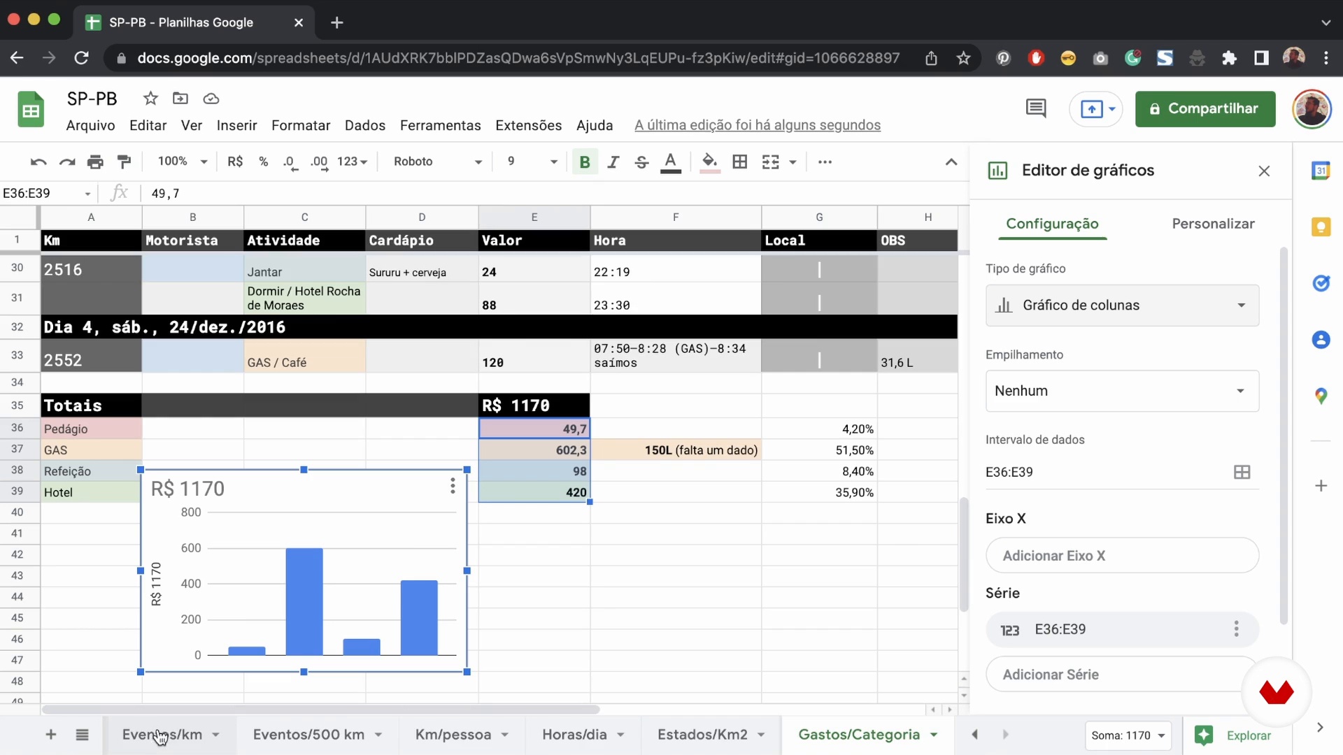
Joining the data
7 minutes, 7 seconds

Start the doodles
12 minutes, 33 seconds
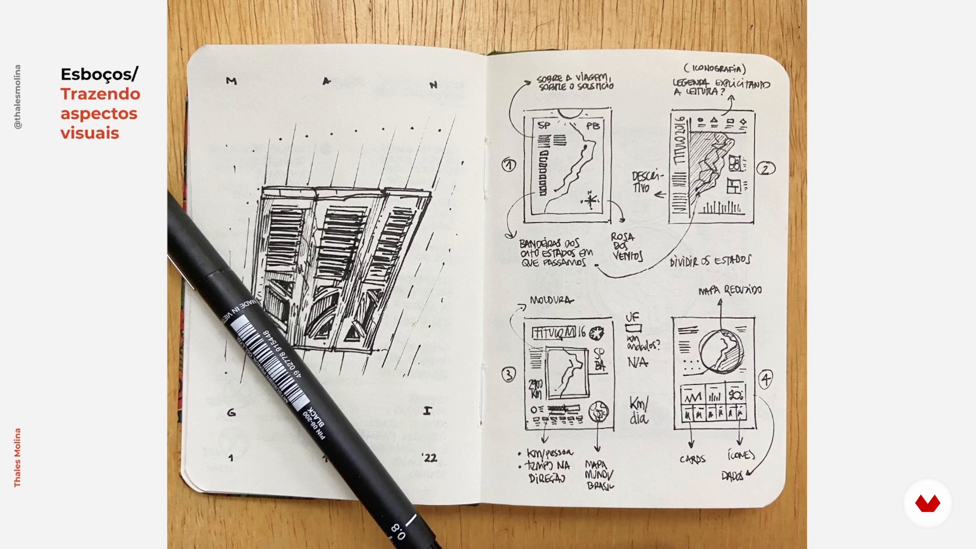
Visual concept development
6 minutes, 25 seconds
What's included in this course?
Meet Thales Molina. He talks about how he combined his passion for science with the design and illustration world and went on to produce infographics for big-name publications. He also shares his biggest influences.
Start by discovering what infographics are, the main resources involved, as well as what this art form has to offer as a narrative tool. Now take a look at how Gestalt principles can help with composition, and learn to use grids, modules, and hierarchies in the creation of your pieces. Thales also gives you top tips on choosing themes, looking for reference materials, and data organization.
It's time to tackle your project! After deciding on a theme, do some initial sketches to get your creative juices flowing. Begin to define the structure of your infographic and develop the visual aesthetic by combining graphic language and content. Next, import your work to the software of your choice to arrange the layout, as well as add images and illustrations.
To round out the course, Thales shows you some different ways to present your work and share it with the world.
Recommended software & tools for this course
What is this course's project?
Create an infographic for a subject that interests you.
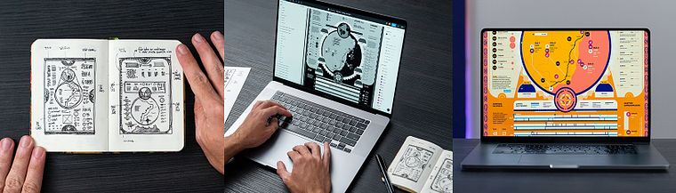
Projects by course students


Who is this online course for?
Illustrators, designers, journalists, and anyone interested in telling stories through a mixture of art and data.
Requirements and materials
Previous experience with a graphics software such as Figma, Adobe Illustrator, or similar is recommended for this course.
For materials, you need a computer installed with the program of your choice.

Reviews
- 1 month ago
muy bueno para aprender donde va cada cosa y como hacerlo
- 3 months ago
Útil para principiantes
- 3 months ago
Un curso breve pero muy efectivo sobre todo para darle la importancia a la organización y visualización de datos en orden del diseño final de la inforgrafía
- 6 months ago
Curso leve, com ótima didática e direto ao ponto.
- 9 months ago
It's good. Like it.

Content
- U1
Introduction
- About Me
- Influences
- U2
One foot in theory and the other in practice
- What is infographics?
- Gestalt laws
- Grids, modules and hierarchies
- Where to get the data and where to look for references
- Joining the data
- U3
Now it's real
- Start the doodles
- Visual concept development
- Start working on the software
- Visual language: illustration and graphics
- U4
Create a legacy
- Preparing the files
- The narrative of the narrative: present your process
- FP
Final project
- Infographic Design: Combine Art and Data
What to expect from a Domestika course
Learn at your own pace
Enjoy learning from home without a set schedule and with an easy-to-follow method. You set your own pace.
Learn from the best professionals
Learn valuable methods and techniques explained by top experts in the creative sector.
Meet expert teachers
Each expert teaches what they do best, with clear guidelines, true passion, and professional insight in every lesson.
Certificates
PLUSIf you're a Plus member, get a custom certificate signed by your teacher for every course. Share it on your portfolio, social media, or wherever you like.
Get front-row seats
Videos of the highest quality, so you don't miss a single detail. With unlimited access, you can watch them as many times as you need to perfect your technique.
Share knowledge and ideas
Ask questions, request feedback, or offer solutions. Share your learning experience with other students in the community who are as passionate about creativity as you are.
Connect with a global creative community
The community is home to millions of people from around the world who are curious and passionate about exploring and expressing their creativity.
Watch professionally produced courses
Domestika curates its teacher roster and produces every course in-house to ensure a high-quality online learning experience.
FAQs
The course is intermediate level, perfect for those with basic design or illustration skills who want to deepen their infographic and visual storytelling techniques.
Basic knowledge of graphic design, illustration, and familiarity with digital tools like Figma, Google Sheets, InDesign, and Excel is recommended.
You’ll learn to create playful and scientific infographics, build illustrated maps, work with grids, organize data, apply visualization techniques, and craft informative visual stories.
Yes, the course covers creating editorial infographics, including data visualization for magazines and annual reports, exploring layout, column structure, and visual hierarchy concepts.
Yes, the course teaches how to turn data into visual, comparative, and interactive charts using various techniques and digital tools to make information easier to understand.
The course shows how to apply color, choose typography, and design icons to build cohesive and engaging visual narratives that match the project’s theme and identity.
You’ll learn techniques like using markers, quick sketching, composing illustrative maps, creating graphic patterns, and 3D and isometric representation in infographics.