Web Layout with CSS Grid, Flexbox and other Modern Techniques
A course by Javier Usobiaga FerrerWeb designer
A course by Javier Usobiaga Ferrer, Web designer

Discover new grids and other ways of designing a website with CSS Shapes, variables, and parallax effects
The internet lives in a constant state of change, and even more so with the likes of CSS Grid and Flexbox. Javier Usobiaga–web designer, front-end developer and cofounder of Swwweet studio–has over a decade's experience creating all kinds of projects for clients such as Barcelona City Council, and with his extensive experience, he invites you to discover the most cutting-edge techniques and tools that are revolutionizing the sector.
In his first Domestika course, Javier brought us an Introduction to Responsive Web Development with HTML and CSS, in this one, learn various advanced techniques with tools such as CSS Grid, Flexbox, CSS Shapes, viewport units, CSS variables, 3D transformations, and parallax effects.
What will you learn in this online course?
25 lessons & 16 downloads
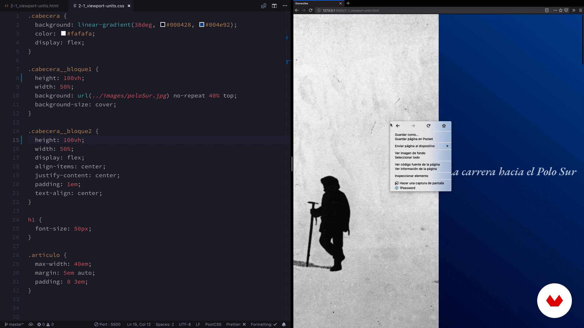
The viewport units
4 minutes, 40 seconds
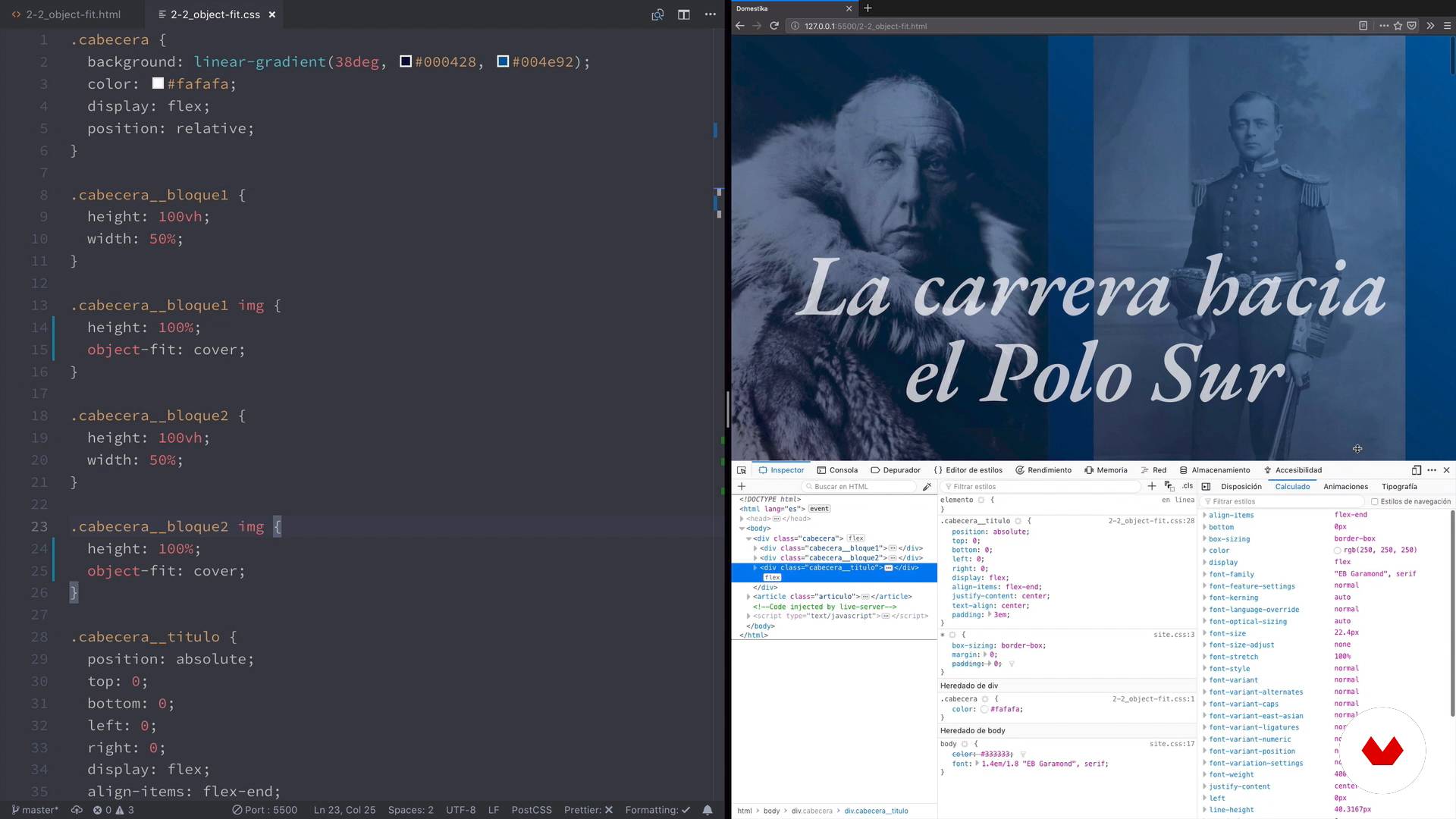
Images with object-fit
4 minutes, 44 seconds
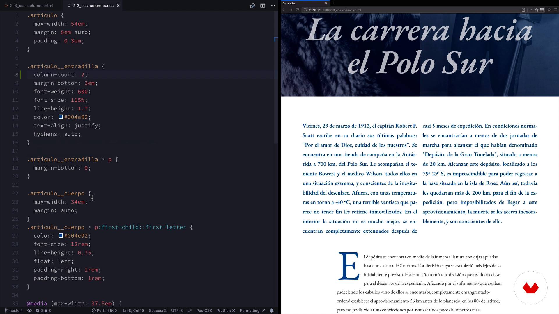
CSS columns
3 minutes, 1 second
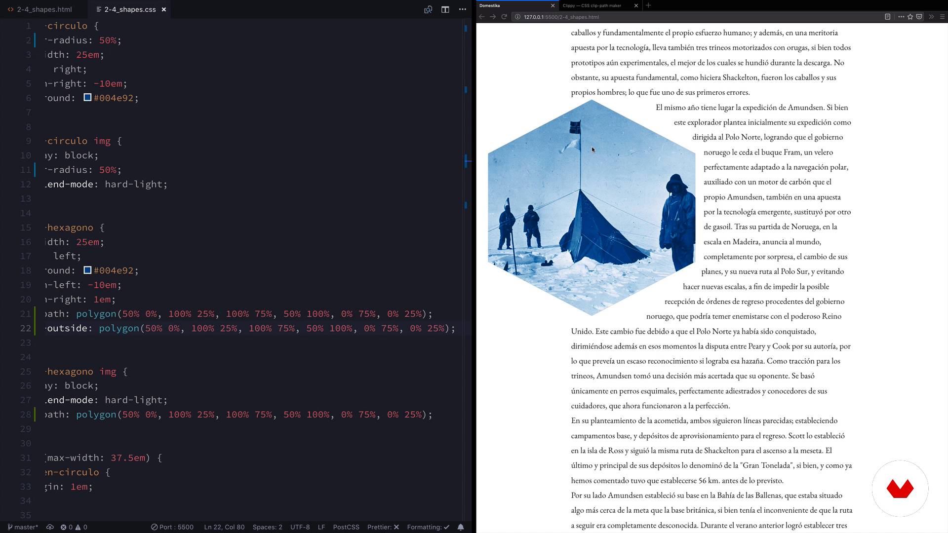
CSS shapes
7 minutes, 5 seconds
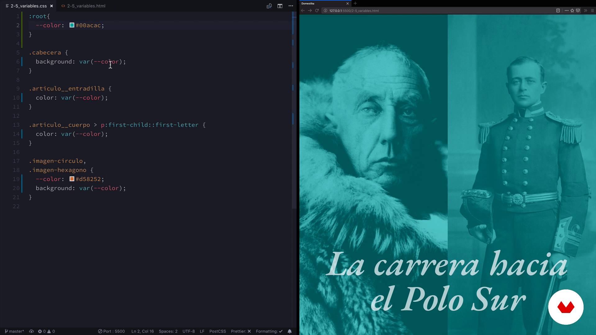
CSS variables
4 minutes, 11 seconds
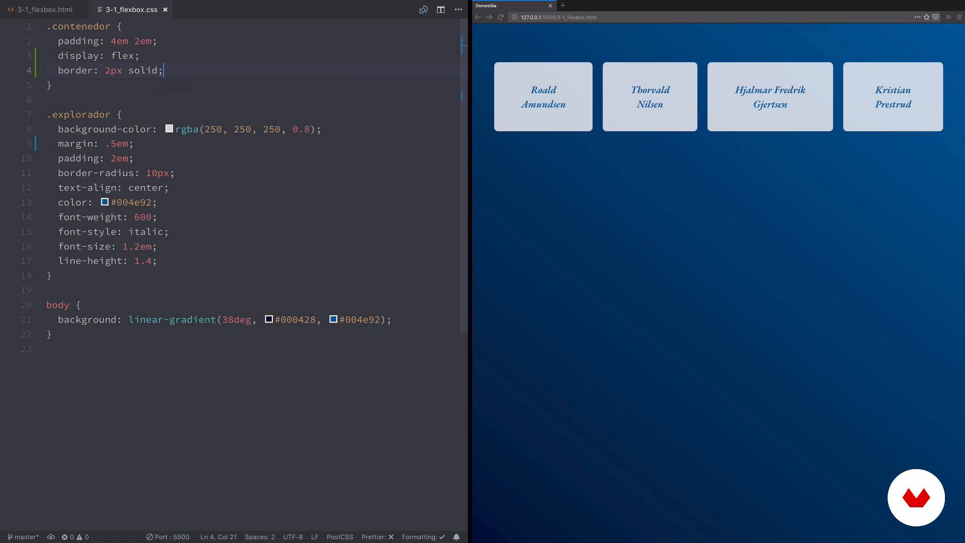
Introduction to flexbox
3 minutes, 12 seconds
What's included in this course?
Start by getting to know Javier Usobiaga, his professional career, and his most notable projects.
Learn how to shape the layout with the units relative to the viewport units, the object-fit property, and how to distribute text with CSS columns. See how to cut shapes from a rectangle with clip-path and CSS Shapes, then learn how to optimize your code with custom properties (native variables).
Explore how Flexbox revolutionized the world of internet layout. Javier teaches you all the advantages of alignment. He explains the properties of the container and the content, and the capabilities of alignments with a main axis, a crossed axis, and alternative axes.
Continue with CSS Grid by looking at changing the way you structure your code and how to approach the layout. Learn some grid functions, layout and size properties, and how to set up a grid that adapts to different screen sizes with the repeat and minmax functions.
Javier explains more advanced CSS Grid techniques like grid areas, alignment, order, nesting, and—using an example—how to use Grid and Flexbox together in projects.
Take a look at 3D transformations with a practical example of depth and scroll effects to finally see projects, examples, and resources selected by Javier to serve as inspiration.
What is this course's project?
Make an information page choosing any theme and project you want, your teacher's is about the conquest of the South Pole. Complete an exercise with one or more of the techniques learned.

Projects by course students


Who is this online course for?
Anyone with an interest in design and modern layout techniques with CSS Grid and Flexbox.
Requirements and materials
You need to have solid knowledge of HTML and CSS, a computer, and a code editor.

Reviews
- 8 months ago
An Amazing course to learn Flexbox & Grid and some advanced animations.
- 8 months ago
increíble
- creative_250792PLUS8 months ago
Cours très instructif, agréable, très complet
- 1 year ago
Es un curso muy bueno
- 1 year ago
Um curso prático e direto, com ênfase em um entendimento passo a passo.

He also enjoys a lot in his facet as professor of Web Design in renowned workshops and schools like Elisava, IDEP.
Usobiaga understands the web as a whole, not only how beautiful it can be on the computer screen, but its usability in different devices and circumstances.
In his words "I think that as important as the aesthetic is how fast it charges or how well it responds, and I think that in our industry we often forget about that."
Content
- U1
Introduction
- Presentation
- Influences
- U2
Shaping the layout
- The viewport units
- Images with object-fit
- CSS columns
- CSS shapes
- CSS variables
- U3
Layout in one dimension with flexbox
- Introduction to flexbox
- Container properties
- Content properties
- Alignments on main shaft and cross shaft
- Advanced alignments
- Advanced layouts with flexbox
- U4
Two-dimensional layout with CSS grid
- Introduction to CSS grid
- Reticle functions
- Distribution and size
- Automatic responsive grid
- U5
Advanced grid CSS
- Areas in the grid
- Alignment and order
- Nesting
- Grid (and flexbox) in practice
- U6
The third dimension: depth and effects in scroll
- Introduction to 3D transformations
- Fixed headers
- Animations synchronized with scroll
- Inspiration and resources
- FP
Final project
- Web layout techniques
What to expect from a Domestika course
Learn at your own pace
Enjoy learning from home without a set schedule and with an easy-to-follow method. You set your own pace.
Learn from the best professionals
Learn valuable methods and techniques explained by top experts in the creative sector.
Meet expert teachers
Each expert teaches what they do best, with clear guidelines, true passion, and professional insight in every lesson.
Certificates
PLUSIf you're a Plus member, get a custom certificate signed by your teacher for every course. Share it on your portfolio, social media, or wherever you like.
Get front-row seats
Videos of the highest quality, so you don't miss a single detail. With unlimited access, you can watch them as many times as you need to perfect your technique.
Share knowledge and ideas
Ask questions, request feedback, or offer solutions. Share your learning experience with other students in the community who are as passionate about creativity as you are.
Connect with a global creative community
The community is home to millions of people from around the world who are curious and passionate about exploring and expressing their creativity.
Watch professionally produced courses
Domestika curates its teacher roster and produces every course in-house to ensure a high-quality online learning experience.
FAQs
This course is designed for people with basic CSS knowledge who want to dive deeper into advanced layouts, modern techniques, and experimenting with the latest properties. You don’t need to be an expert, but you should know the basics of HTML and CSS.
You should have basic knowledge of HTML and CSS, plus a code editor and a modern browser. No special tools or framework experience required.
You’ll learn to build advanced, responsive layouts with Flexbox and CSS Grid, parallax animations, custom shapes, viewport units, image and column control, CSS variables, and 3D transforms for innovative web interfaces.
The course covers element alignment, advanced properties, differences between Flexbox and Grid, responsive layouts, nested grids, custom areas, distribution techniques, and when to choose each method based on design needs.
Viewport units like vh and vw are used to size blocks, text, and images relative to the browser window, creating responsive interfaces and avoiding horizontal scroll or poor proportions.
Yes, you’ll learn to create parallax animations, sticky headers, and scroll-synced effects using pure CSS and advanced visual interaction techniques.
Yes, the course teaches how to adjust images with object-fit, object-position, media queries, and techniques to make images adapt to any container or screen.