Fundamentals of Data Visualization
A course by Gemma Busquets, Designer

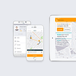


Learn how to tell the stories behind data, using everything from statistics to maps and charts



If you've ever had to present a report and not known how to turn the data into an attractive graph, this online course is for you. Together with the designer Gemma Busquets, explore a simple formula to tell a story and generate curiosity, however dense or technical the data may be.
Throughout the course, discover a wide range of graphics, from statistical data visualizations to maps and diagrams. Learn how to create them from scratch and design them to be clear and visually powerful. In her previous course, Typography Concepts for the Screen, Gemma guides you through digital projects for the screen.
What will you learn in this online course?
21 lessons & 30 downloads


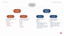
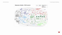
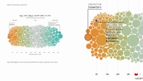
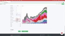
What's included in this course?
To start, get to know Gemma Busquets better. She tells you about some of the clients she's made data visualizations for. She also shares her influences and books that have inspired her on a daily basis.
Next, she explains why data visualization is so present in our lives. Then see the key concepts that you should know before starting work, and the most common mistakes in order to avoid them.
Now delve into the three most popular graphic charts—bar, line, and pie. Take a look at who created them, before Gemma shares guides so you can use them without making mistakes. Also explore a range of other visually striking charts, maps, and diagrams.
It's time to hone in on the details! Your teacher teaches you about color palettes and how to improve typography. In addition, come to understand the importance of composition to use the space properly.
After laying the foundations of your final project—the theme, focus, objective, target, and medium— continue by defining the narrative to present the data and do sketches by hand. To wrap up the course, work with different tools to create and edit the graphics, as well as prepare your pieces for three formats—Instagram, a poster, and Power Point.
- 100% positive reviews (64)
- 2,279 students
- 21 lessons (3h 23m)
- 30 additional resources (12 files)
- Online and at your own pace
- Available on the app
- Audio: Spanish
- Spanish · English · Portuguese · German · French · Italian · Polish · Dutch · Turkish · Romanian · Indonesian
- Level: Beginner
- Unlimited access forever
What is this course's project?
Create a series of data visualizations that tell a story and explore its application in different formats.

Projects by course students


Who is this online course for?
Anyone who wants to learn to visualize data from scratch. Also, for professionals who have already made visualizations and want to improve them graphically.
Requirements and materials
You don't need any previous experience to take the course.
As for tools, you need Illustrator and Affinity Designer (or a similar vector editing program) in addition to Excel, Numbers, or Google Docs. Throughout the course, see a variety of free web applications that you don't need to install or know anything about previously.

Reviews

Gemma Busquets
A course by Gemma Busquets
Gemma Busquets is a freelance graphic designer and art director based in Barcelona, Spain with more than 10 years of experience. Throughout her career, she has had the opportunity to collaborate with major brands such as Dell, Novartis, San Miguel, HuffPost, Coca-Cola, Nike, Rosetta Stone, Peugeot, InfoJobs, and Puig, among others. She has also been a judge at the ADG Laus Awards for Graphic Design and Visual Communication, specifically evaluating projects in the digital category.
She currently combines her work with teaching at the BAU, Barcelona University Design Center, Spain, as art director of the final projects in the Postgraduate Program in Digital Editions, and professor in the Master's in Infographics and Data Visualization, which she also directs and coordinates.
Content
-
U1
Introduction
-
About Me
-
Influences
-
-
U2
Data Visualization
-
The importance of data in our lives
-
Considerations before you start
-
Data and variables
-
The most common mistakes
-
-
U3
Graphics creation
-
Chart types
-
The 3 graphics that you will use the most 1
-
The 3 graphics that you will use the most 2
-
Visually Stunning Graphics 1
-
Visually Stunning Graphics 2
-
Visualizations with maps
-
Diagrams and other graphics
-
-
U4
Designing the Data
-
Well-designed graphics work best
-
The visual language of graphics
-
Color and Typography
-
The composition
-
-
U5
End-to-end data visualization
-
Project Preparation
-
Data sketches
-
Creation and design of graphics
-
Adaptation to different formats
-
-
FP
Final project
-
Fundamentals of Data Visualization
-
What to expect from a Domestika course
-
Learn at your own pace
Enjoy learning from home without a set schedule and with an easy-to-follow method. You set your own pace.
-
Learn from the best professionals
Learn valuable methods and techniques explained by top experts in the creative sector.
-
Meet expert teachers
Each expert teaches what they do best, with clear guidelines, true passion, and professional insight in every lesson.
-
Certificates
PlusIf you're a Plus member, get a custom certificate signed by your teacher for every course. Share it on your portfolio, social media, or wherever you like.
-
Get front-row seats
Videos of the highest quality, so you don't miss a single detail. With unlimited access, you can watch them as many times as you need to perfect your technique.
-
Share knowledge and ideas
Ask questions, request feedback, or offer solutions. Share your learning experience with other students in the community who are as passionate about creativity as you are.
-
Connect with a global creative community
The community is home to millions of people from around the world who are curious and passionate about exploring and expressing their creativity.
-
Watch professionally produced courses
Domestika curates its teacher roster and produces every course in-house to ensure a high-quality online learning experience.
FAQs
Data visualization is the graphical representation of information to make it easier to understand. It’s essential in design because it turns complex data into clear, engaging messages that help communicate ideas and support informed decision-making.
This course is aimed at people with basic knowledge of design or data handling, as it’s intermediate level. Some prior familiarity with charts and digital tools is recommended.
You only need basic design or data skills and access to a computer. Experience with Excel and a curiosity for visually analyzing and interpreting information will be helpful.
You’ll learn how to create infographics, pick the right chart, use color and typography effectively, analyze variables, avoid common mistakes, and use tools like Excel and Datawrapper to visualize data efficiently.
Yes, the course includes practical exercises to create and customize charts in Excel and Datawrapper, along with techniques for importing, cleaning, and preparing data for visualization.
Yes, the course covers adapting visualizations for digital formats and social media, including strategies for crafting effective infographics for Instagram.
Yes, you’ll learn to identify quantitative and qualitative variables, assess their relevance, and cross-reference them to build charts and uncover data patterns.


Me encanto
Muito útil e facil de entender, otimo para quem esta a iniciar o estudo na analise de dados!
El curso es muy bueno y útil para la visualización de datos.
Muy bien explicado, sencillo y directo al grano. Muy bueno para iniciarse en visualización de datos.
curso, Magnifico! recomendo muitíssimo para queira iniciar na visualização de dados.