
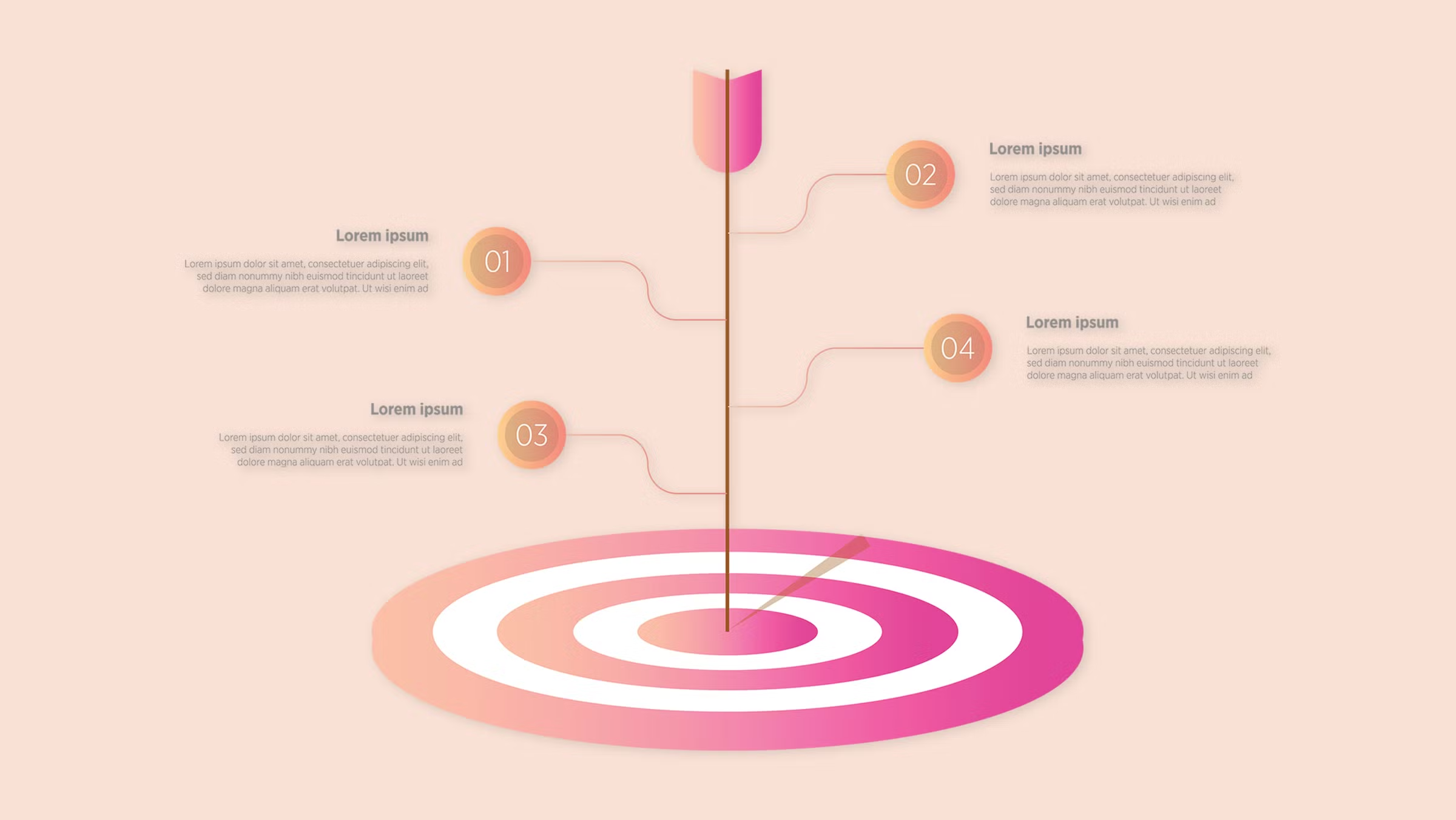
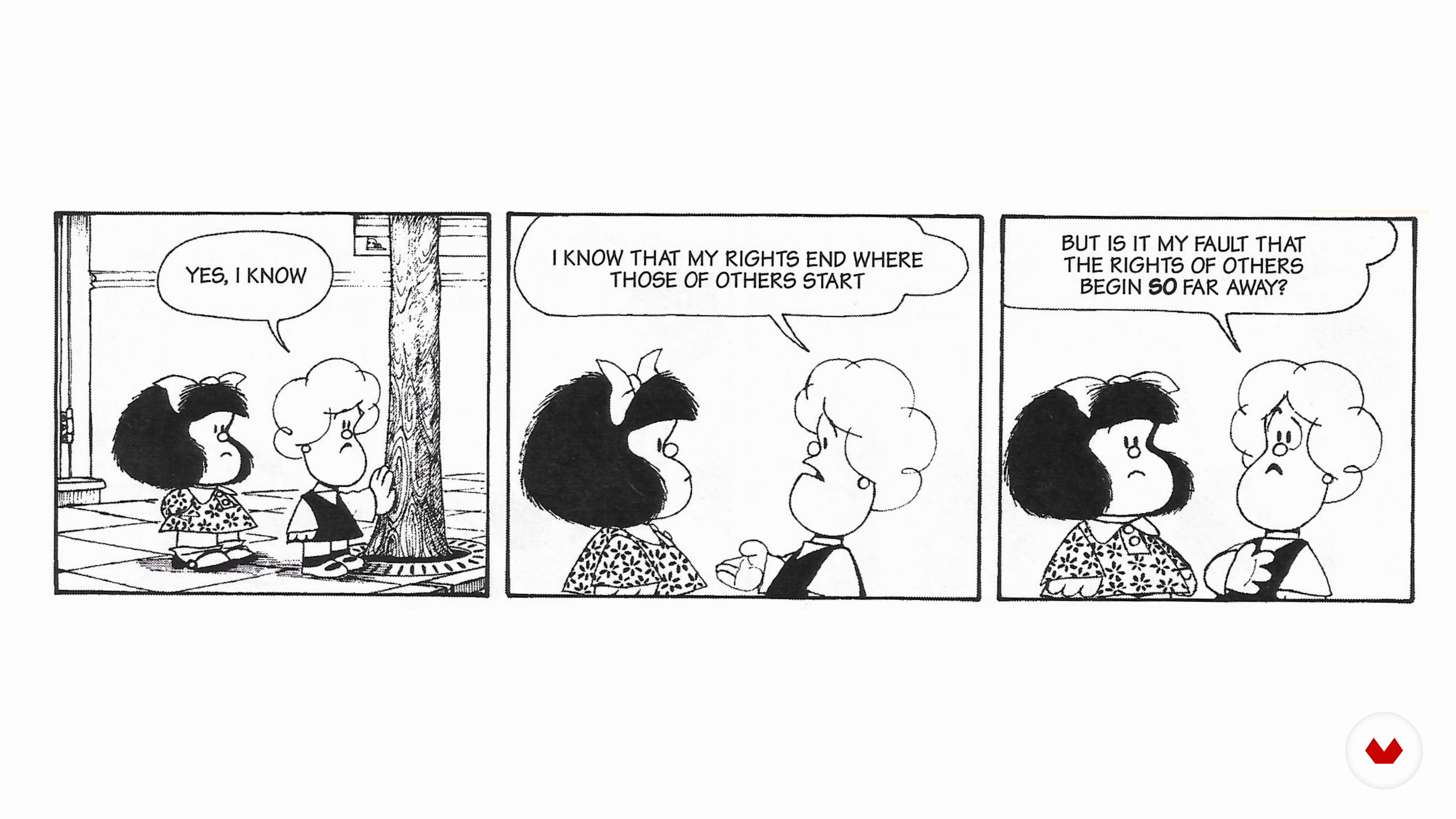
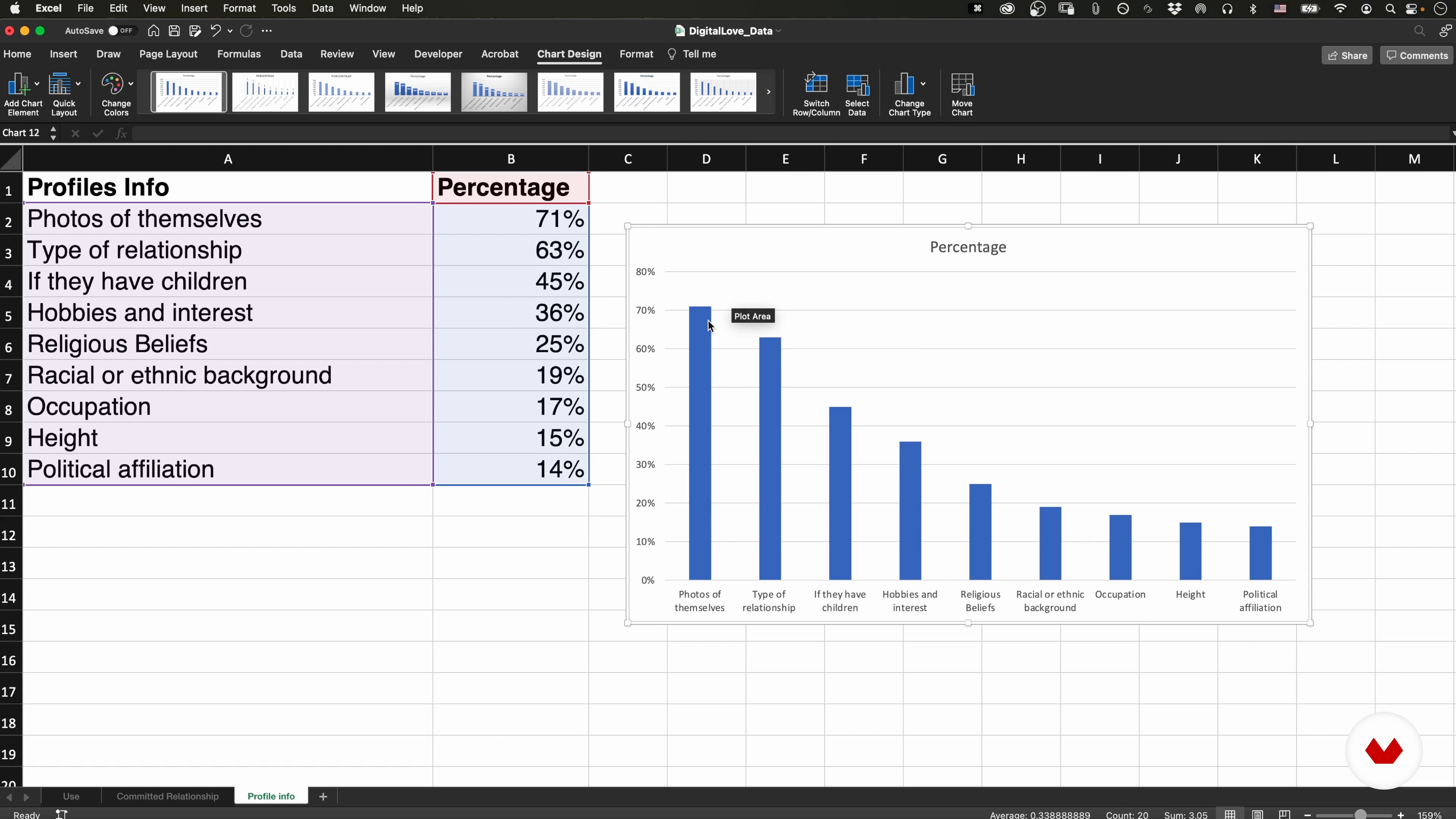
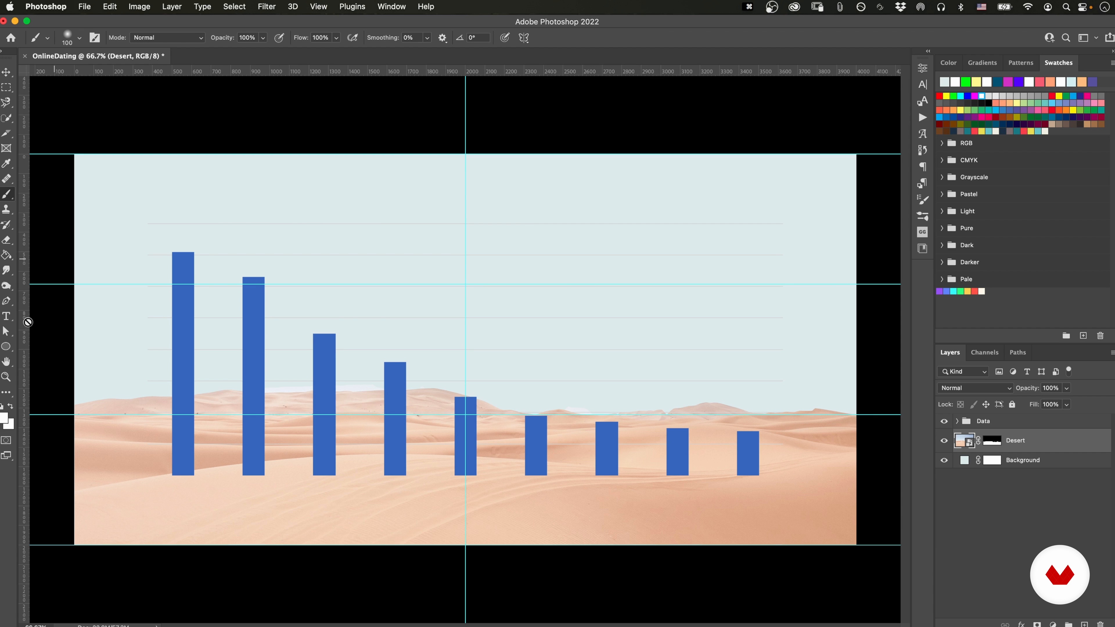
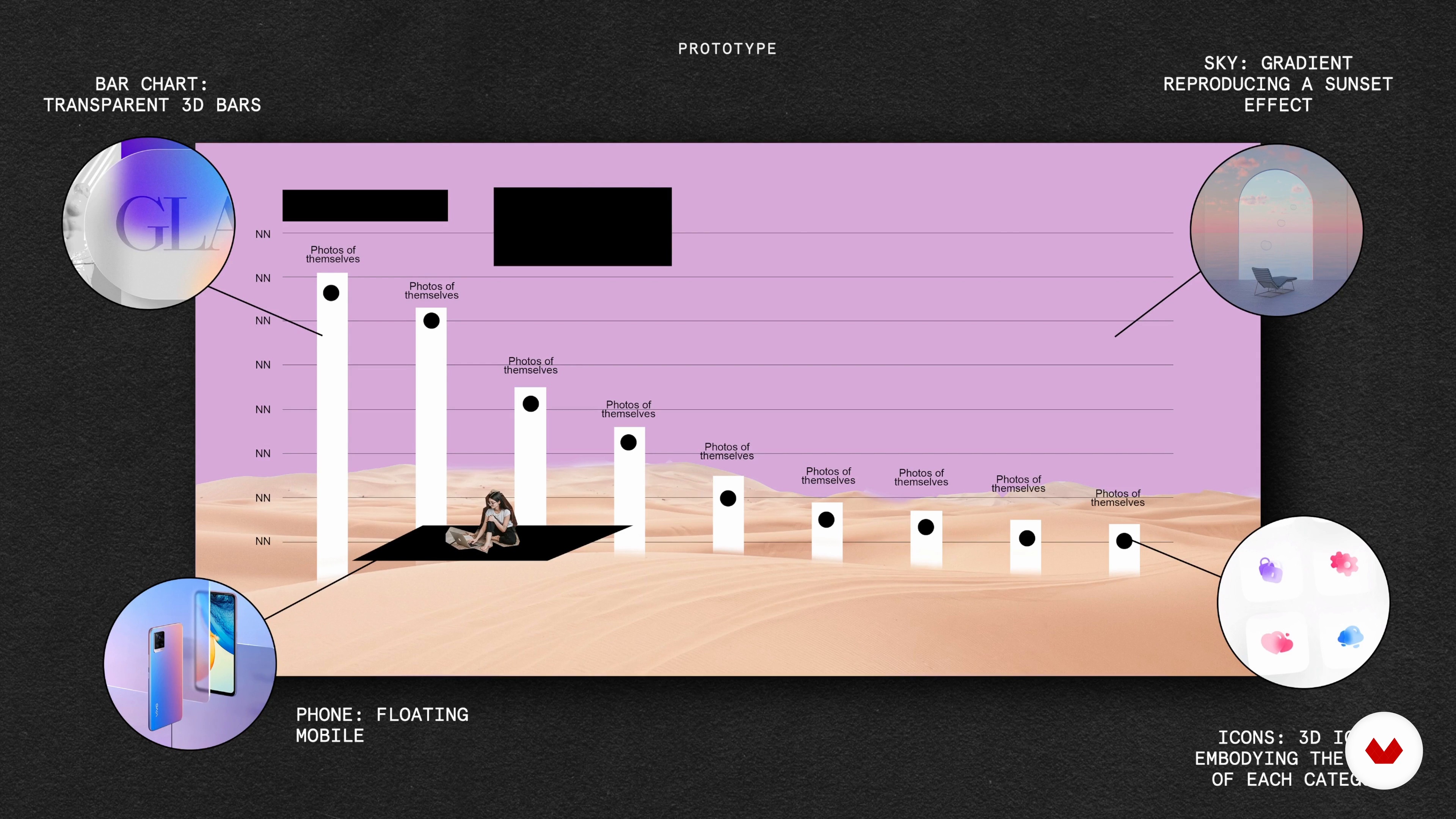
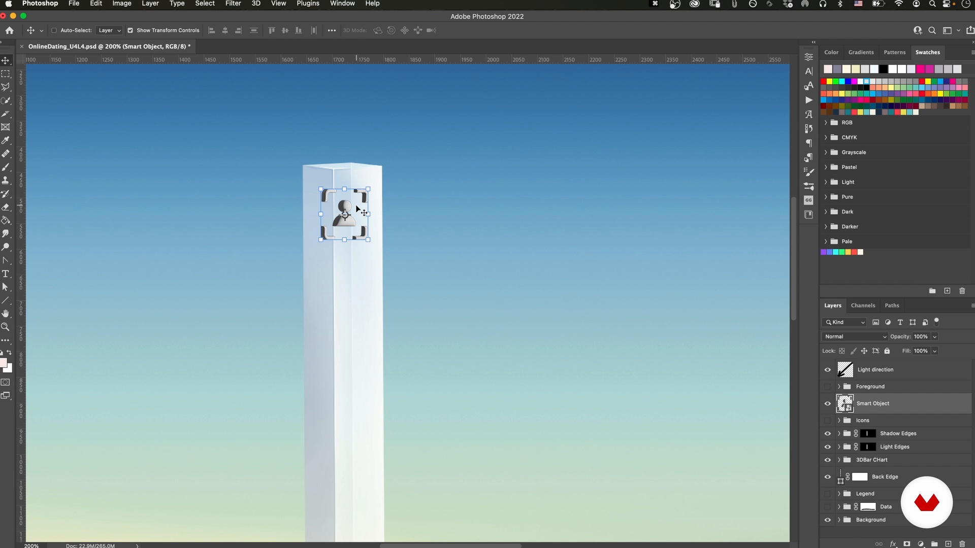
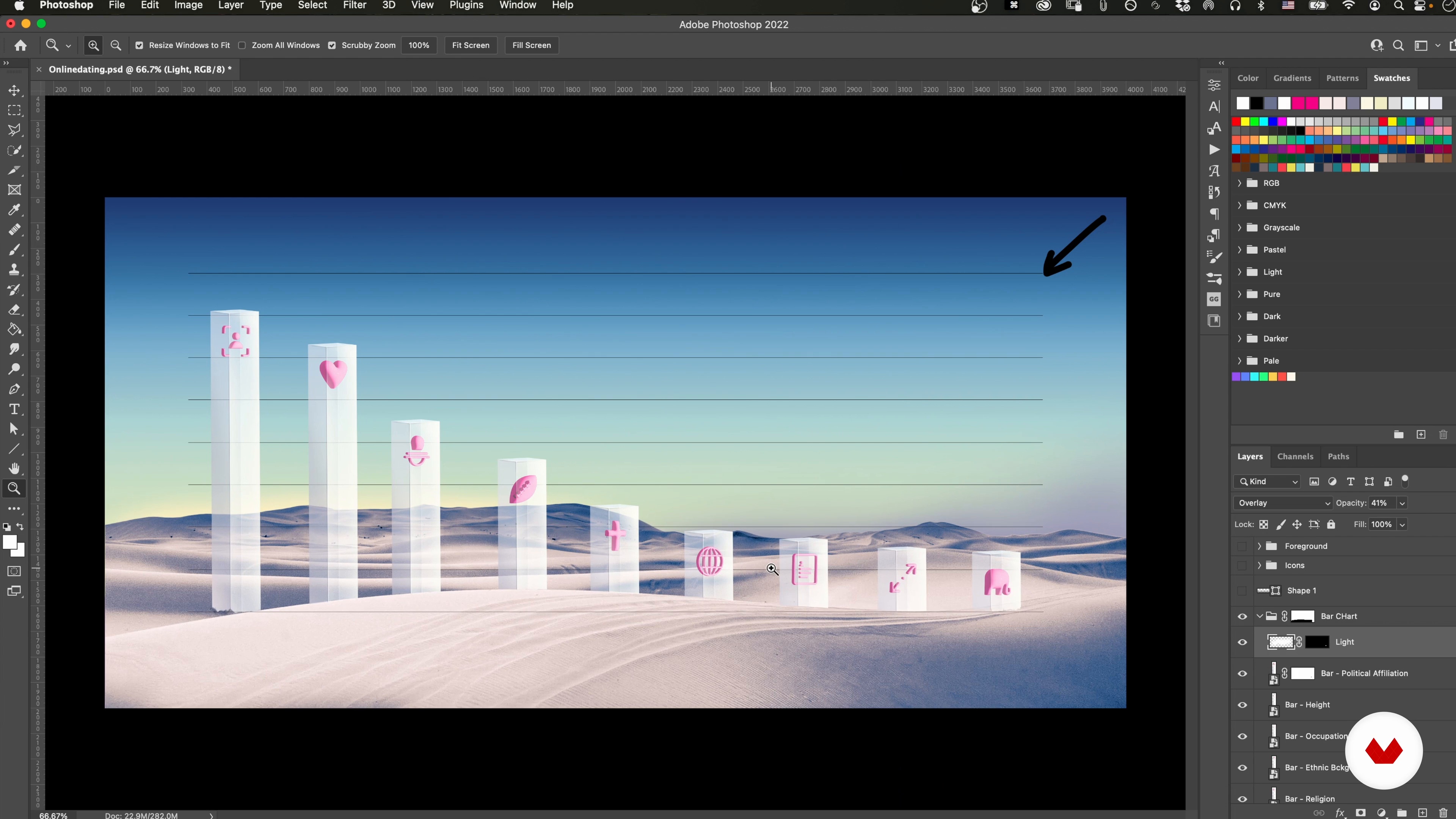
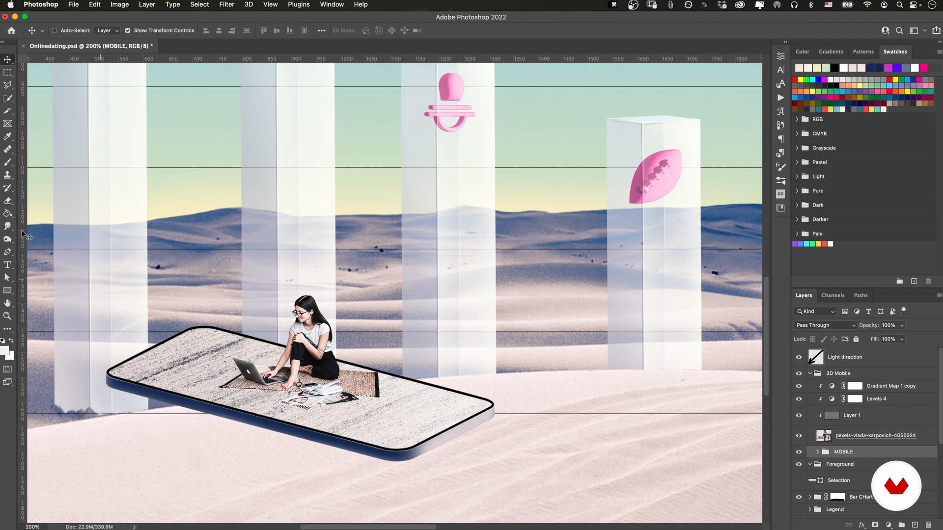
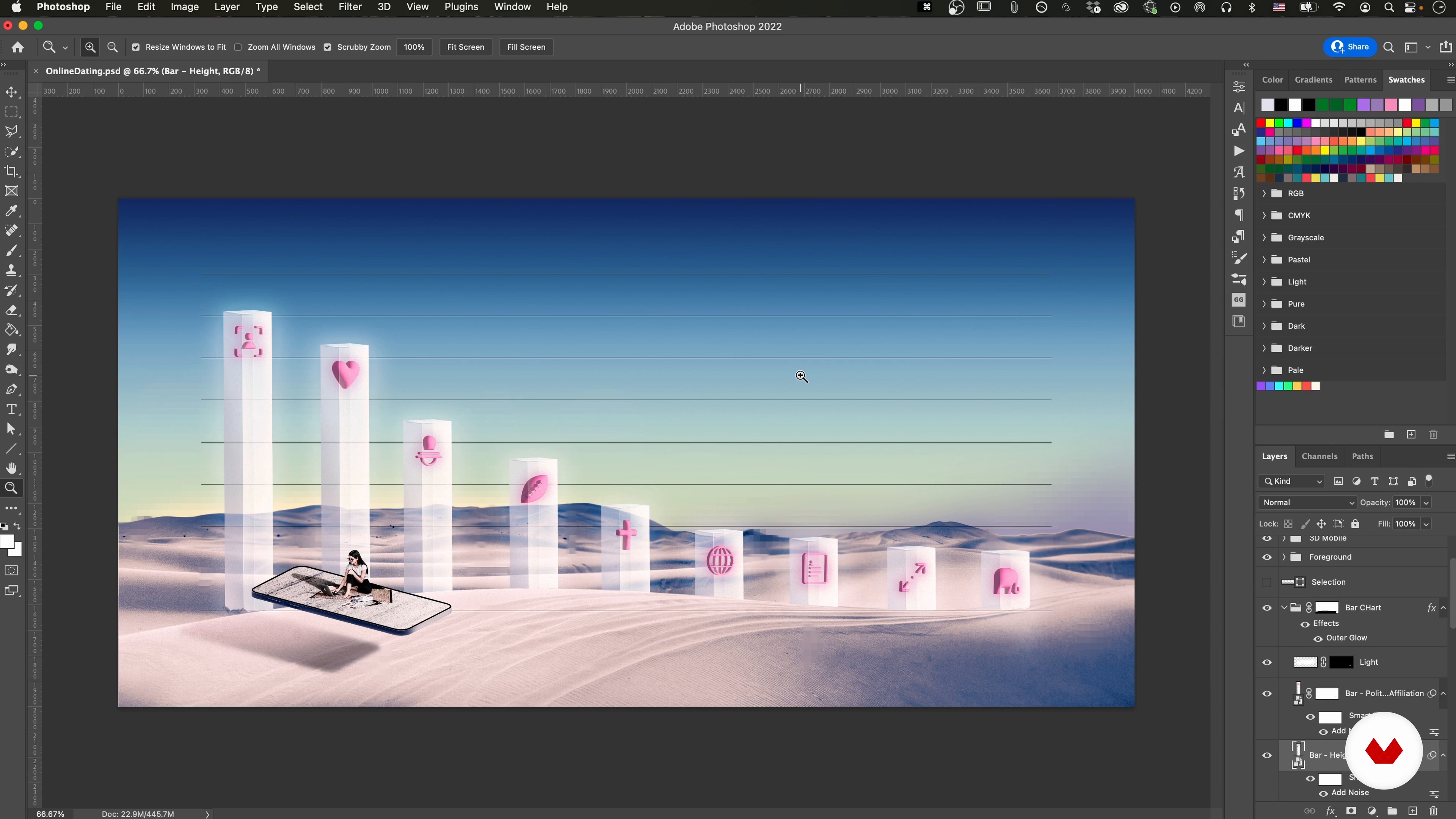
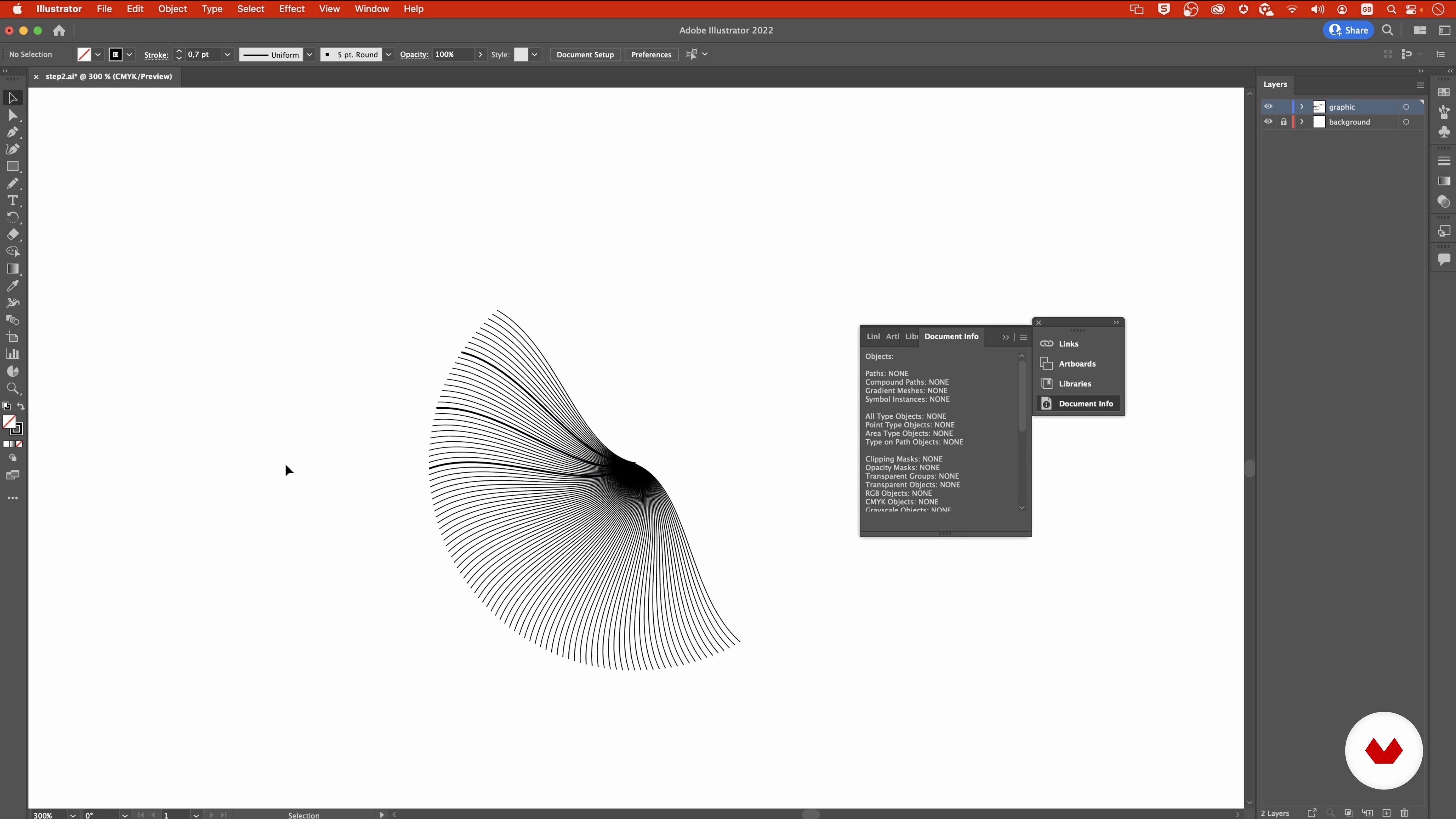
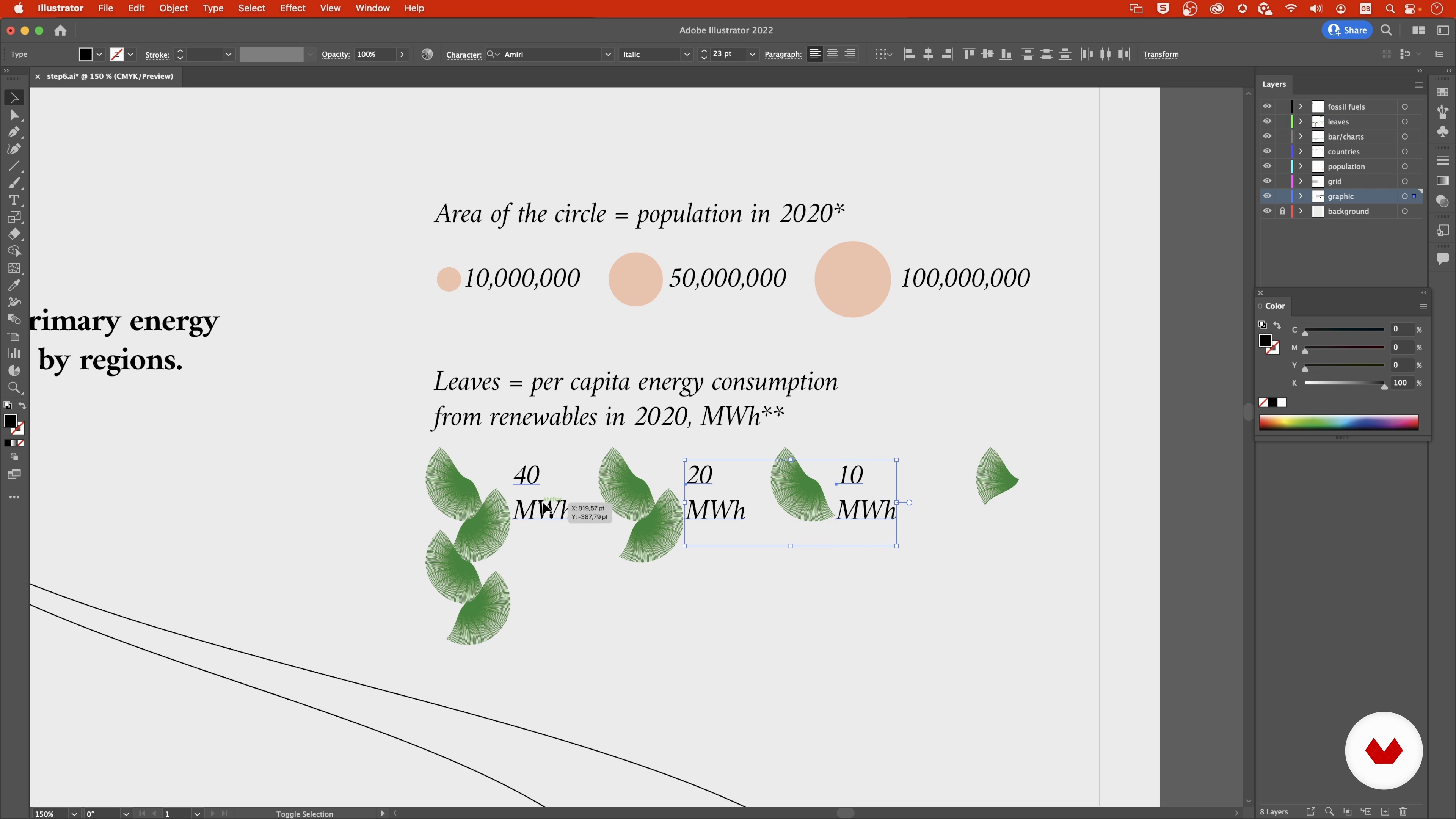
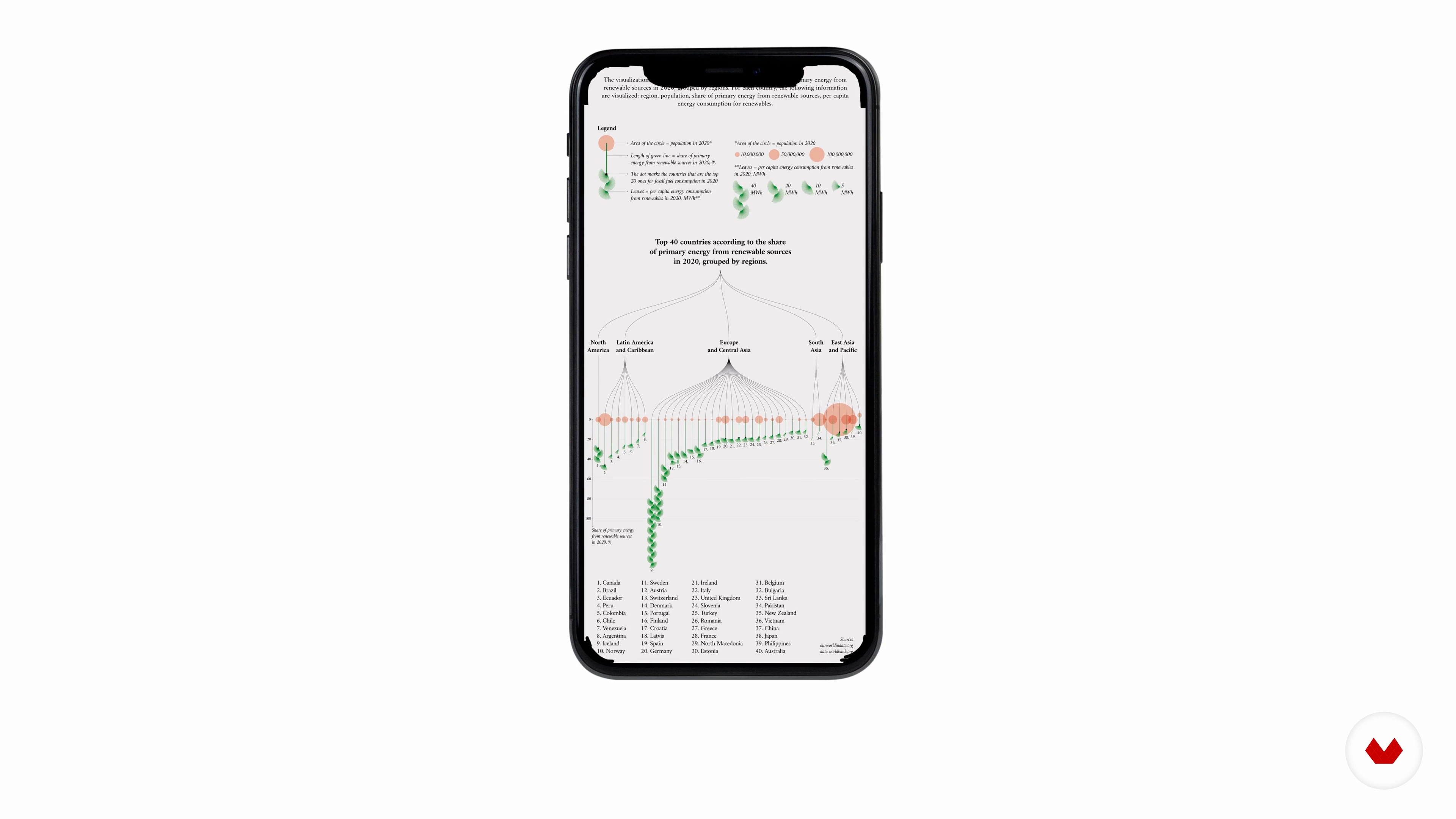
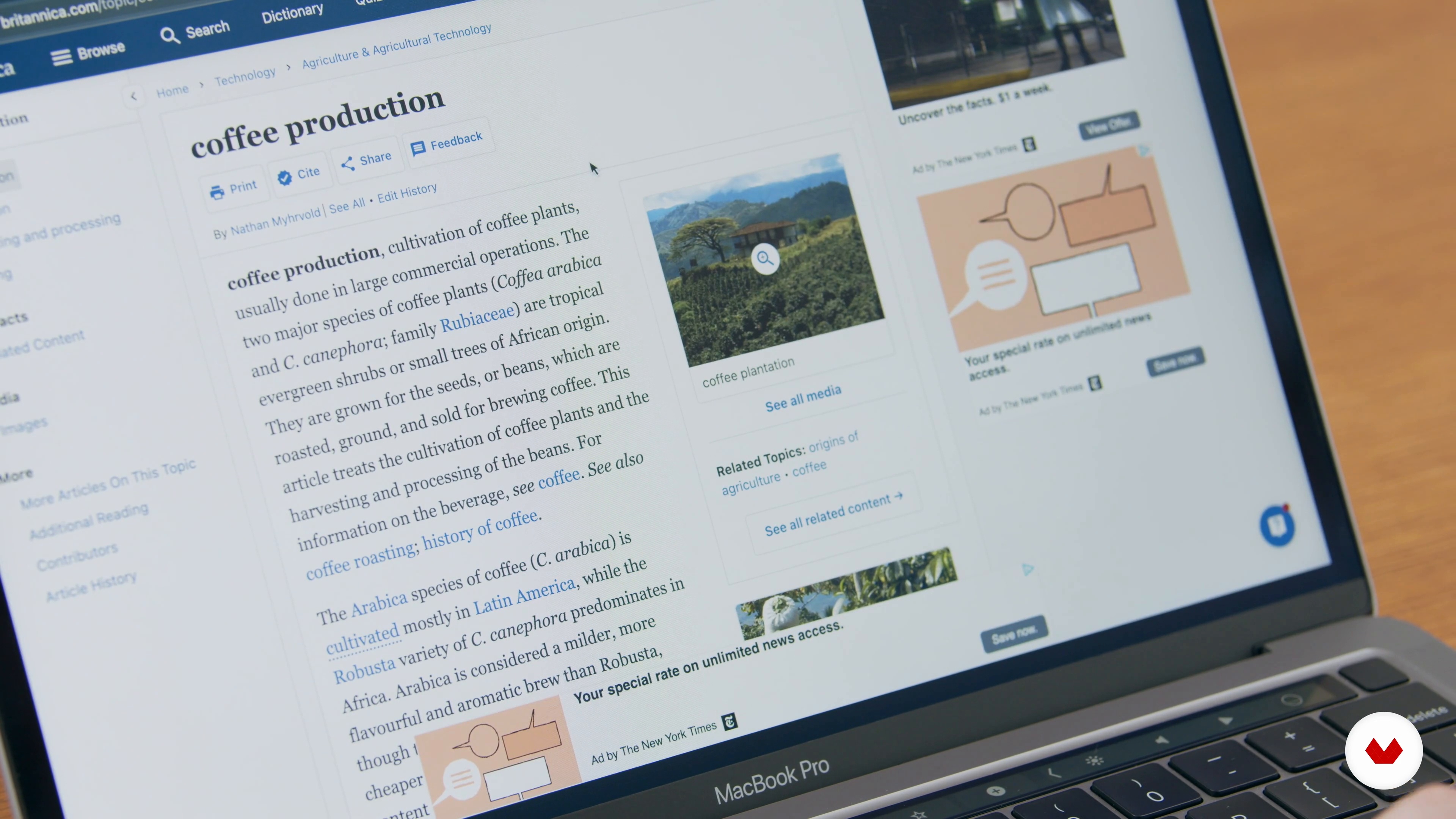
Create engaging narratives with digital illustration and collage to craft captivating, informative data visualizations
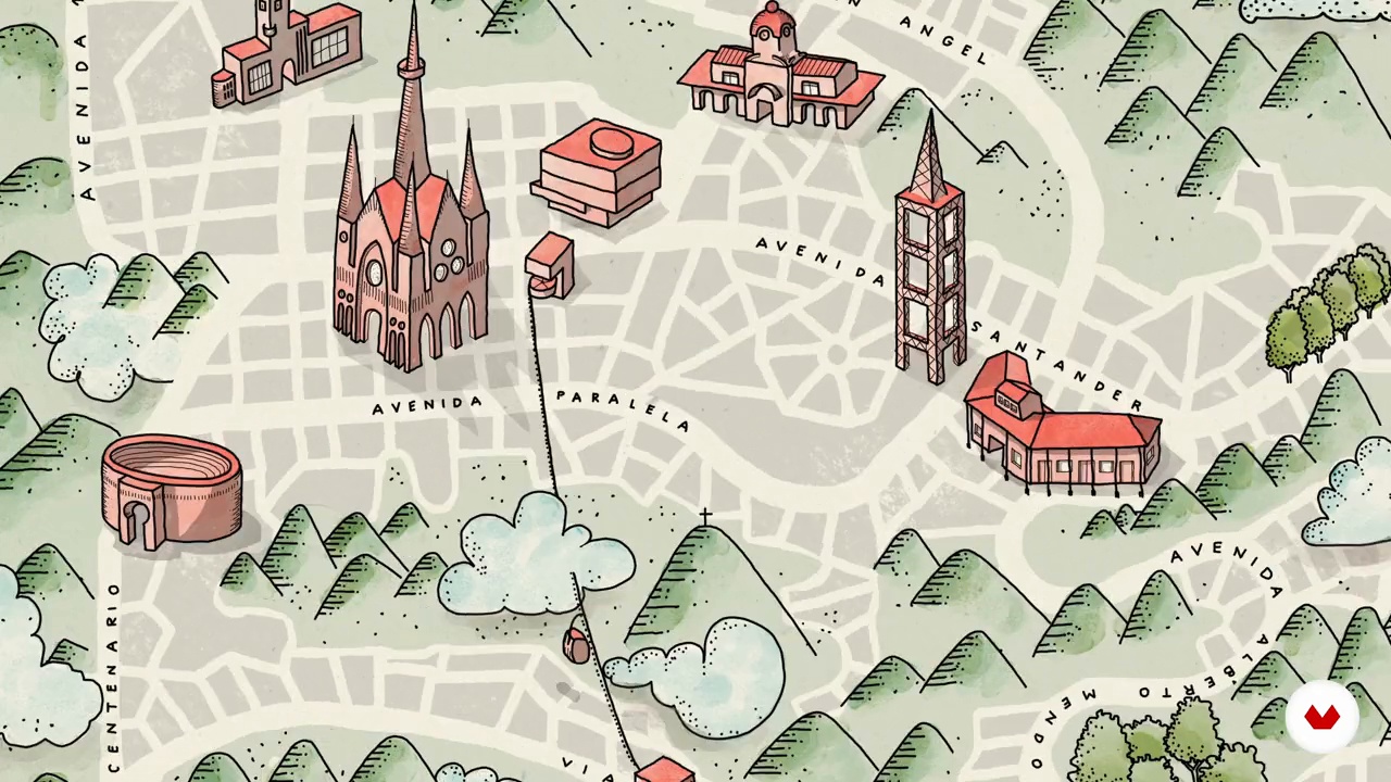
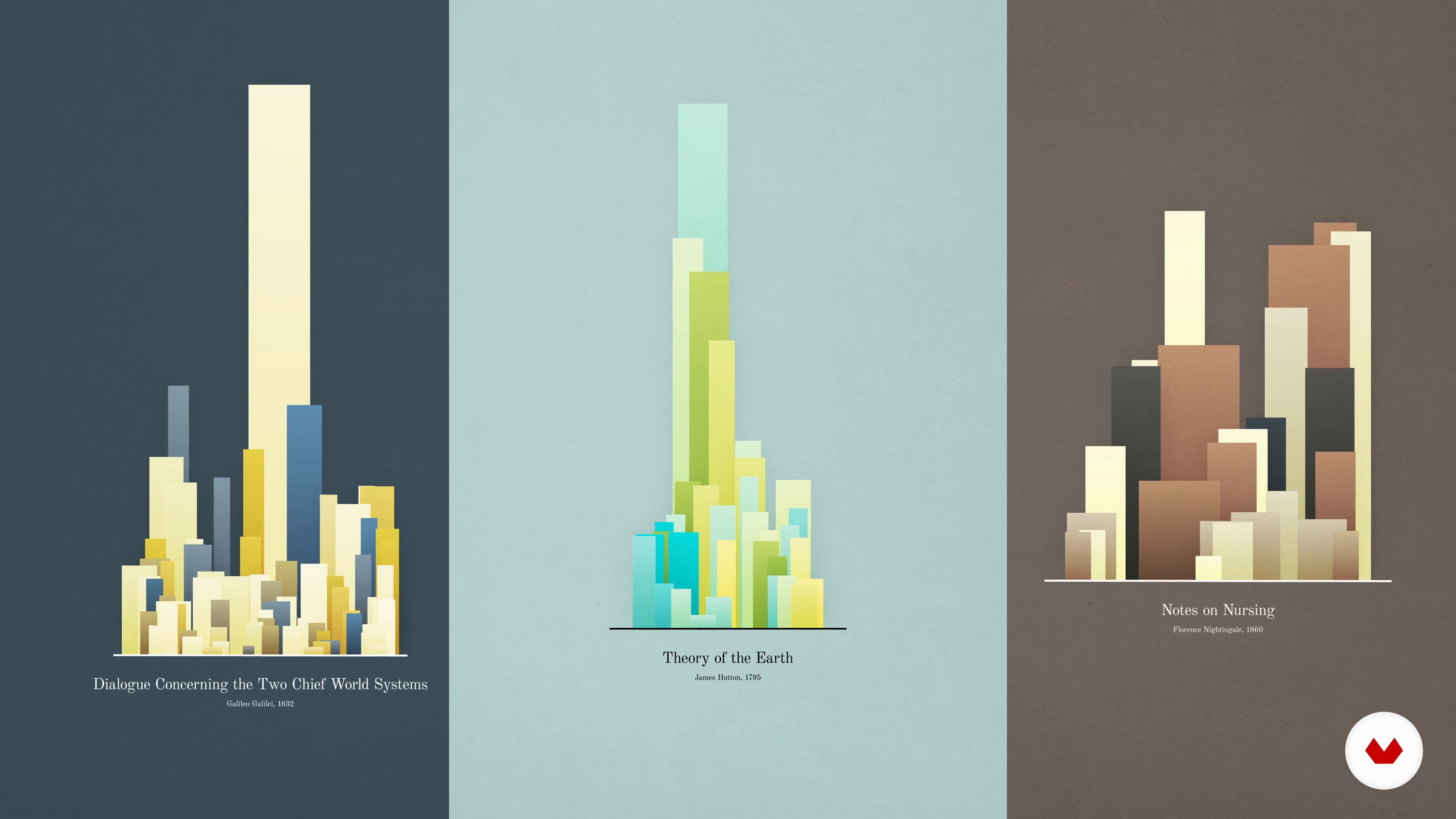
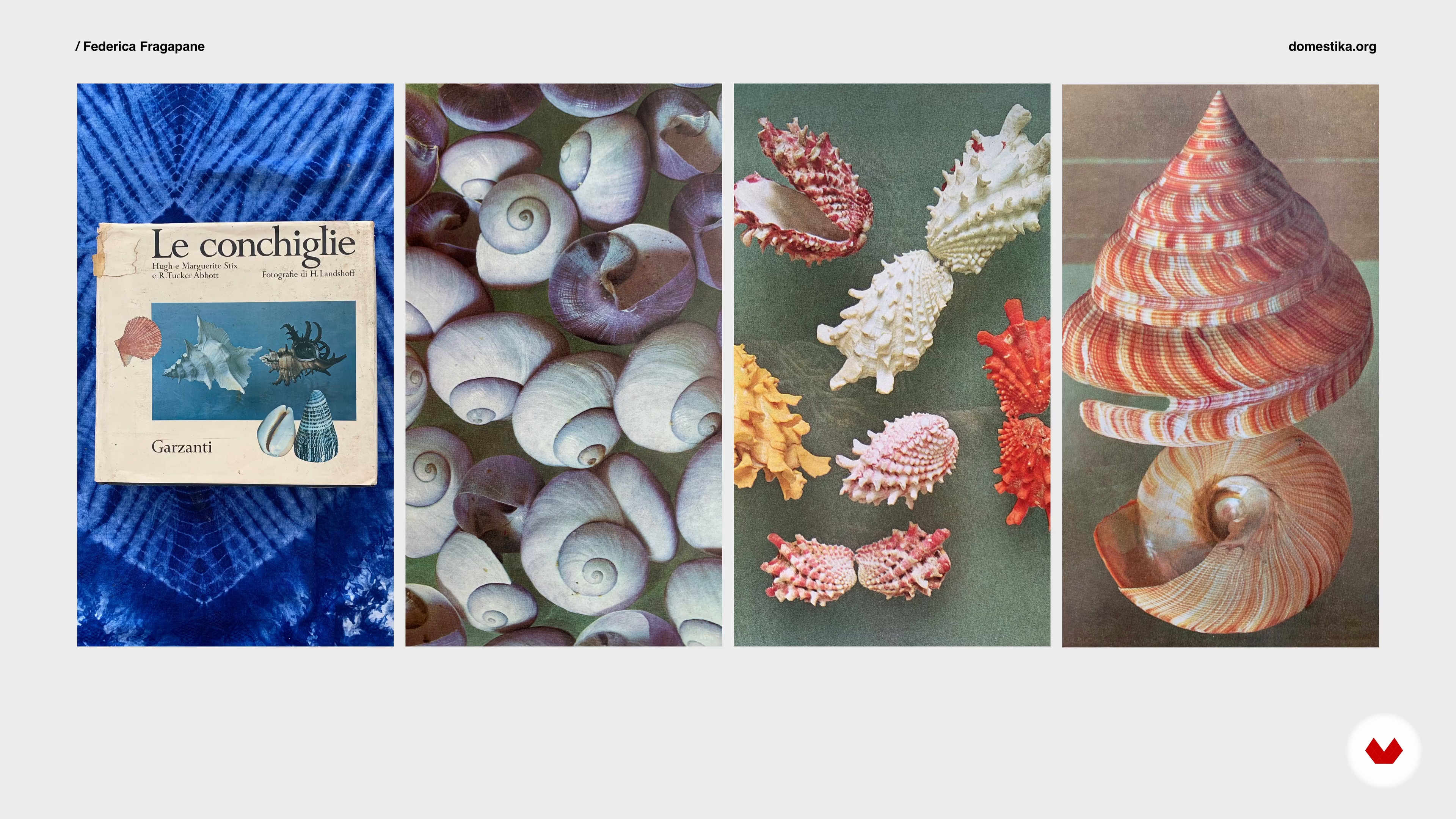
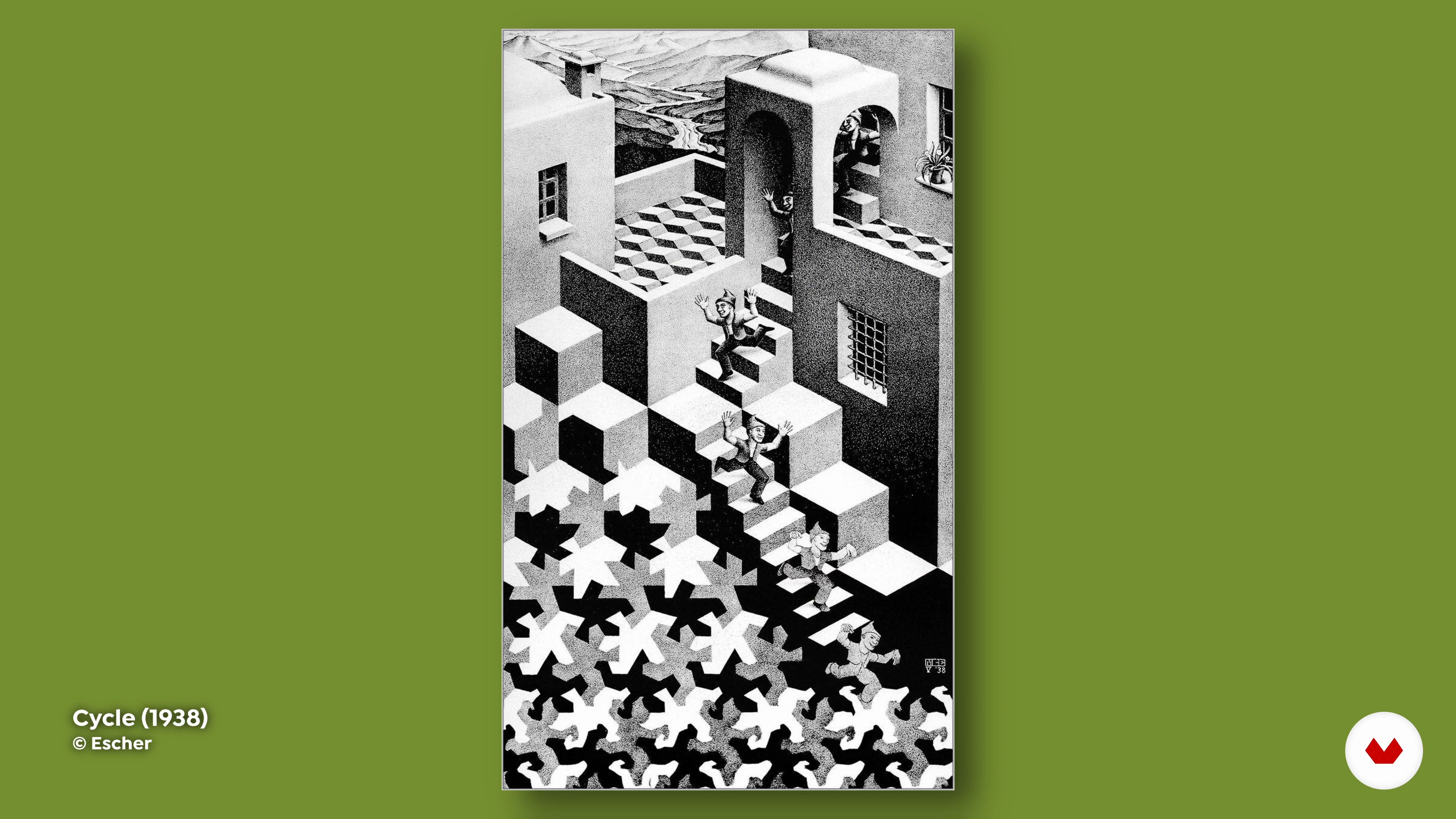
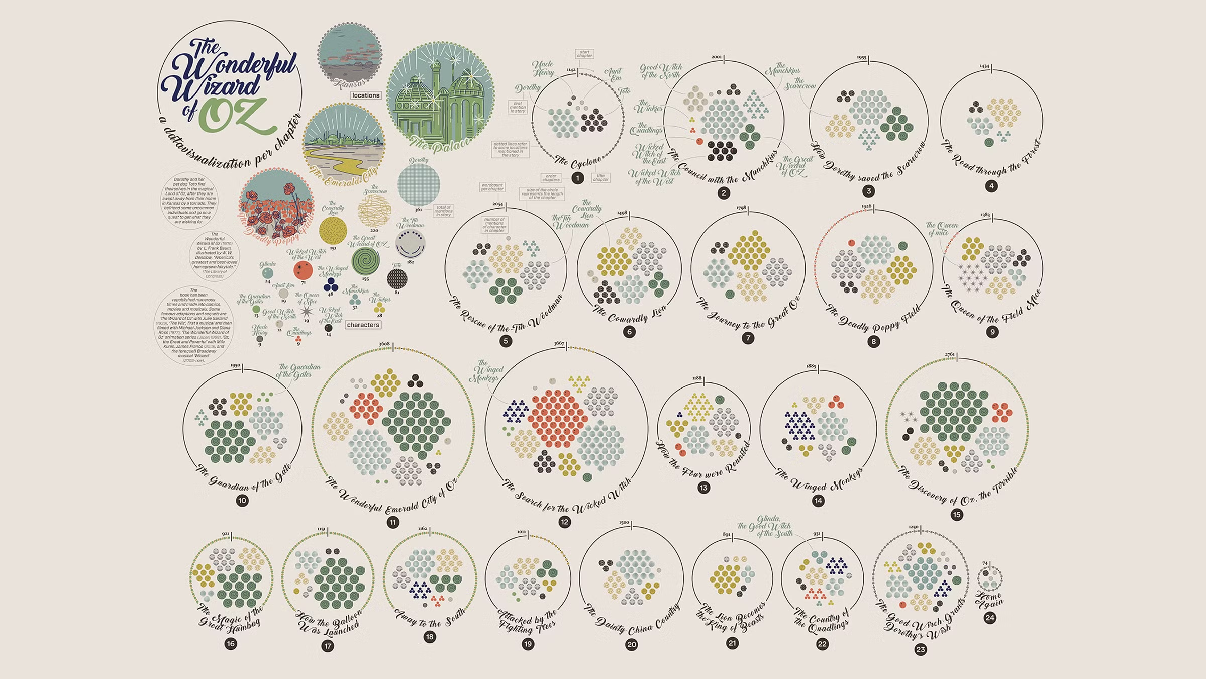
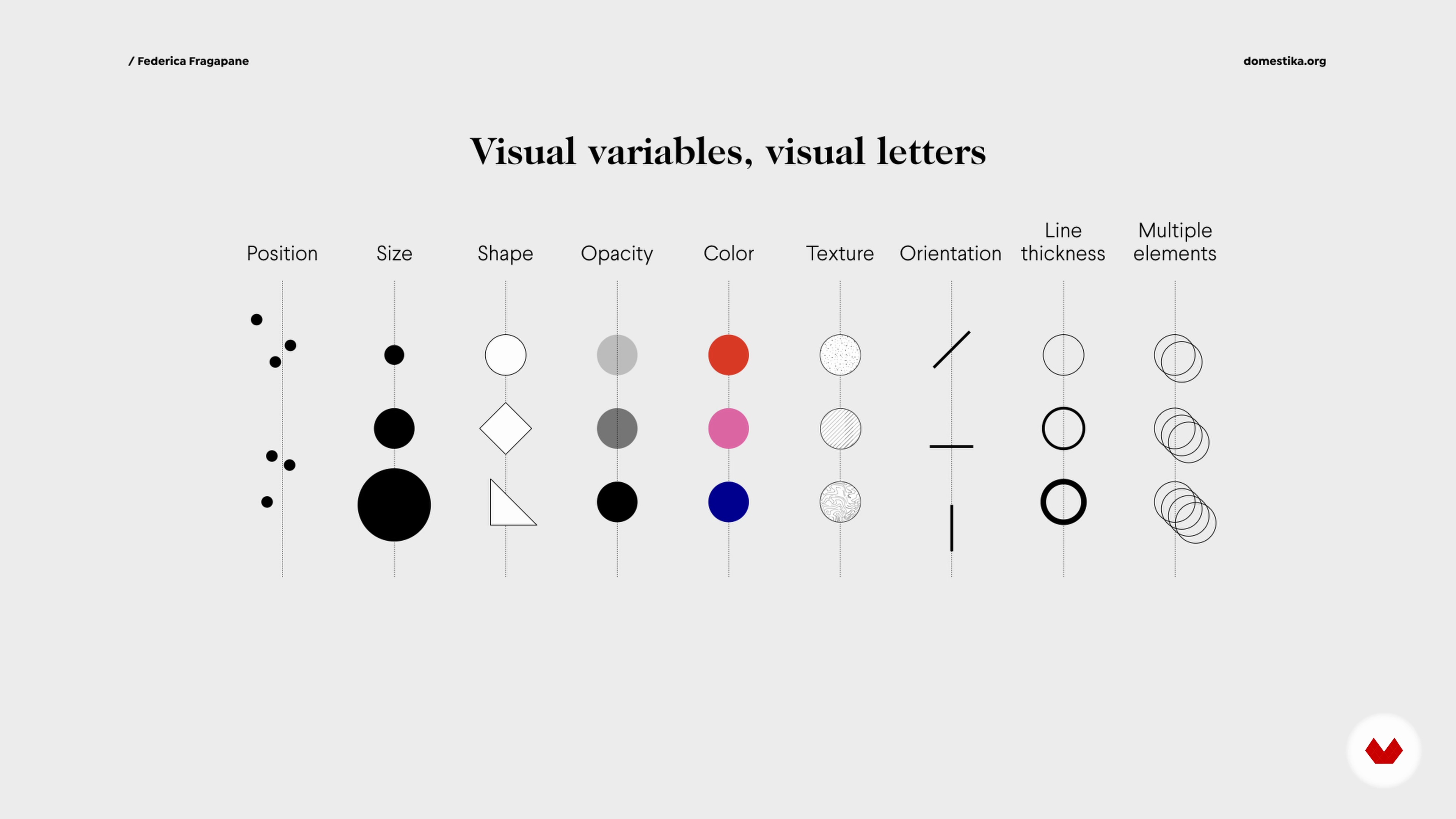
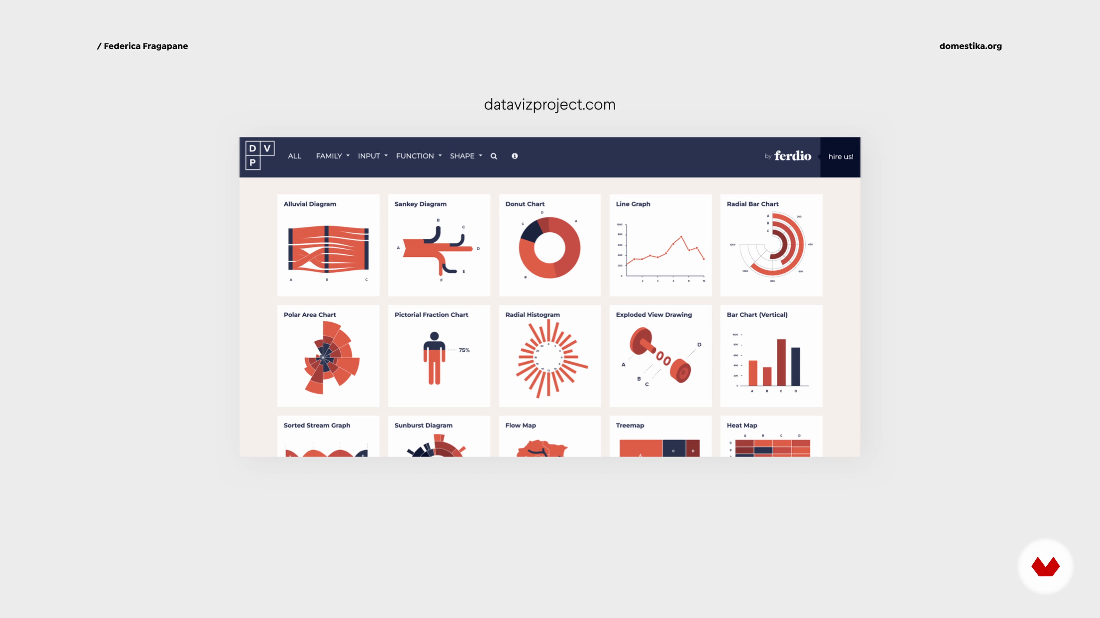
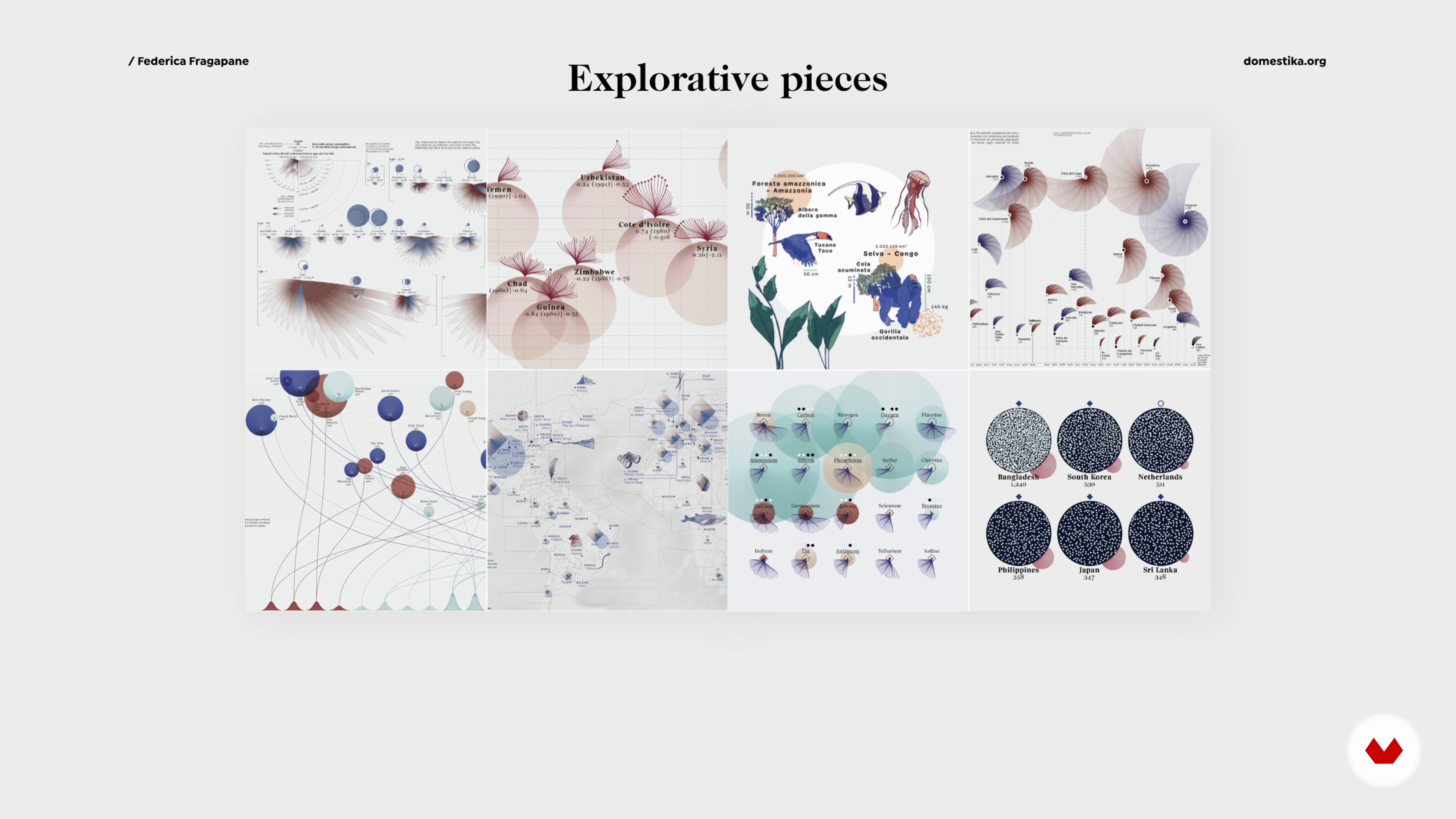
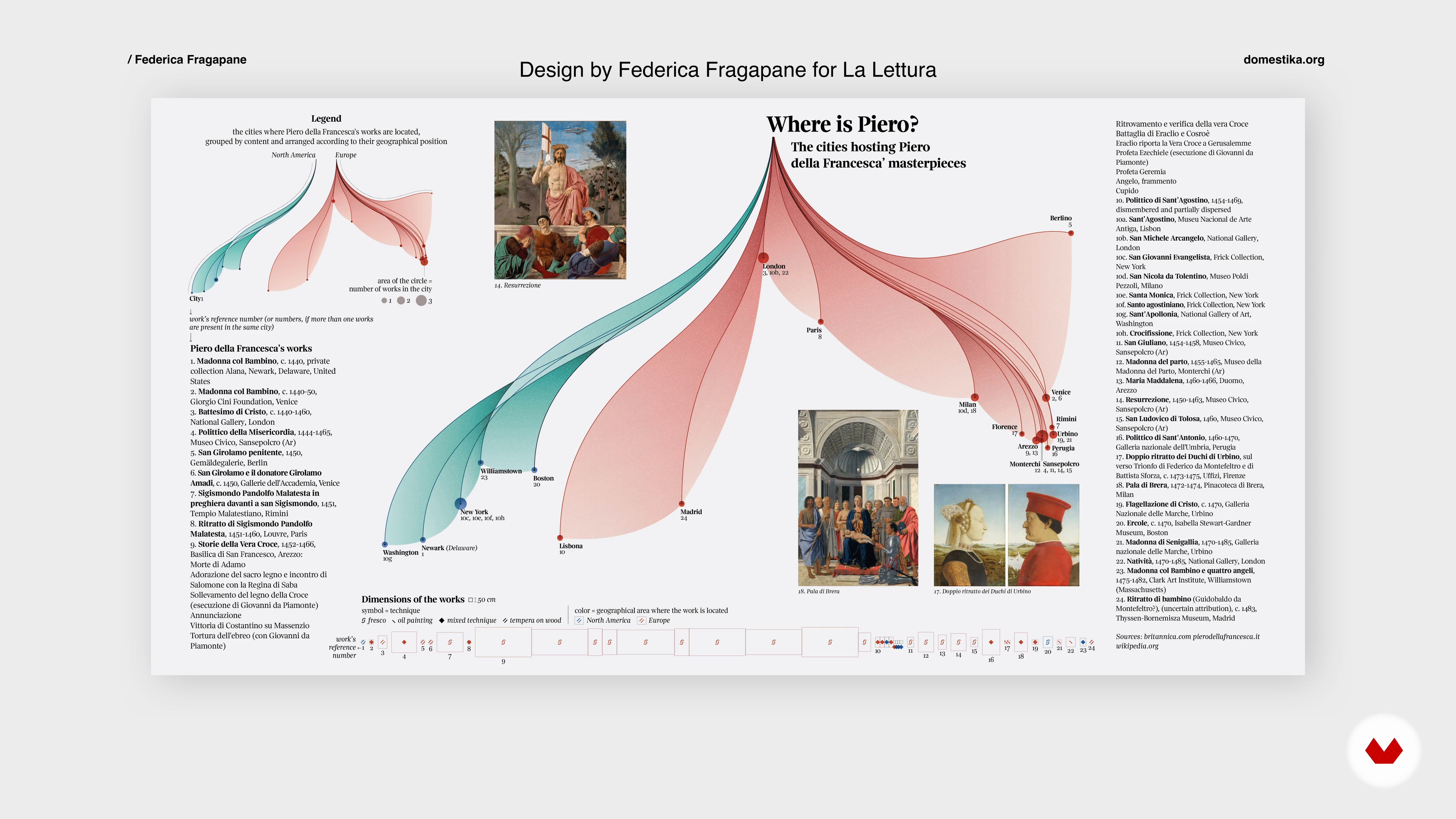
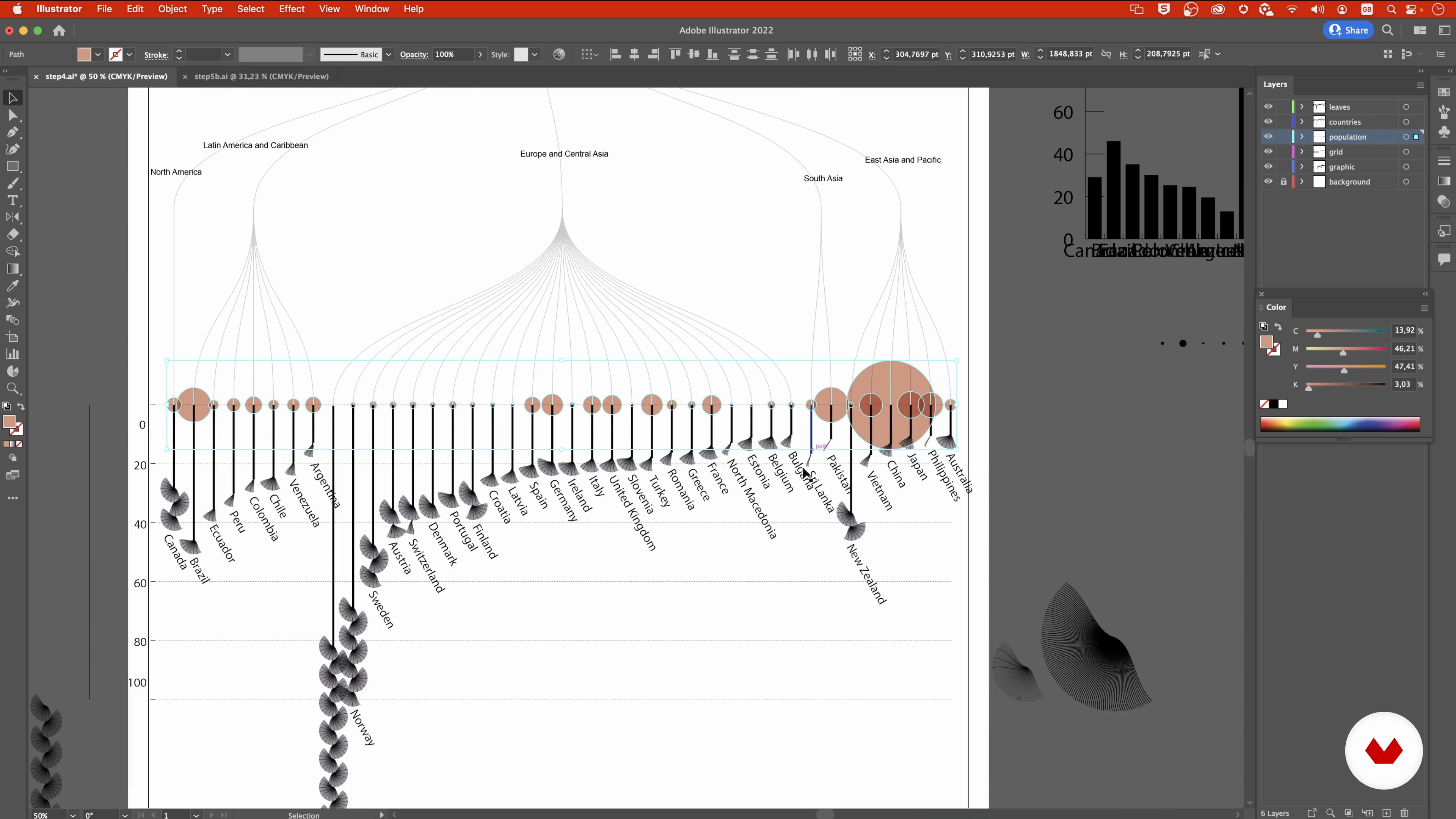
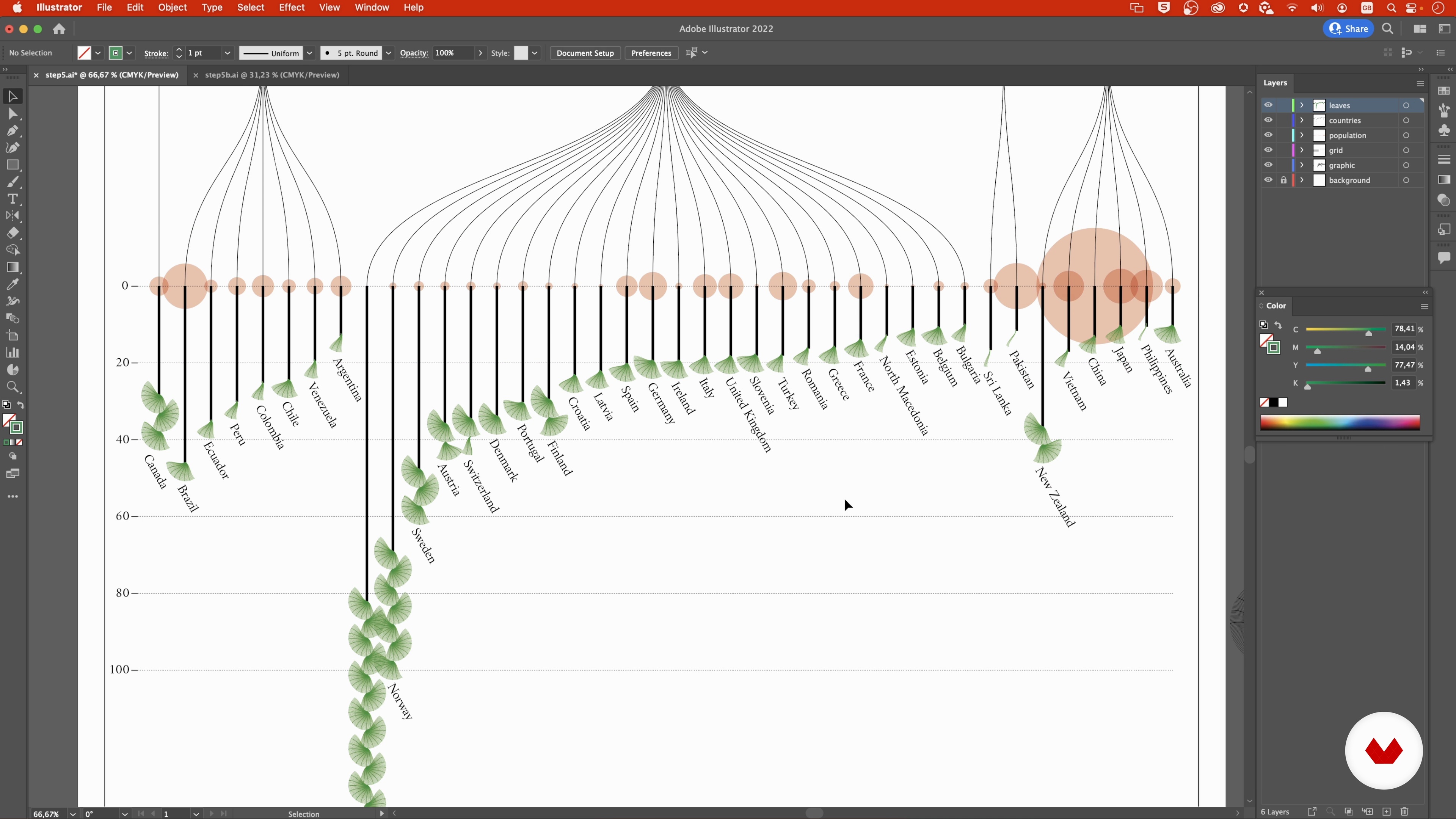
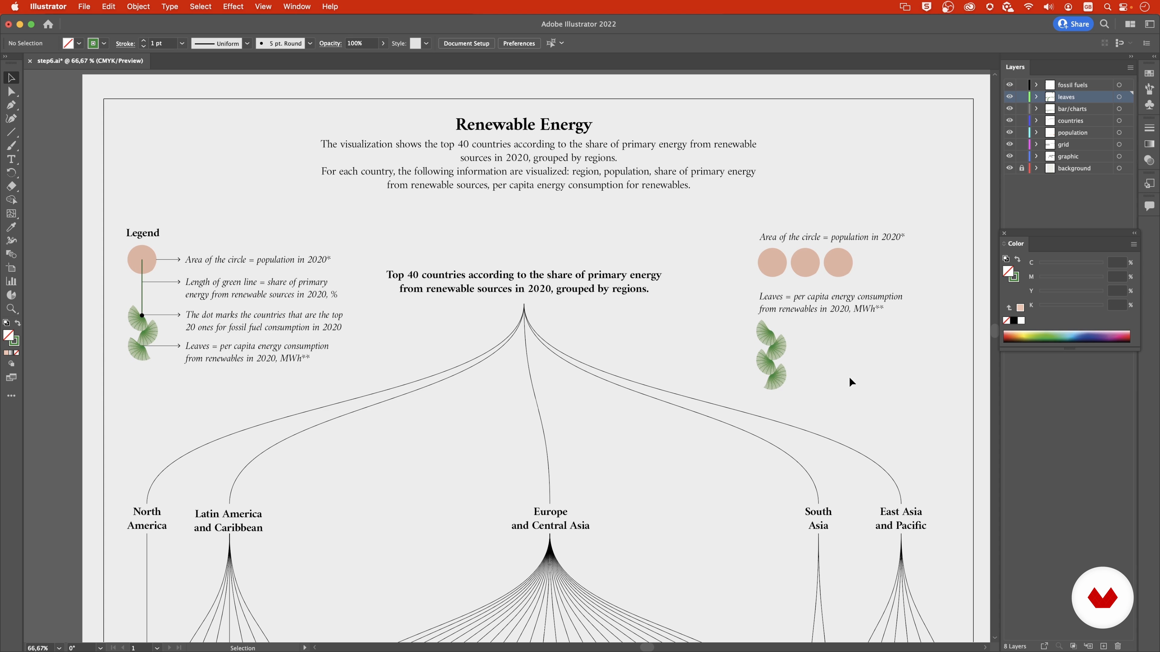
Unlock the power of data visualization and storytelling with a dynamic collection of courses designed to transform information into art. Dive into the world of creative data visualization with Gabrielle Mérite, who introduces captivating narratives through digital illustration and collage techniques. Federica Fragapane takes you further into narrative designs, teaching the expressiveness of shapes and organic forms to transform data into engaging stories. From beginners to seasoned designers, these courses offer a comprehensive journey into visual storytelling.
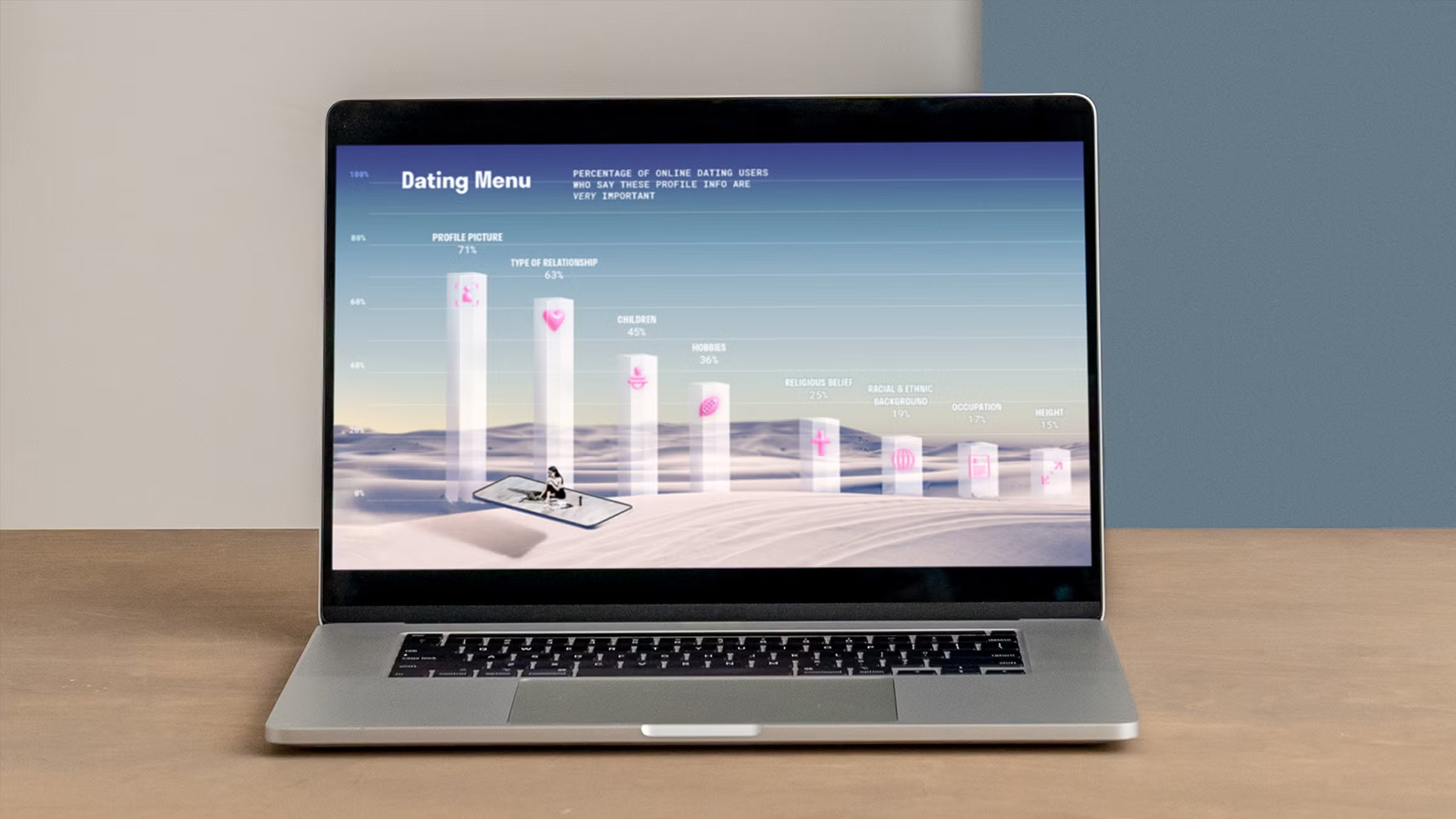
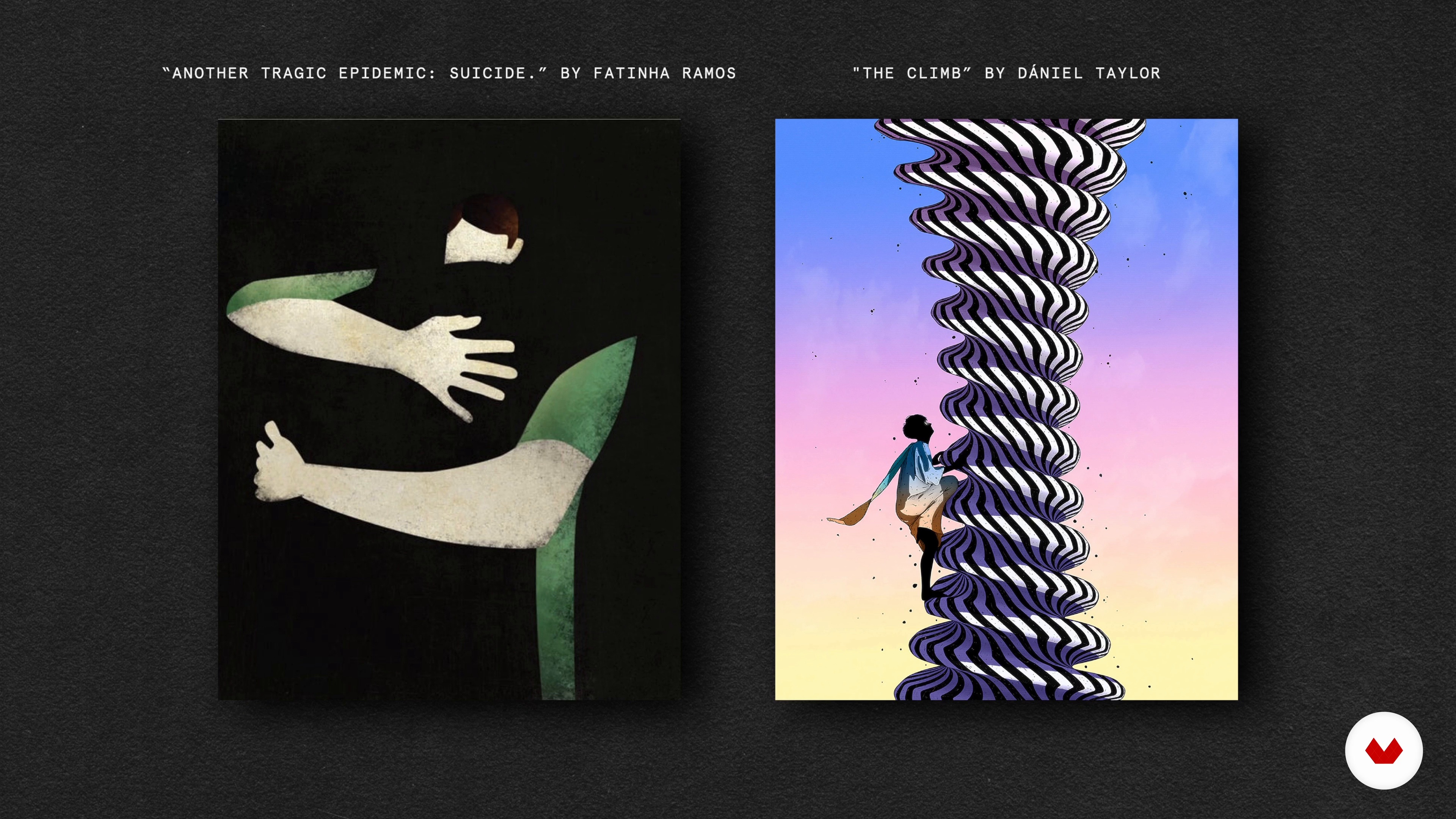
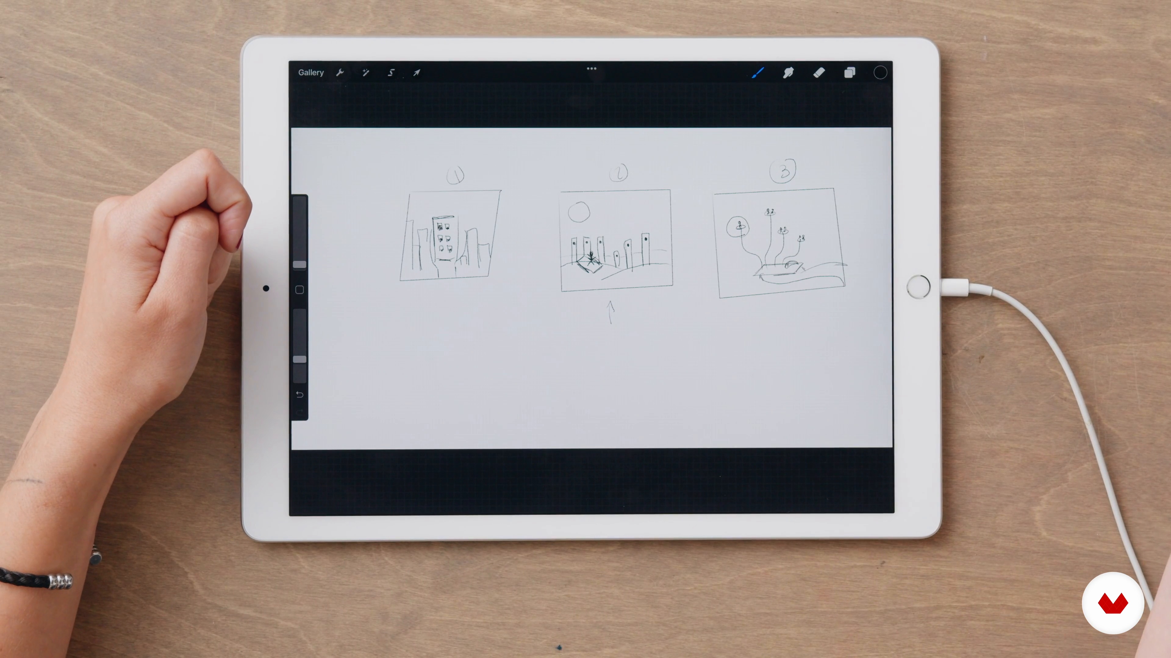
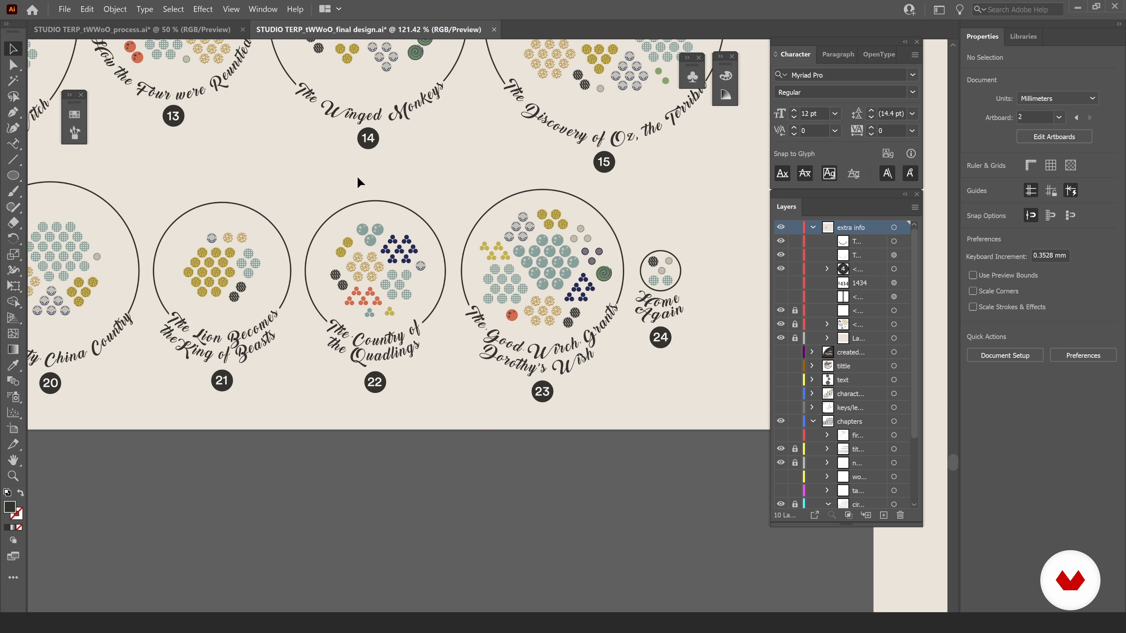
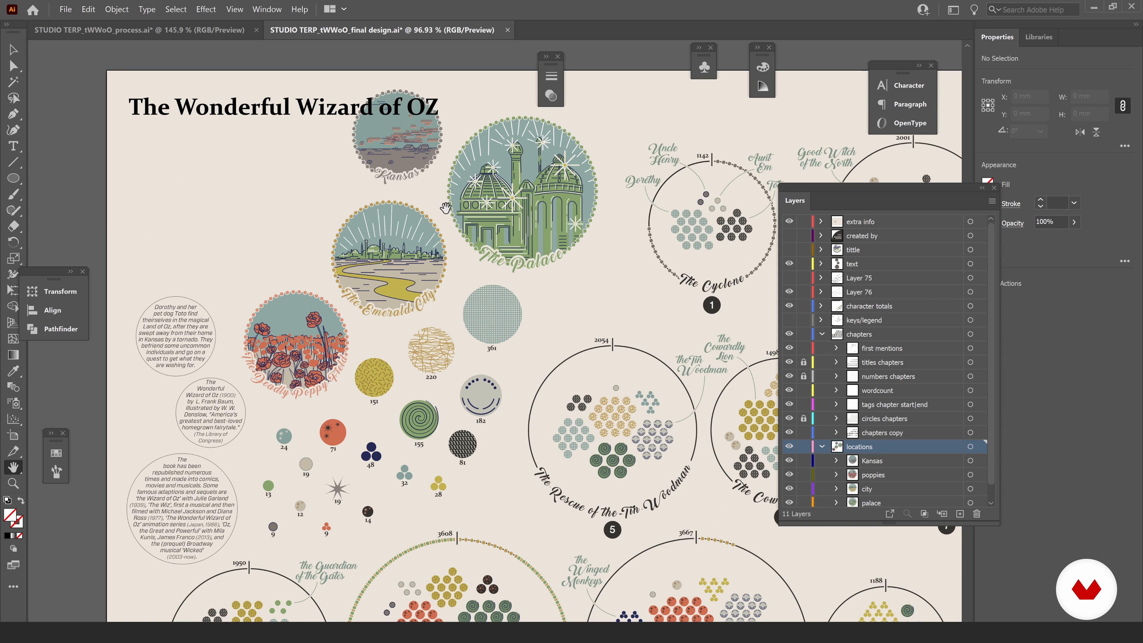
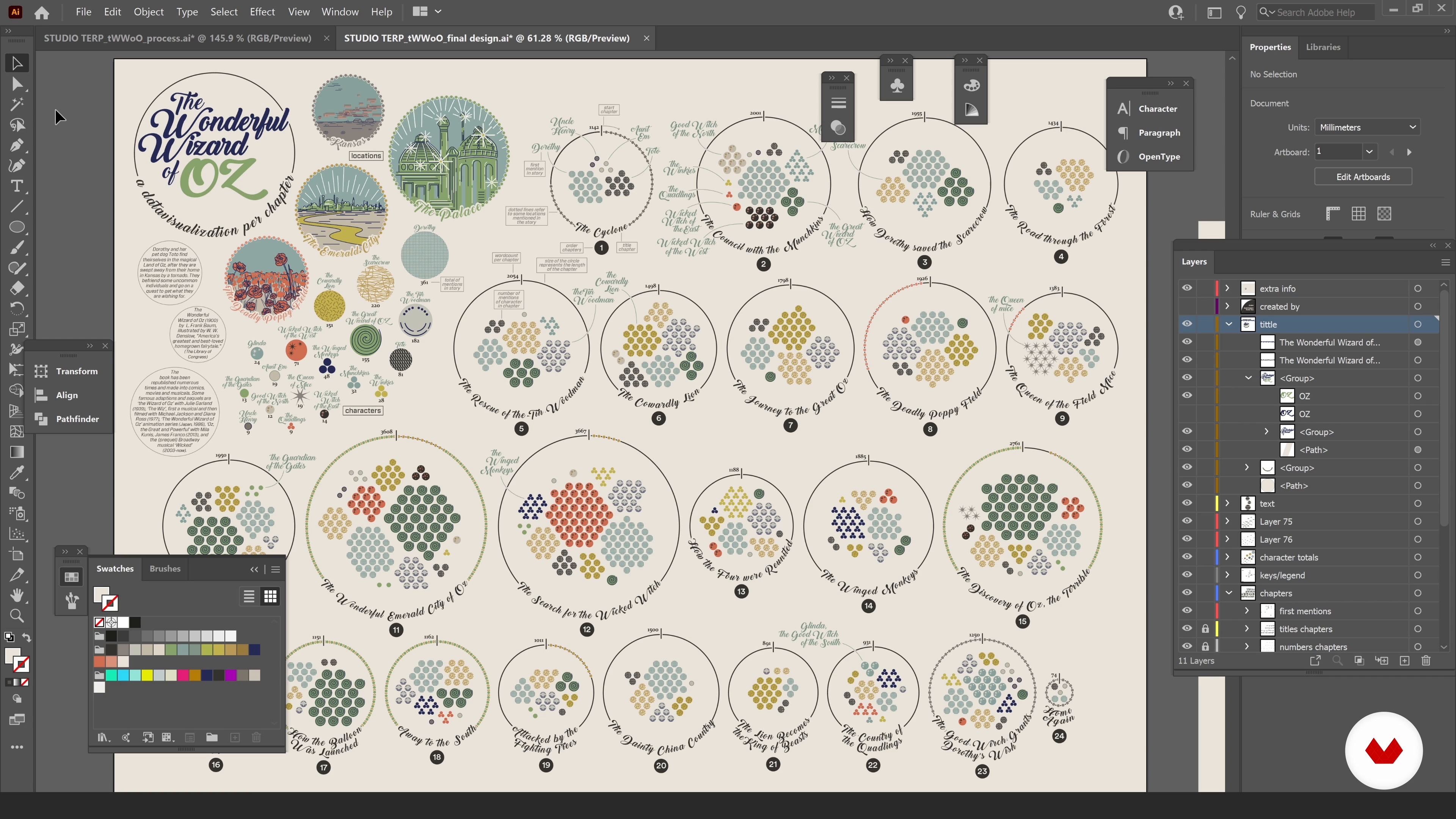
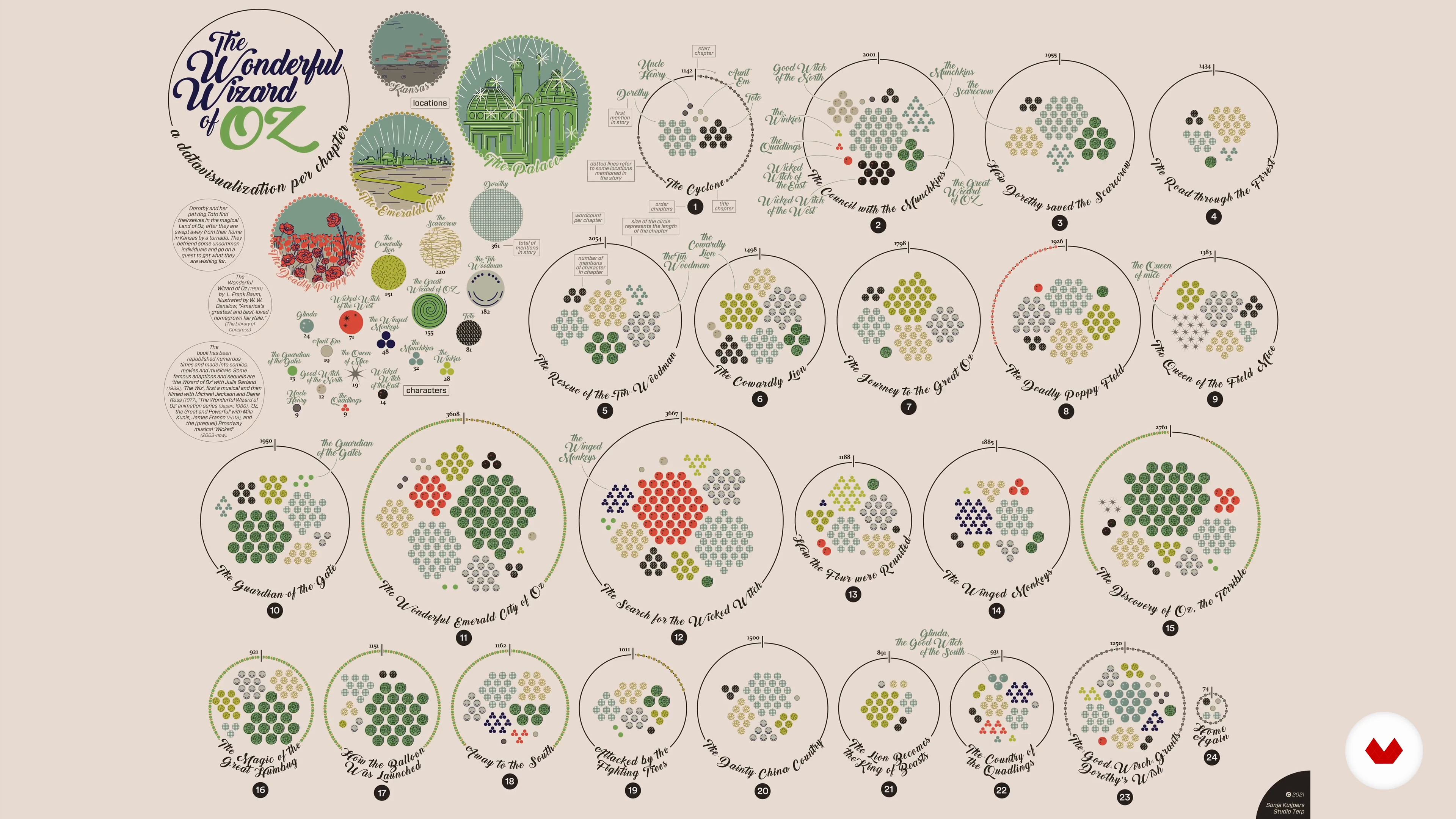
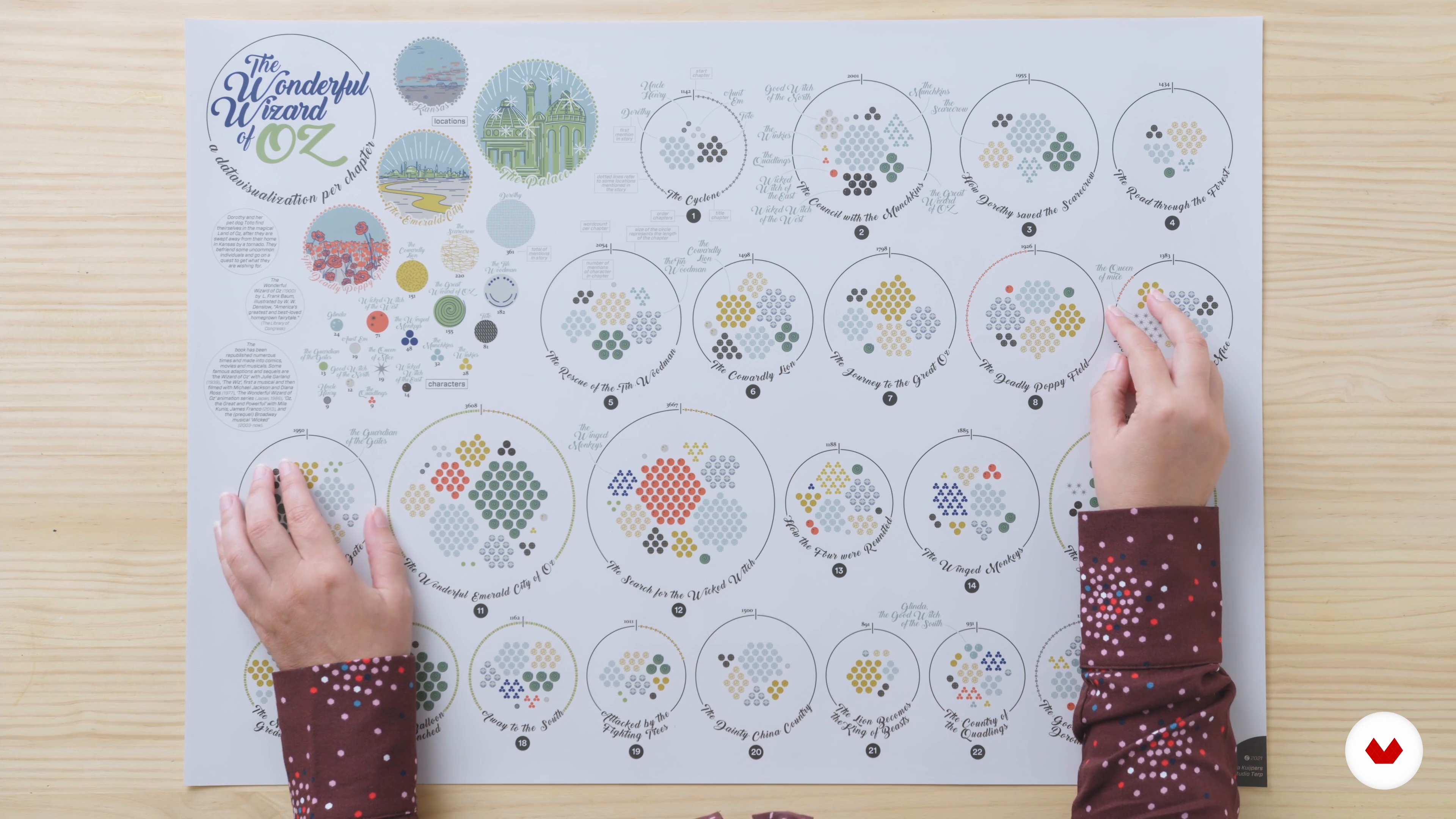
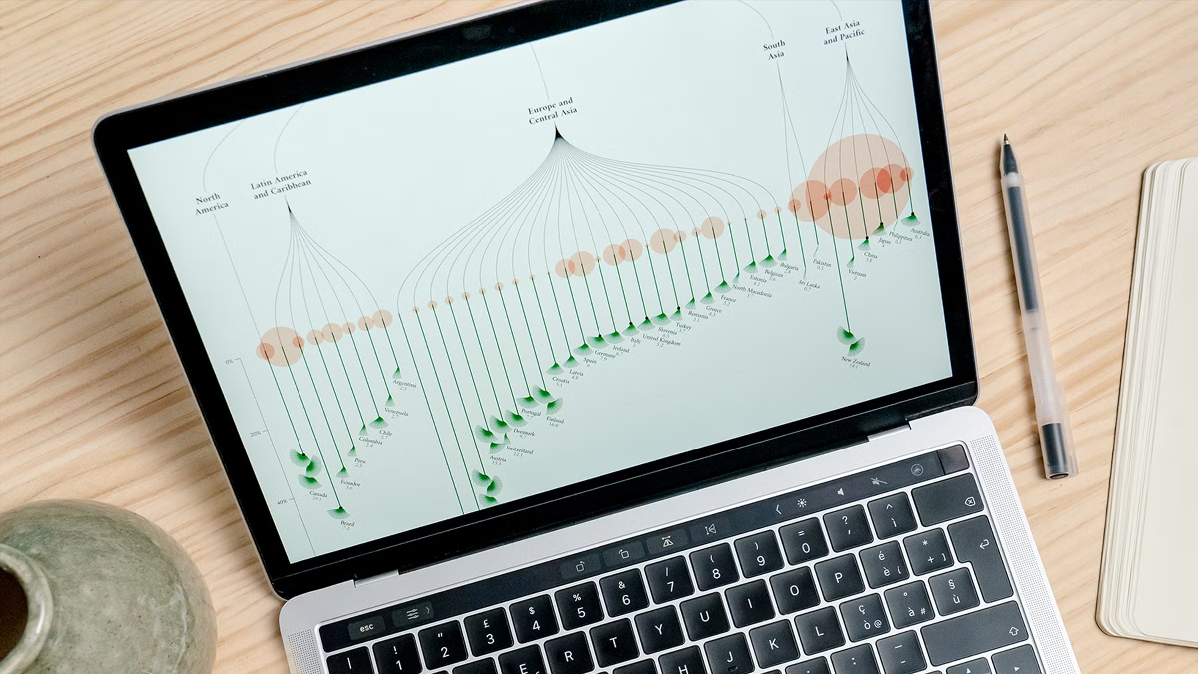
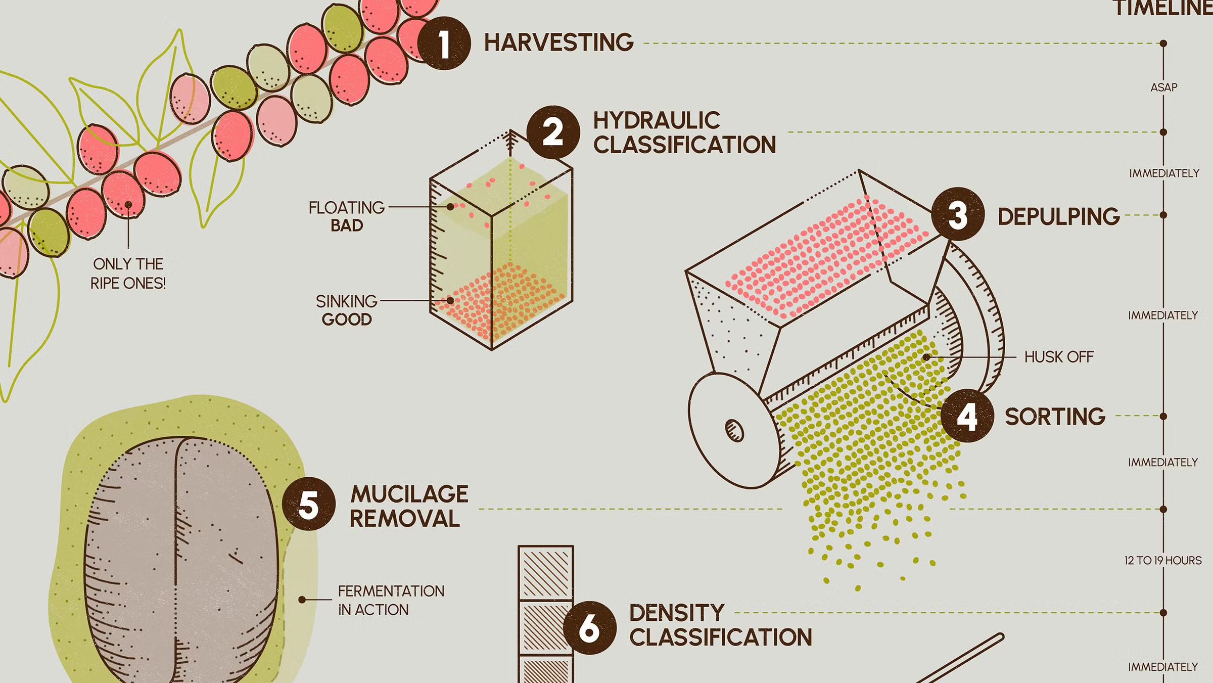
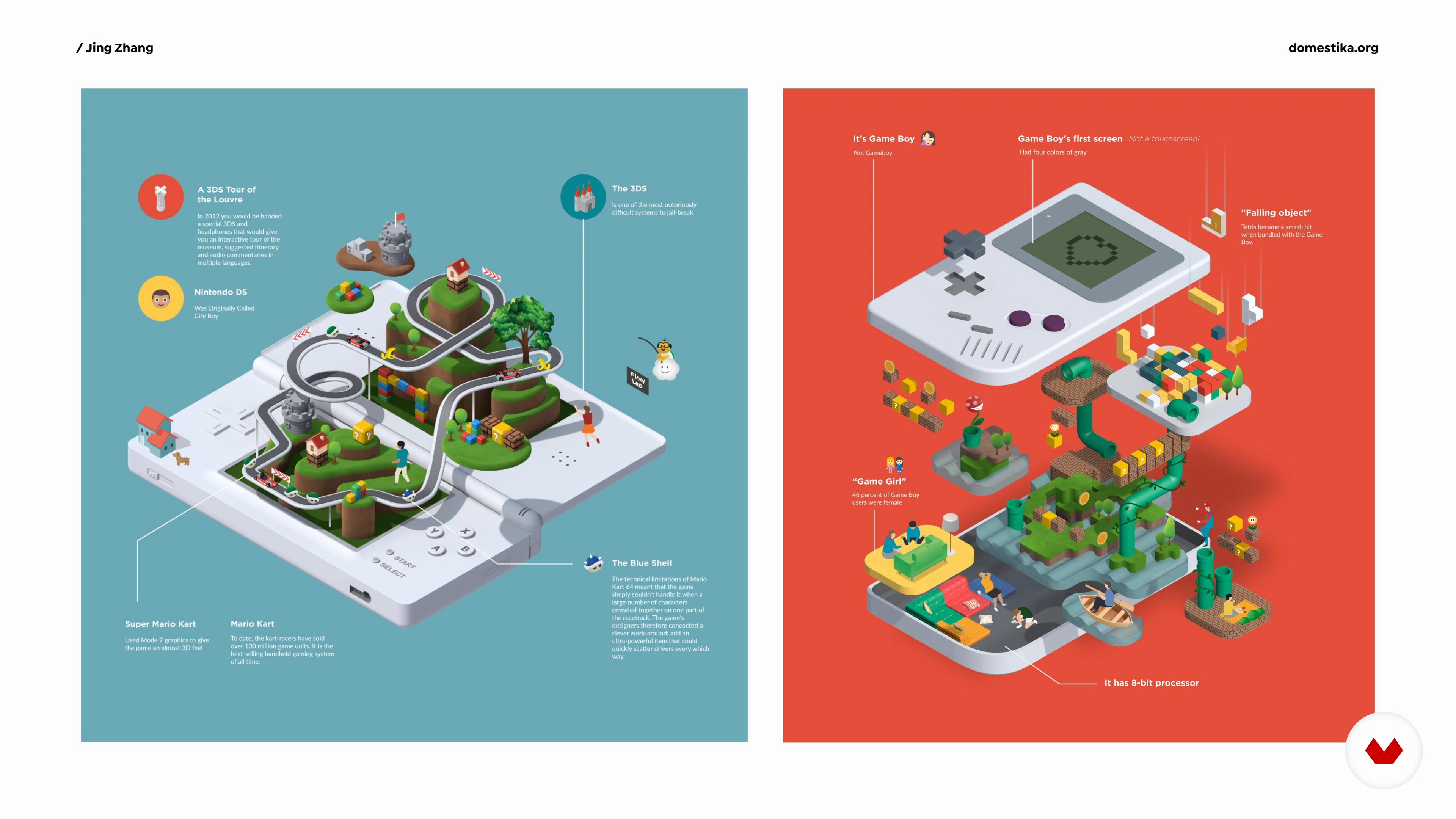
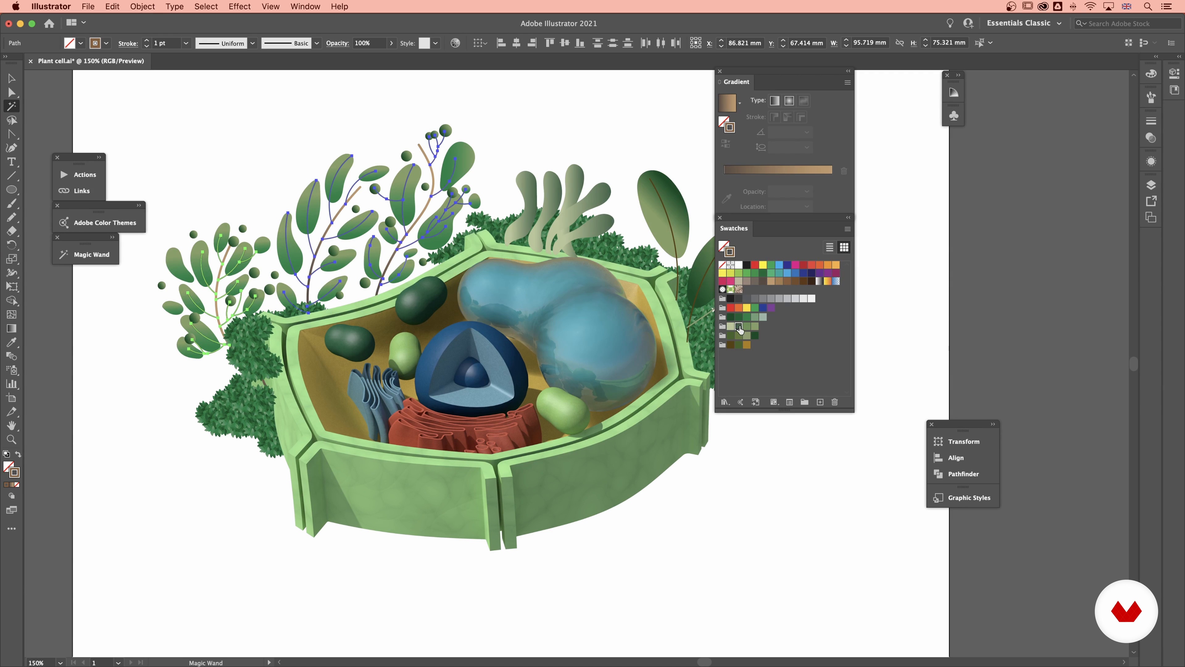
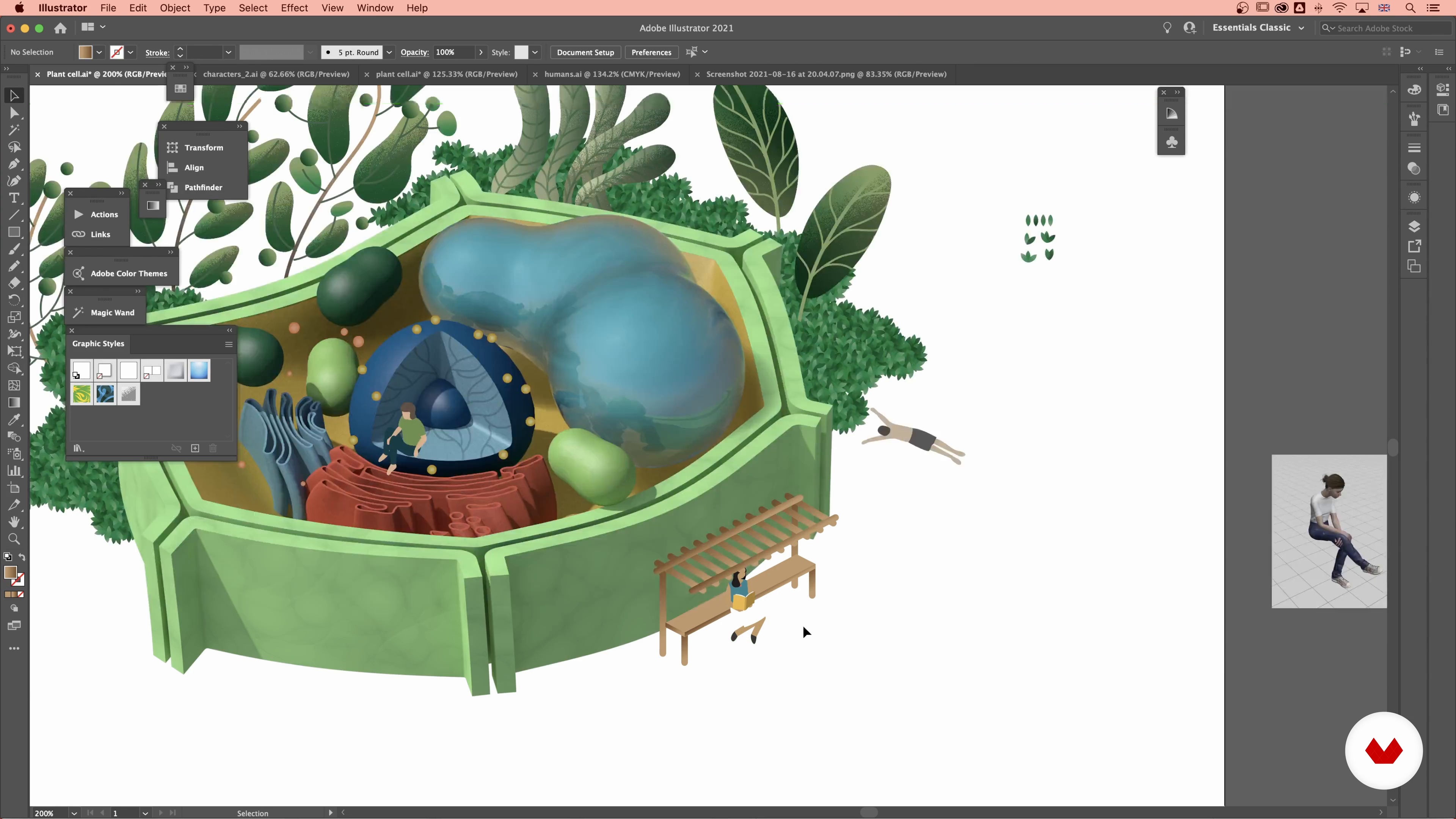
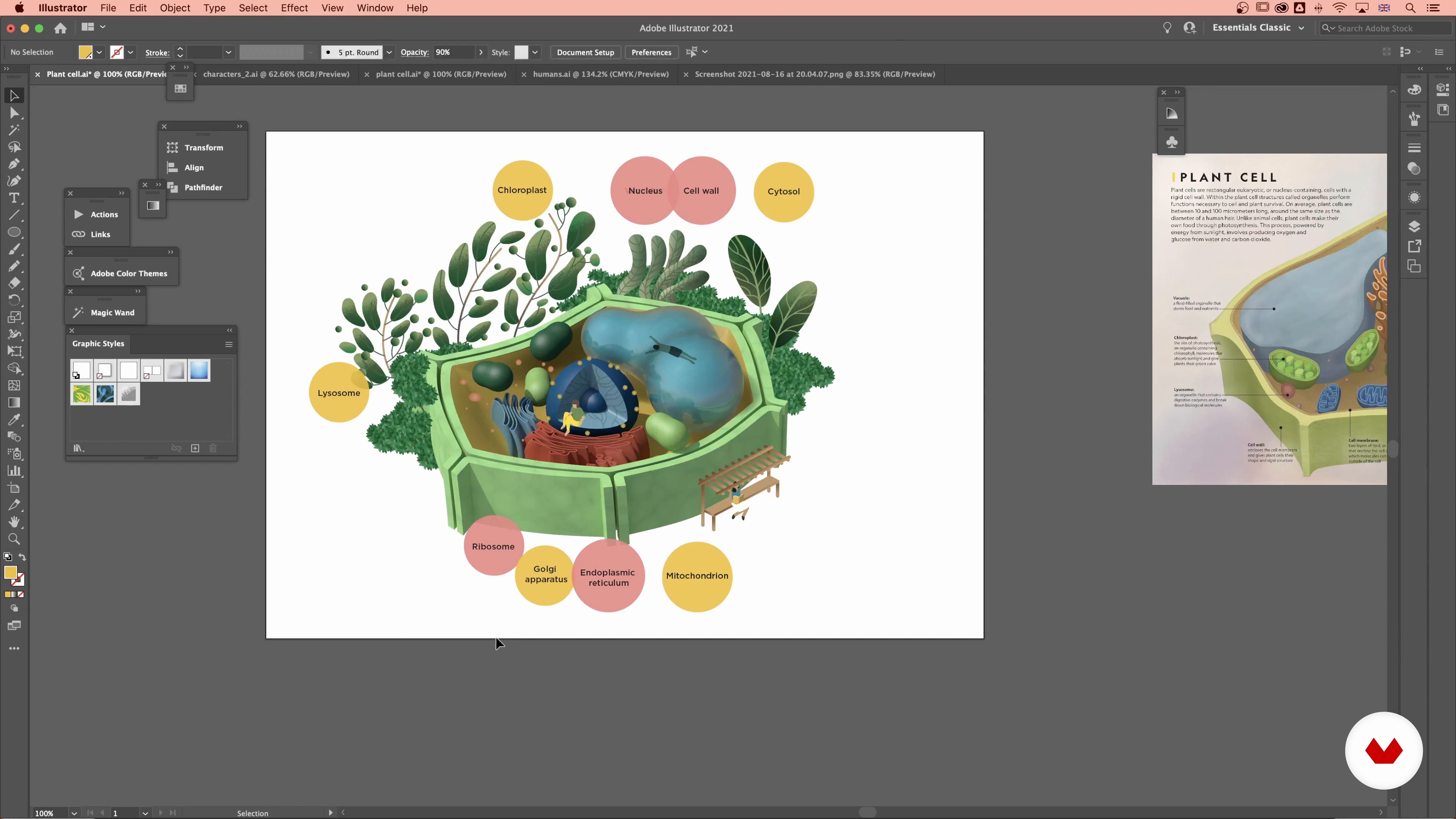
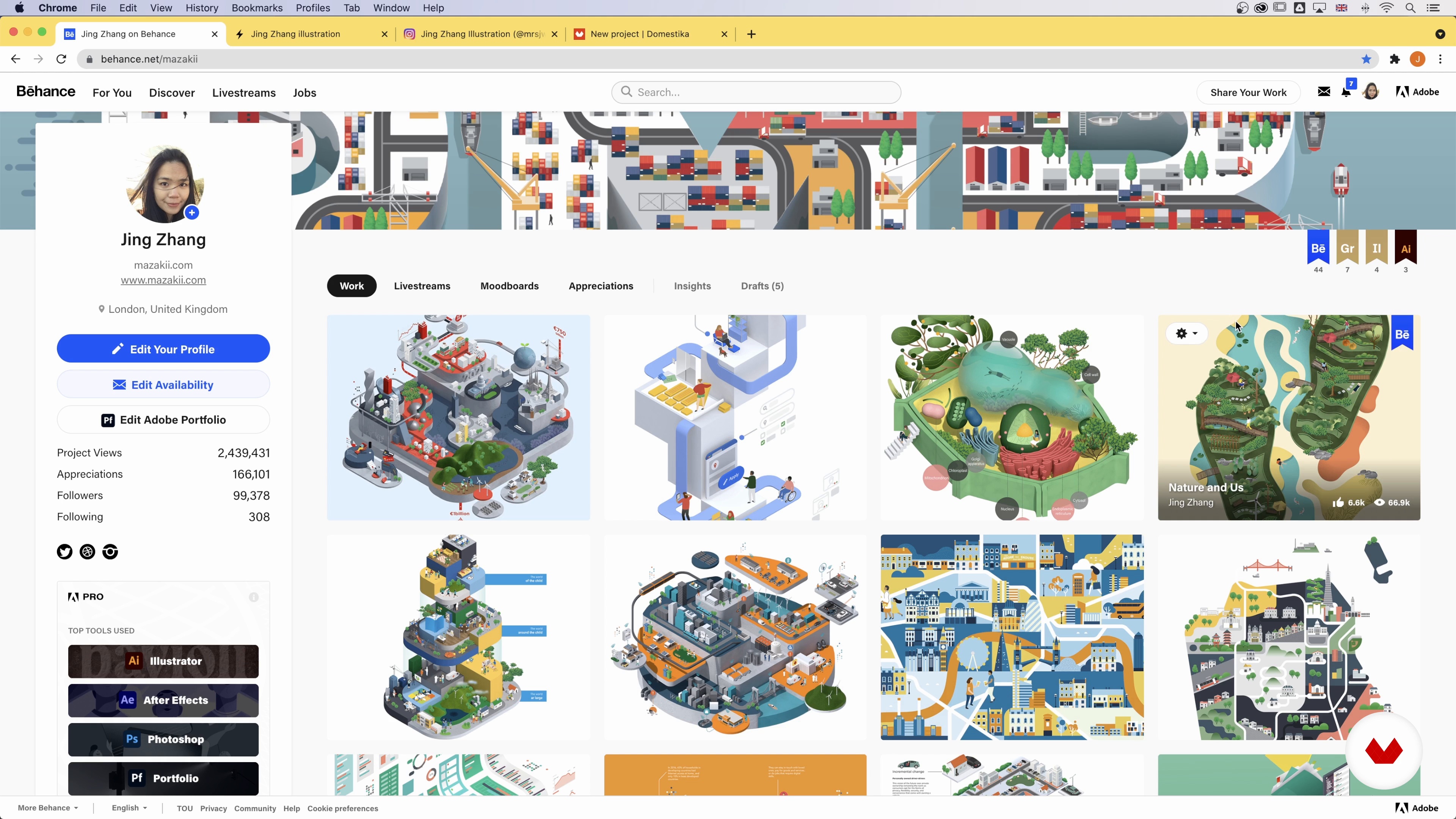
Sonja Kuijpers and Jing Zhang join the team of expert instructors, guiding you through the process of turning raw data into stunning visuals. Master the art of illustrated infographics with Jing Zhang, exploring both 2D and 3D modeling. Sonja Kuijpers focuses on effective data visualization, equipping you with the skills to create captivating posters using shapes, colors, and unique layouts. Catalina Plé wraps up the specialization, emphasizing the importance of simplicity in communicating complex ideas through infographics. Elevate your design skills and discover the endless possibilities of visual storytelling with this all-encompassing specialization.
What will you learn in this specialization?


- 100% positive reviews (18)
- 1,278 students
- 77 lessons (11h 15m)
- 80 additional resources (32 files)
- Online and at your own pace
- Audio: English, Spanish
- English · Spanish · Portuguese · German · French · Italian · Polish · Dutch · Turkish · Romanian · Indonesian
- Level: Beginner
- Unlimited access forever
What is this course's project?
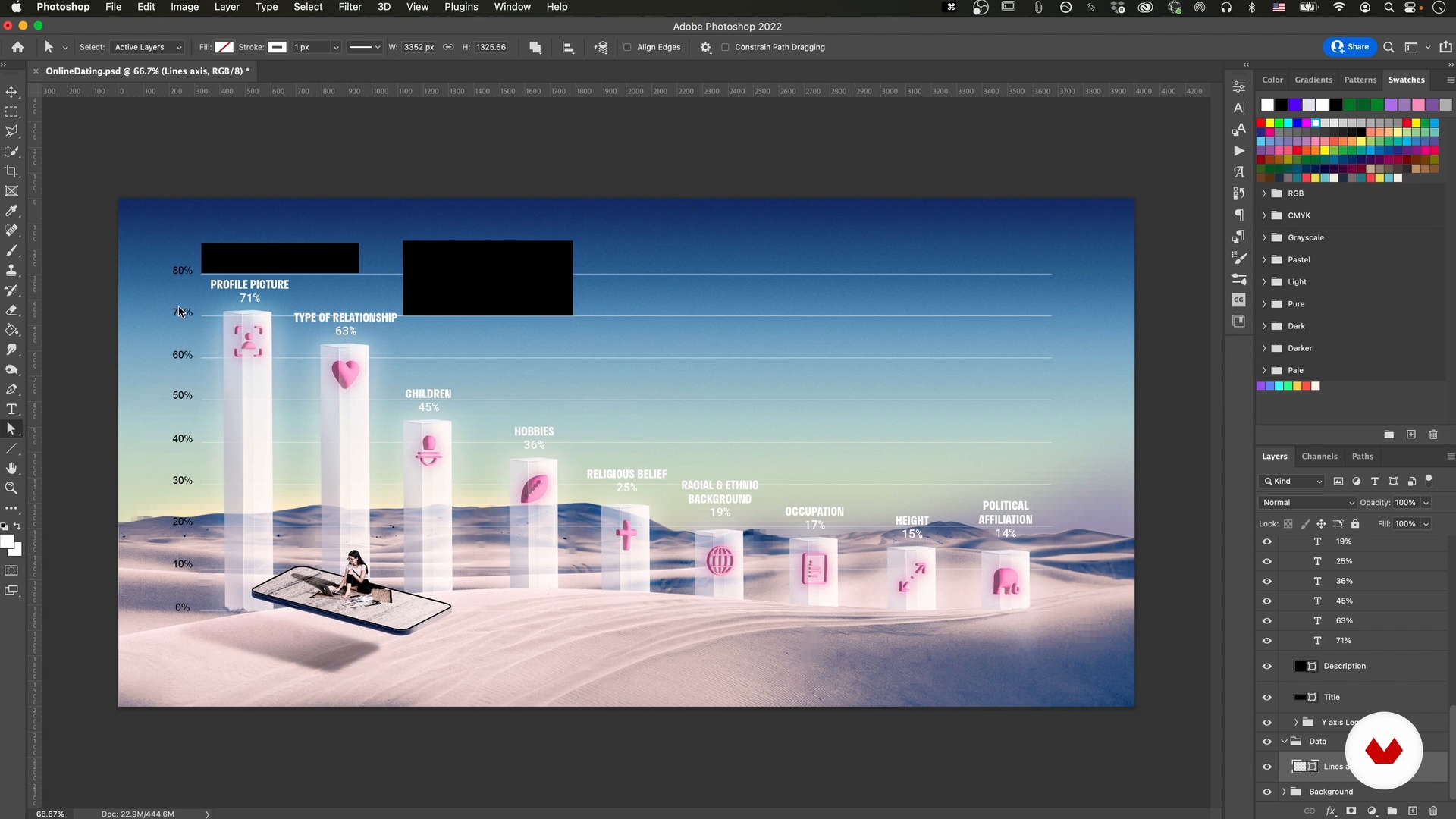
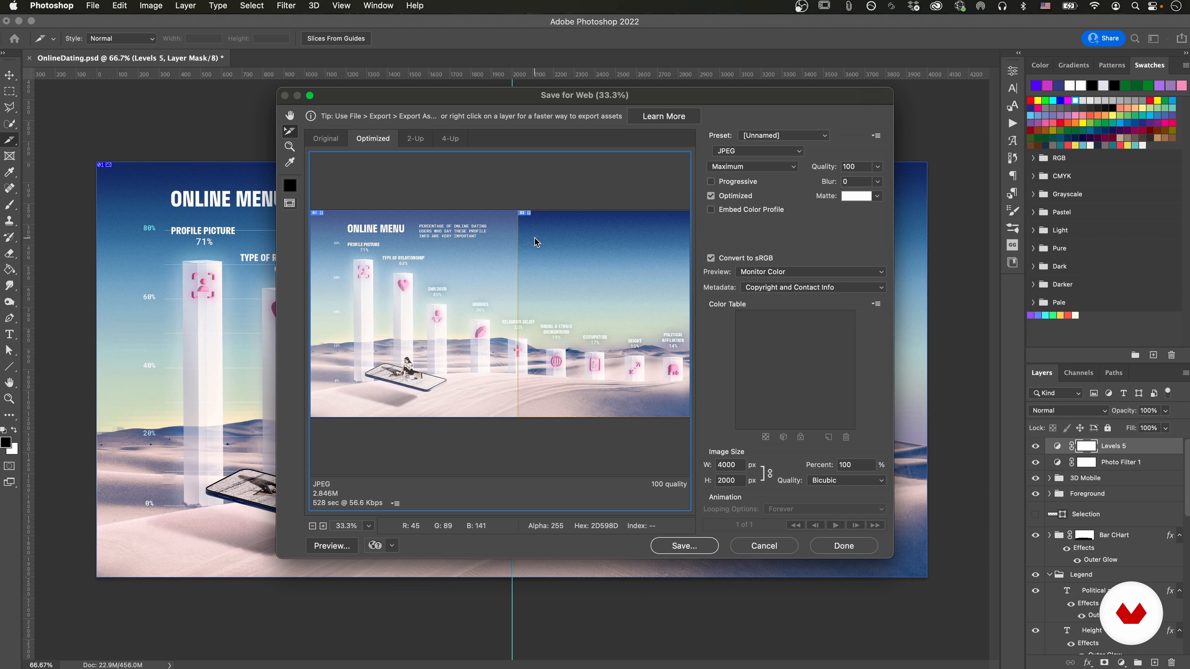
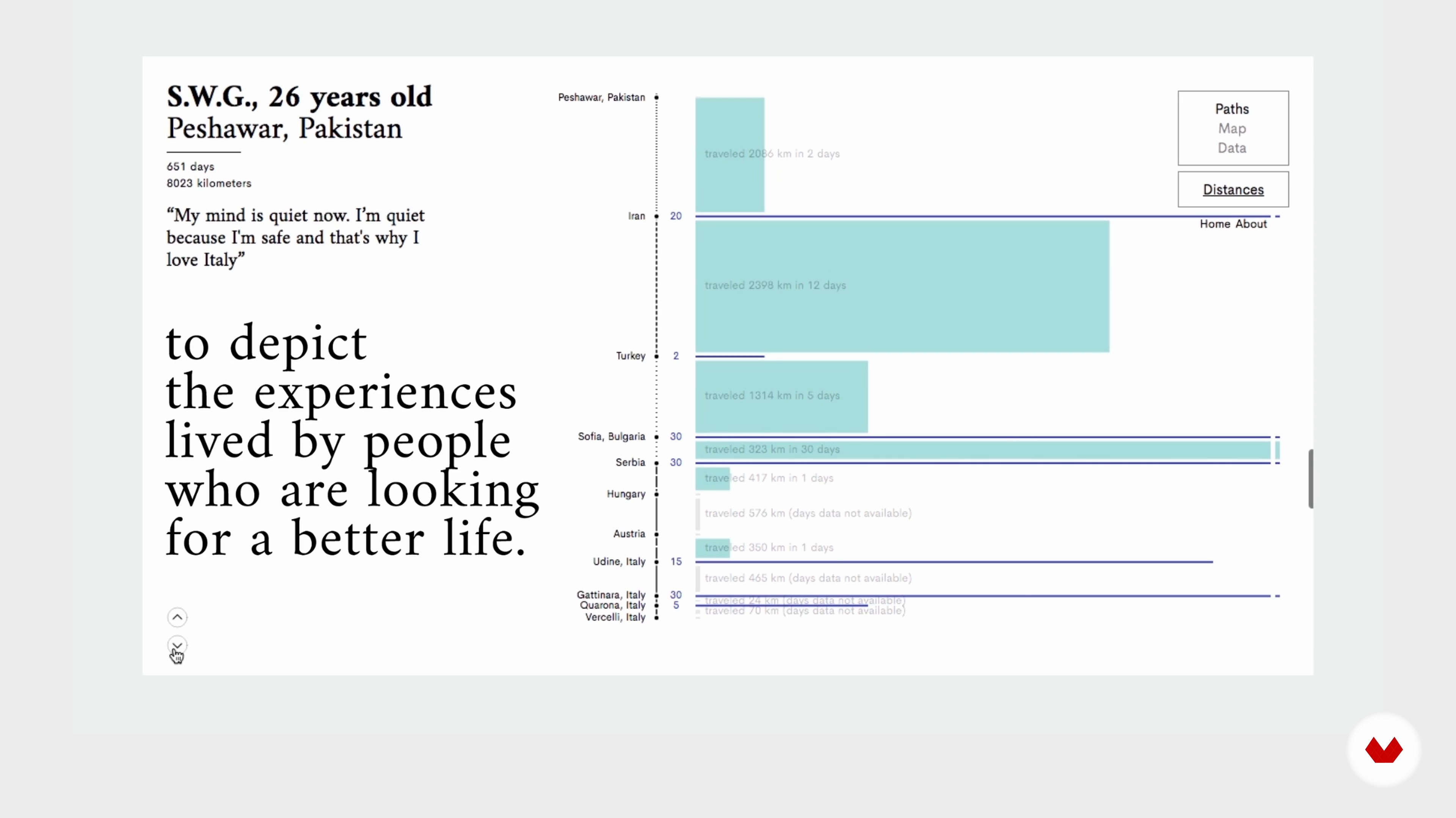
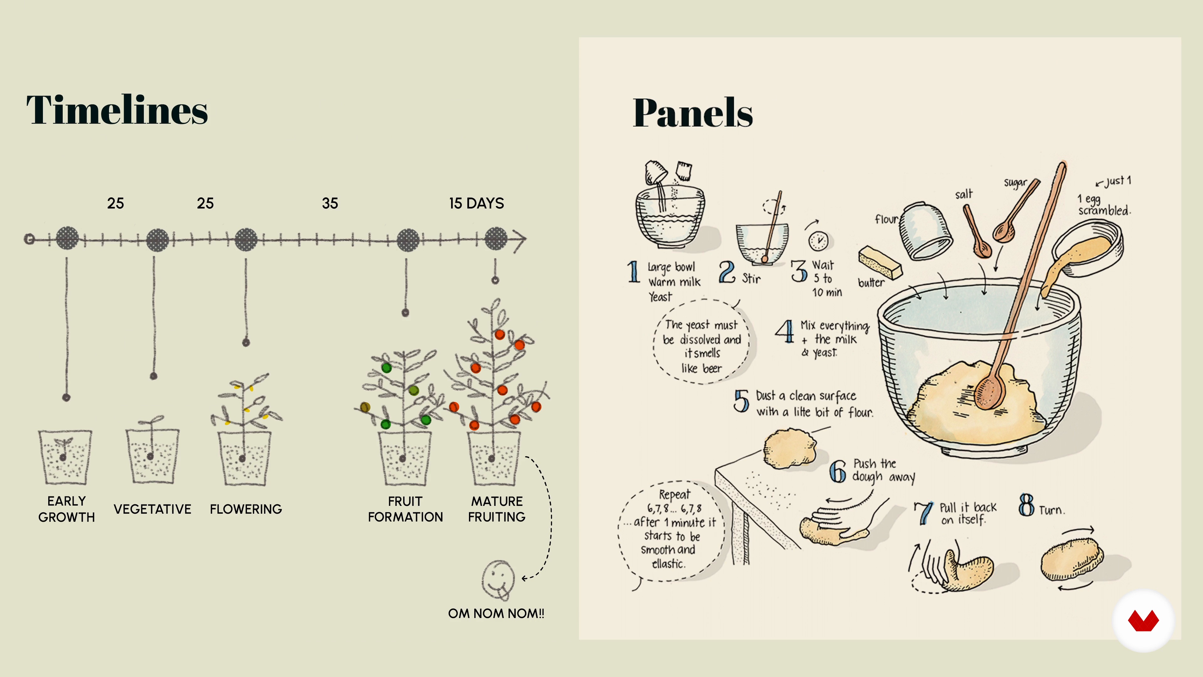
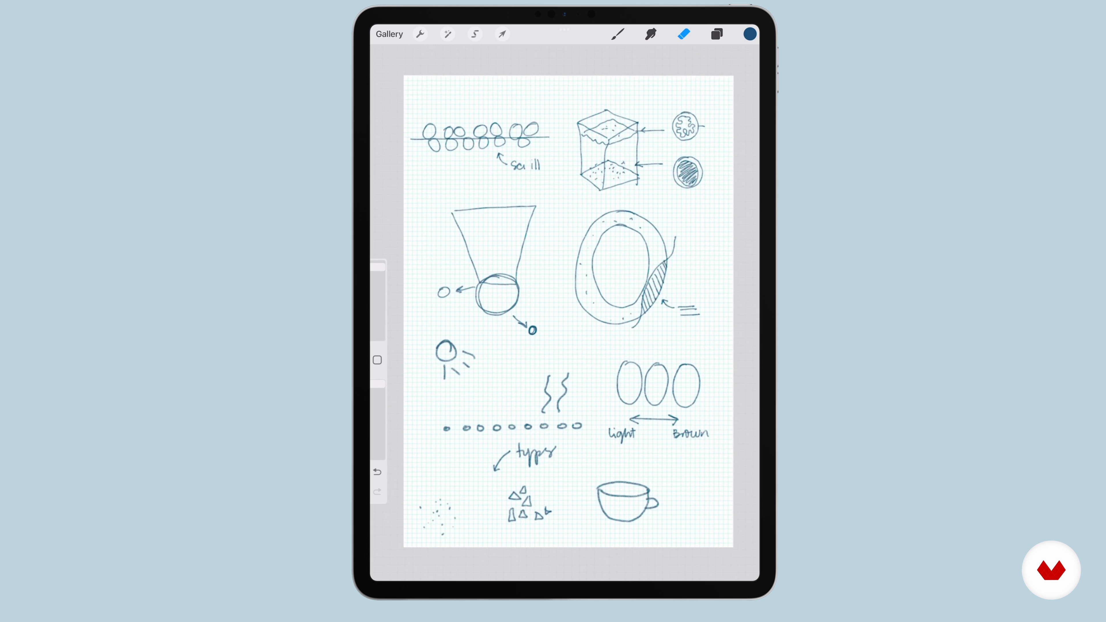
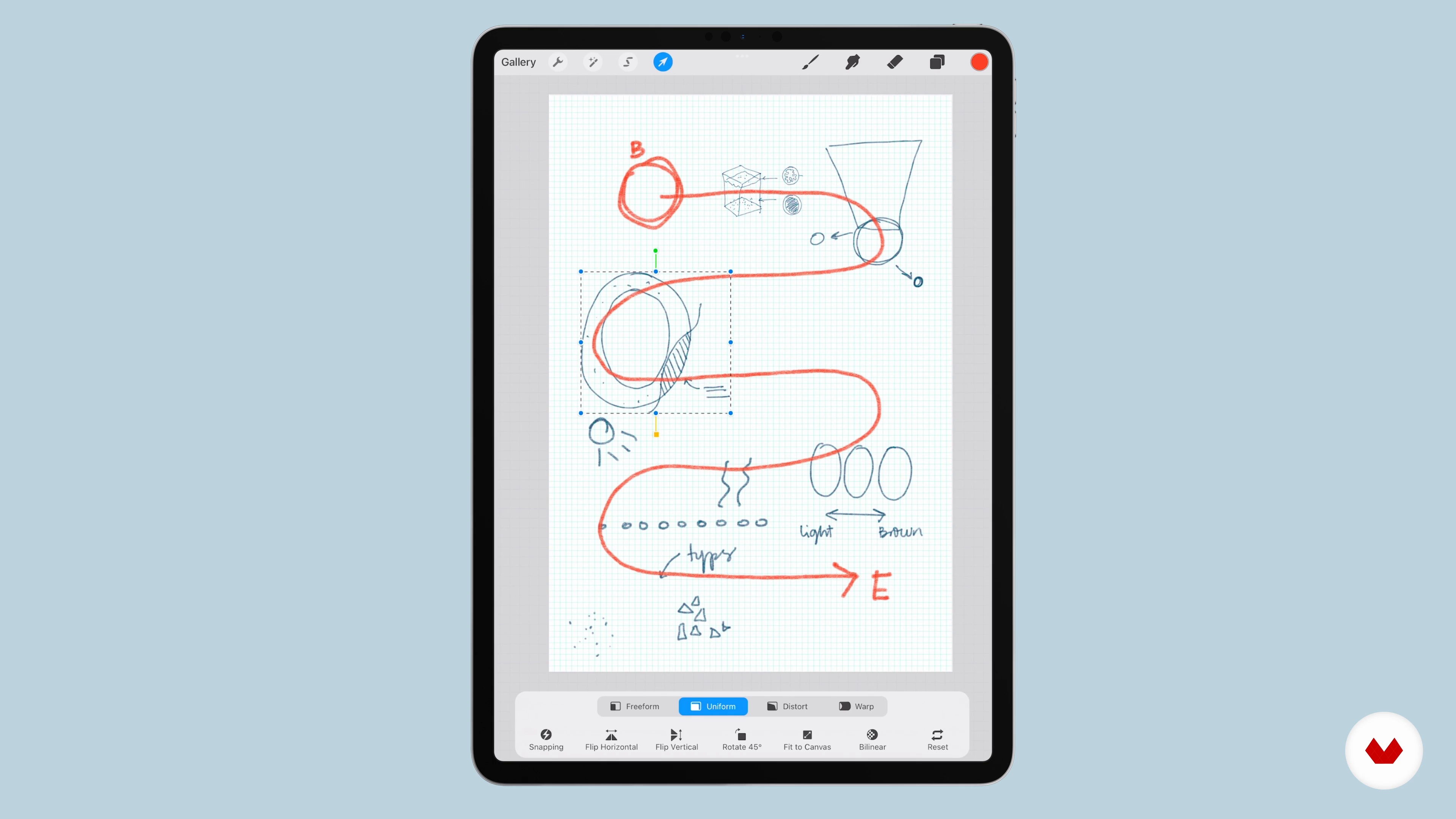
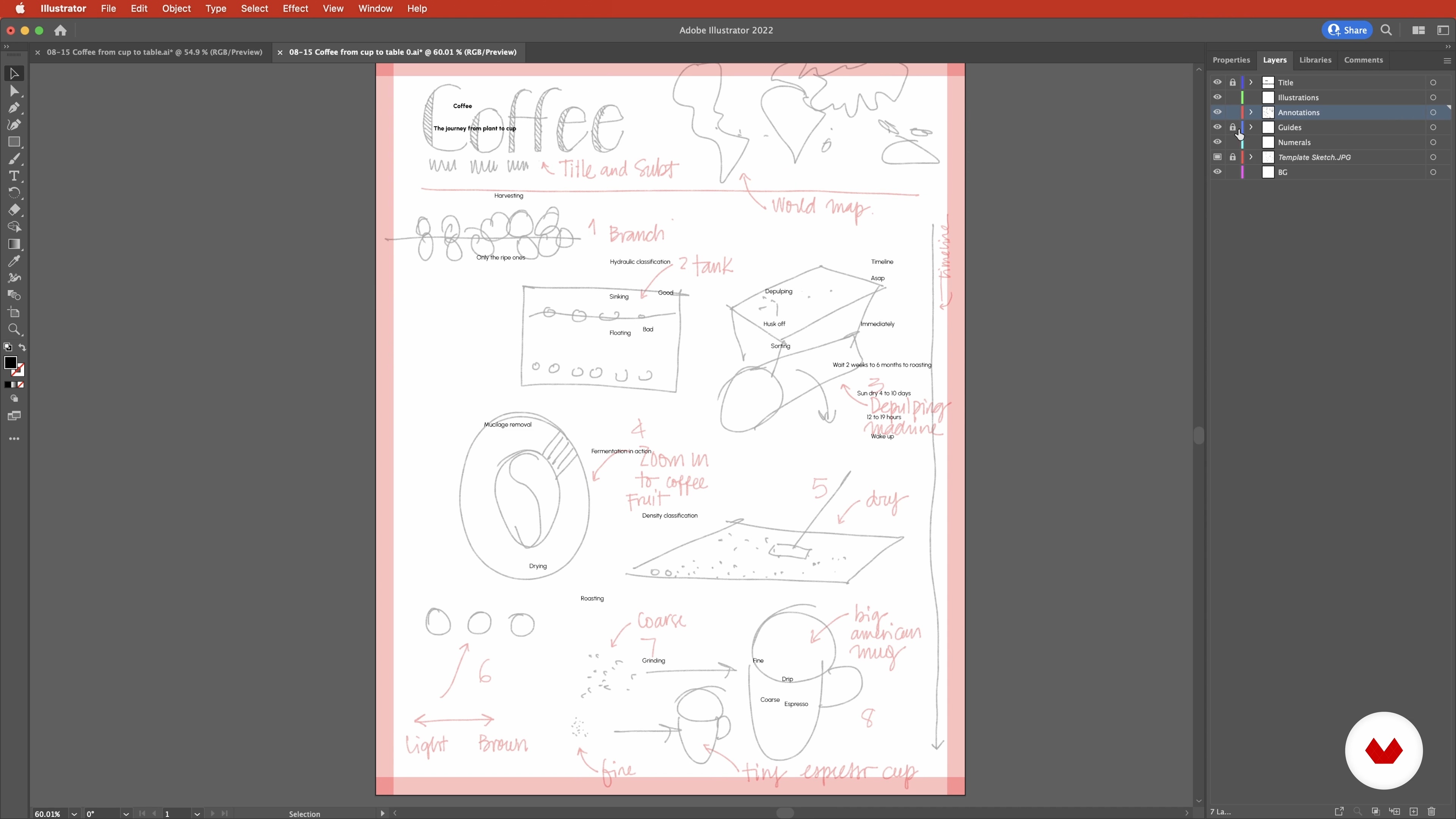
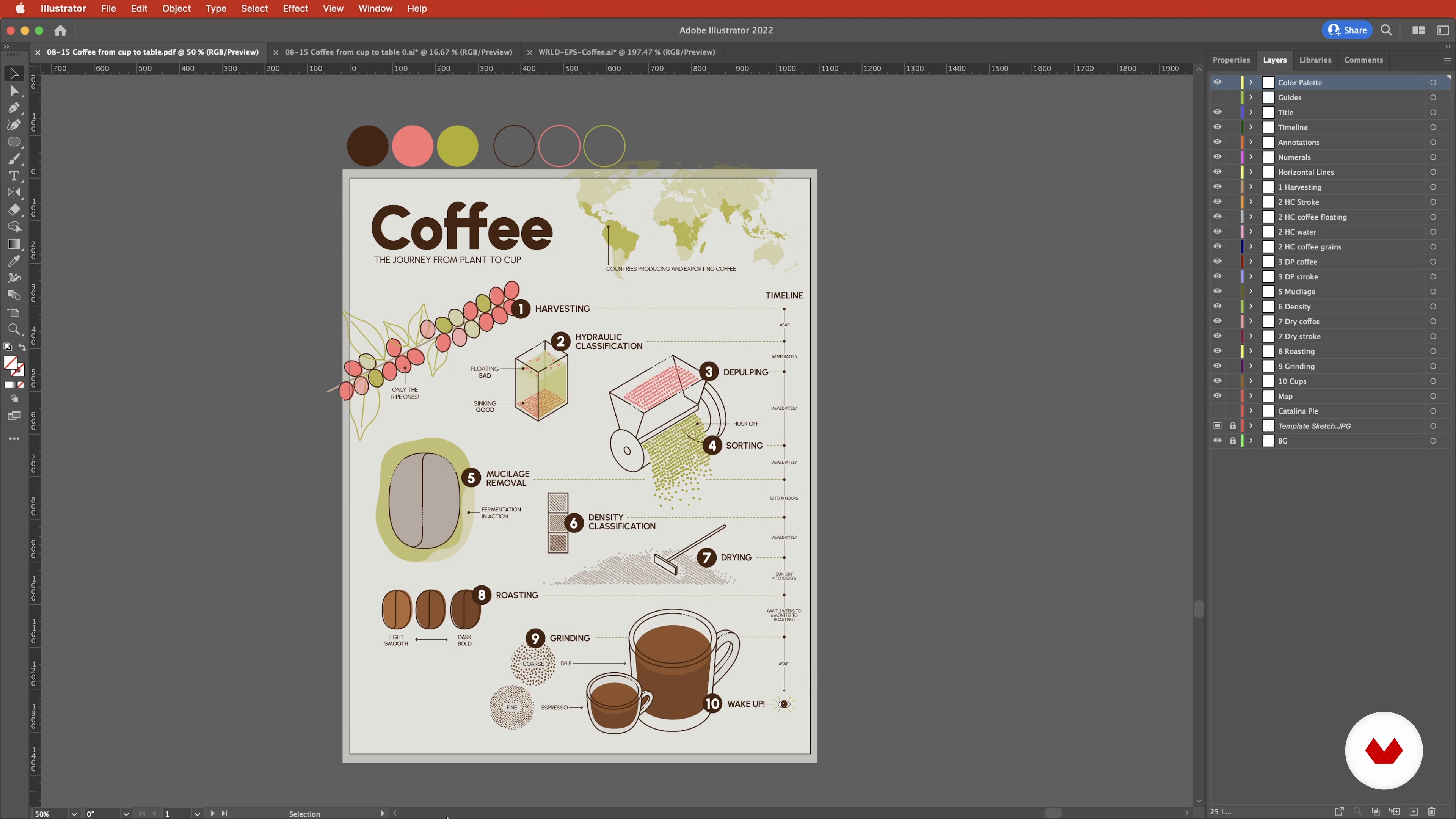
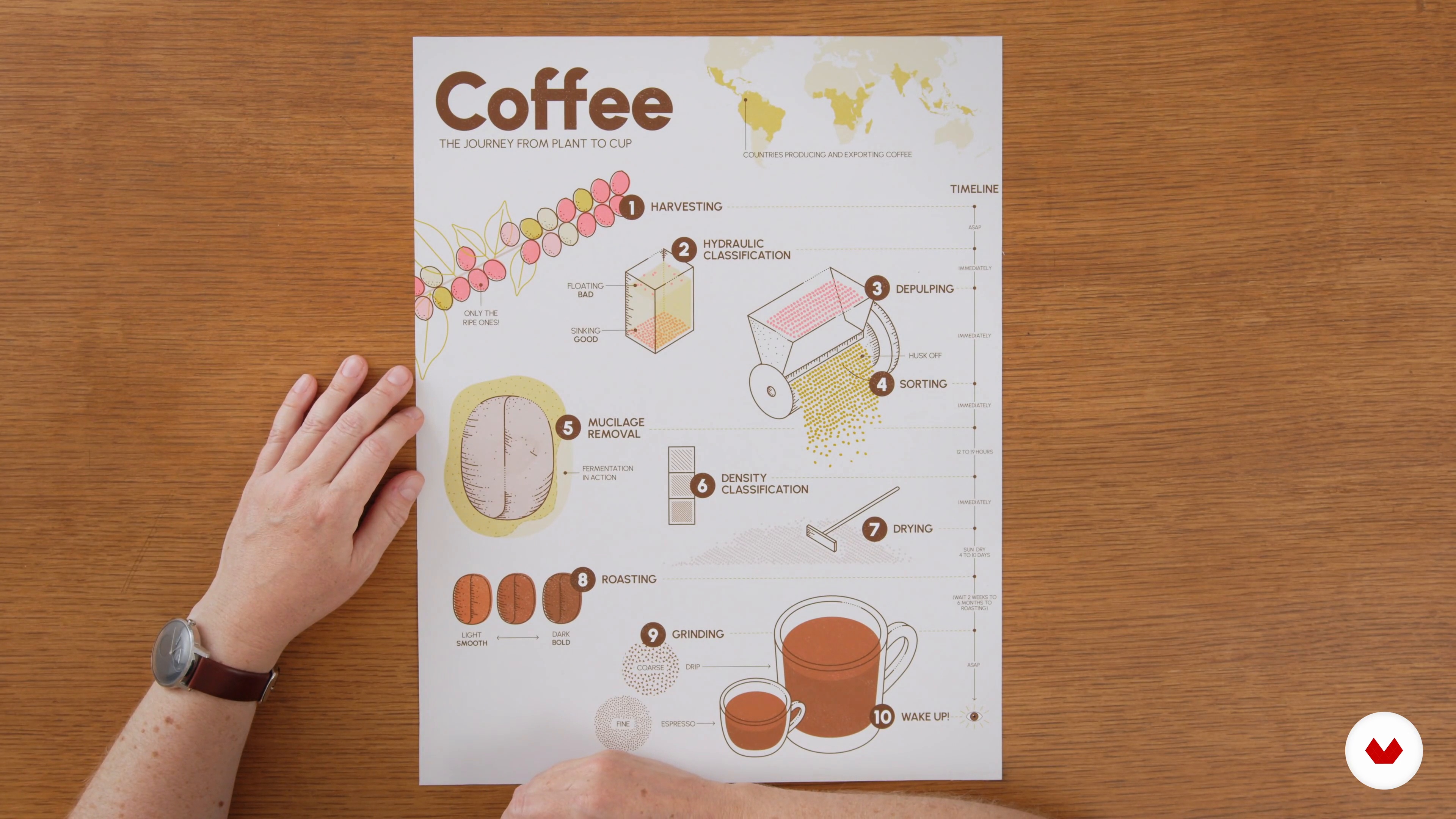
Compose an informative and eye-catching illustration for a data visualization using collage and digital illustration techniques. Transform complex information into a captivating visual story with expressive shapes, colors, and layouts that effectively communicate intricate ideas with simplicity and creativity.
Who is this specialization for?
Ideal for creative professionals, designers, and artists eager to transform data into visually engaging stories. Beginners exploring data visualization or seasoned experts enhancing their skills will find value. Perfect for those wanting to communicate complex information creatively.
Requirements and materials
No extensive prior knowledge is required for this course. Participants should have a basic understanding of digital tools like Adobe Illustrator and access to materials such as a computer and internet connection. Creativity and curiosity will greatly enhance the learning experience.


Reviews
What to expect from this specialization course
-
Learn at your own pace
Enjoy learning from home without a set schedule and with an easy-to-follow method. You set your own pace.
-
Learn from the best professionals
Learn valuable methods and techniques explained by top experts in the creative sector.
-
Meet expert teachers
Each expert teaches what they do best, with clear guidelines, true passion, and professional insight in every lesson.
-
Certificates
PlusIf you're a Plus member, get a custom certificate for every specialization course. Share it on your portfolio, social media, or wherever you like.
-
Get front-row seats
Videos of the highest quality, so you don't miss a single detail. With unlimited access, you can watch them as many times as you need to perfect your technique.
-
Share knowledge and ideas
Ask questions, request feedback, or offer solutions. Share your learning experience with other students in the community who are as passionate about creativity as you are.
-
Connect with a global creative community
The community is home to millions of people from around the world who are curious and passionate about exploring and expressing their creativity.
-
Watch professionally produced courses
Domestika curates its teacher roster and produces every course in-house to ensure a high-quality online learning experience.
FAQs
This course is designed for intermediate learners with some basic experience in illustration or 3D modeling. Beginners may find it challenging, but those familiar with Illustrator or Cinema 4D will benefit most.
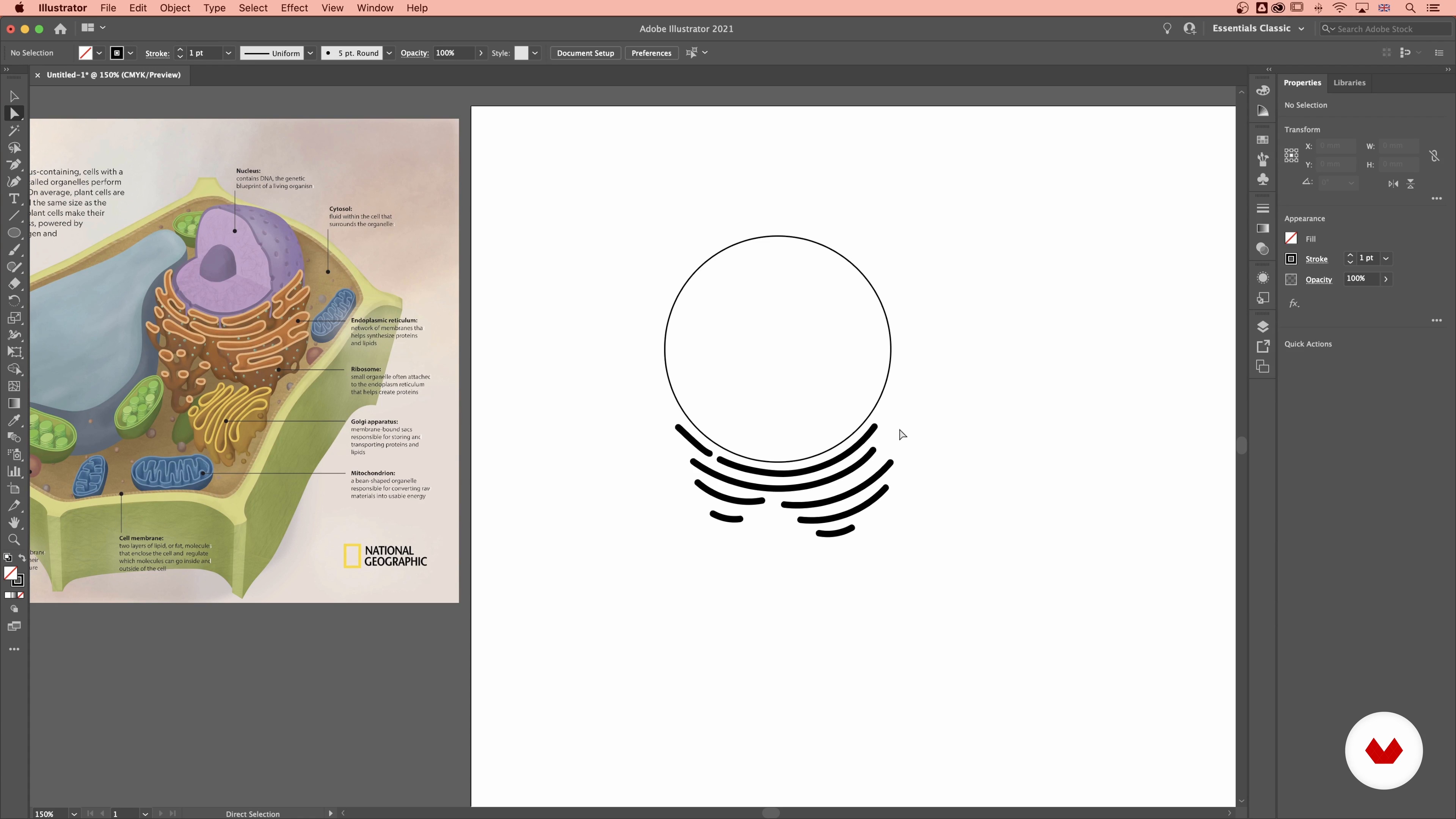
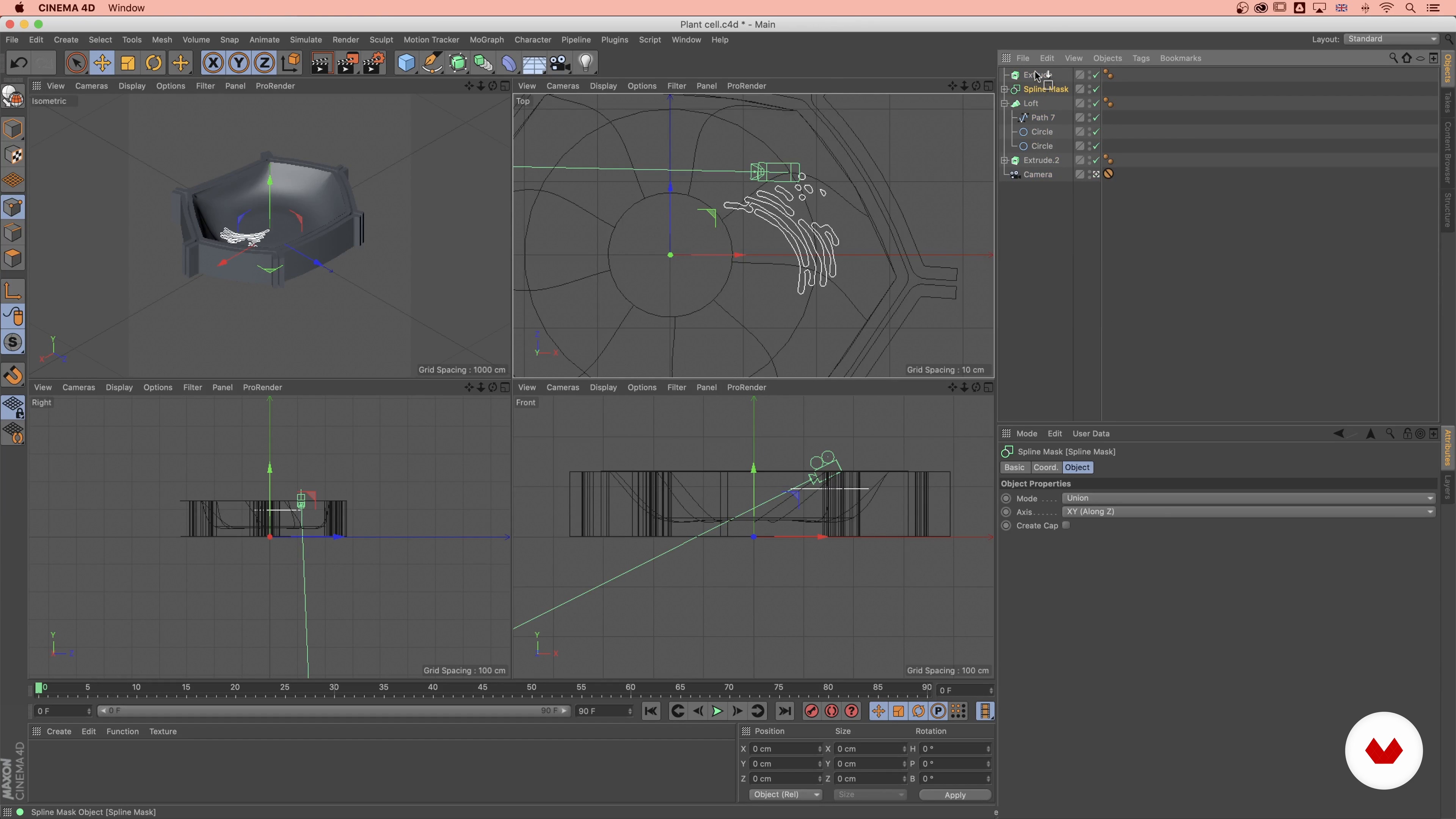
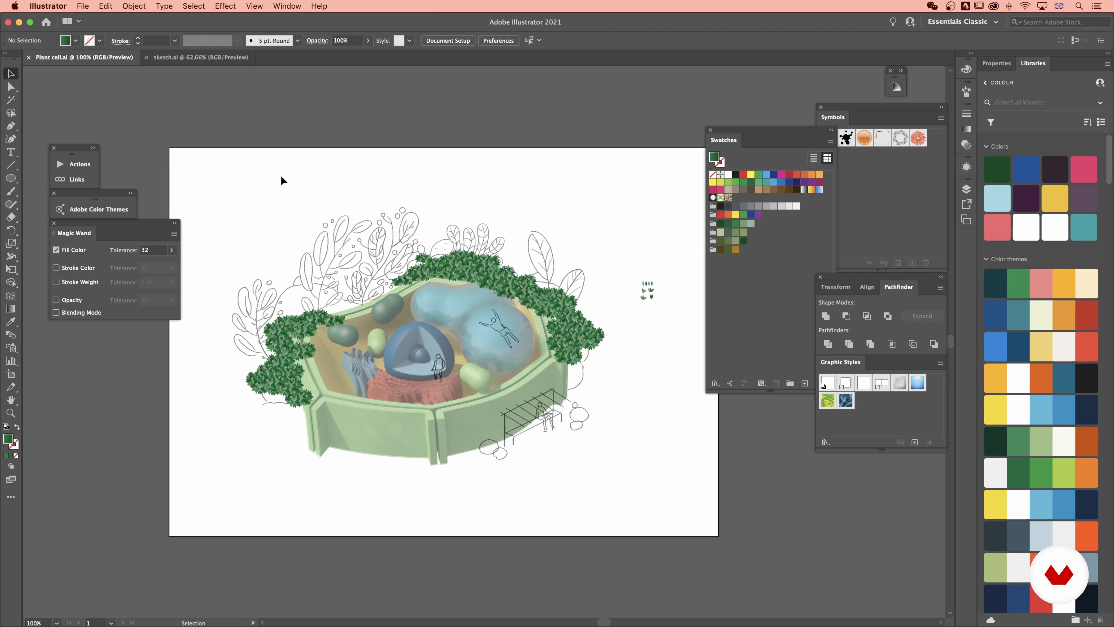
You’ll need Adobe Illustrator and Cinema 4D to follow along with the lessons and complete the hands-on projects in this course.
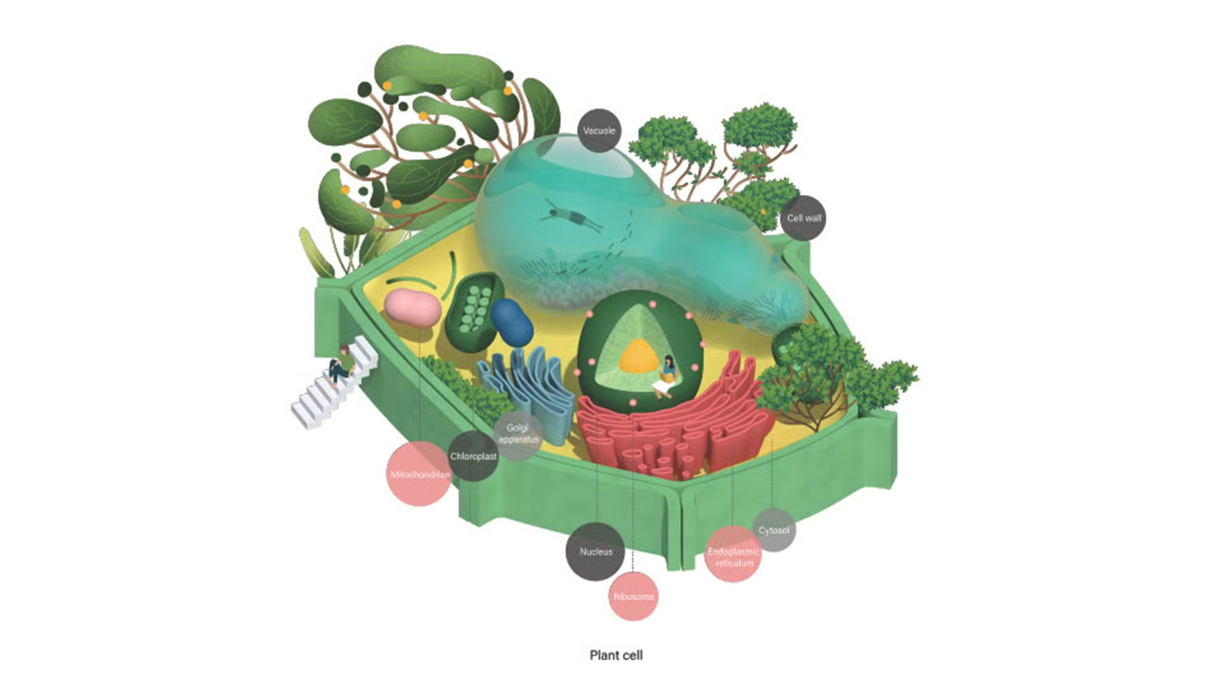
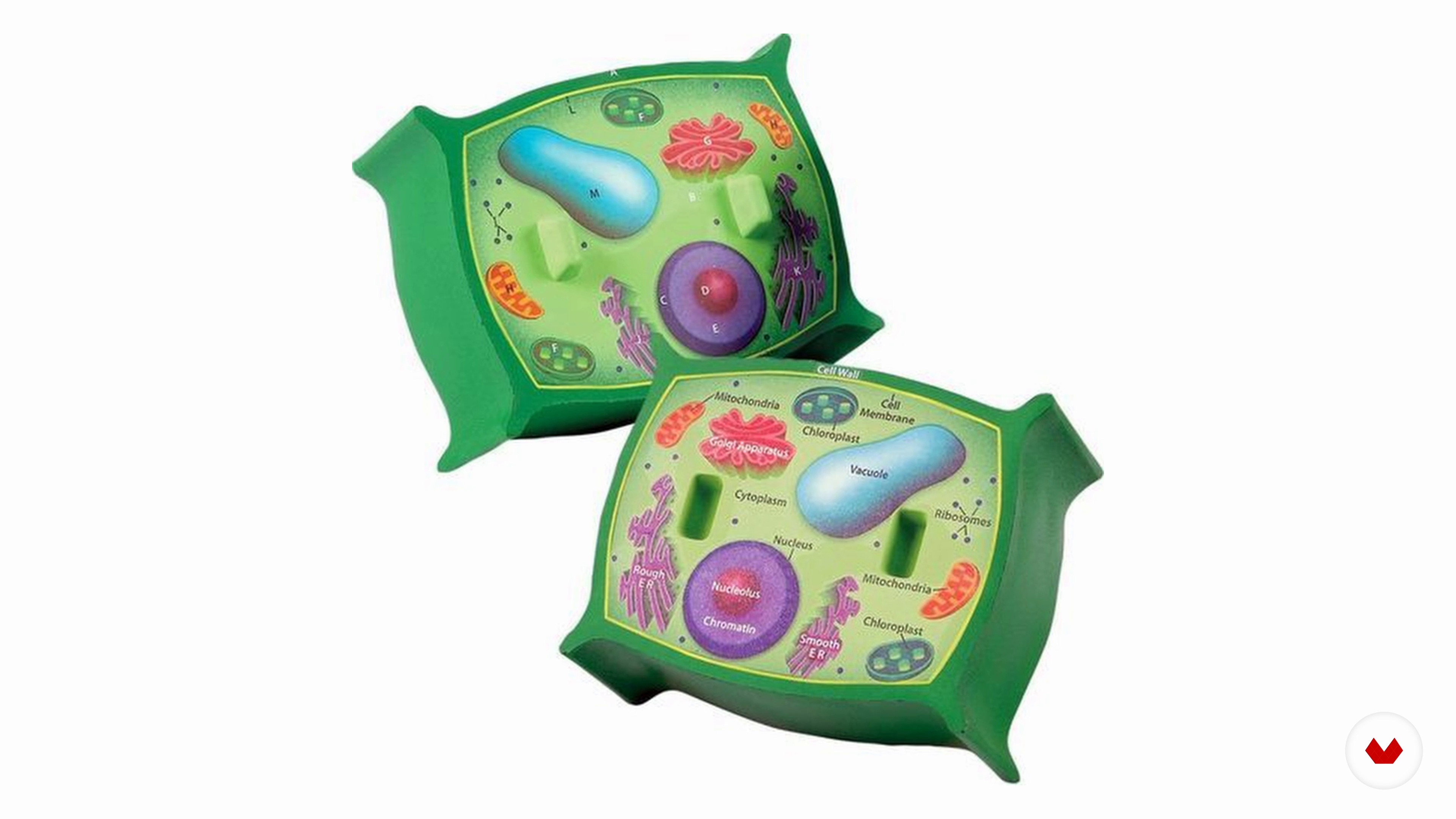
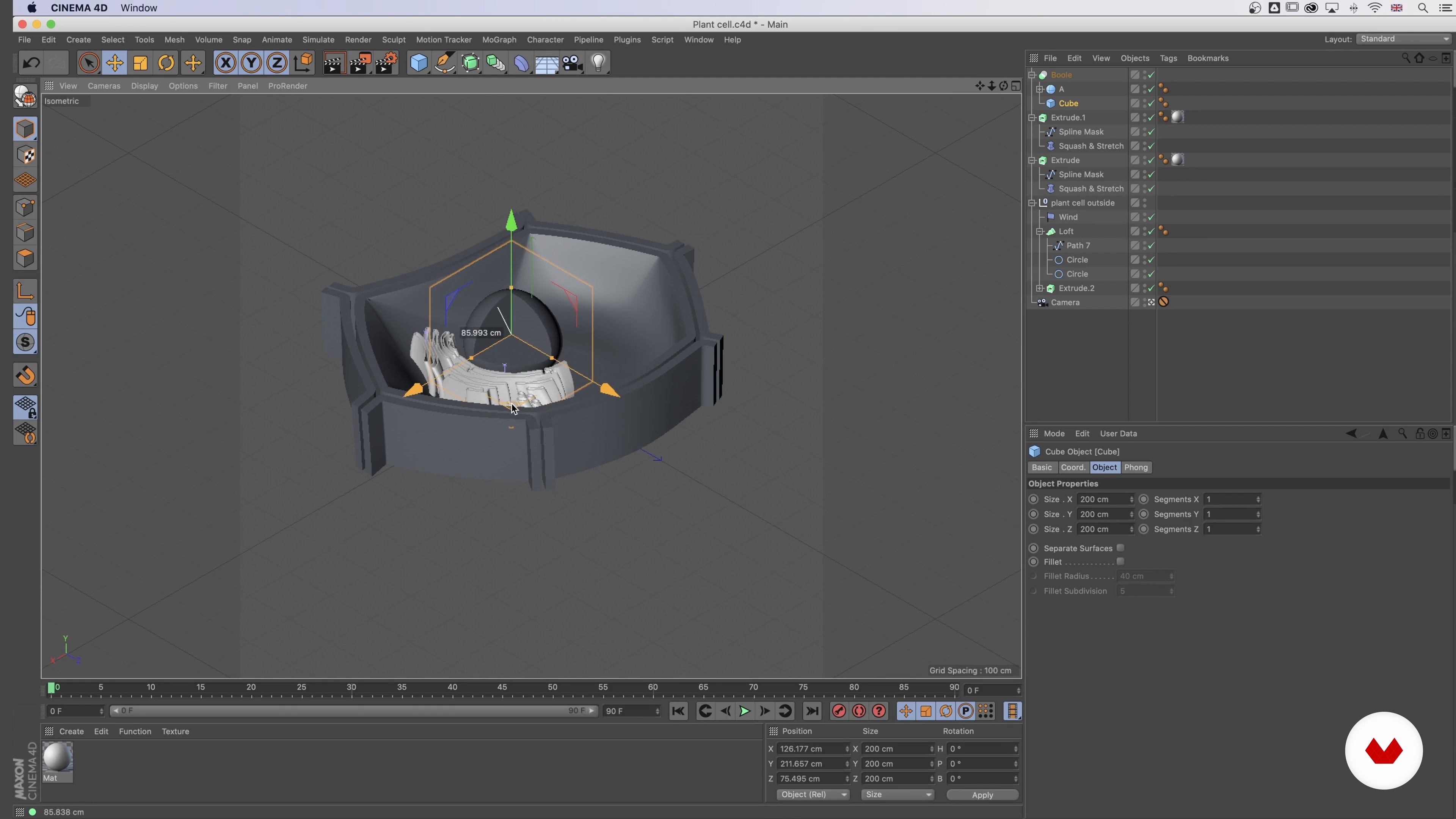
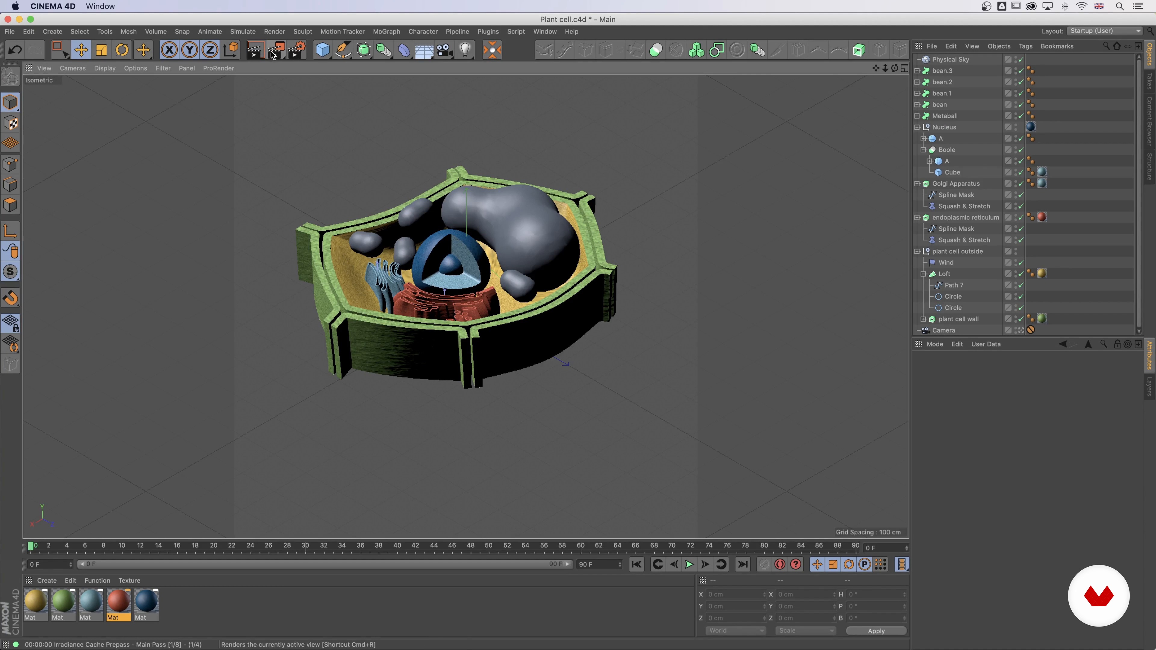
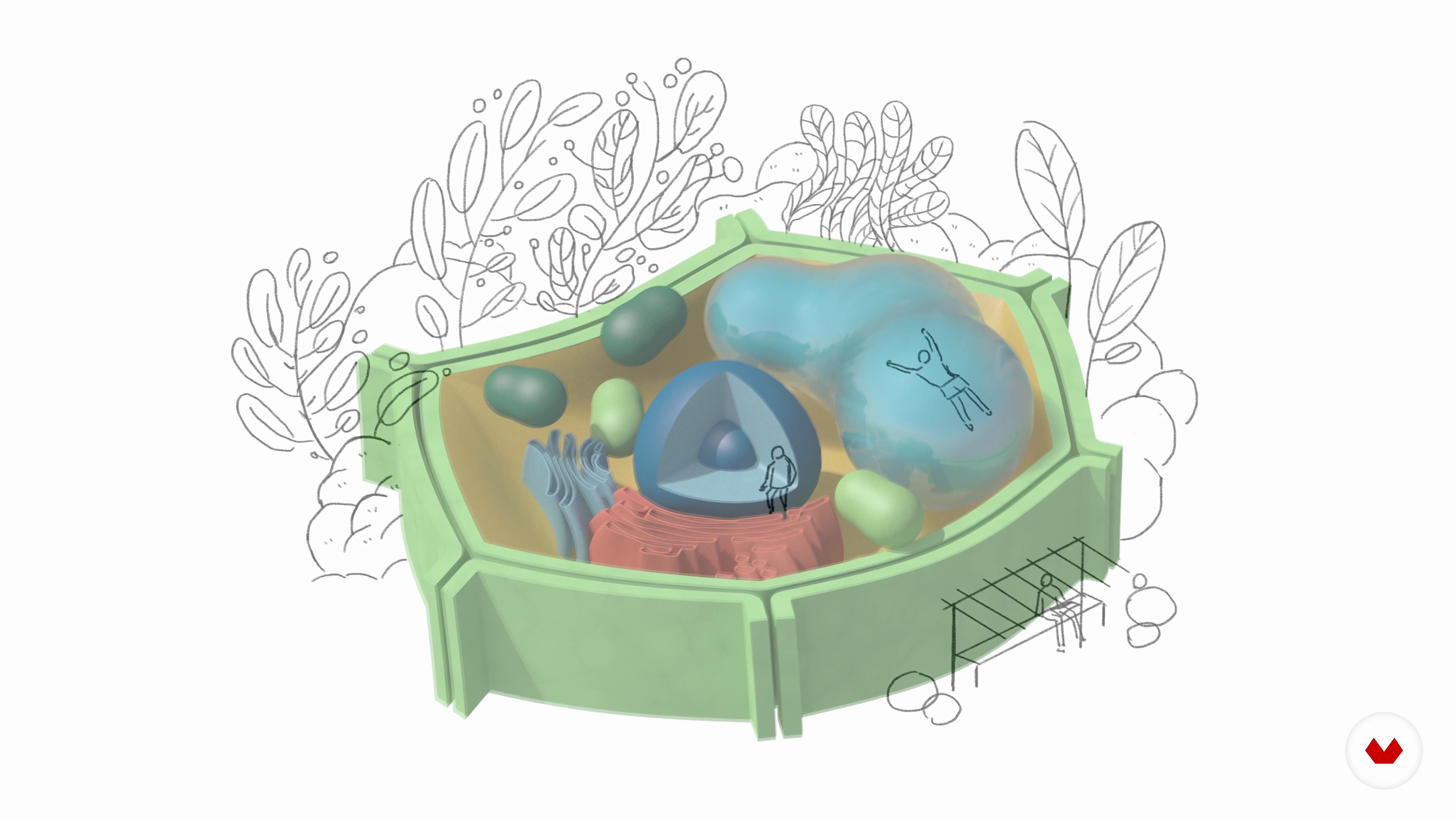
You’ll learn how to create illustrated infographics, build 3D models in Cinema 4D, visualize scientific and architectural concepts, and integrate data into visually engaging designs.
Yes, a basic understanding of Adobe Illustrator or Cinema 4D is recommended as the course covers intermediate to advanced techniques.
The course covers cross-section and isometric illustration, architectural and biological infographics, 3D modeling workflows, texturing, lighting, and combining 2D vector art with 3D scenes.
Yes, the course is ideal for anyone looking to create editorial, biological, or scientific illustrations that require clear and engaging visual communication.
Yes, you’ll master techniques for visualizing scientific, architectural, and narrative data through infographics and layered visual structures.


Bastante completo. Cubre aproximaciones diversas a la Visualización de datos.
ESTA MUY ESPECIALIDO LO RECOMIENDO ENORMEMENTE
Esta especialização é excelente! As experiências e conhecimentos compartilhados pelos(as) professores(as) são enriquecedores. Contribuírão muito para minha trajetória profissional!
Very informative
Muy completo e incluye distintas perpectivas, desde las infos más tradicionales a las ilustradas, además de enseñar gráficos en 2 y 3D.