
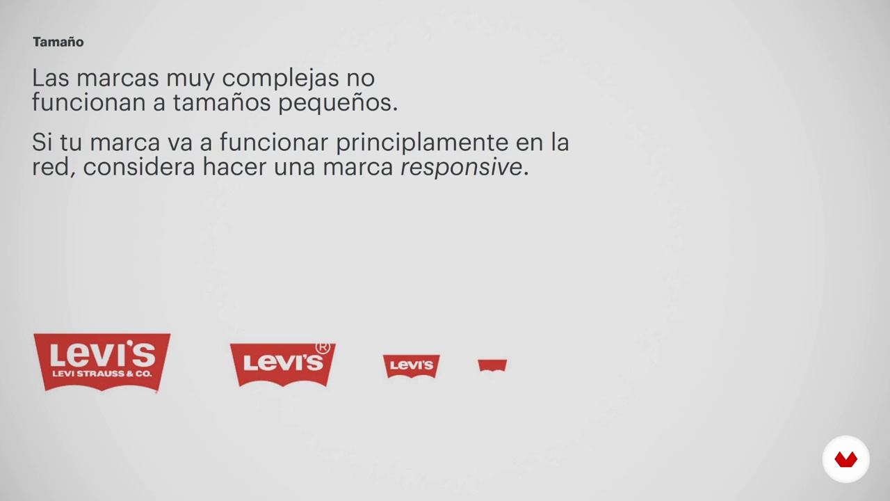
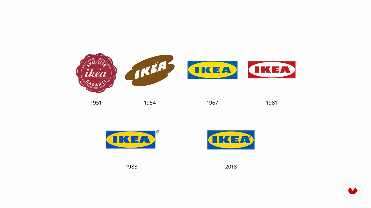
Master's in Graphic Design: Master color, composition, and visual perception to create impactful and coherent visual identities.
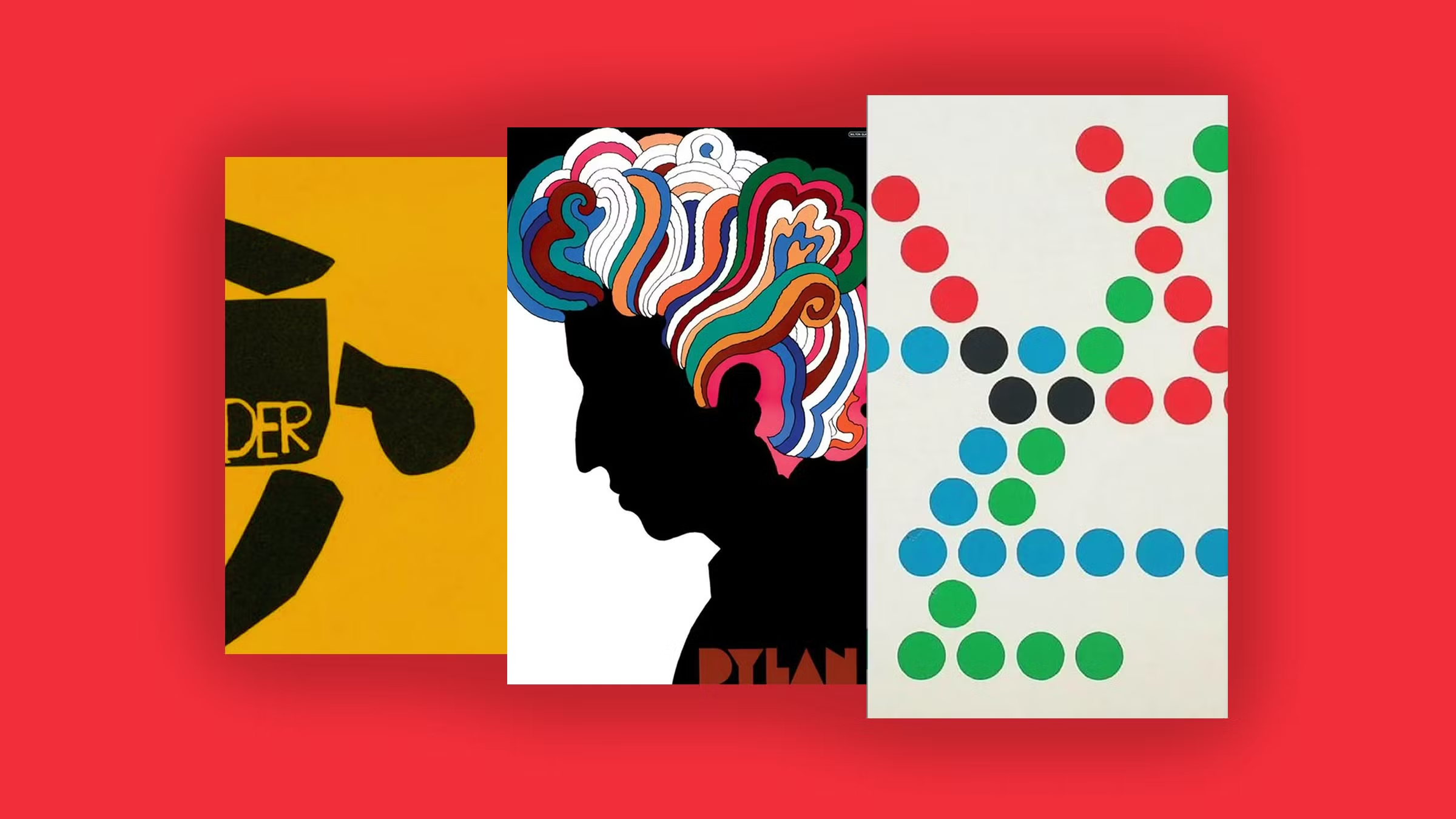
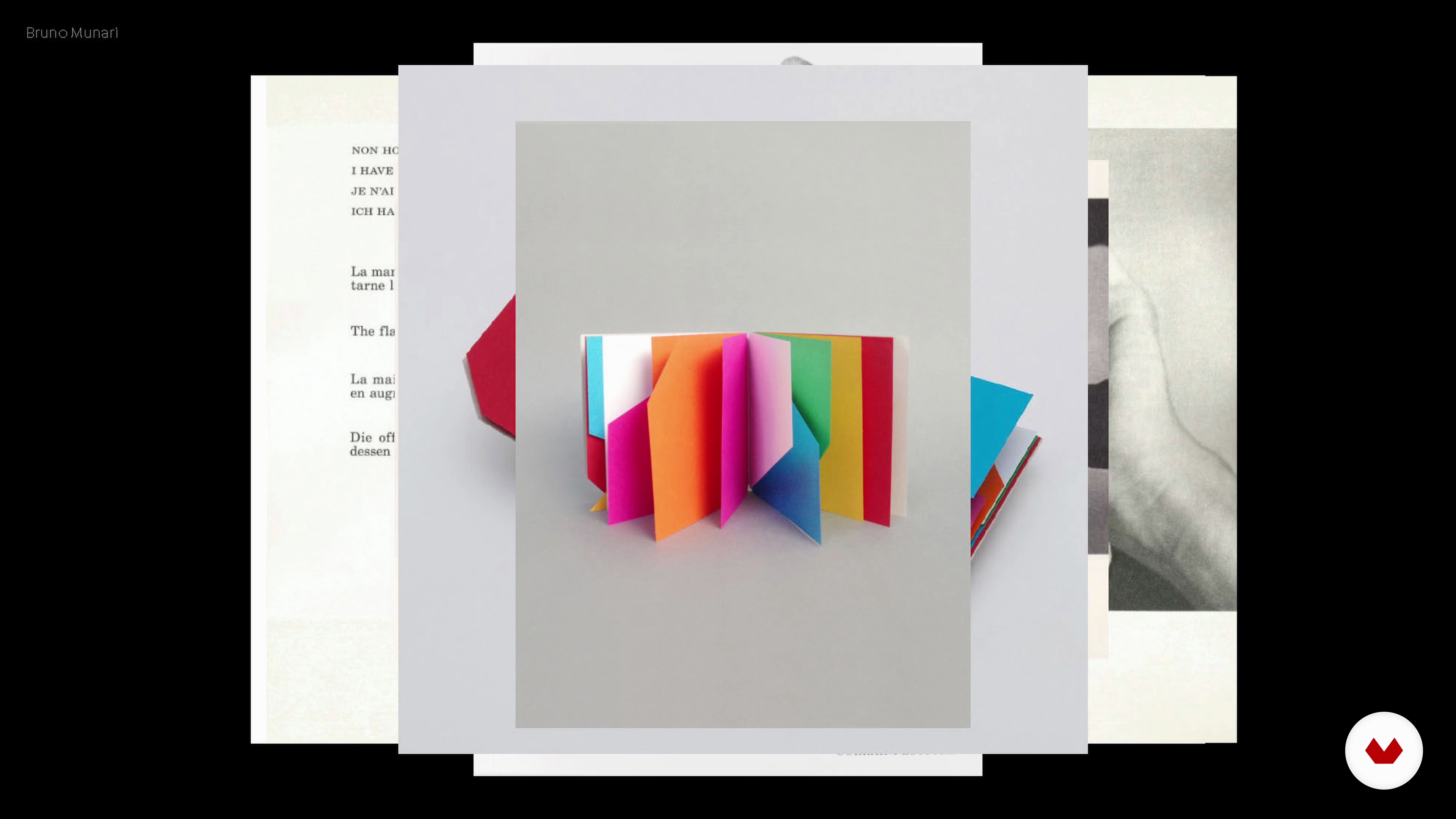
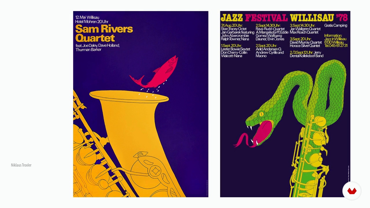
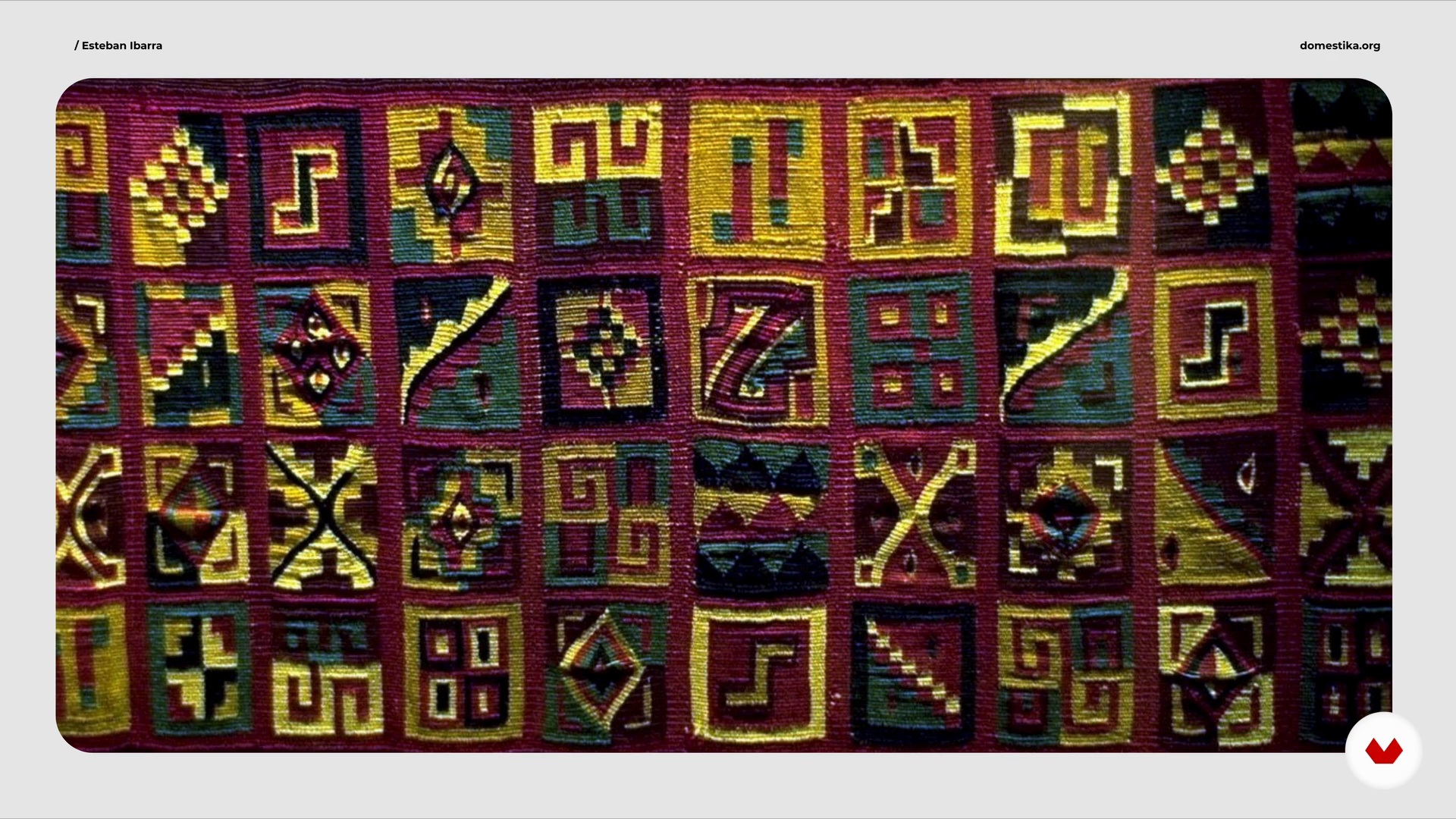
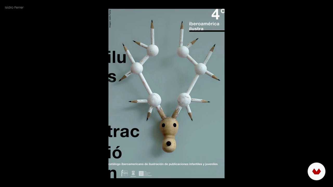
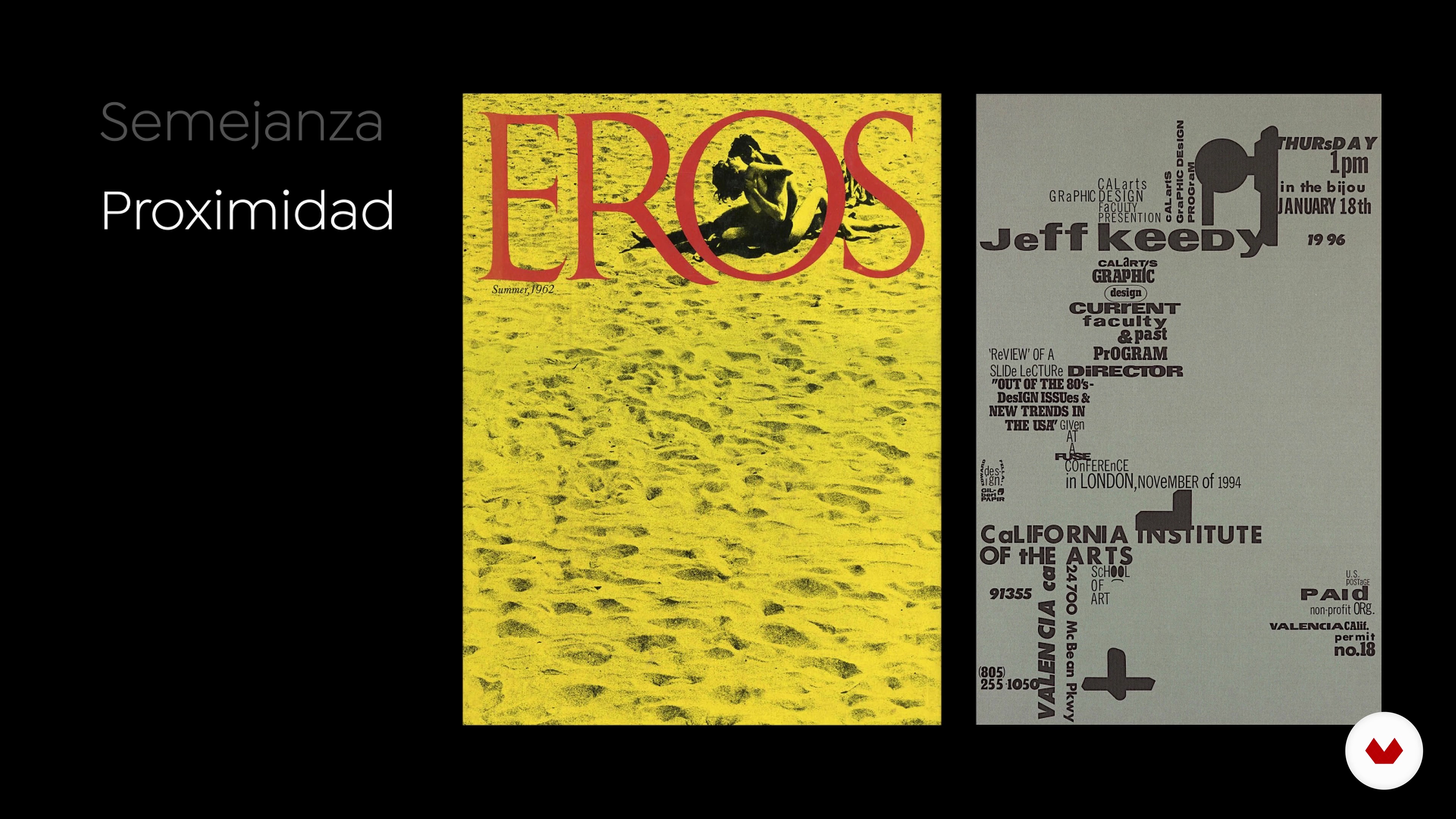
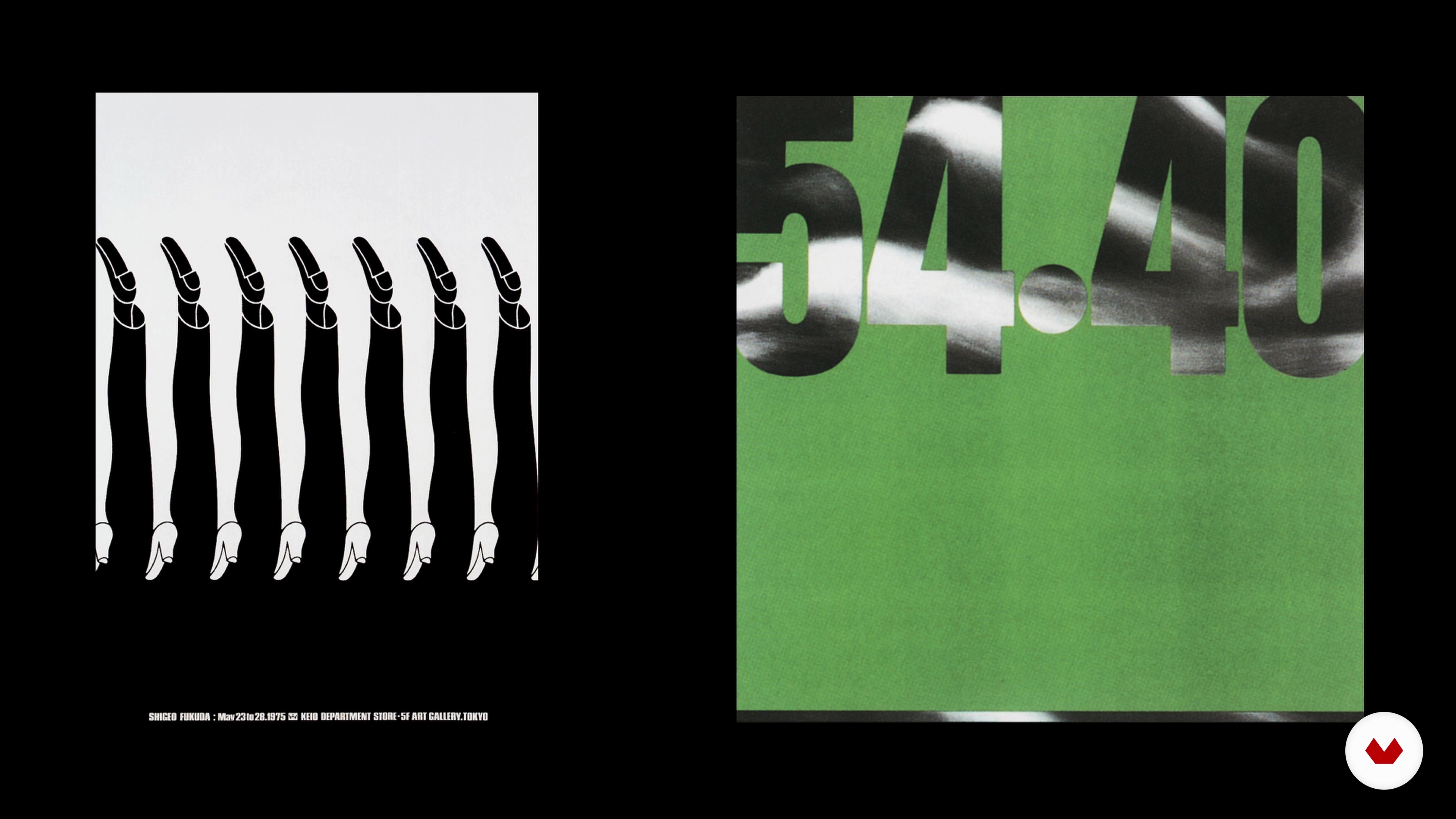
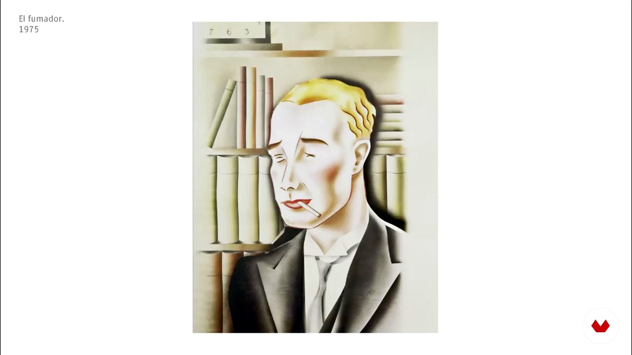
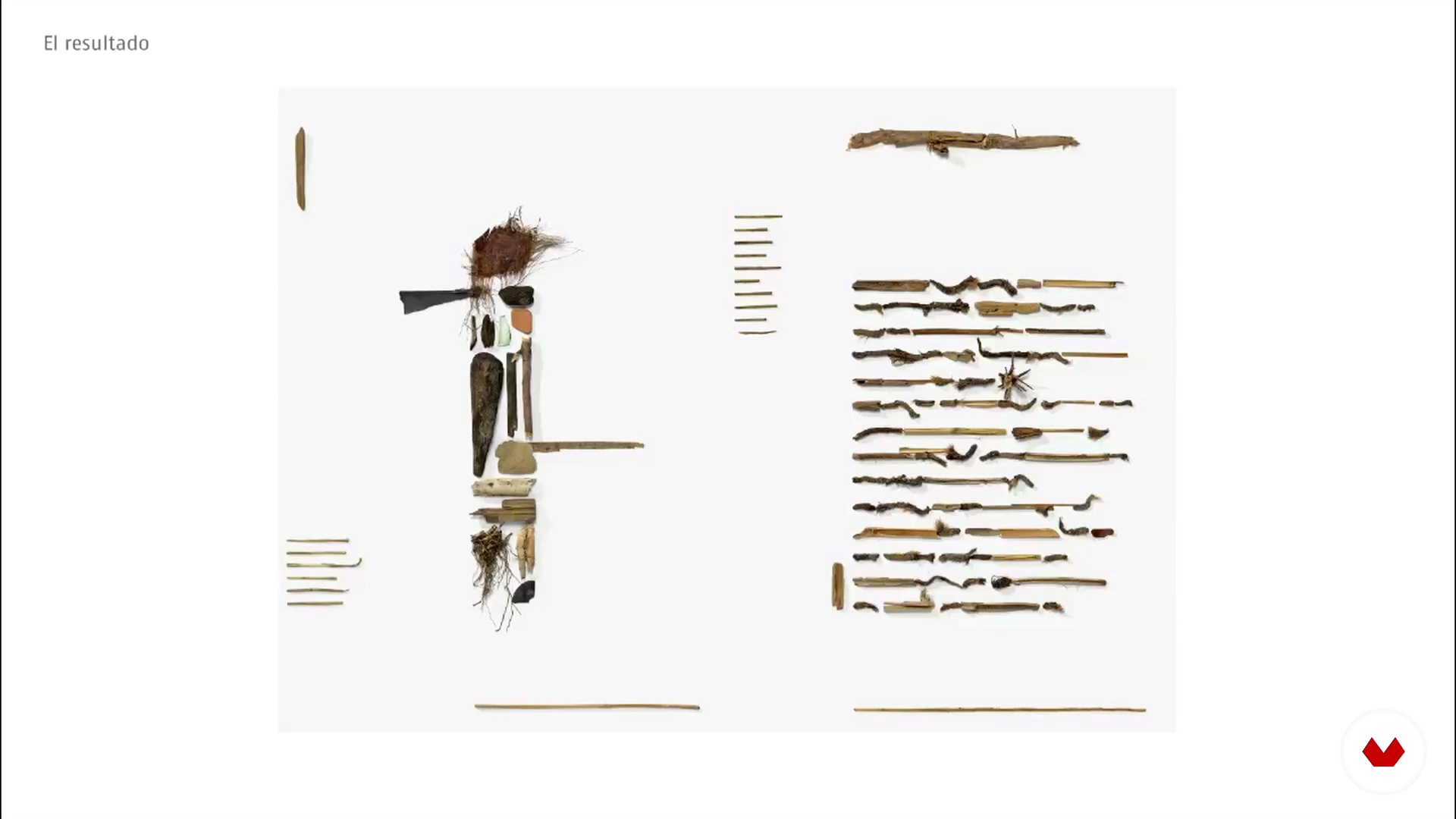
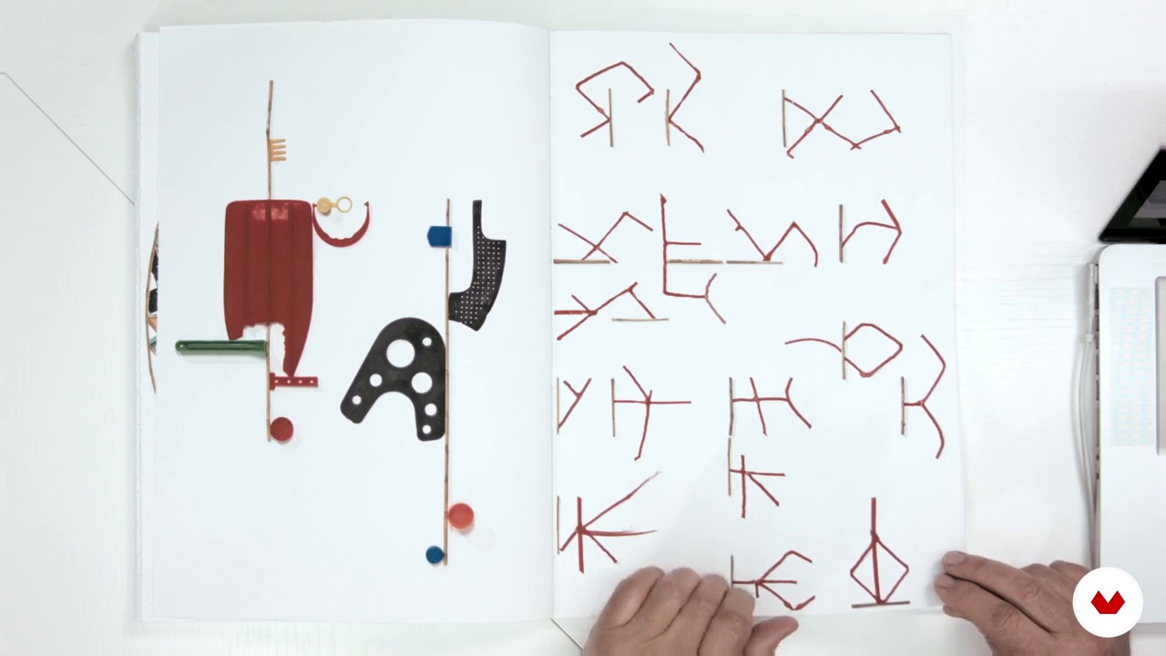
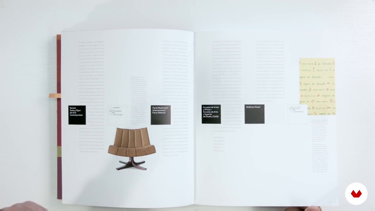
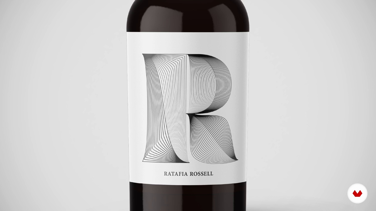
Discover the fascinating world of graphic design and master its fundamental concepts with this program designed by Silvia Ferpal, Leire Fernández, Eduardo Herrera, Javier Alcaraz, Esteban Ibarra and Enric Jardí. Immerse yourself in the artistic and cultural influences that have shaped design over time, while exploring the laws of visual perception to create dynamic and balanced compositions. Learn to develop your own visual universe using geometric shapes, typography and color to effectively communicate visual messages.
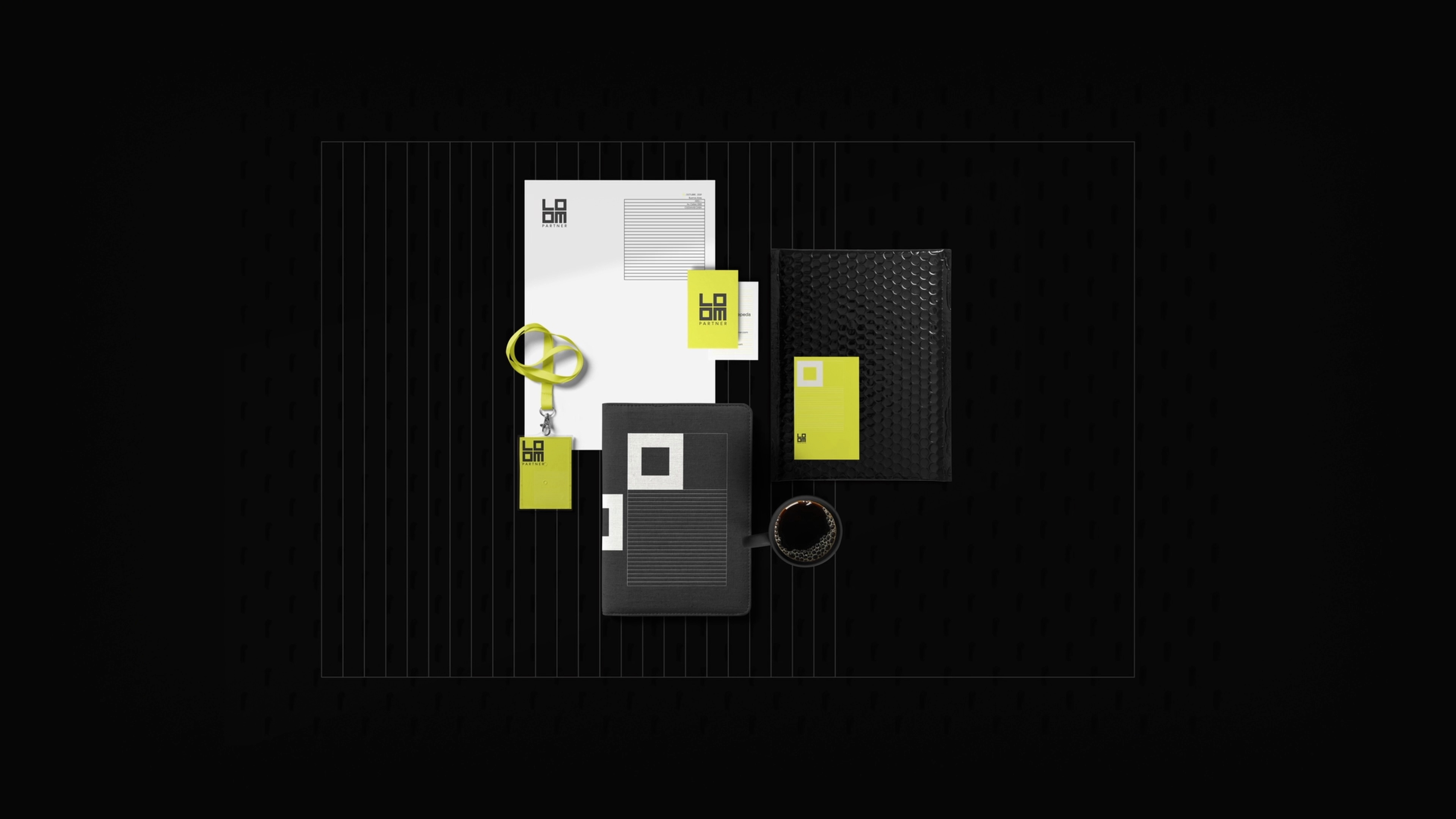
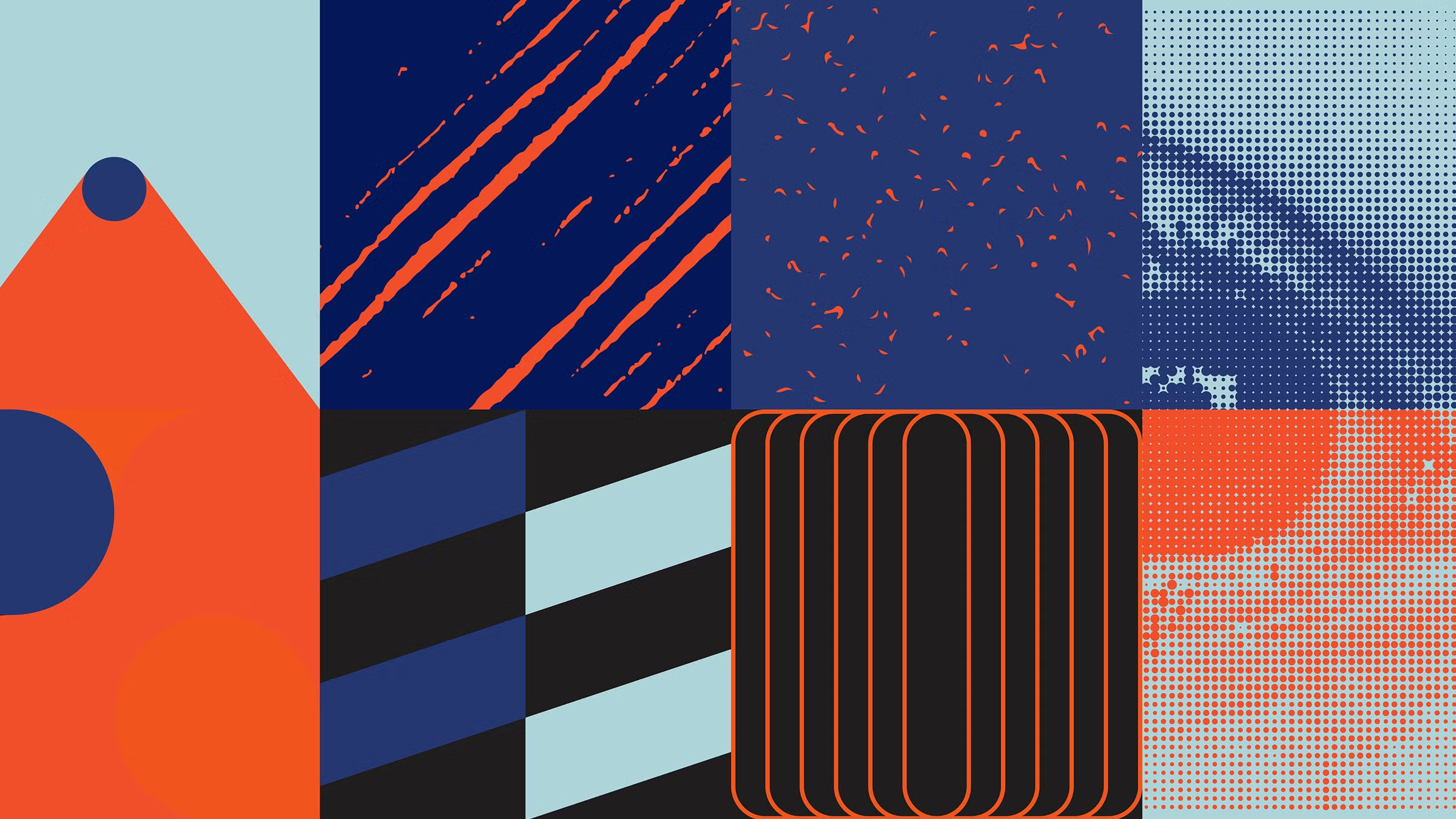
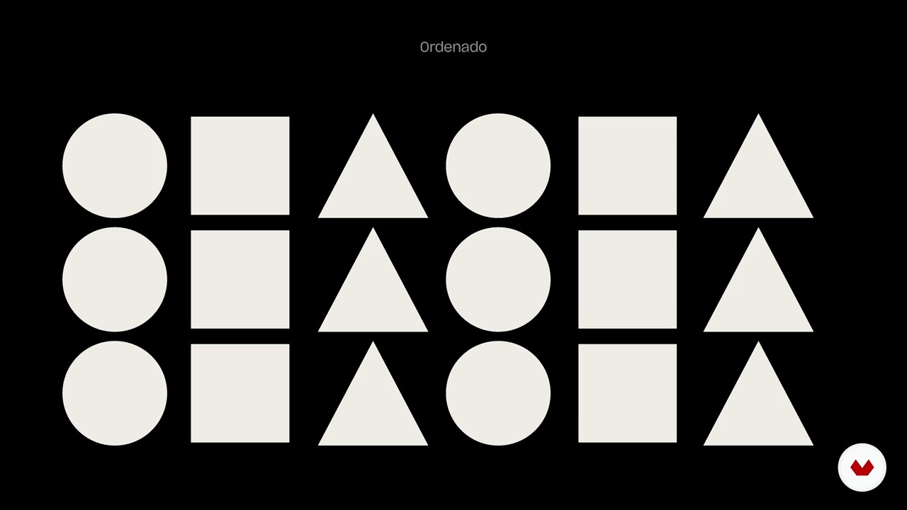
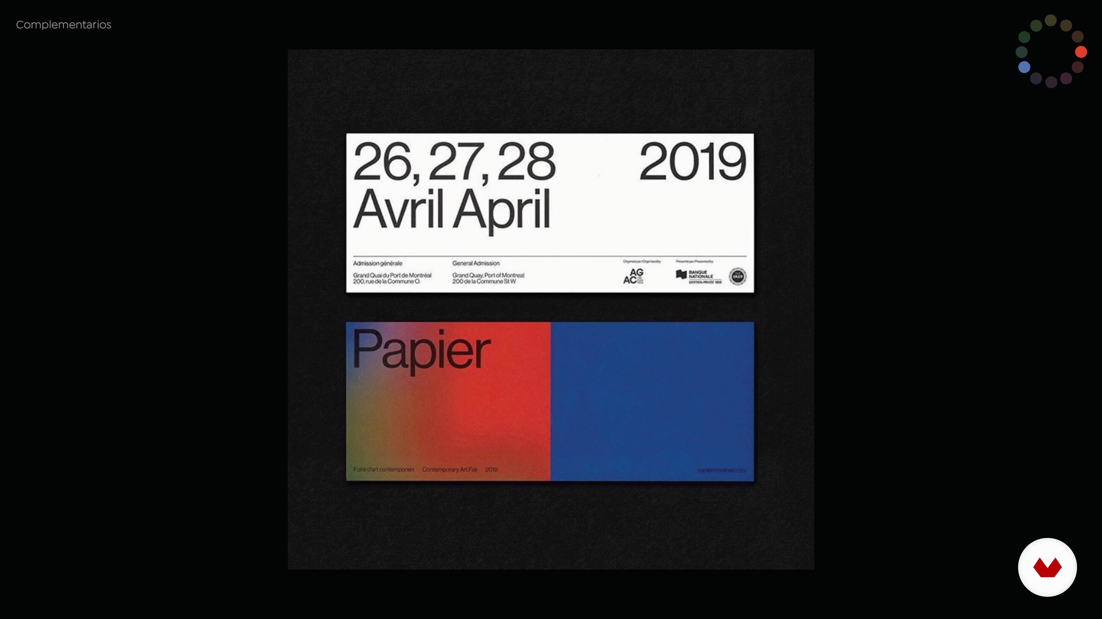
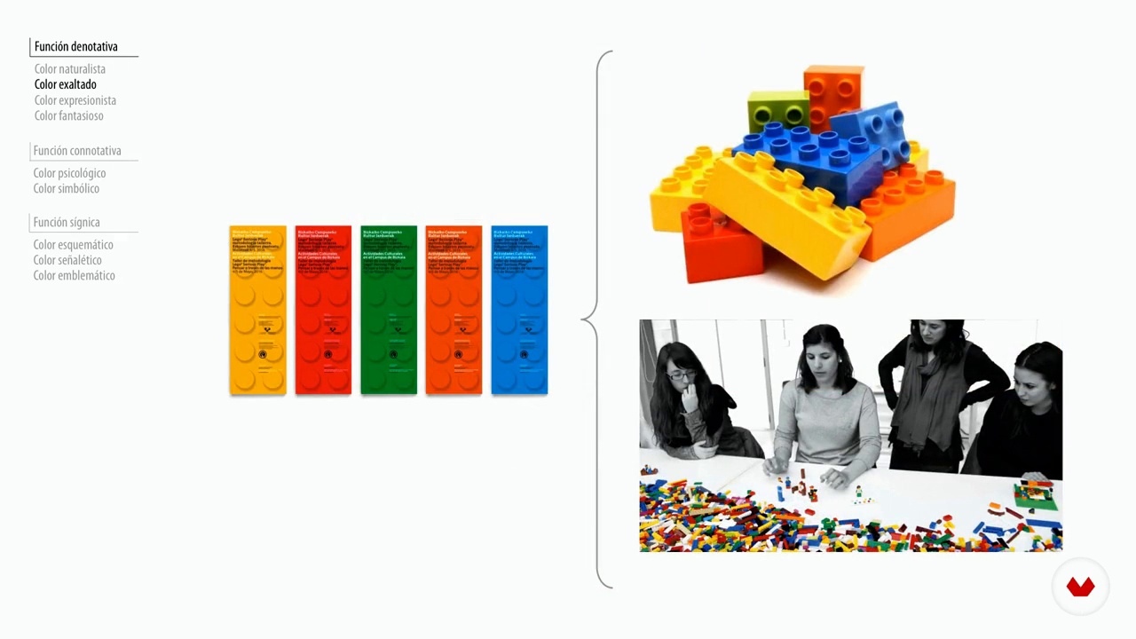
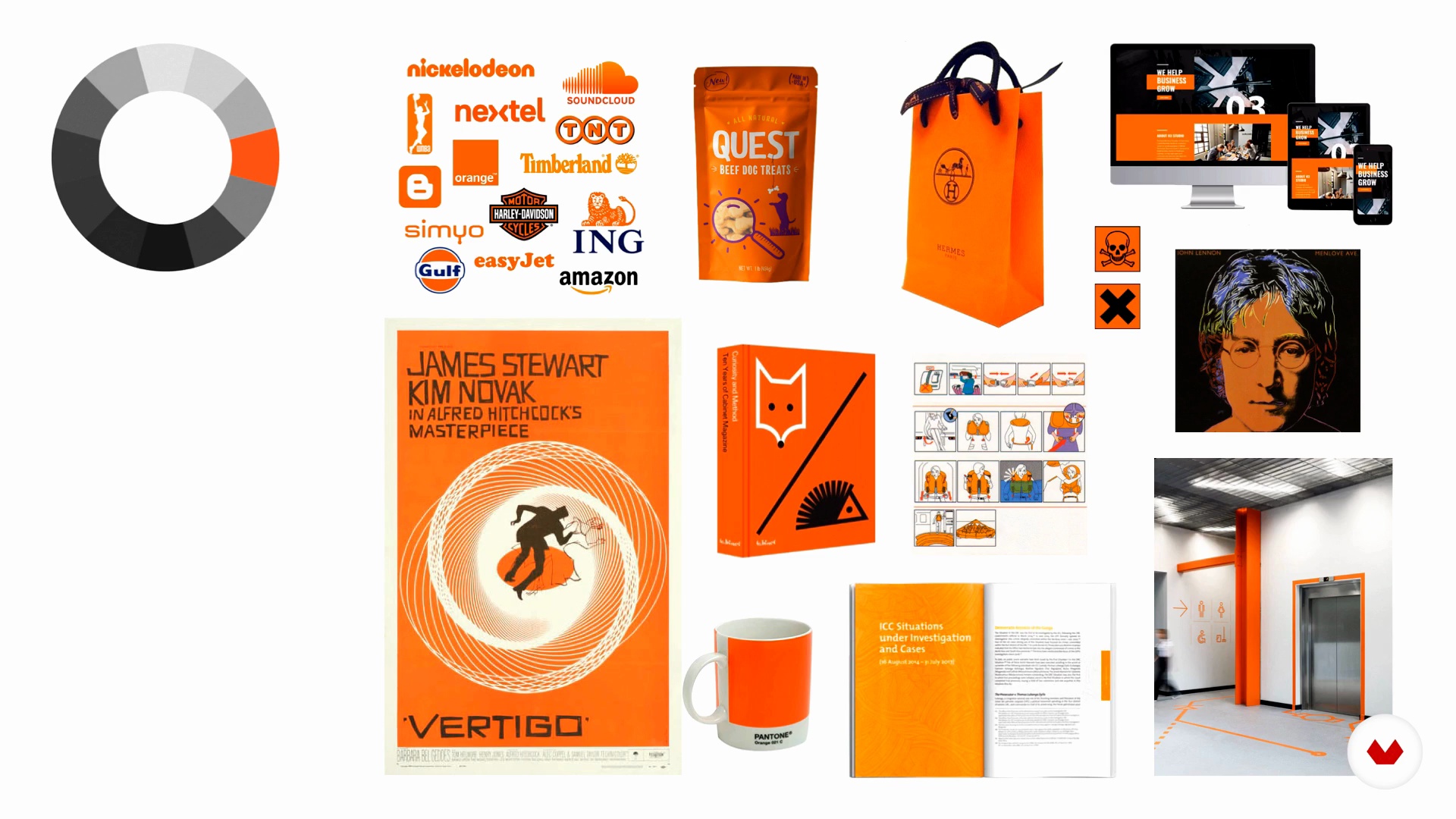
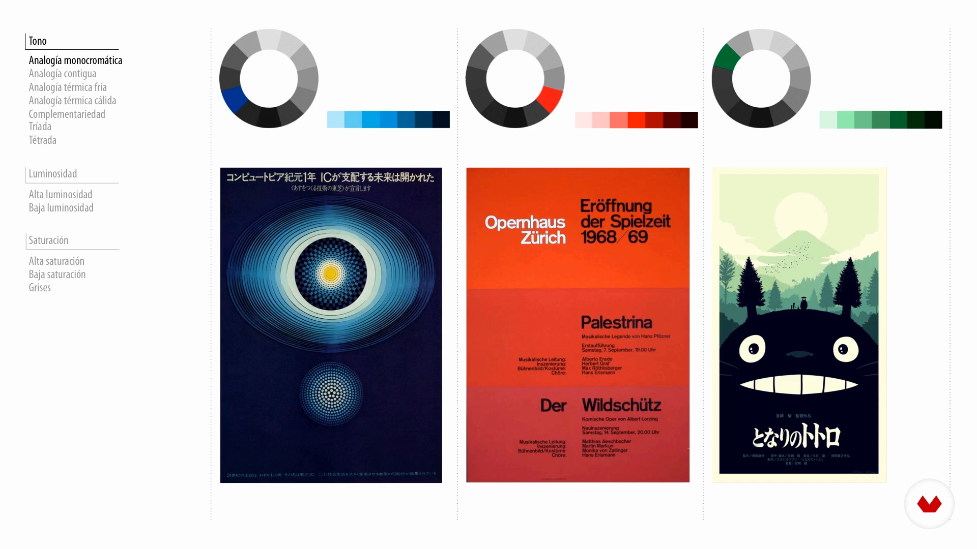
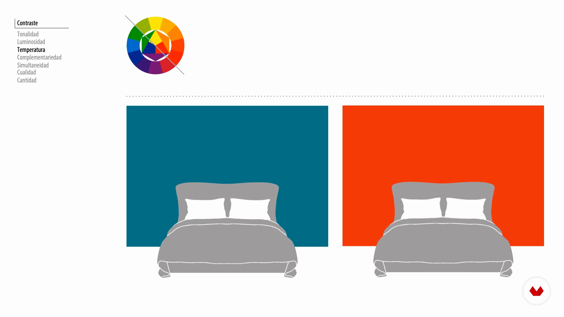
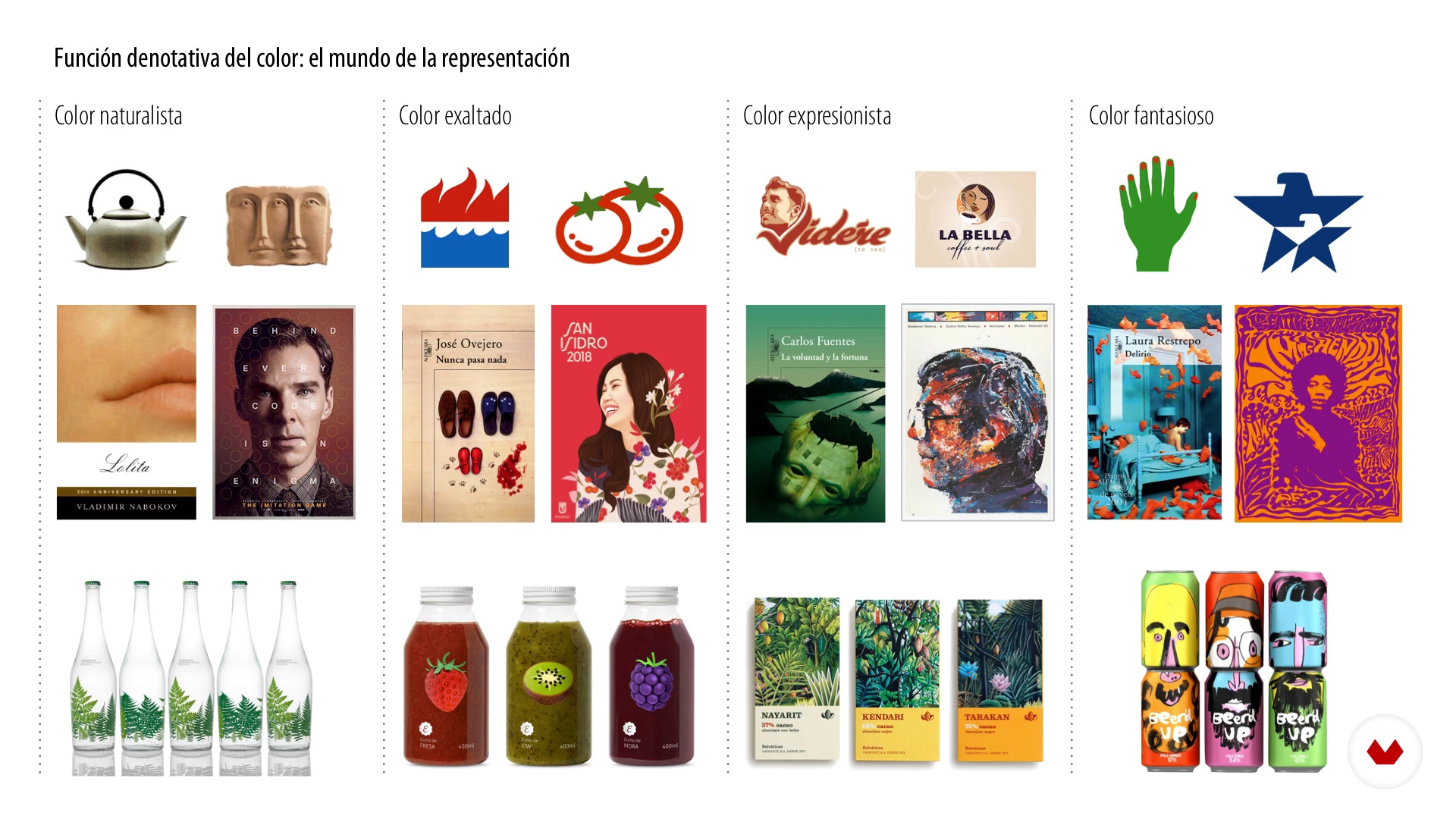
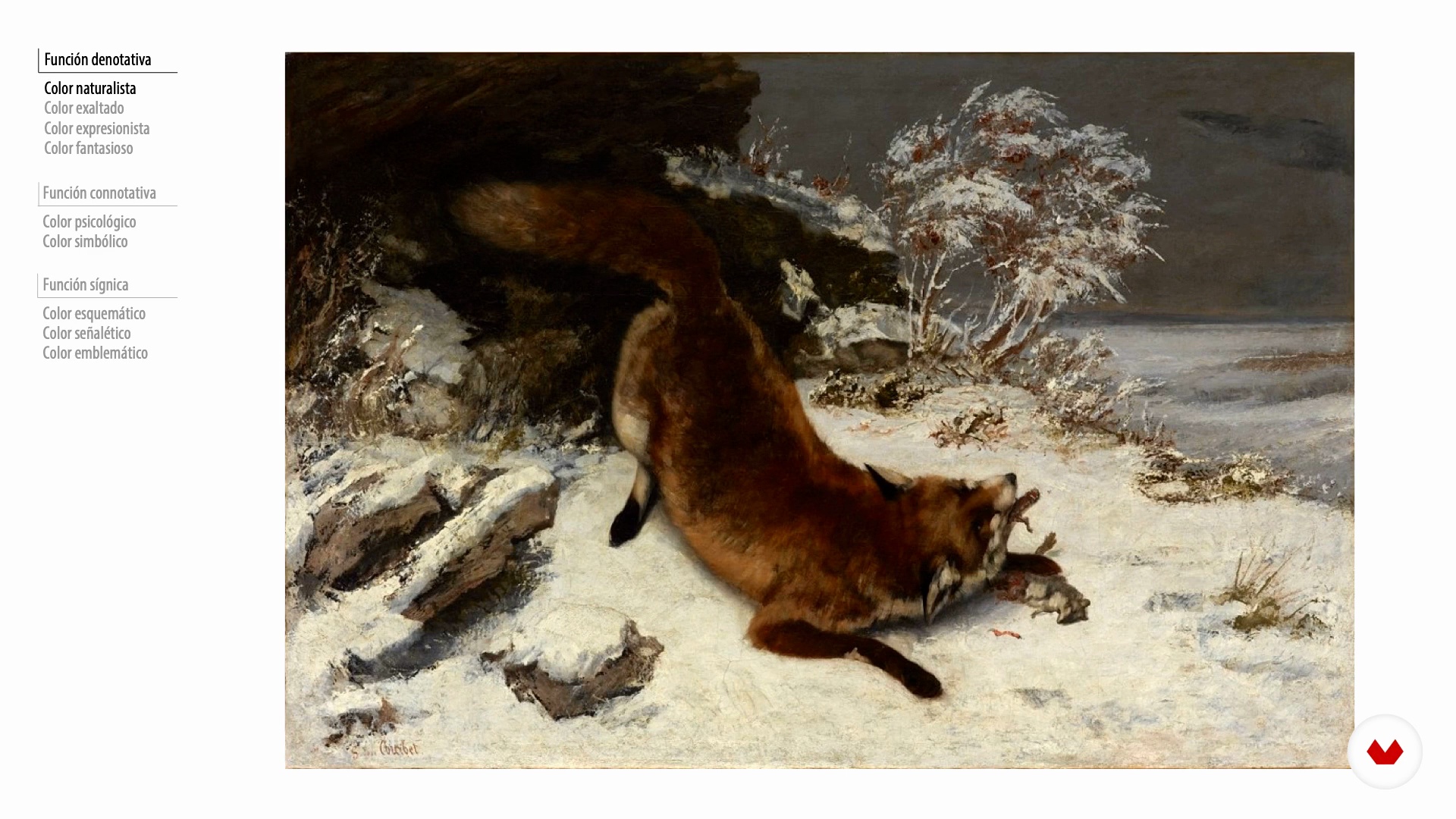
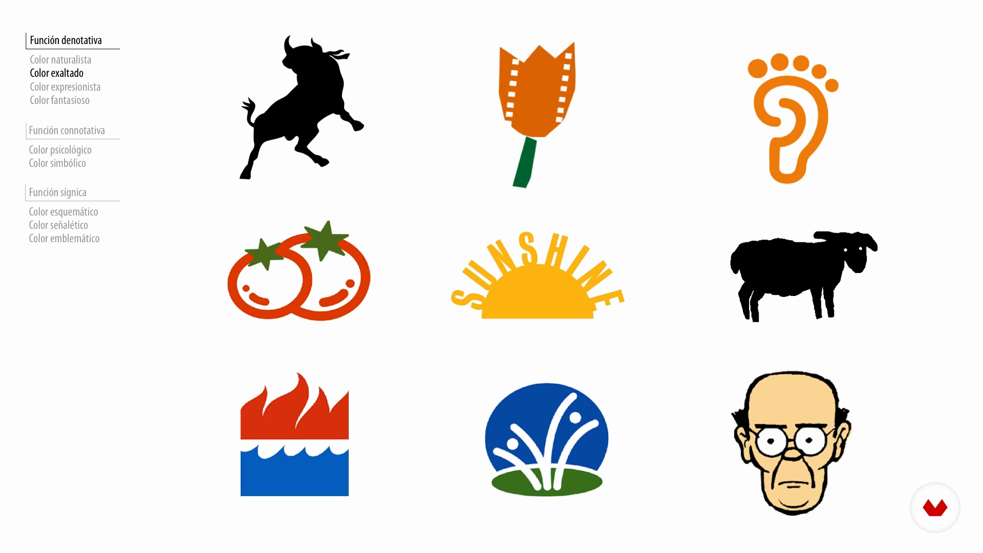
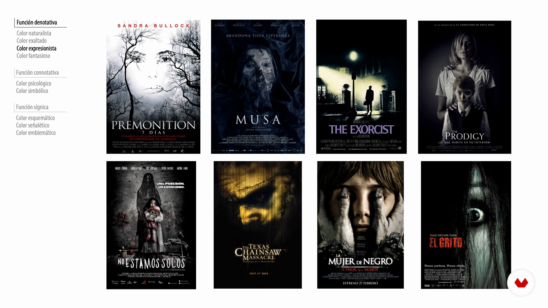
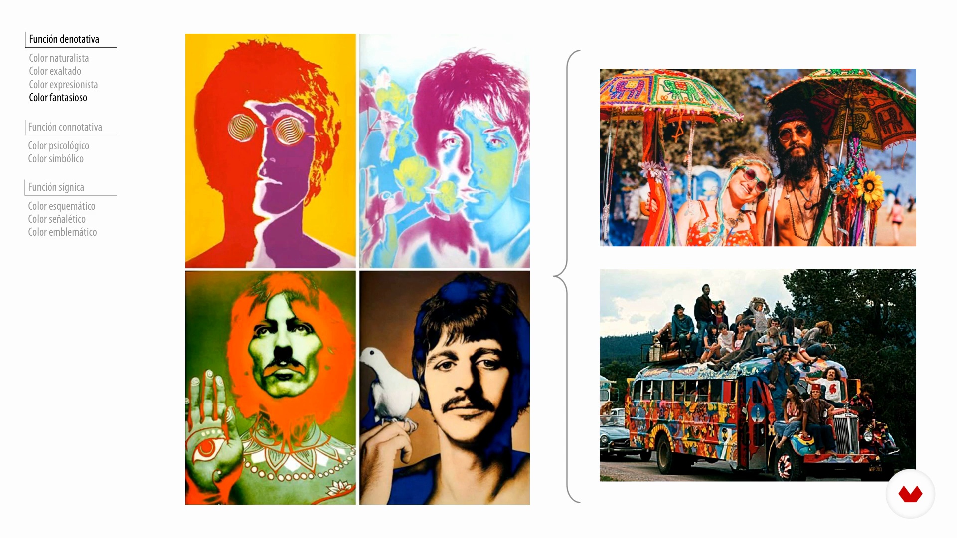
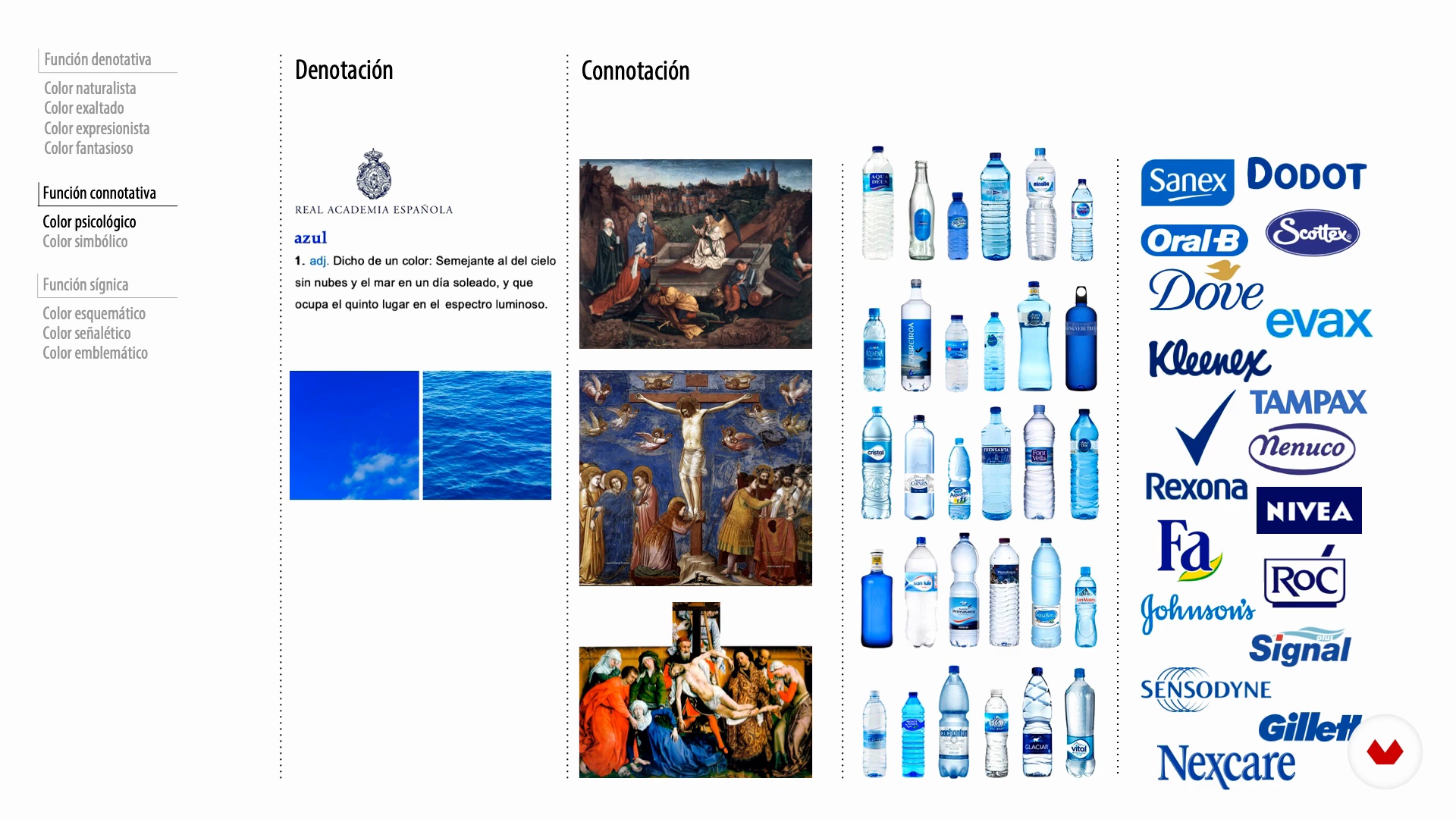
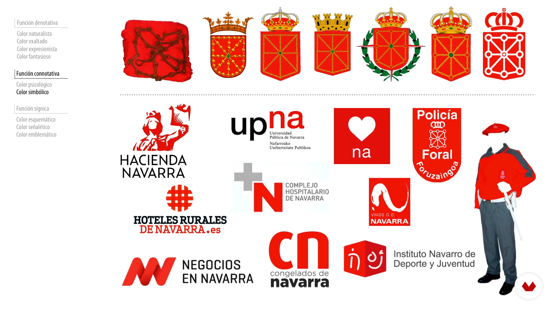
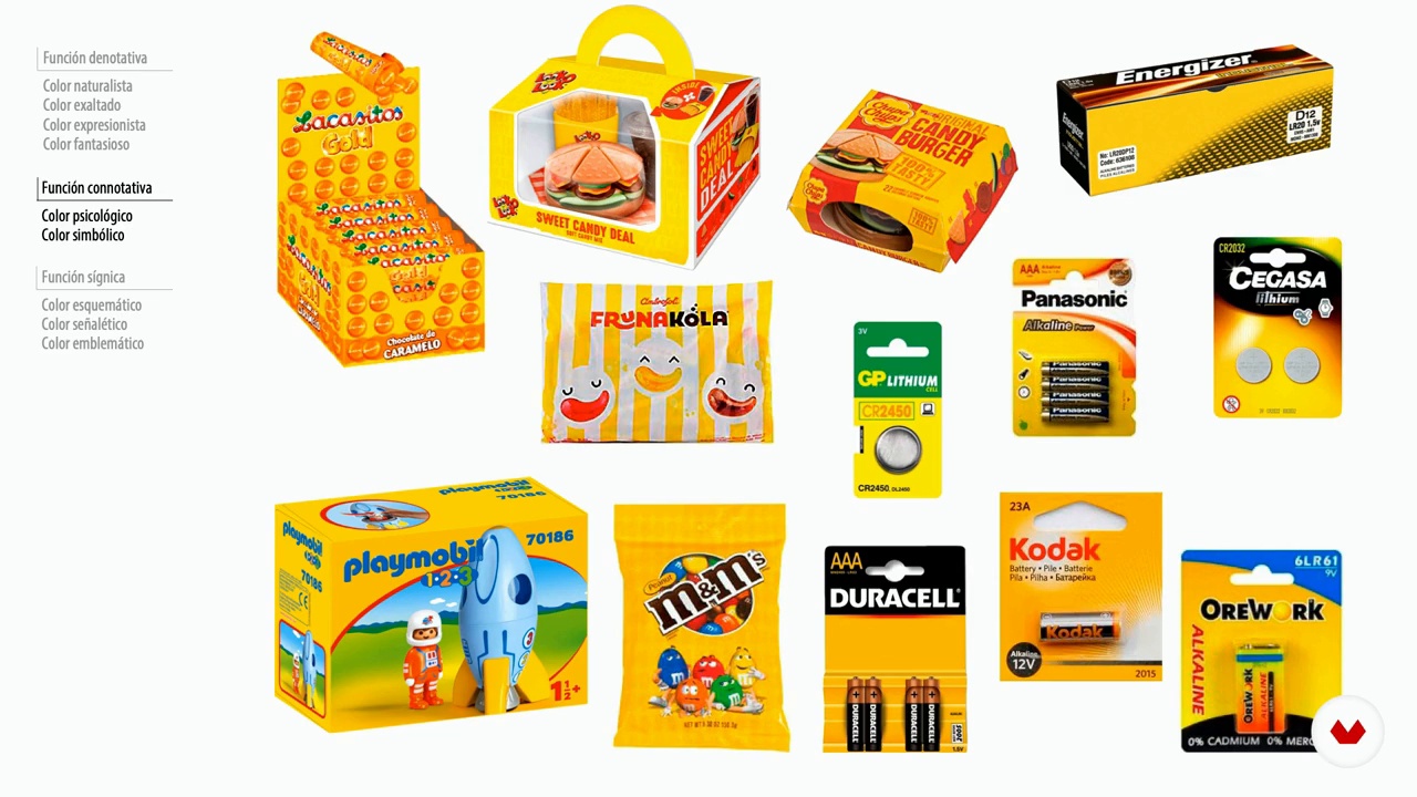
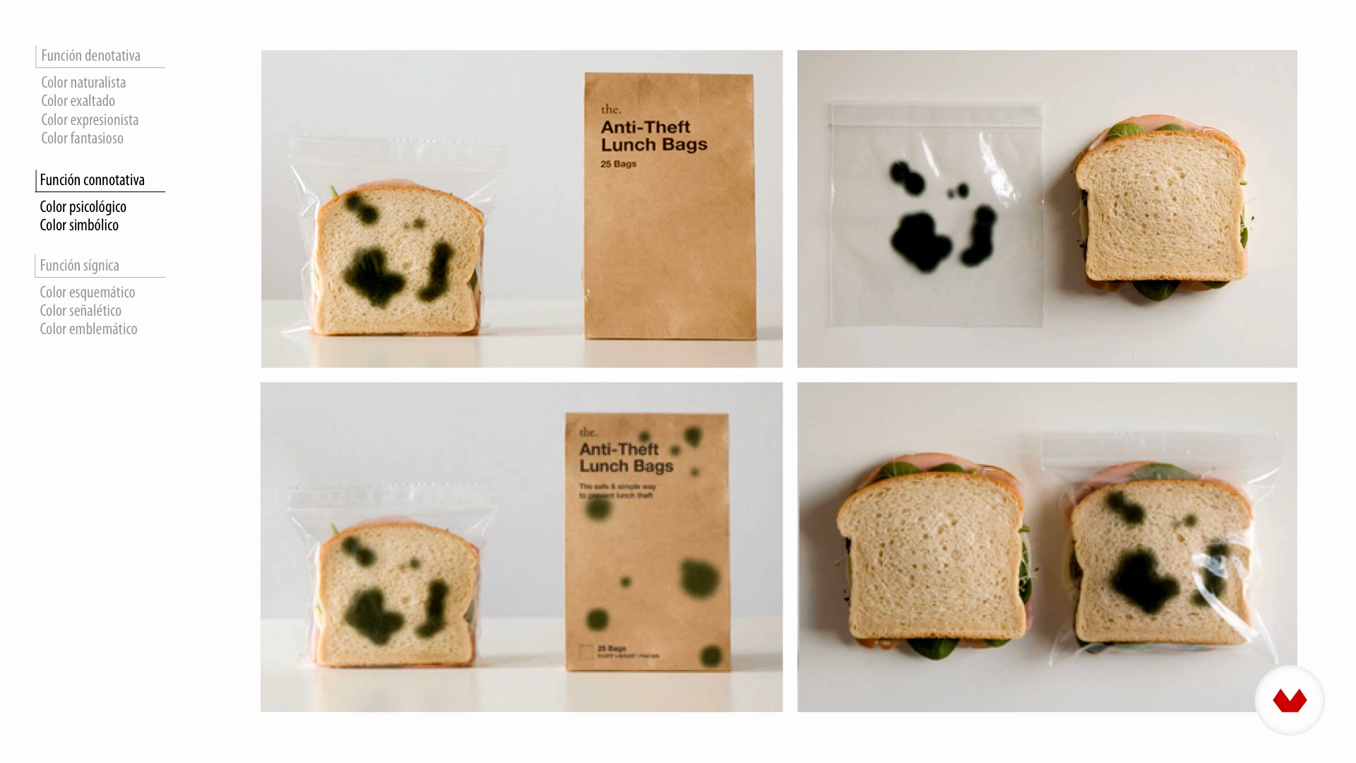
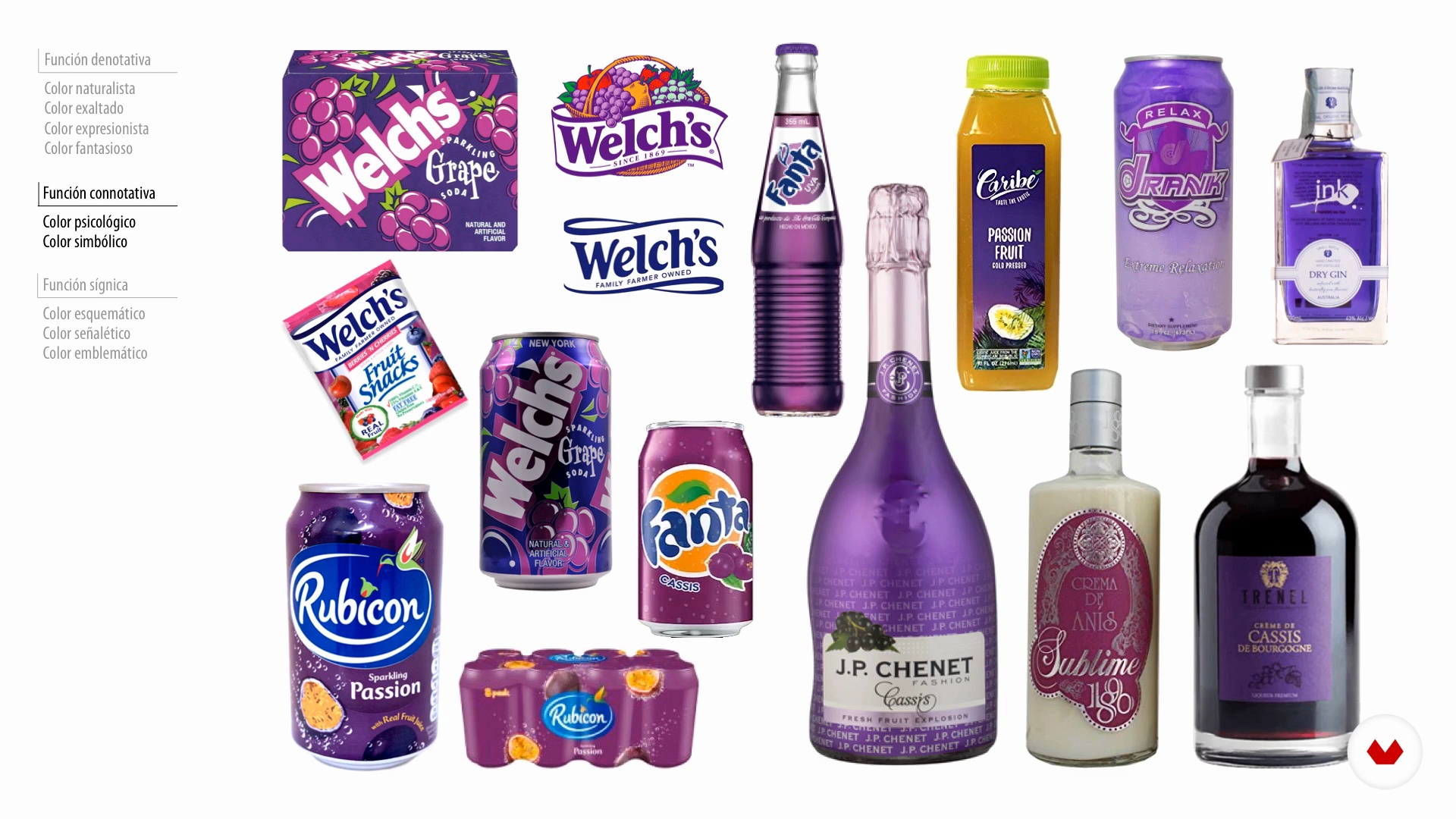
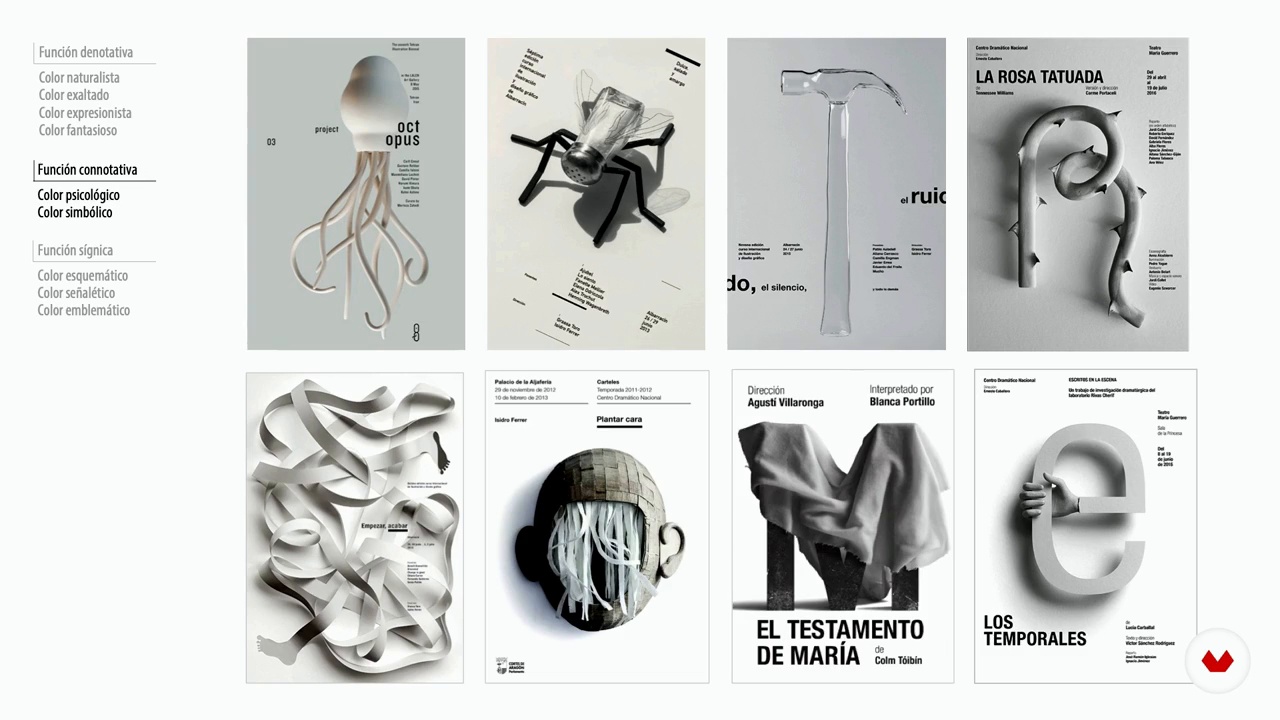
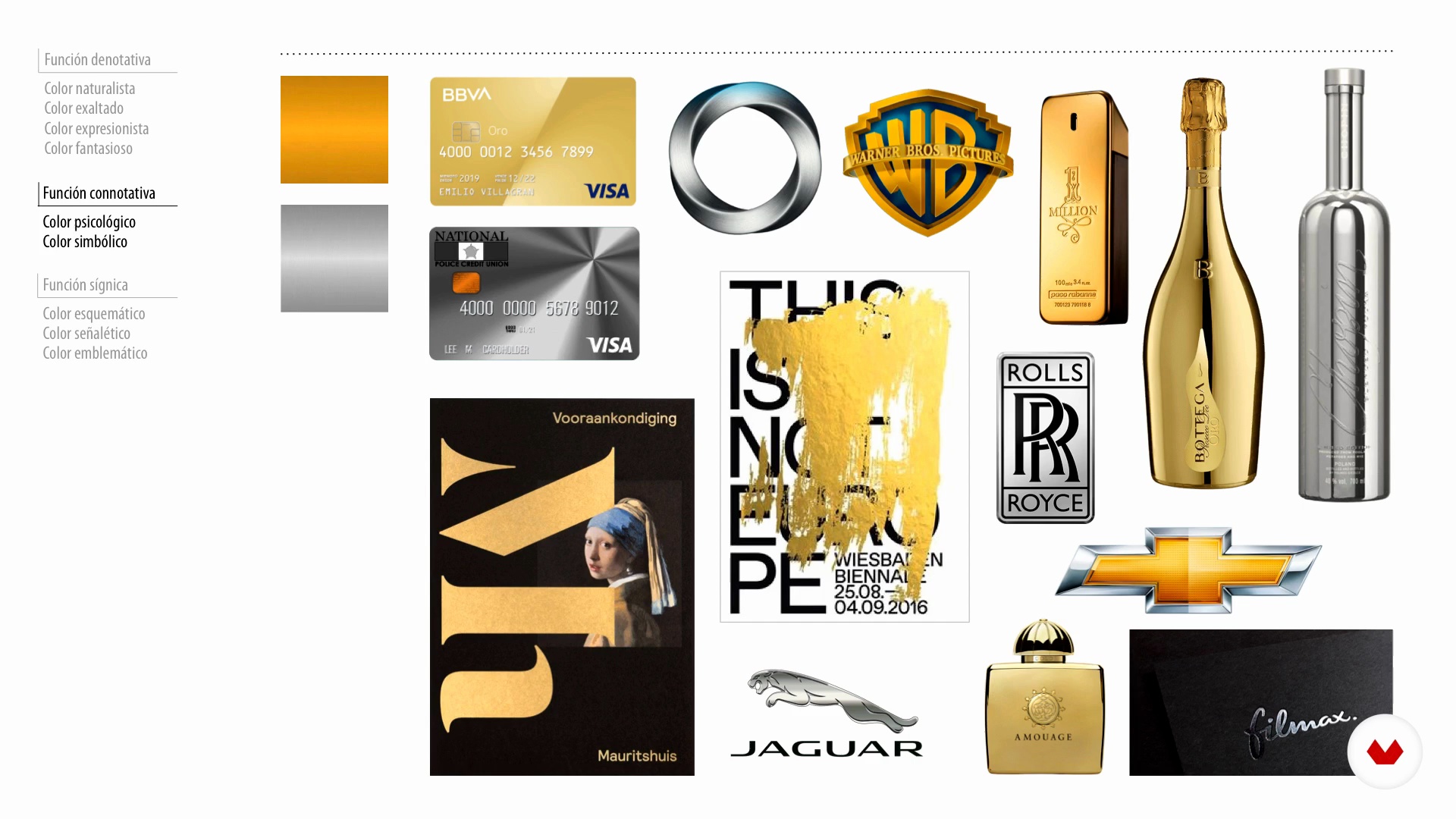
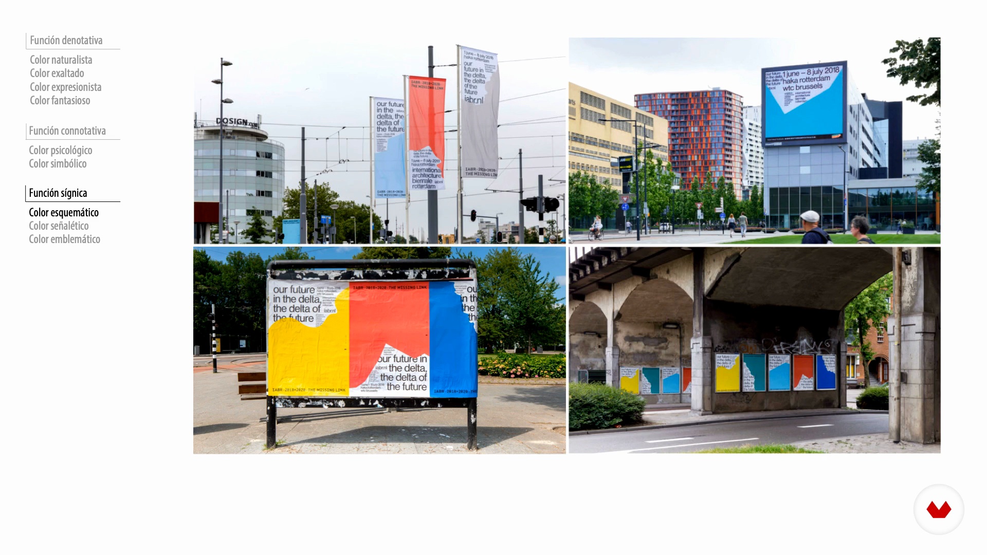
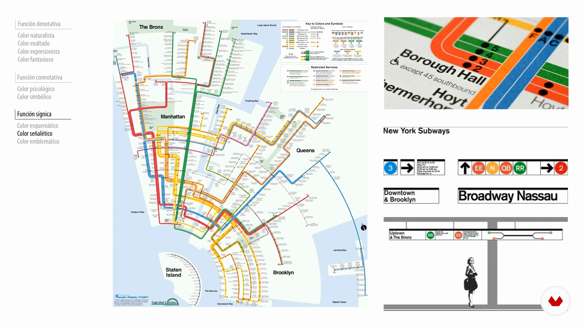
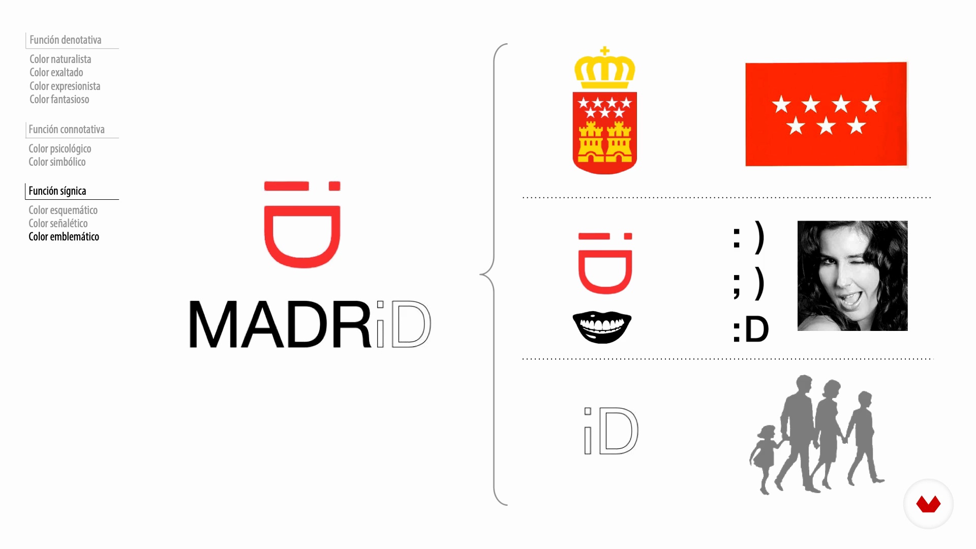
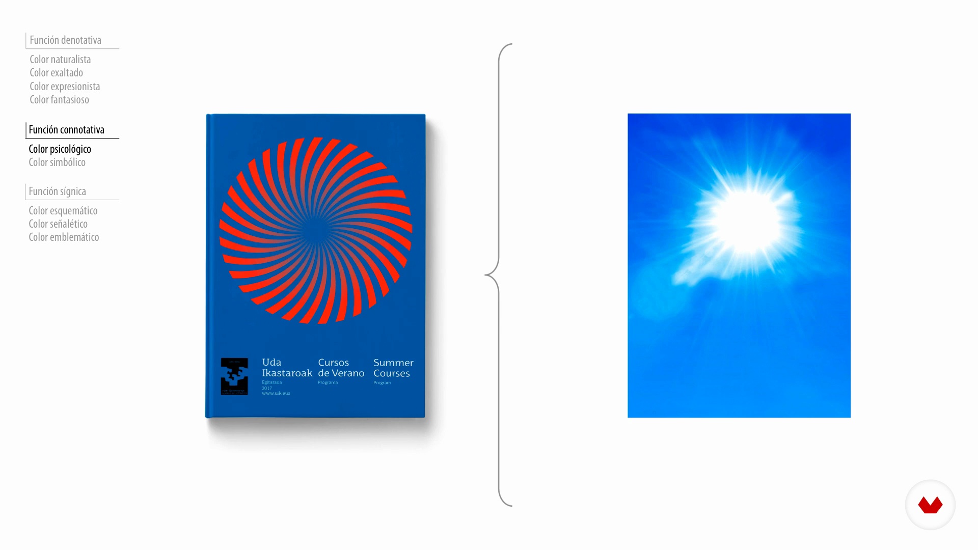
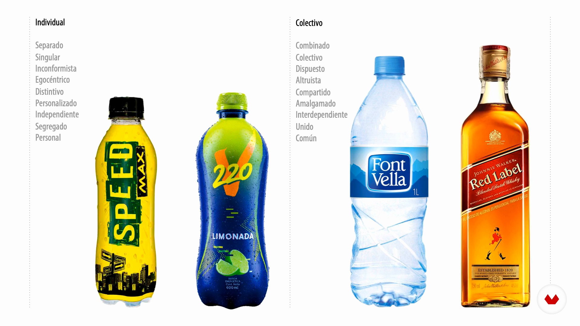
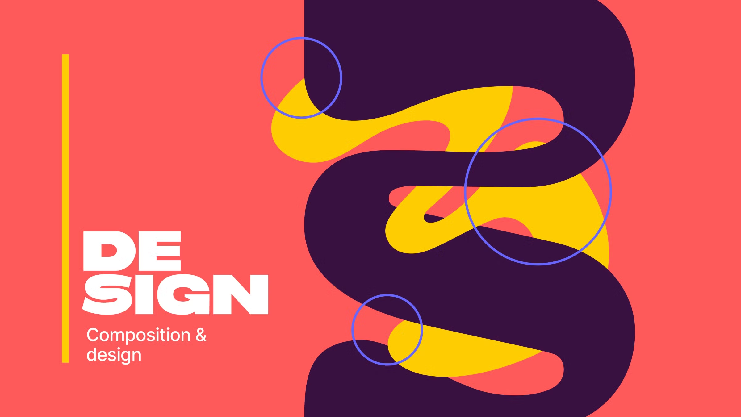
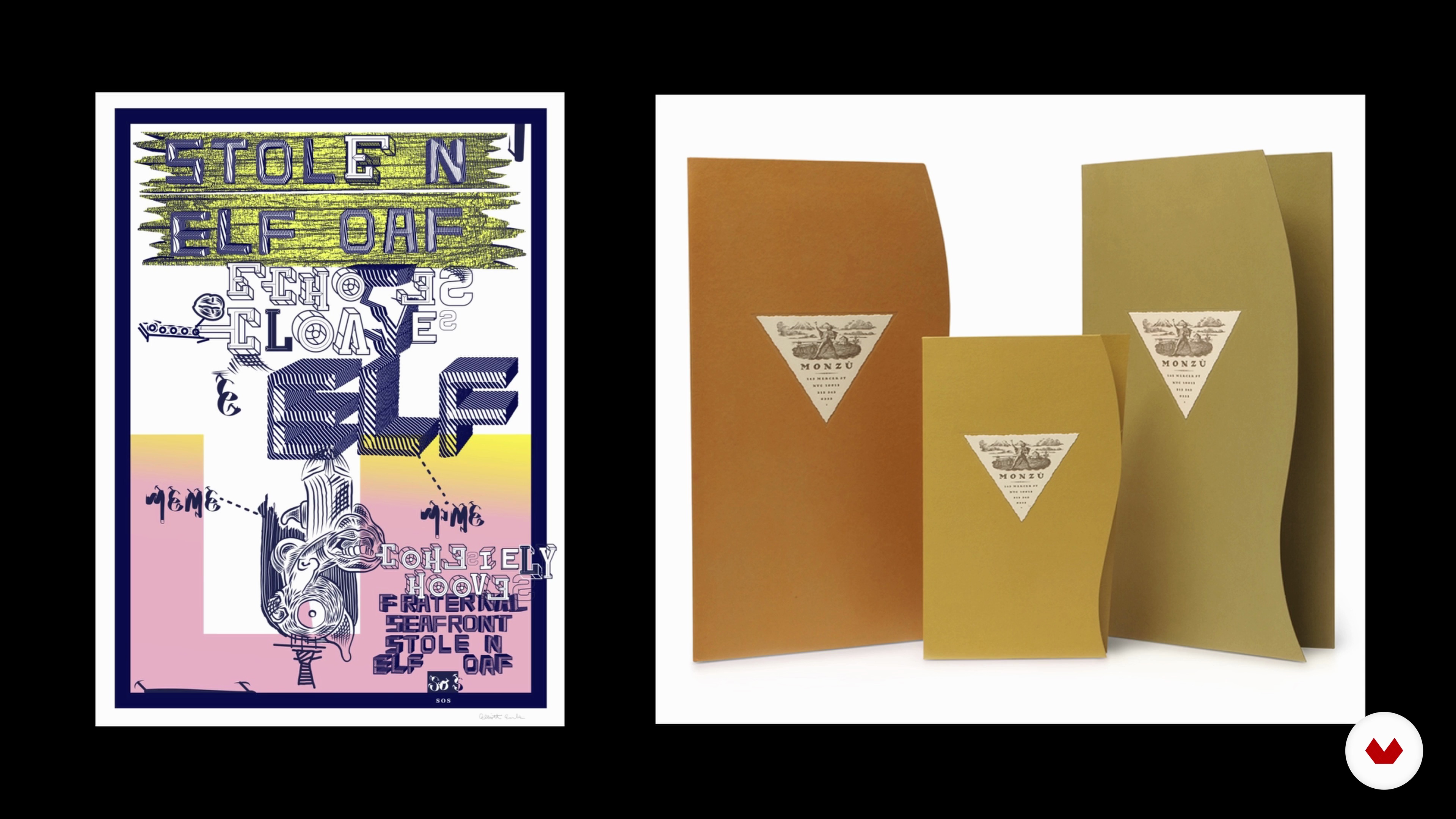
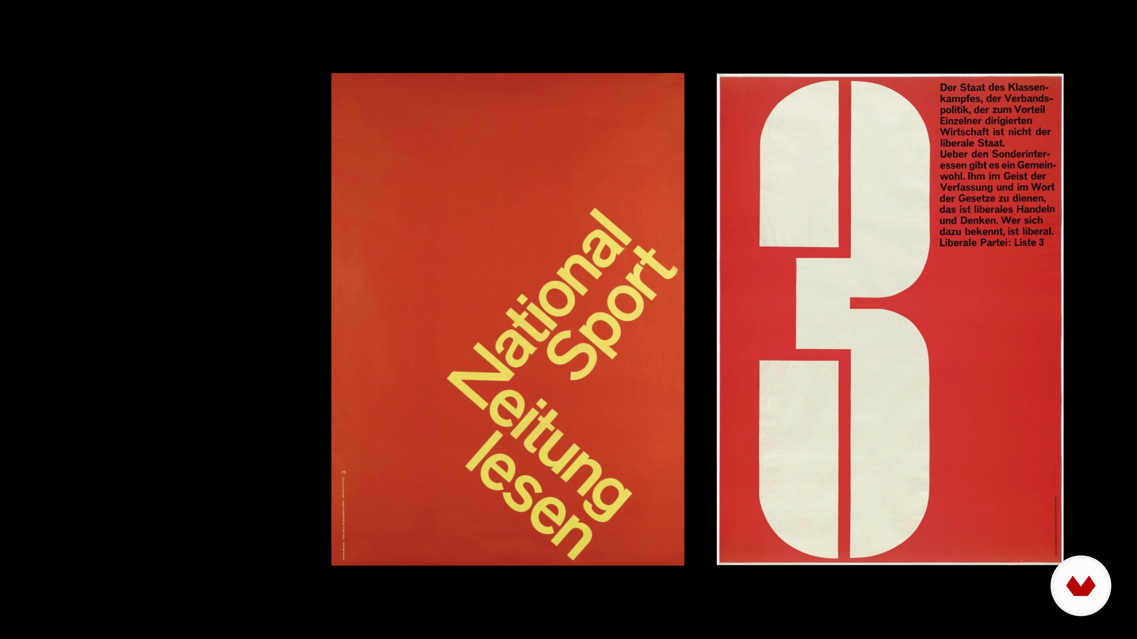
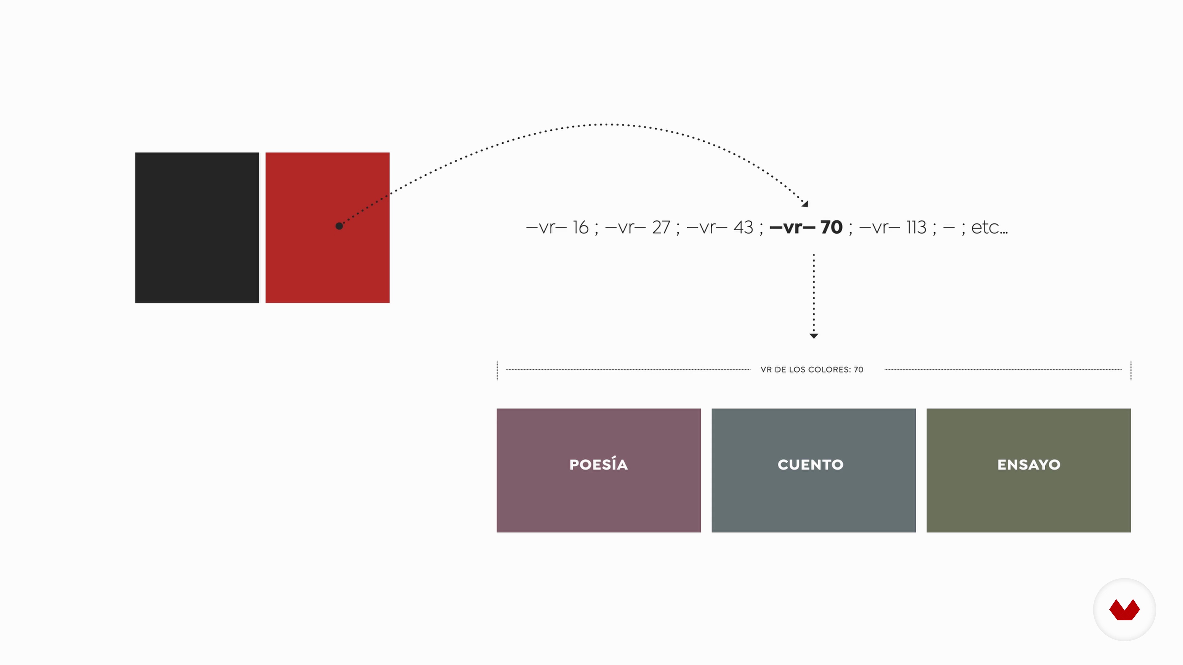
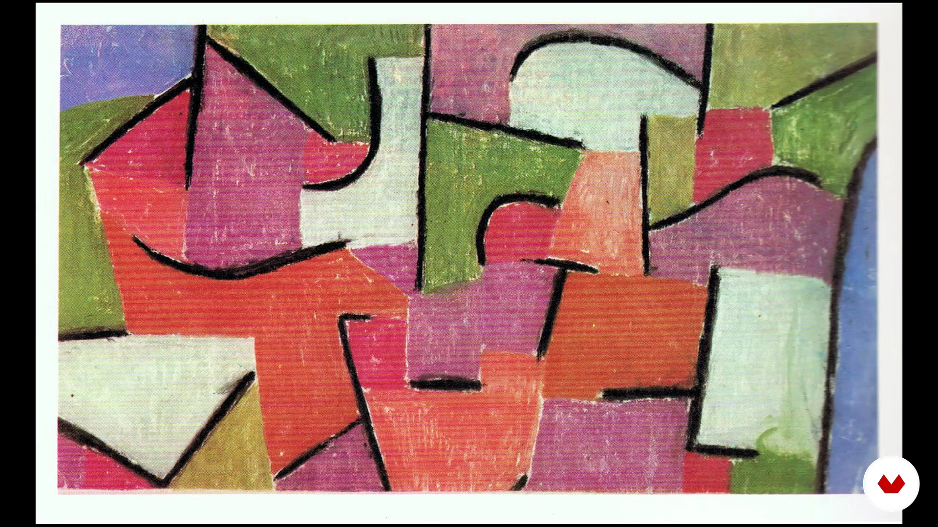
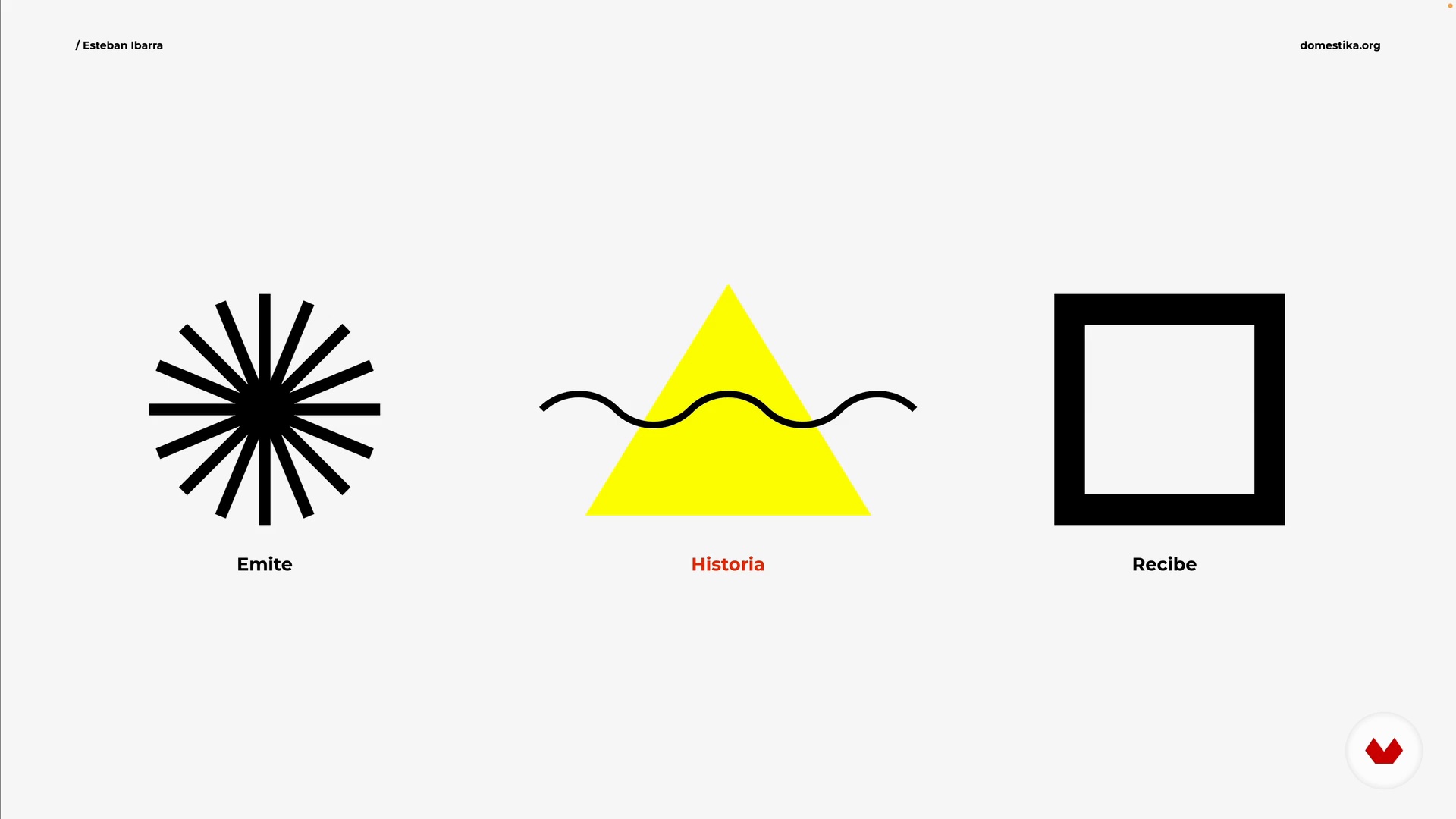
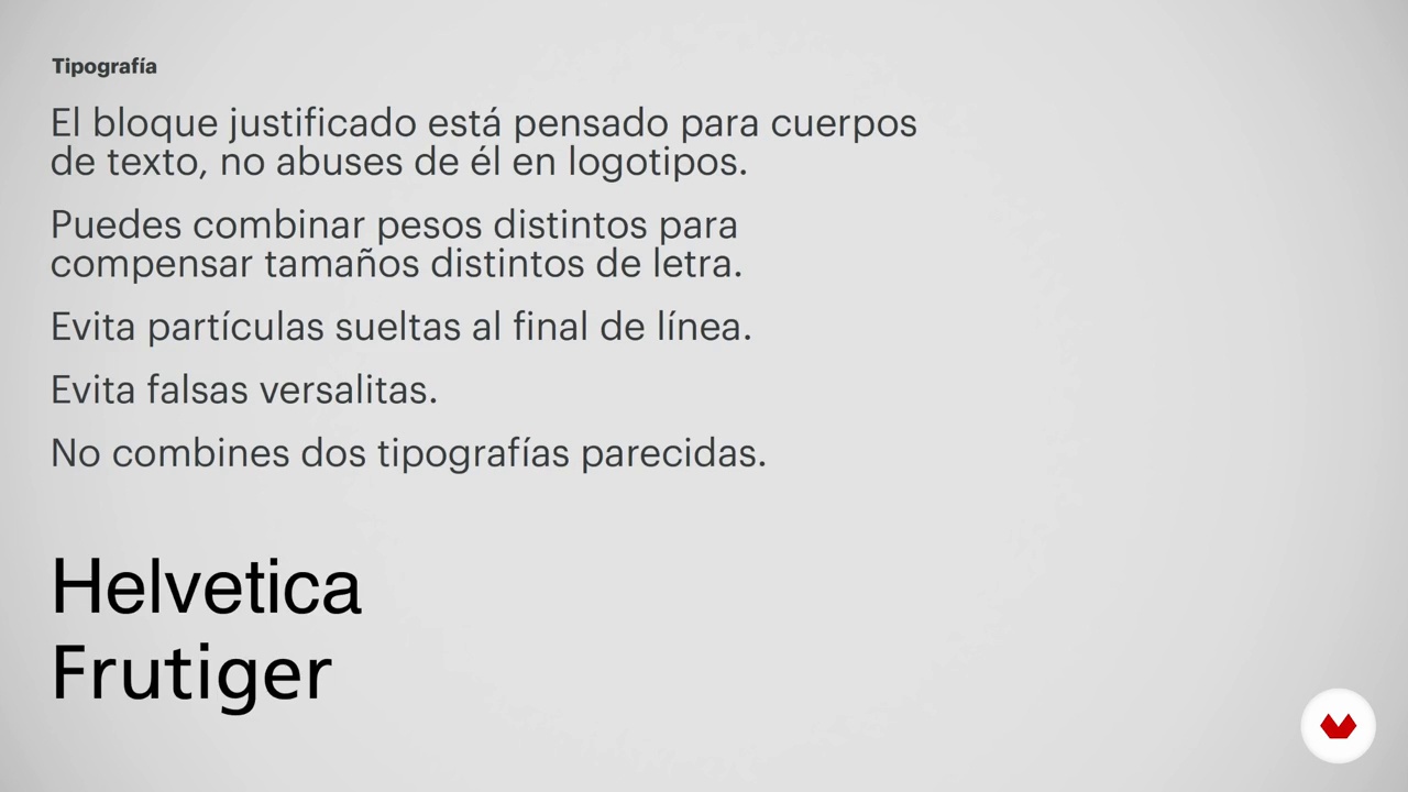
As you progress, explore the importance of color in design and its emotional impact. Learn how to apply harmony, contrast, and functional color classifications to enhance your projects. Gain key skills in composition techniques, balance, movement, and iconography. Finally, apply what you’ve learned to personal projects, creating coherent and lasting visual identities. This course offers you the opportunity to transform your creativity into impactful graphic artworks, guided by renowned experts in the field of graphic design.
What will you learn in this specialization?


- 99% positive reviews (368)
- 29,359 students
- 104 lessons (18h 2m)
- 127 additional resources (53 files)
- Online and at your own pace
- Audio: Spanish, German, English, French, Indonesian, Italian, Dutch, Polish, Portuguese, Romanian, Turkish
- Spanish · English · Portuguese · German · French · Italian · Polish · Dutch · Turkish · Romanian · Indonesian
- Level: Beginner
- Unlimited access forever
What is this course's project?
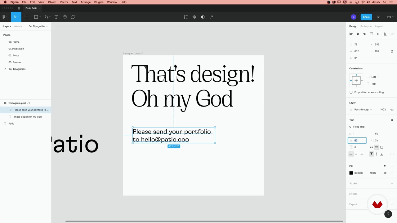
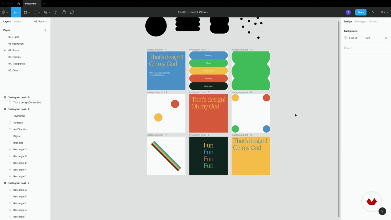
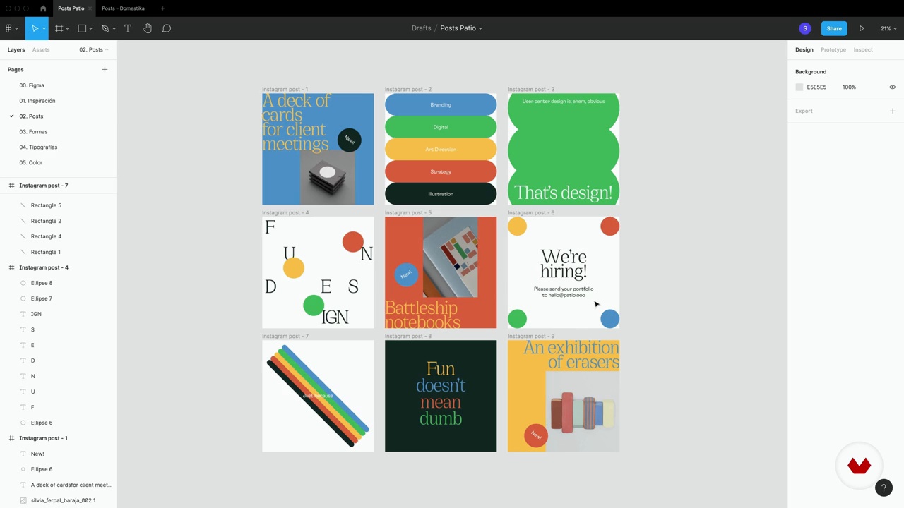
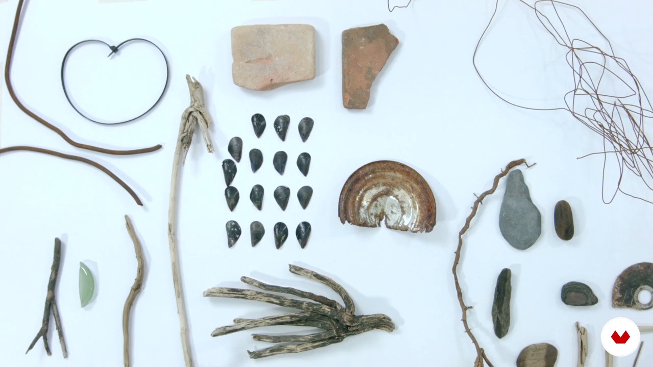
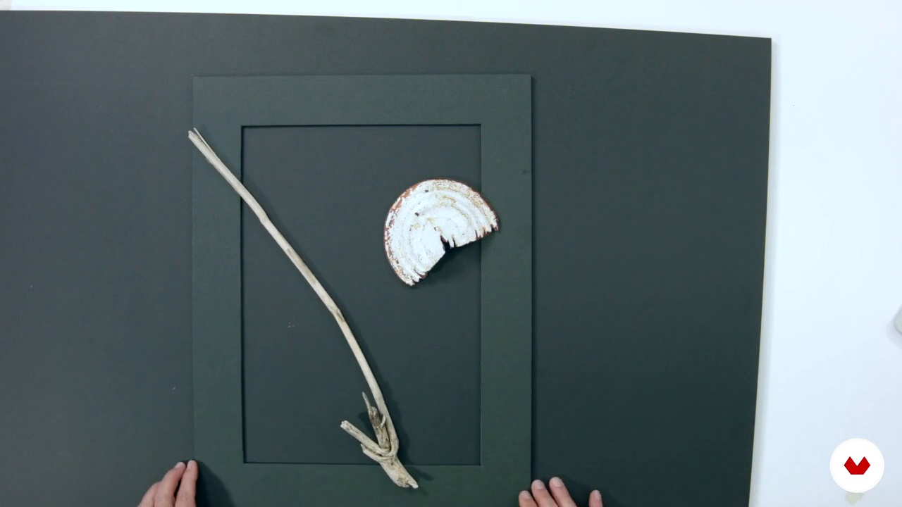
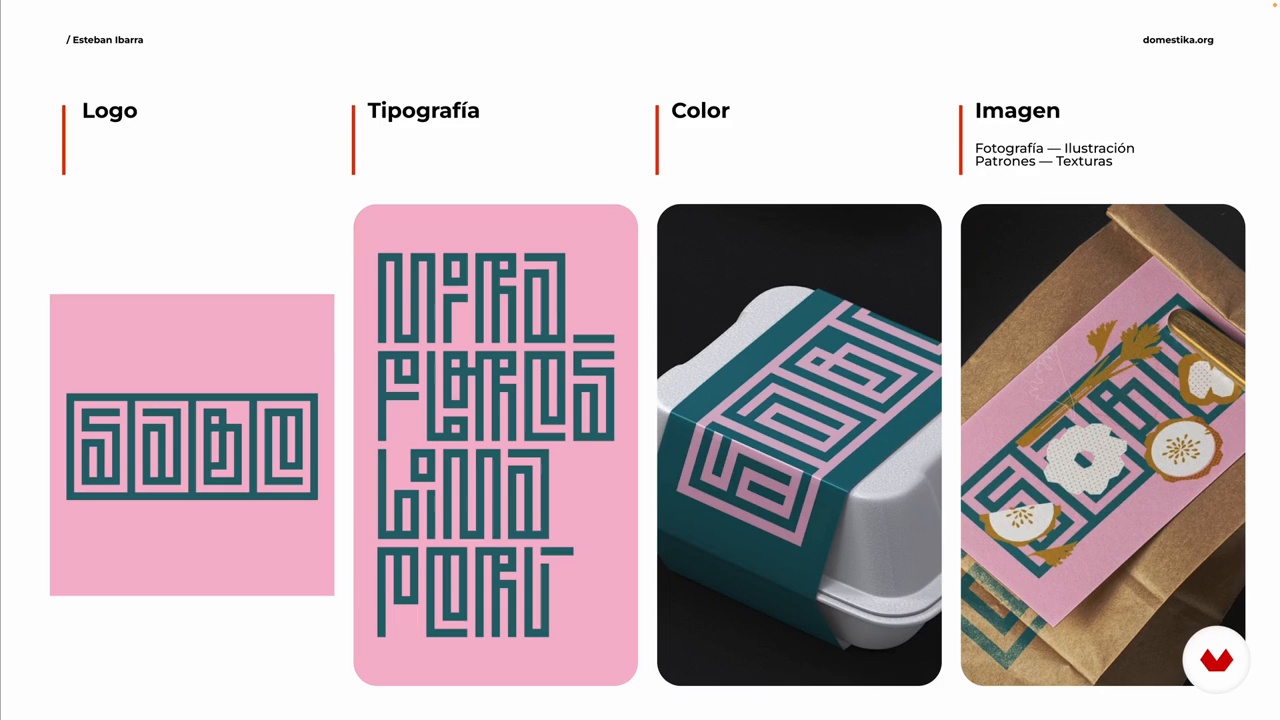
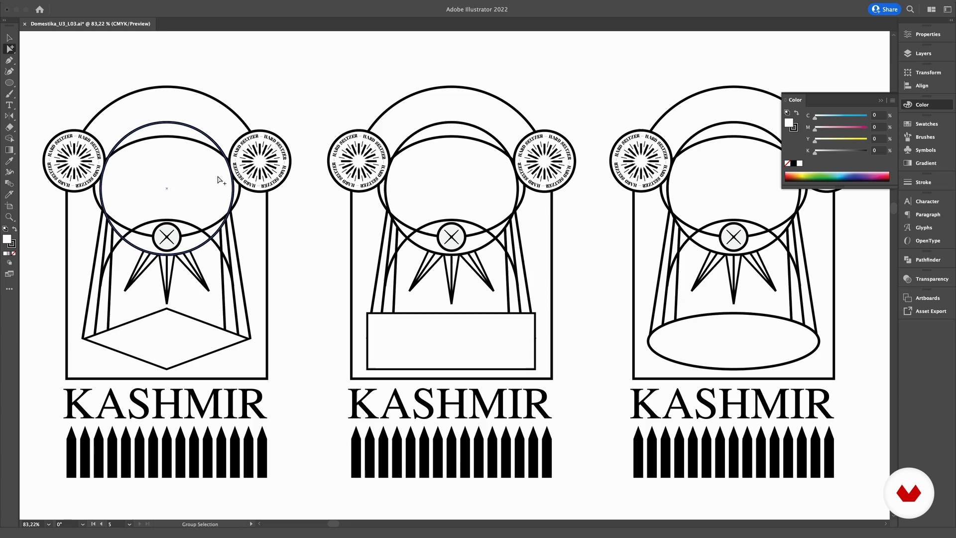
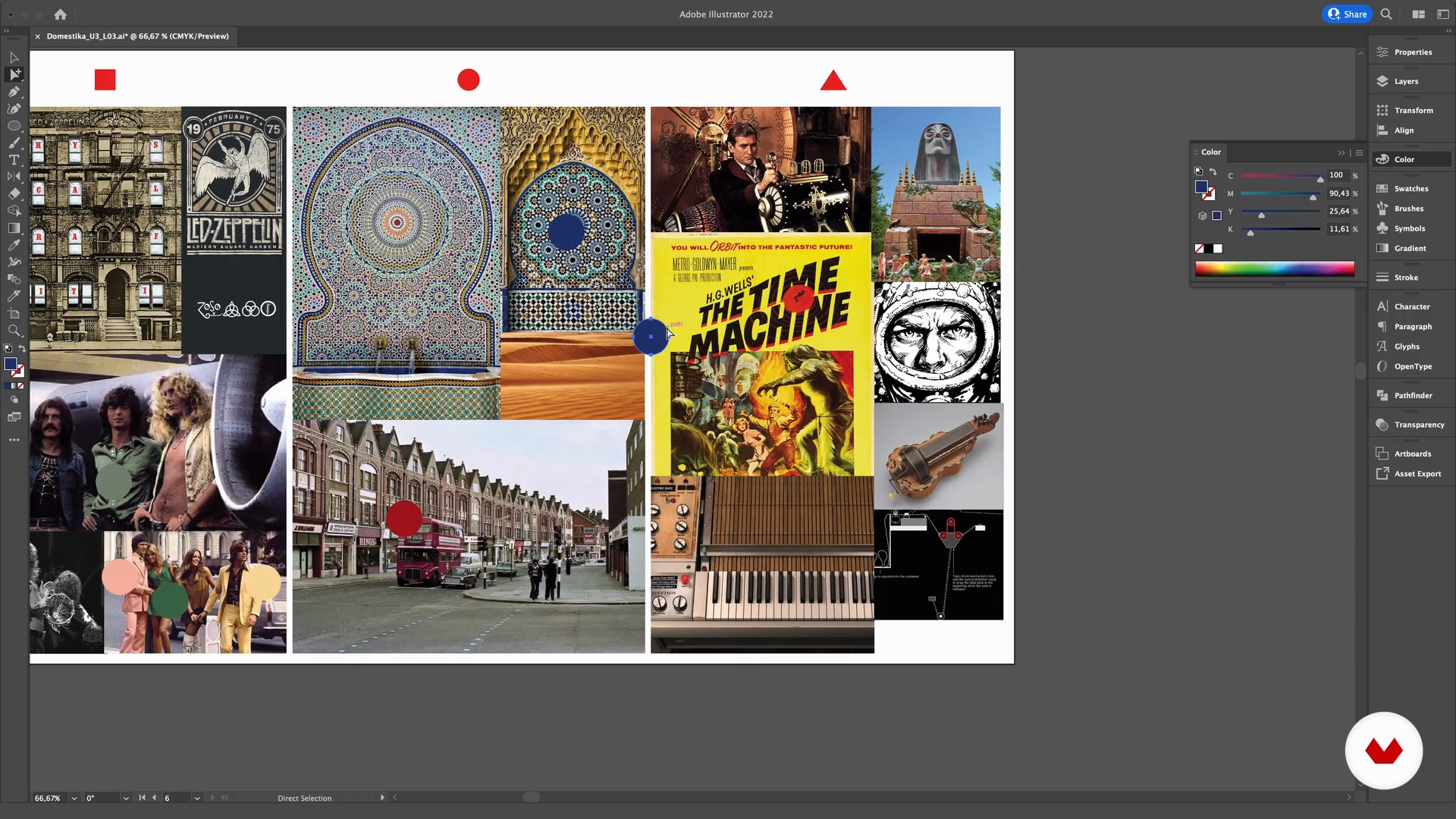
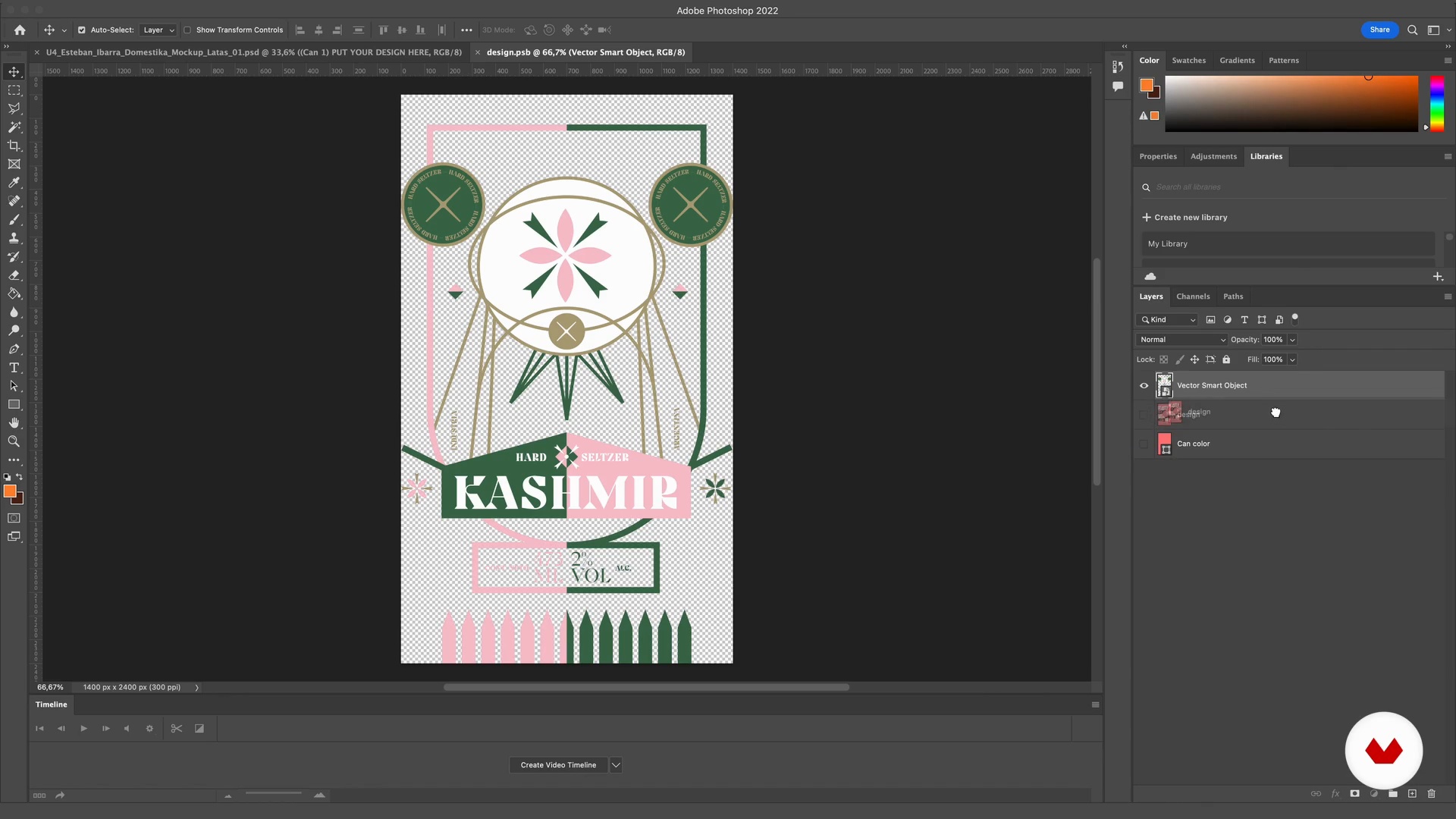
You will design a series of images that express your visual universe in template format for Instagram. You will explore key concepts such as shape, typography, color and composition to develop a striking visual project based on your imagination and creativity.
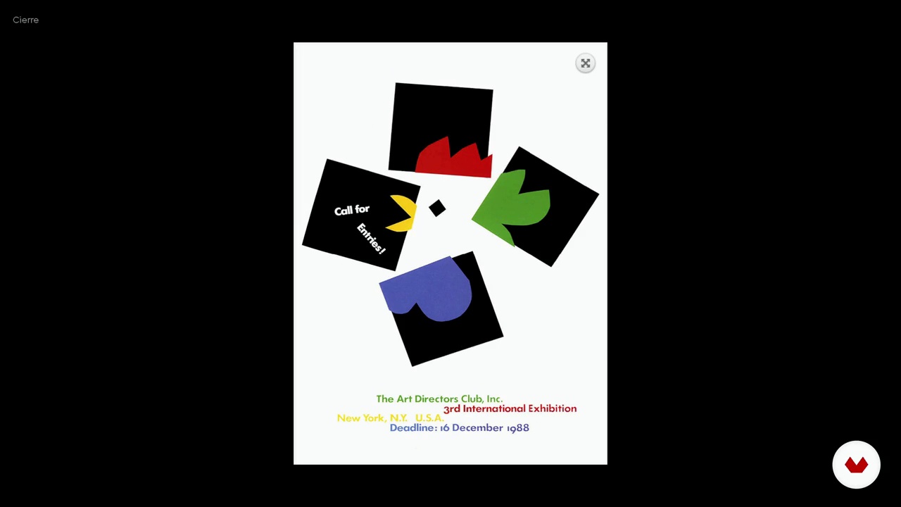
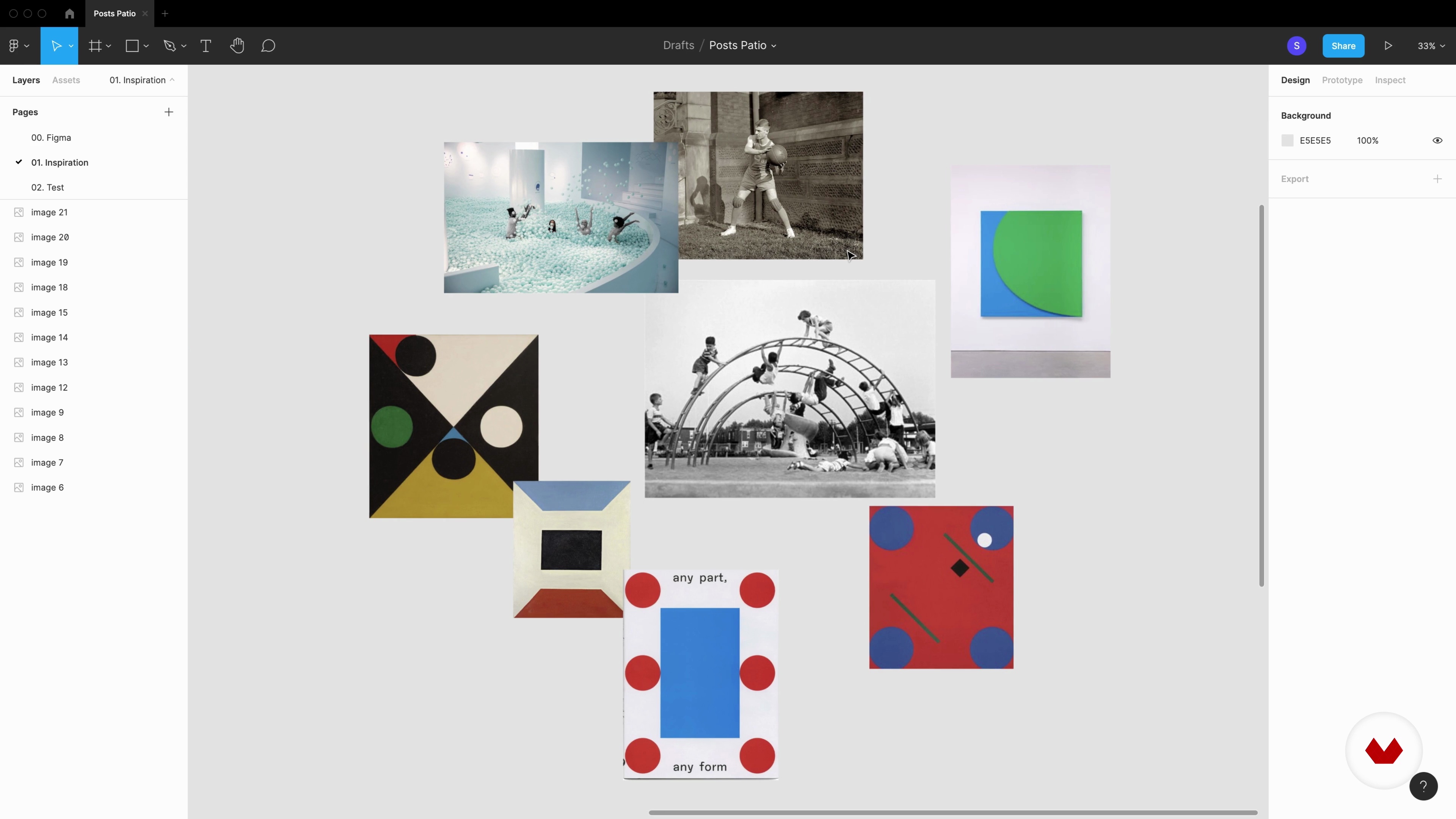
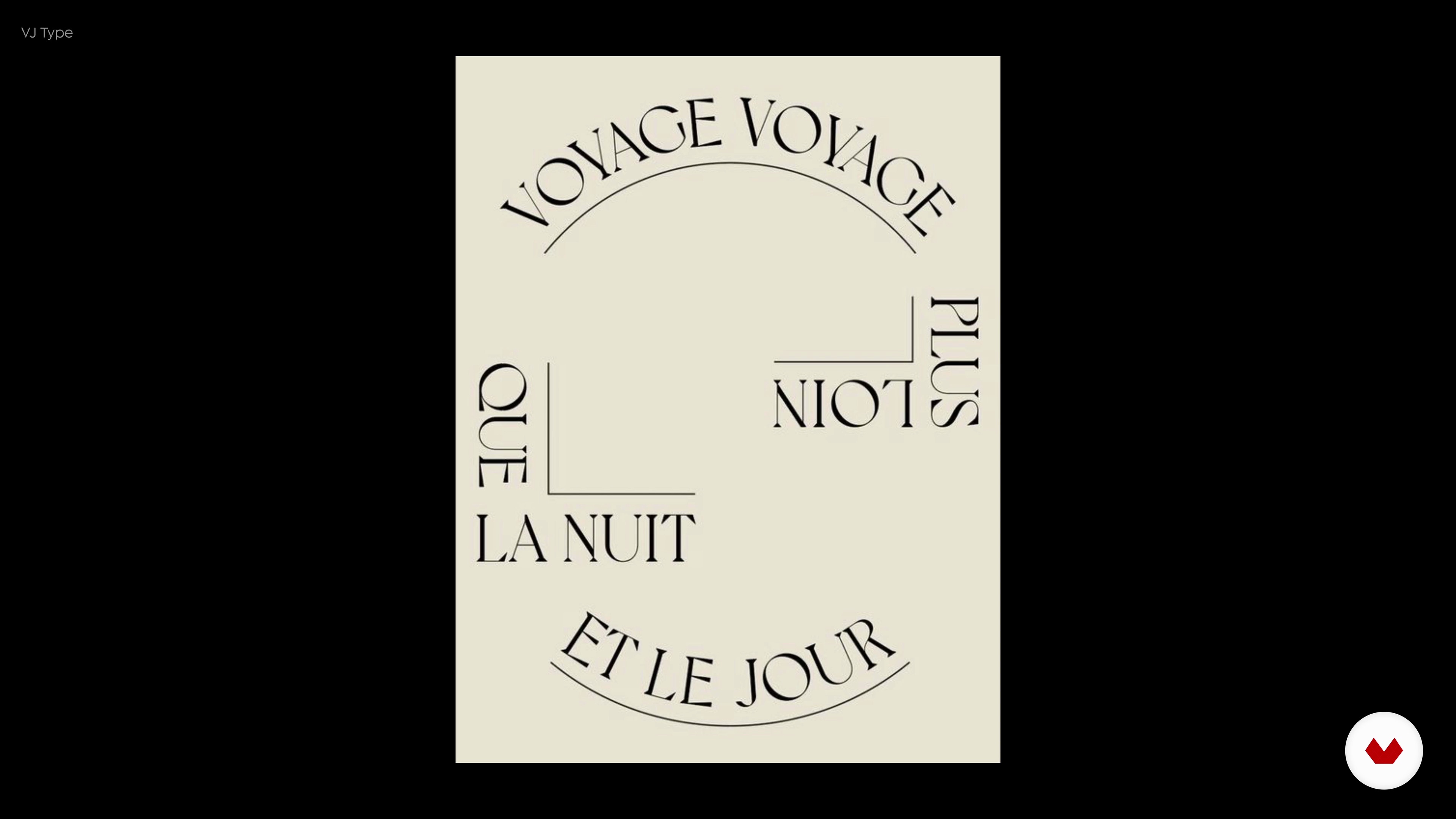
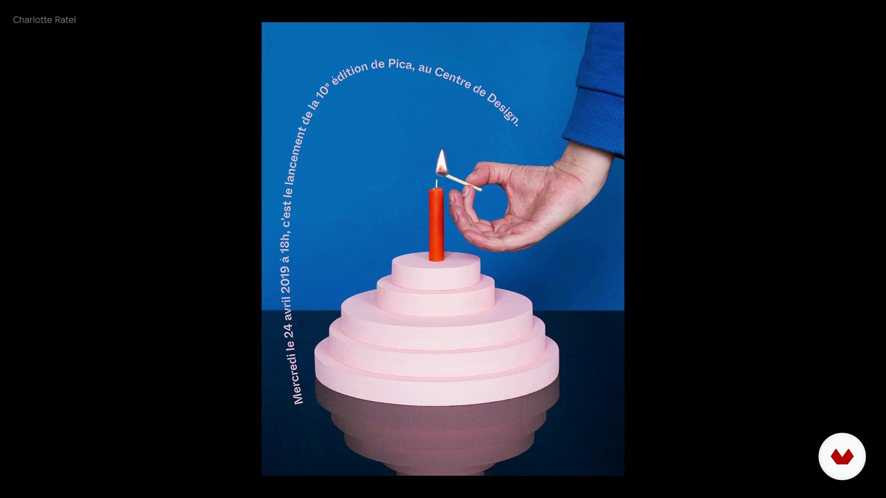
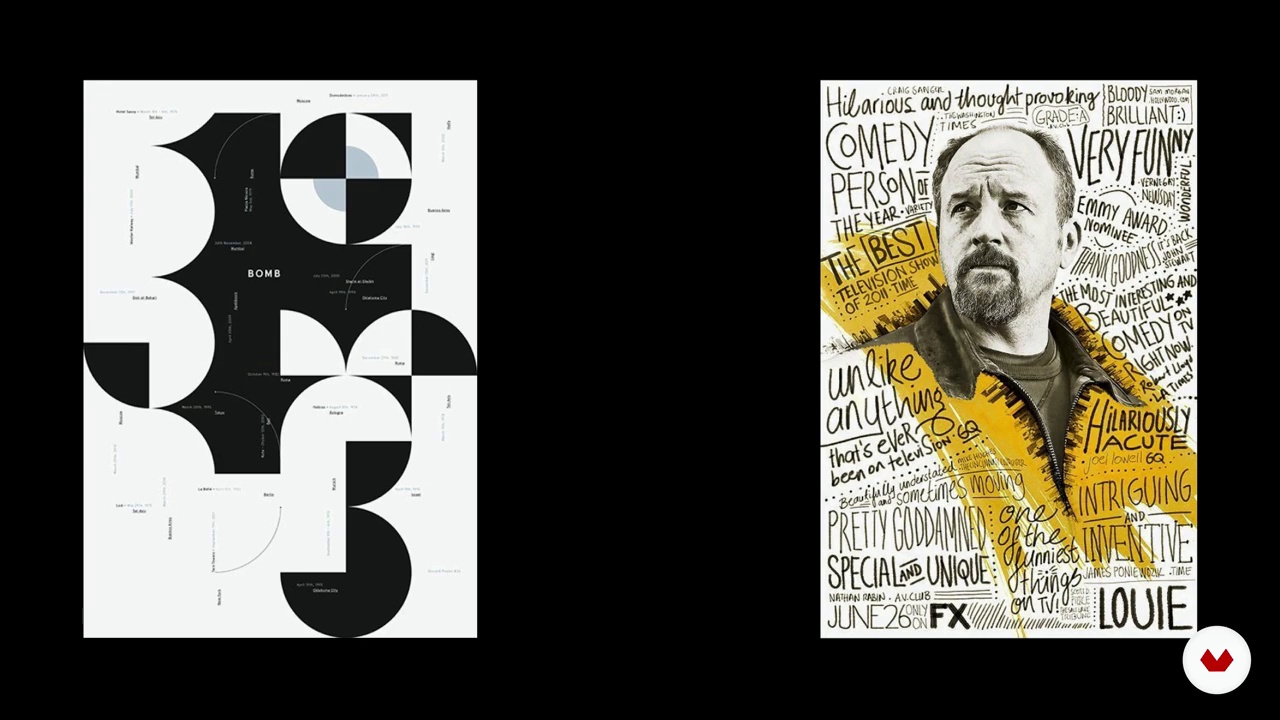
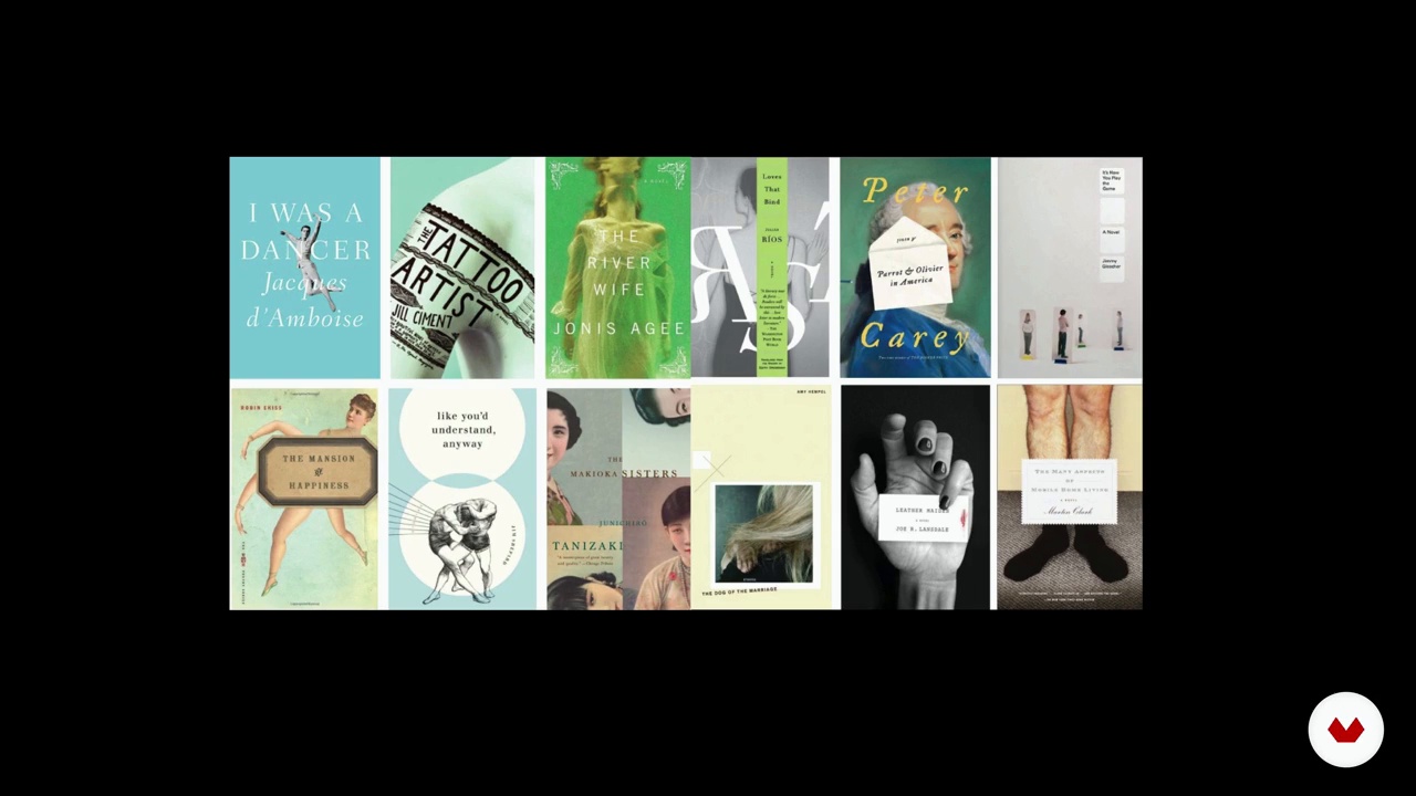
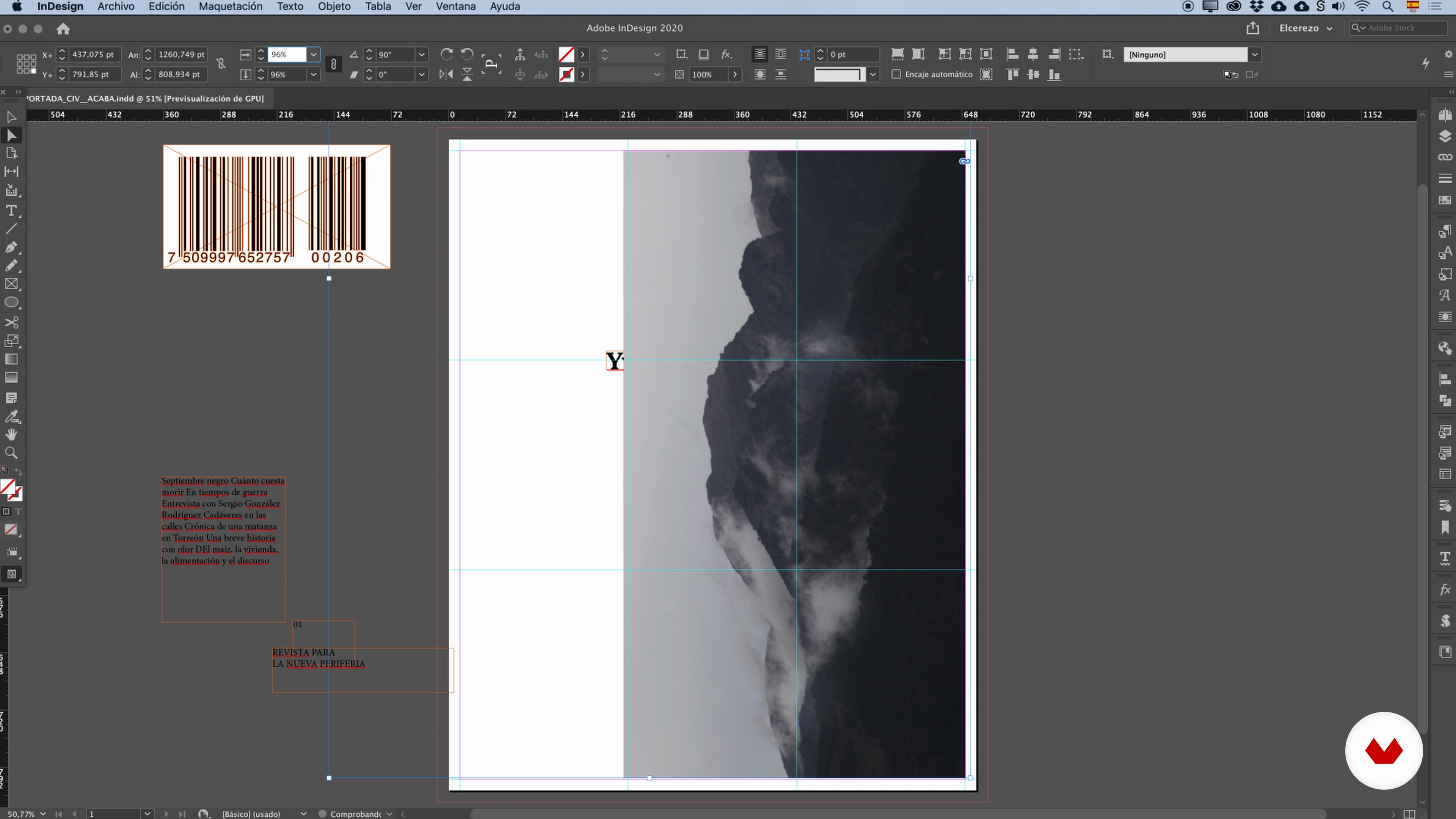
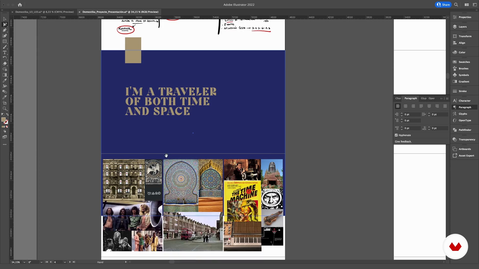
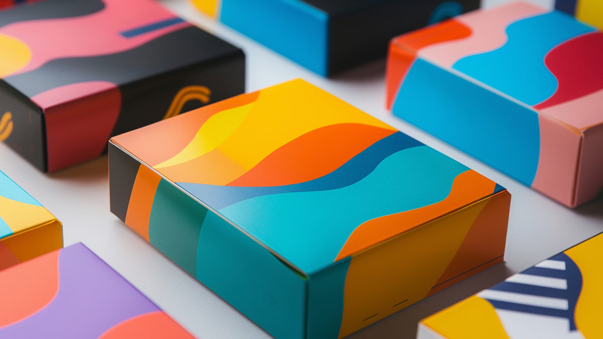
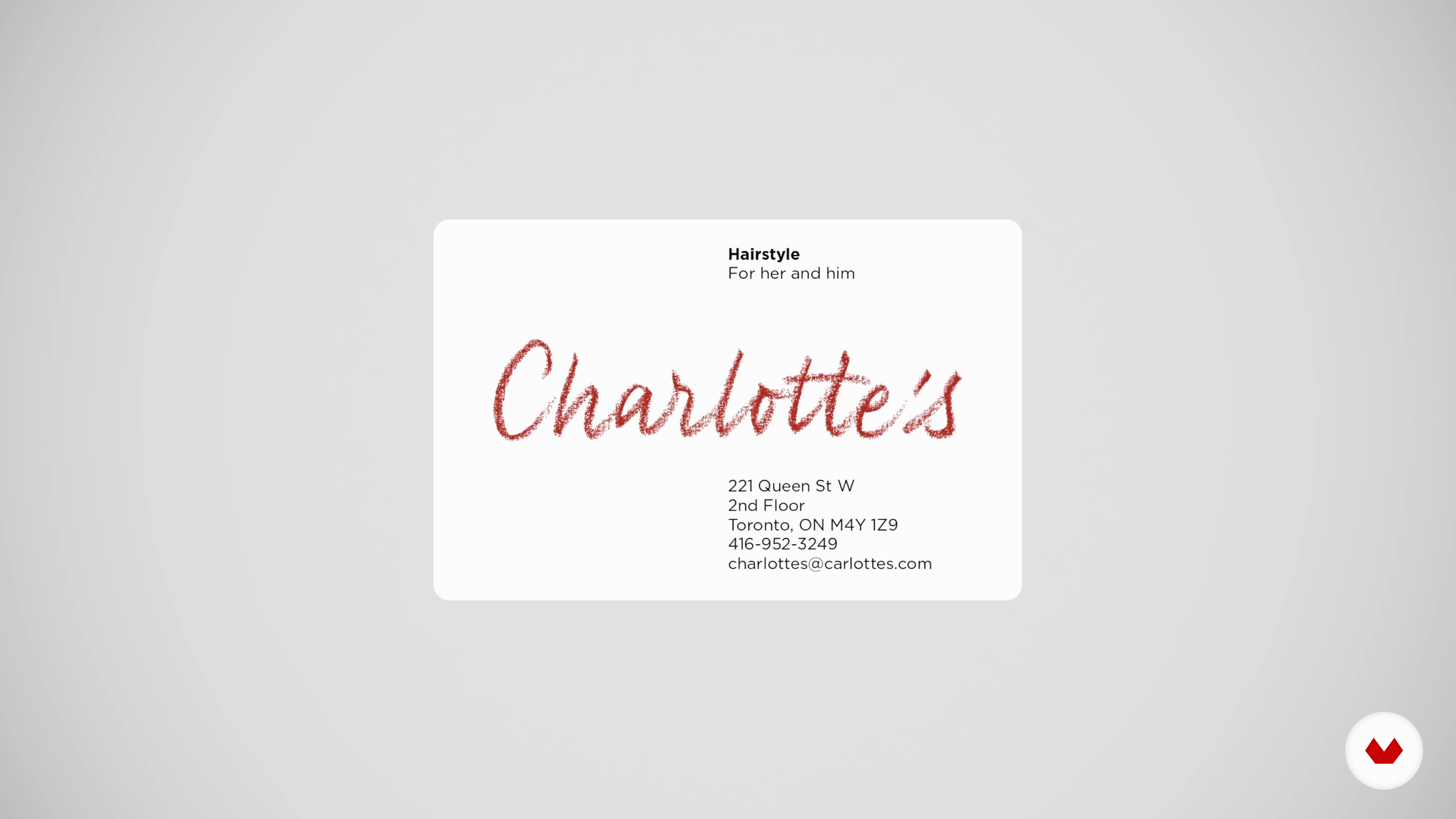
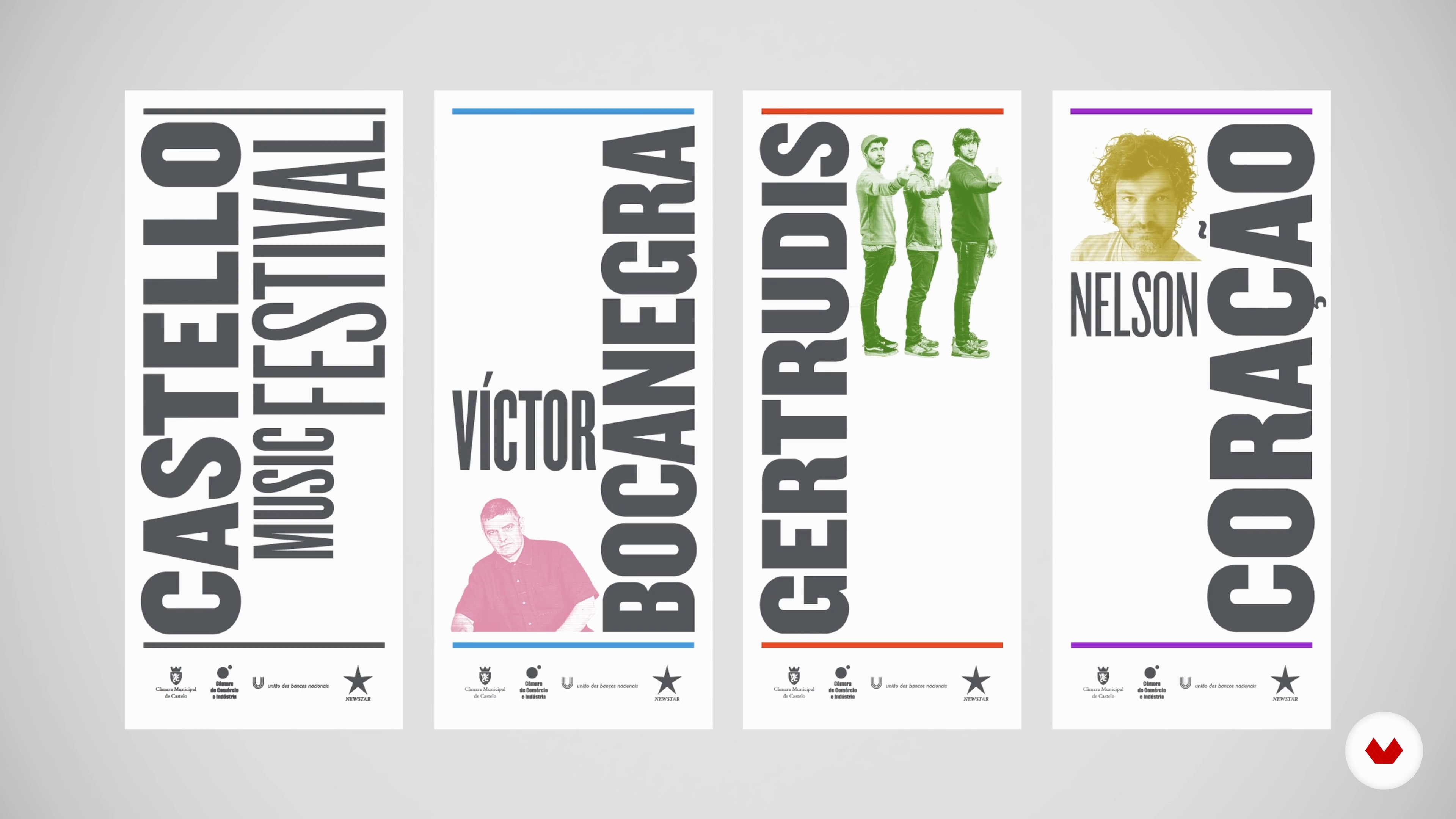
Projects by course students


Who is this specialization for?
This course is ideal for aspiring graphic designers, art students, self-taught creatives, and professionals who wish to strengthen their design skills. Perfect for those looking to master fundamental concepts, explore visual perception, and develop visually striking projects.
Requirements and materials
No extensive prior knowledge is required. You need access to a computer with basic graphic design software and an internet connection. A notebook for sketching and exploring ideas is also helpful in developing your creativity and visual concepts.


Reviews
What to expect from this specialization course
-
Learn at your own pace
Enjoy learning from home without a set schedule and with an easy-to-follow method. You set your own pace.
-
Learn from the best professionals
Learn valuable methods and techniques explained by top experts in the creative sector.
-
Meet expert teachers
Each expert teaches what they do best, with clear guidelines, true passion, and professional insight in every lesson.
-
Certificates
PlusIf you're a Plus member, get a custom certificate for every specialization course. Share it on your portfolio, social media, or wherever you like.
-
Get front-row seats
Videos of the highest quality, so you don't miss a single detail. With unlimited access, you can watch them as many times as you need to perfect your technique.
-
Share knowledge and ideas
Ask questions, request feedback, or offer solutions. Share your learning experience with other students in the community who are as passionate about creativity as you are.
-
Connect with a global creative community
The community is home to millions of people from around the world who are curious and passionate about exploring and expressing their creativity.
-
Watch professionally produced courses
Domestika curates its teacher roster and produces every course in-house to ensure a high-quality online learning experience.
FAQs
Domestika courses are online classes that allow you to learn new skills and create incredible projects. All our courses include the opportunity to share your work with other students and/or teachers, creating an active learning community. We offer different formats:
Original Courses: Complete classes that combine videos, texts, and educational materials to complete a specific project from start to finish.
Basics Courses: Specialized training where you master specific software tools step by step.
Specialization Courses: Learning paths with various expert teachers on the same topic, perfect for becoming a specialist by learning from different approaches.
Guided Courses: Practical experiences ideal for directly acquiring specific skills.
Intensive Courses (Deep Dives): New creative processes based on artificial intelligence tools in an accessible format for in-depth and dynamic understanding.
All specialization courses are 100% online, so once they're published, specialization courses start and finish whenever you want. You set the pace of the class. You can go back to review what interests you most and skip what you already know, ask questions, answer questions, share your projects, and more.
The specialization courses are divided into different modules. Each one includes lessons, informational text, tasks, and practice exercises to help you carry out your project step by step, with additional complementary resources and downloads. You'll also have access to an exclusive forum where you can interact with other students, as well as share your work and your final project, creating a community around the specialization courses.
You can redeem the specialization courses you received by accessing the redeeming page and entering your gift code.


excelente curso, tenia todo lo que necesitaba
muy completo ,excelentes profesionales
Parece muito completo, a experiência deles no assunto é evidente
Se nota la experiencia que tienen sobre el tema lo dominan muy bien y me dan confianza para terminar este curso
Queria algo que complemente mis estudios como diseñadora grafico. Un curso que me indicara si tengo o no claras algunas bases del diseño. Me ayudo absolutamente en lo que buscaba, es perfecto.