Specialization

Specialization in calligraphy: art from fundamentals to ornamentation

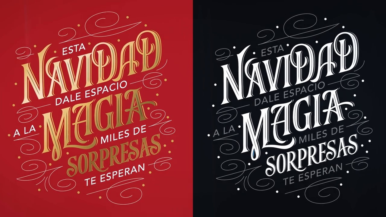
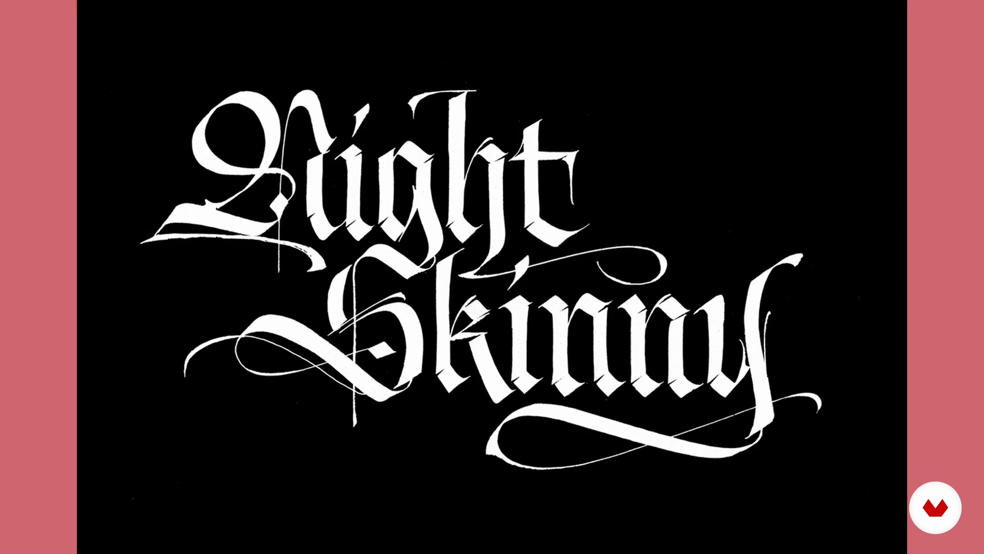
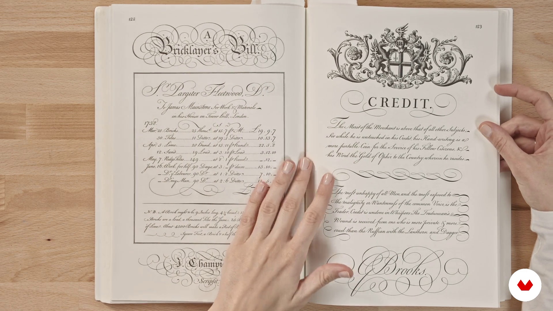
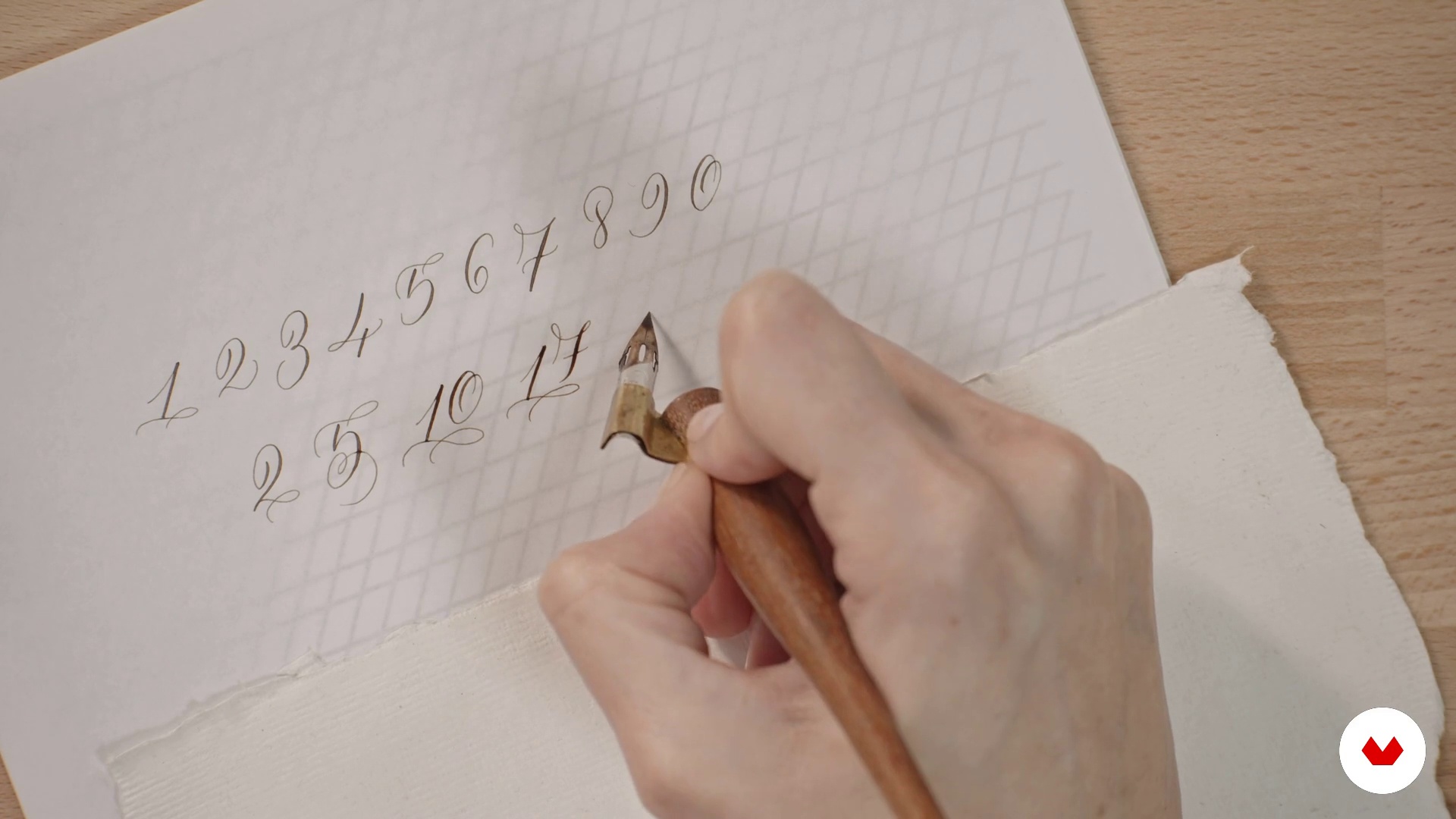
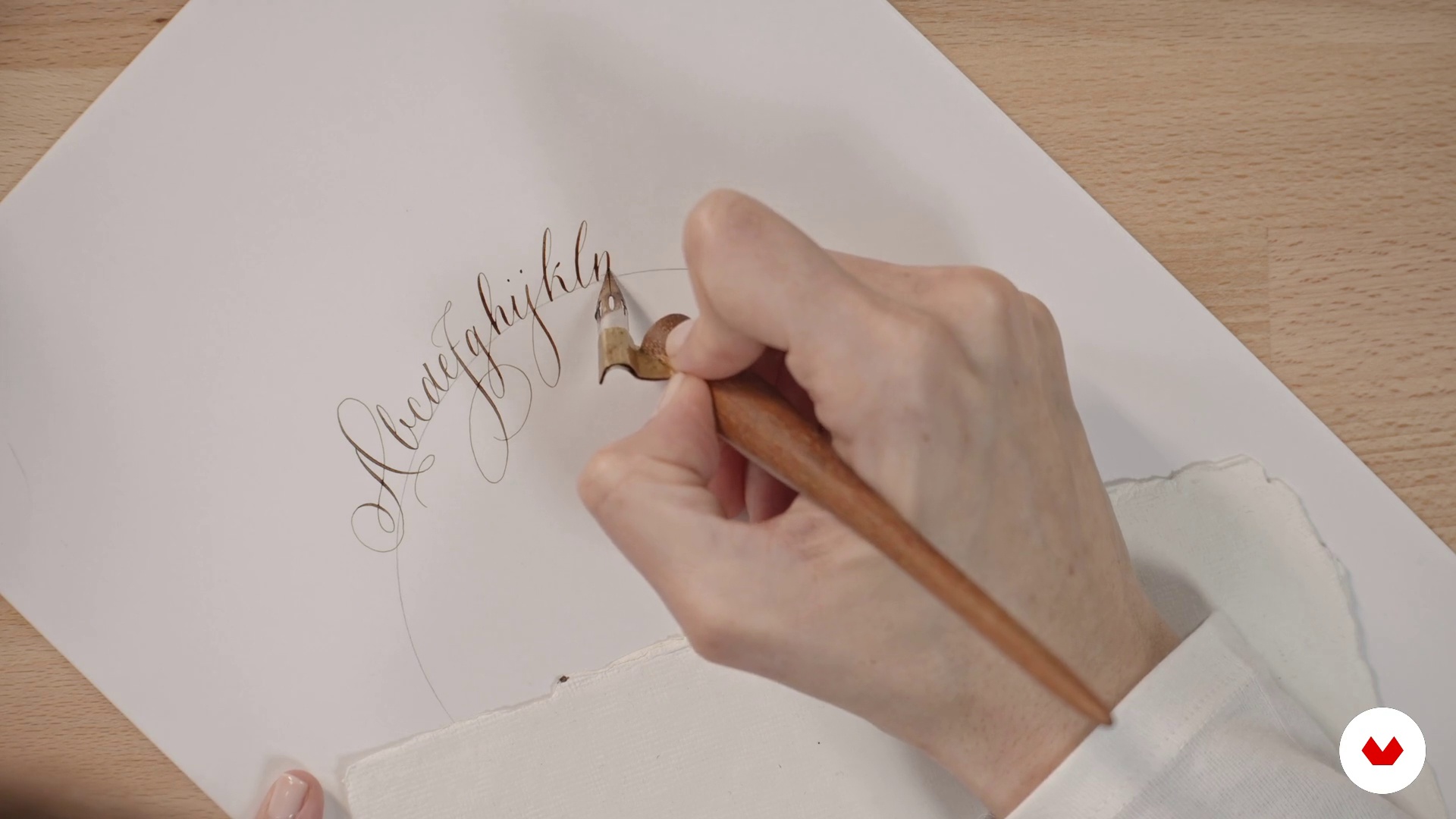
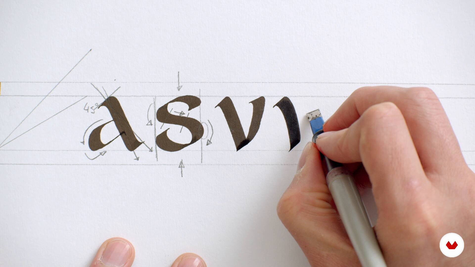
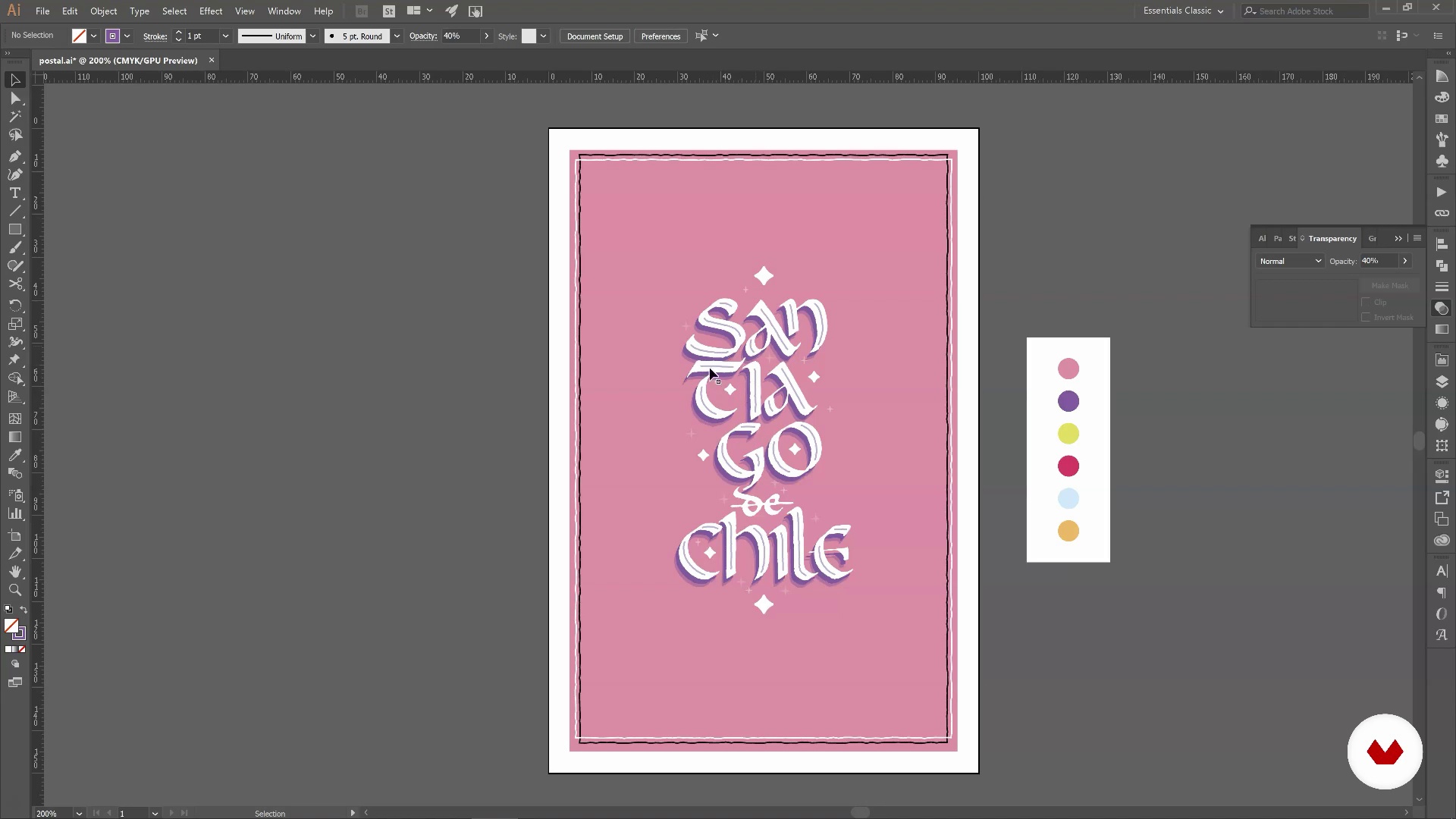
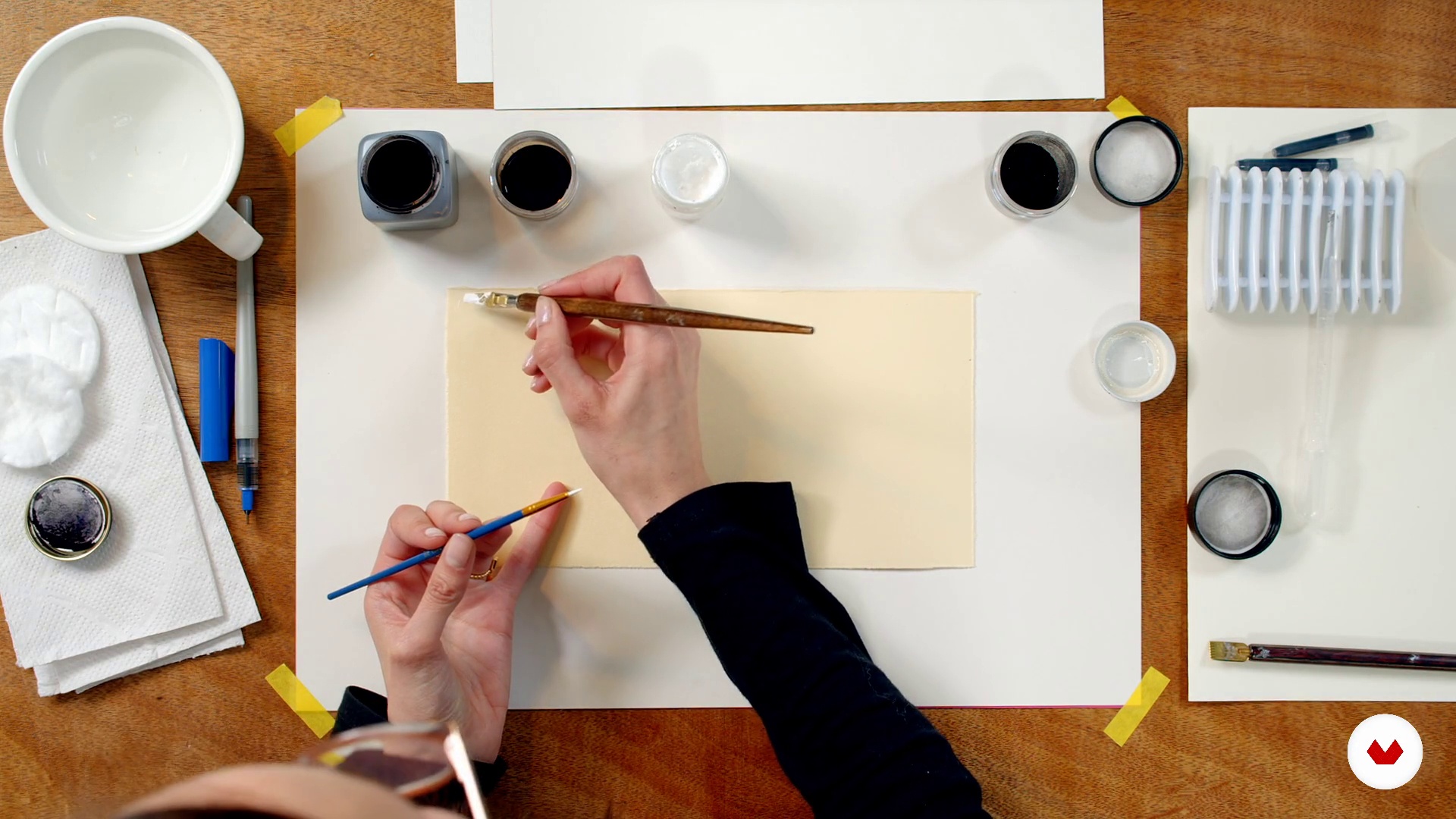
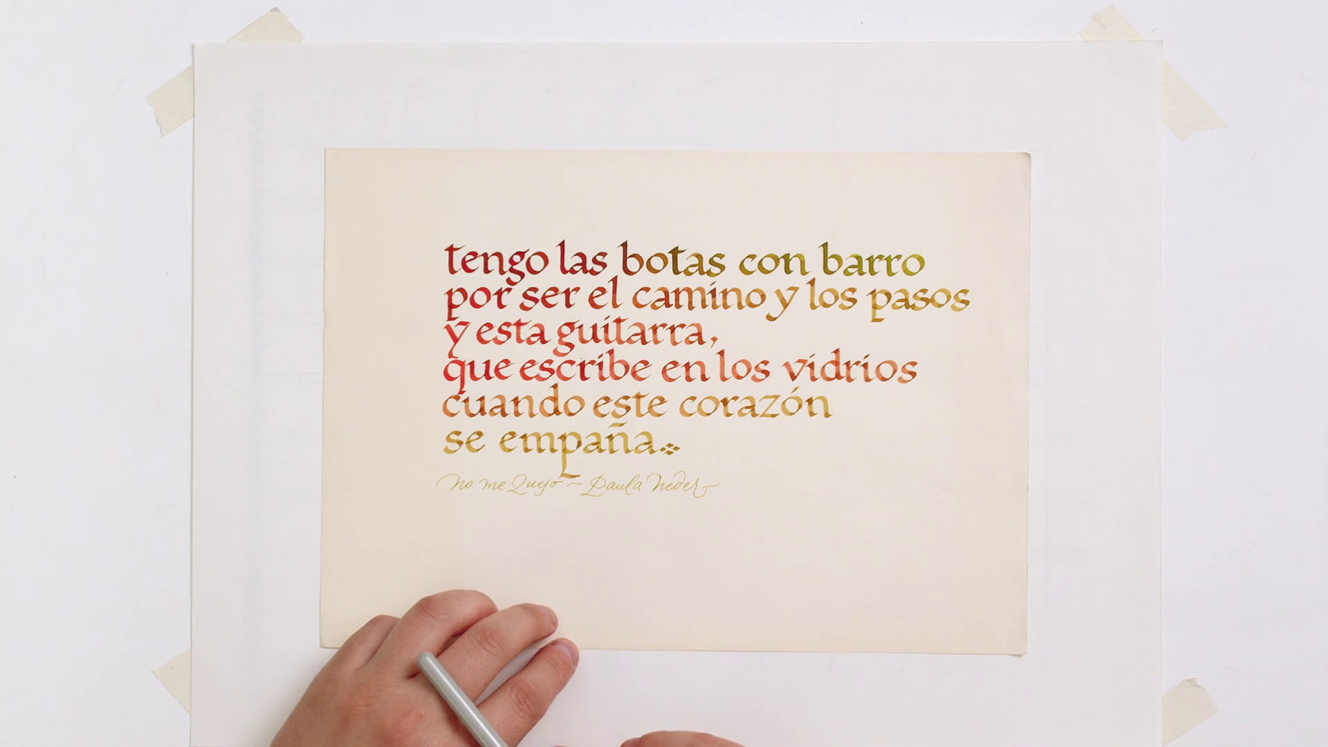
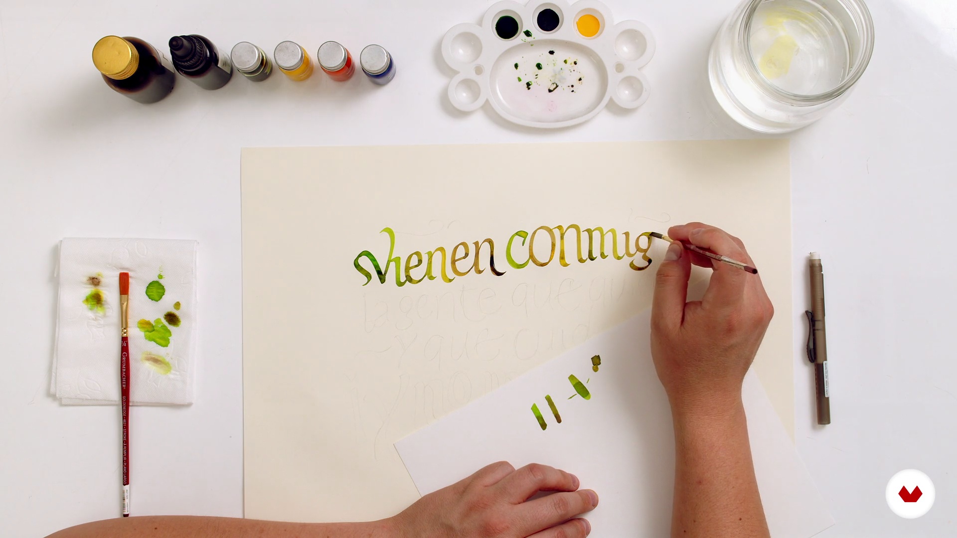
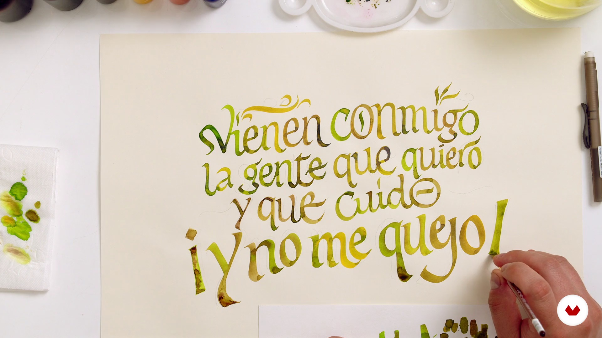
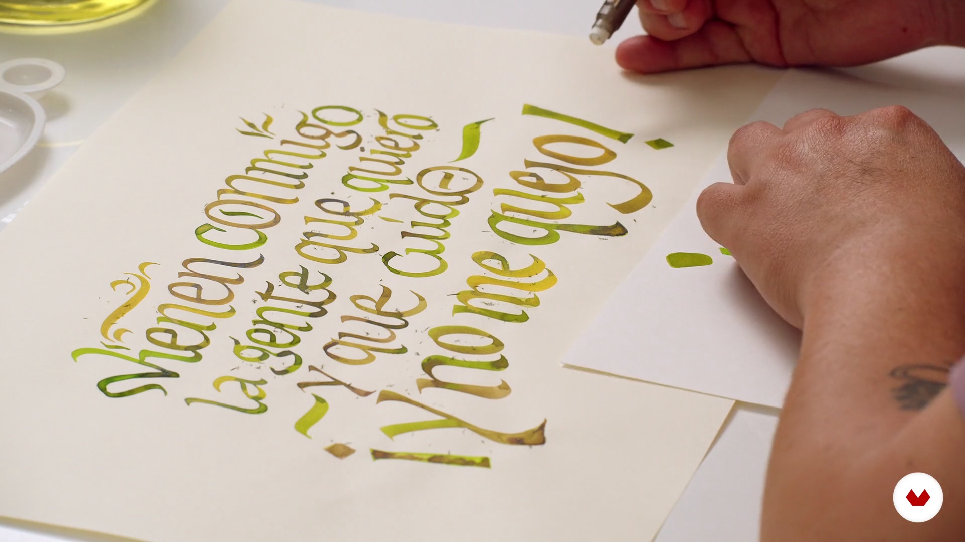
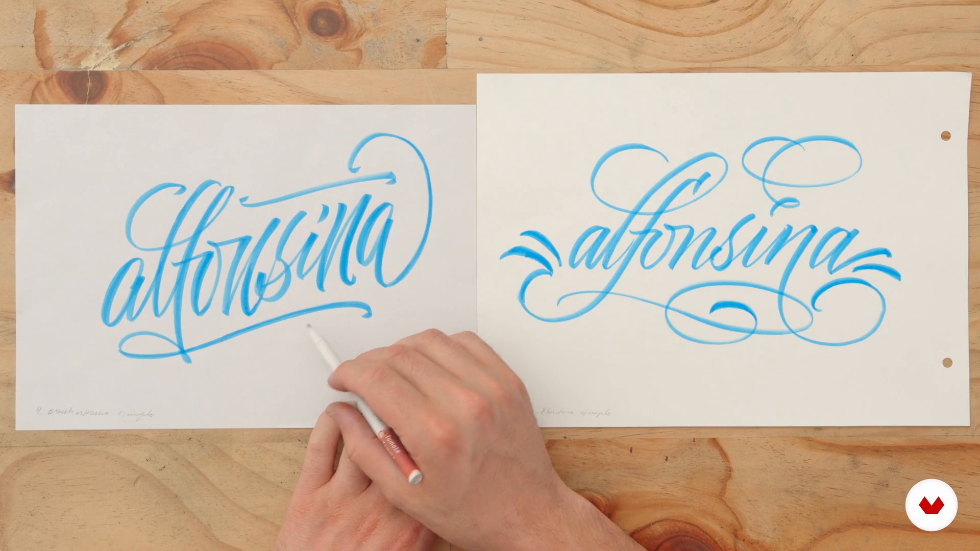
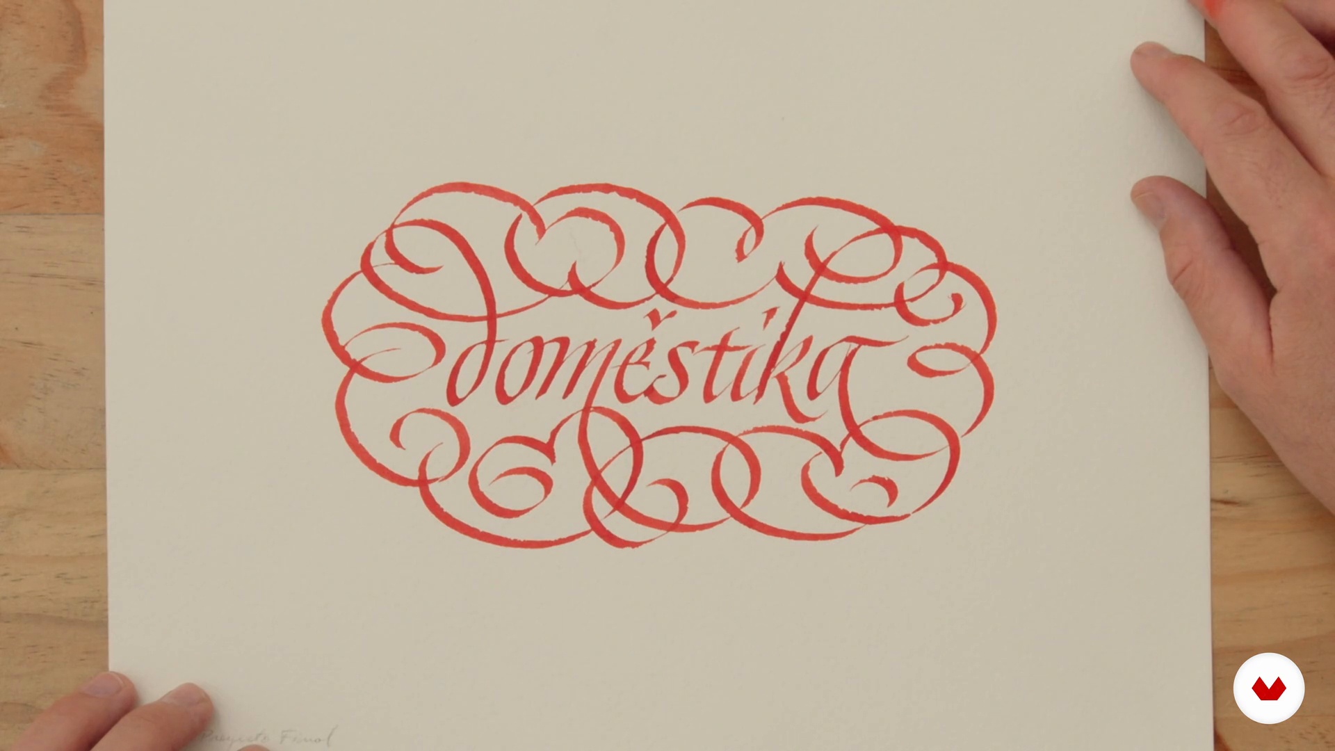
English calligraphy dominates with plumilla and watercolor techniques to create elegant and artistic works

Specialization · 6 modules

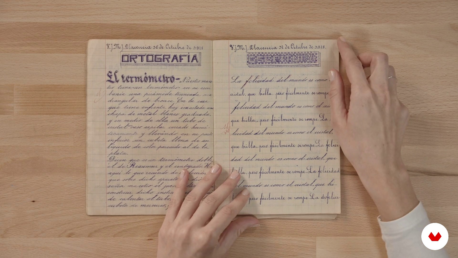
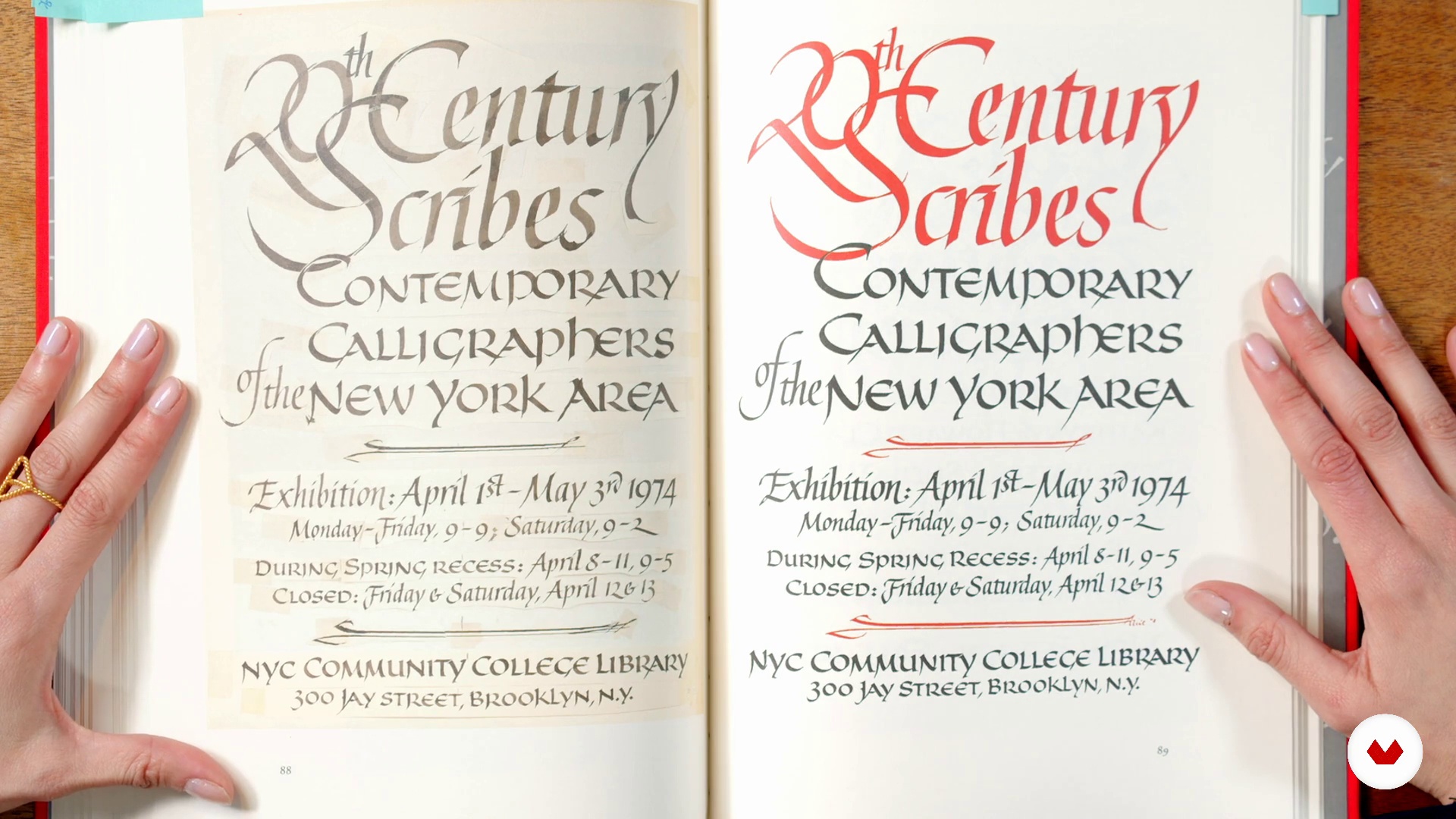
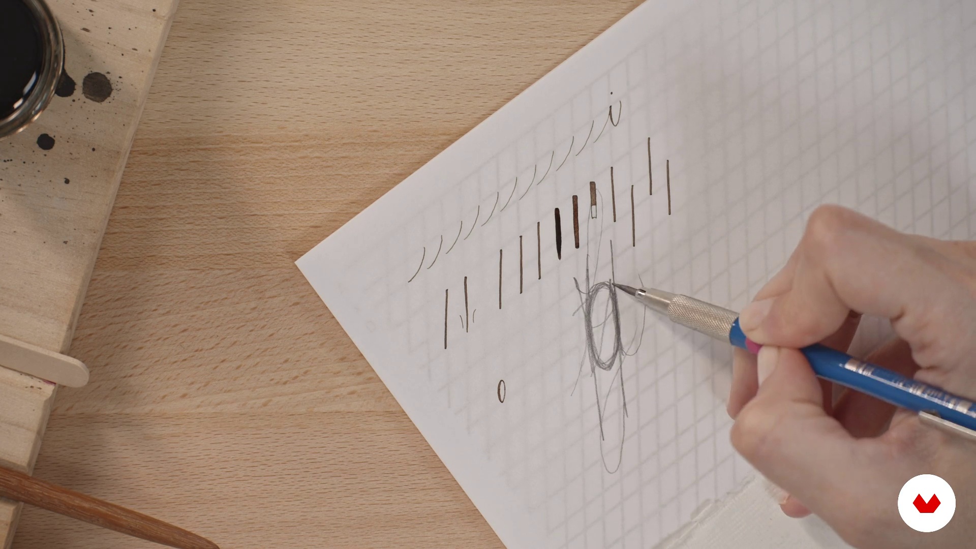
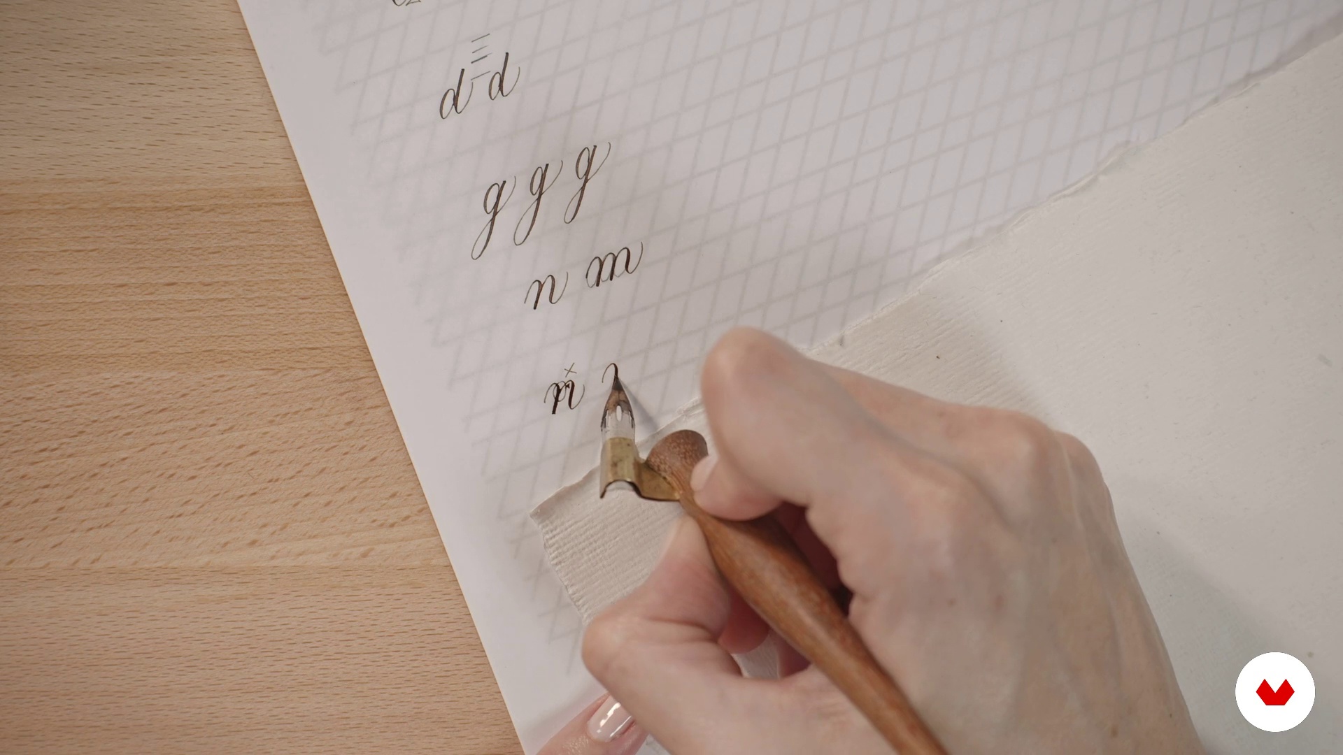
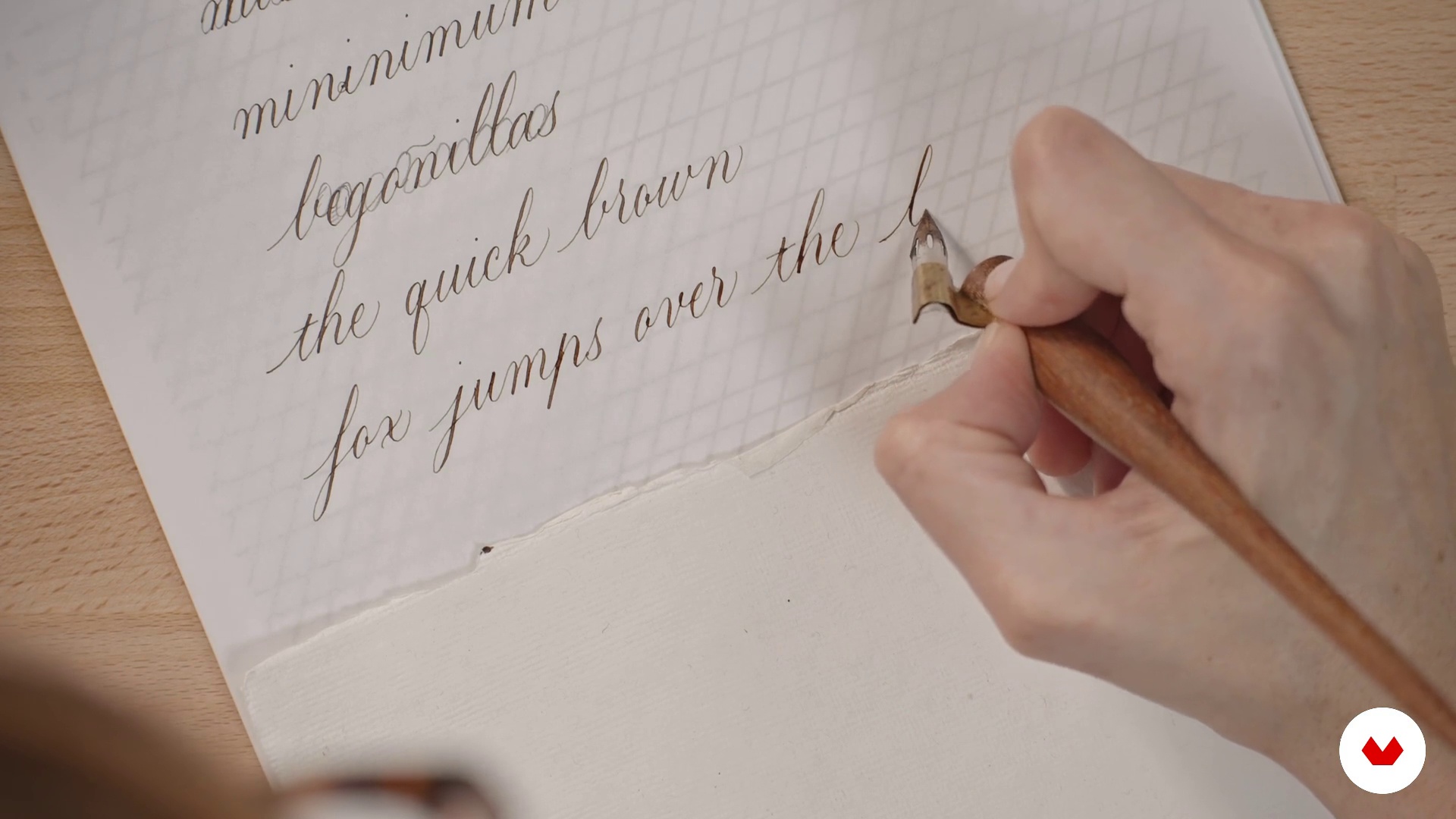
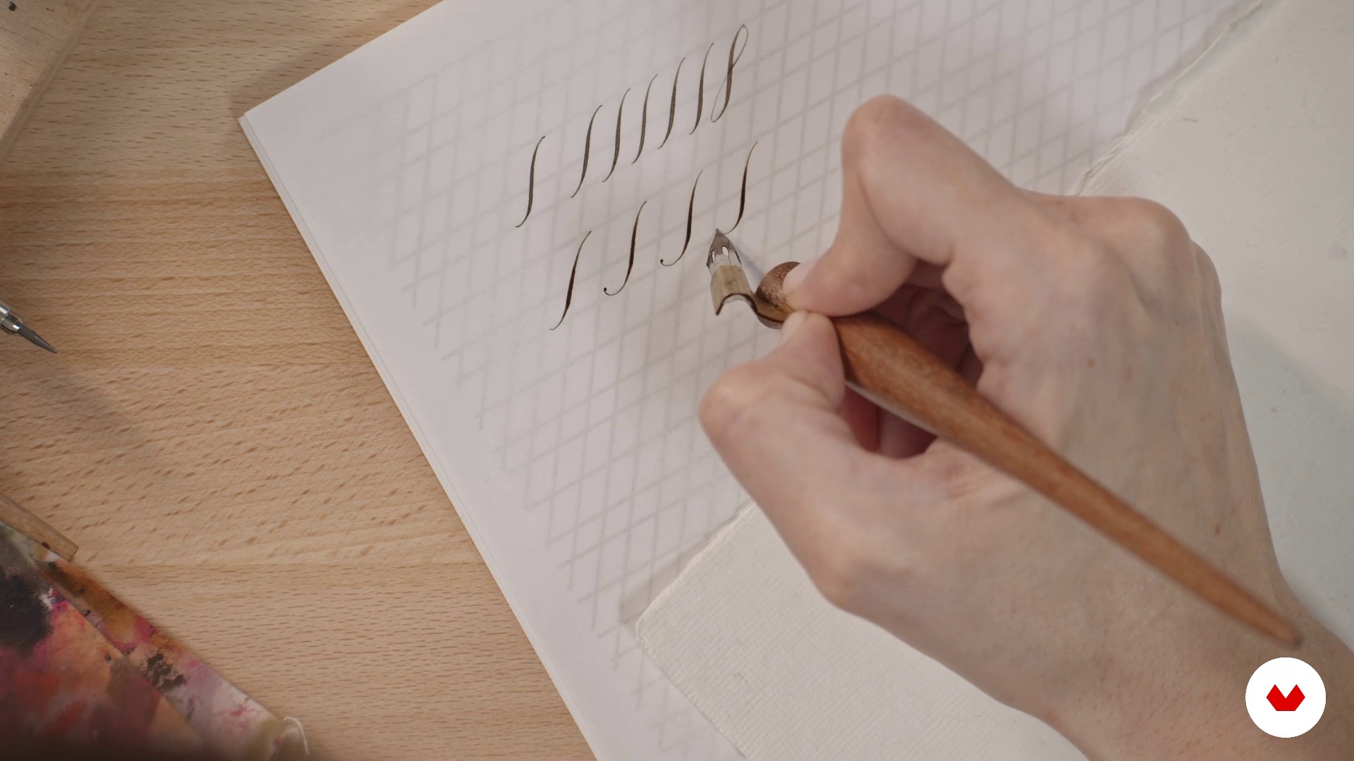
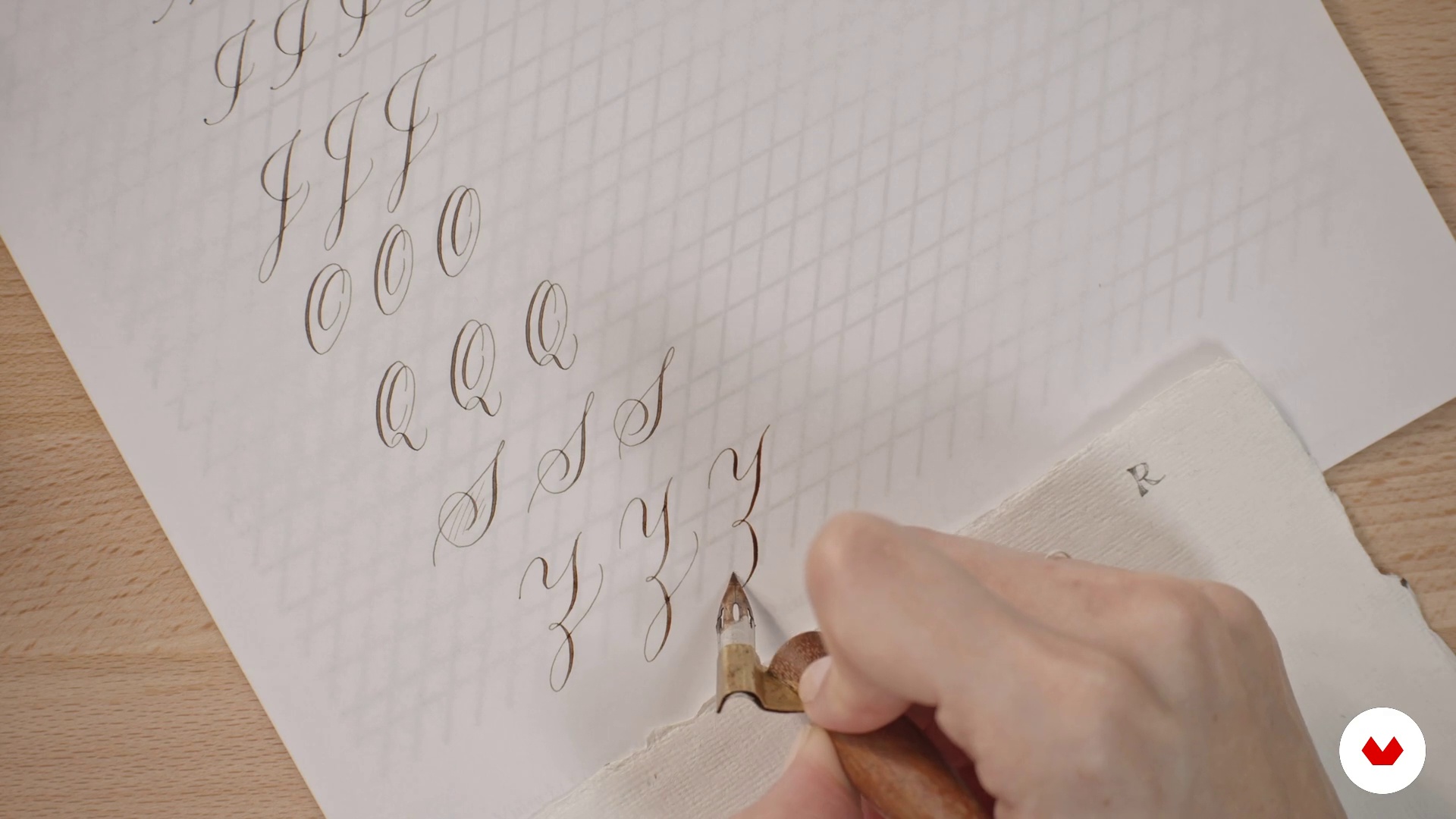
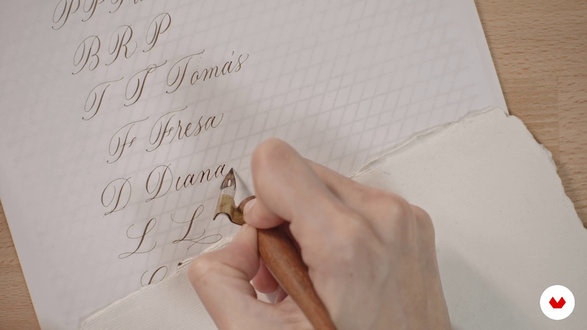
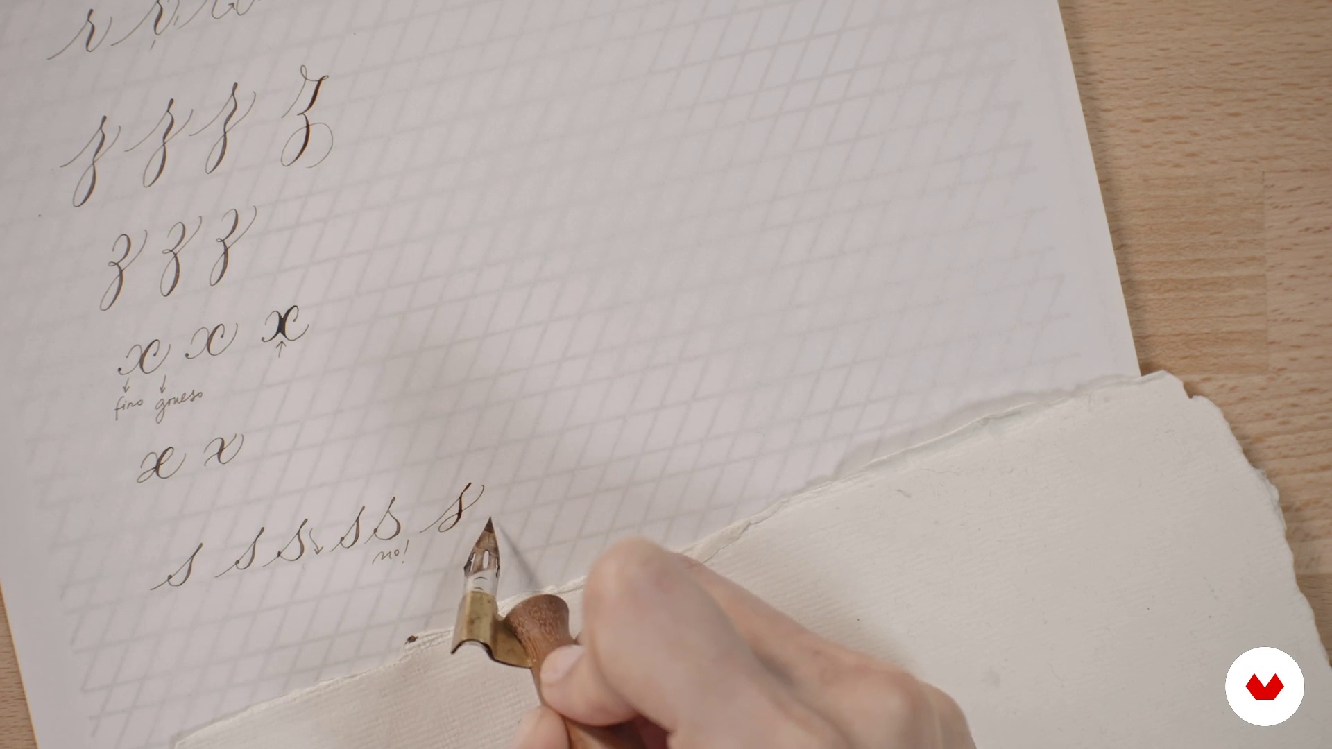
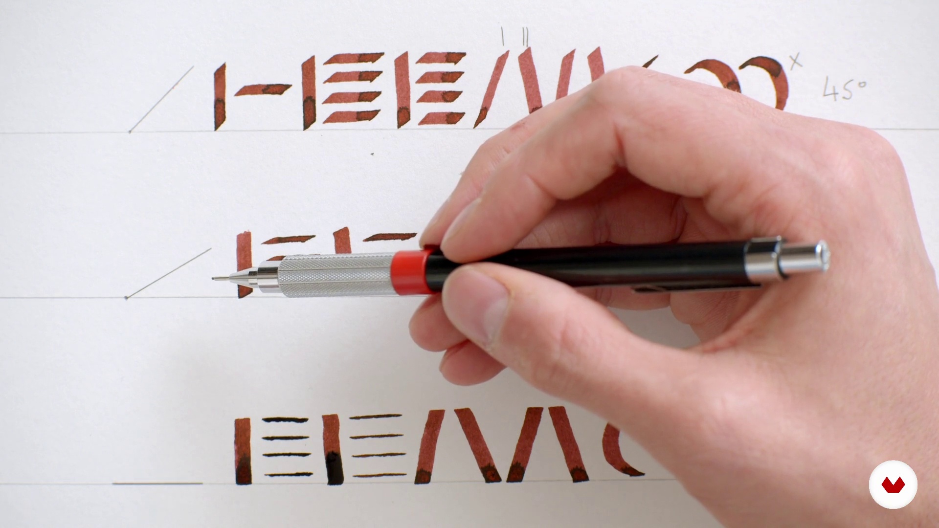
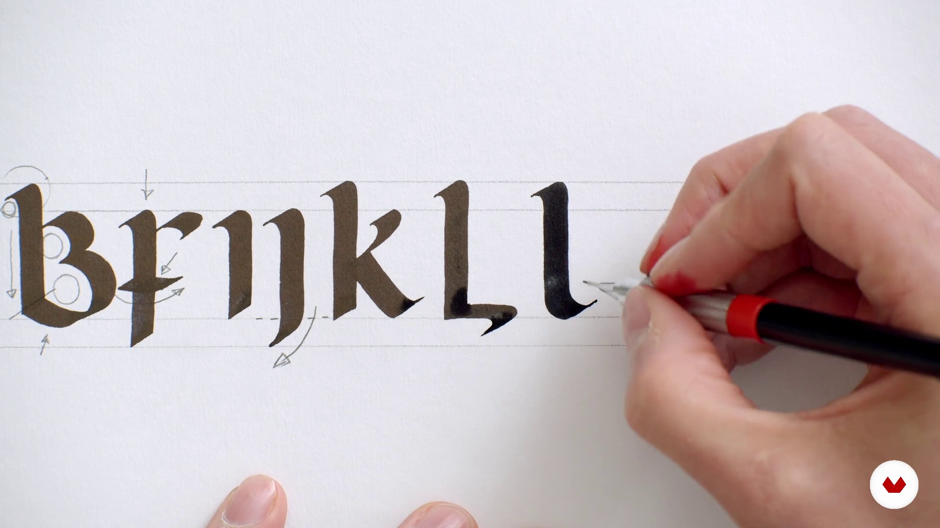
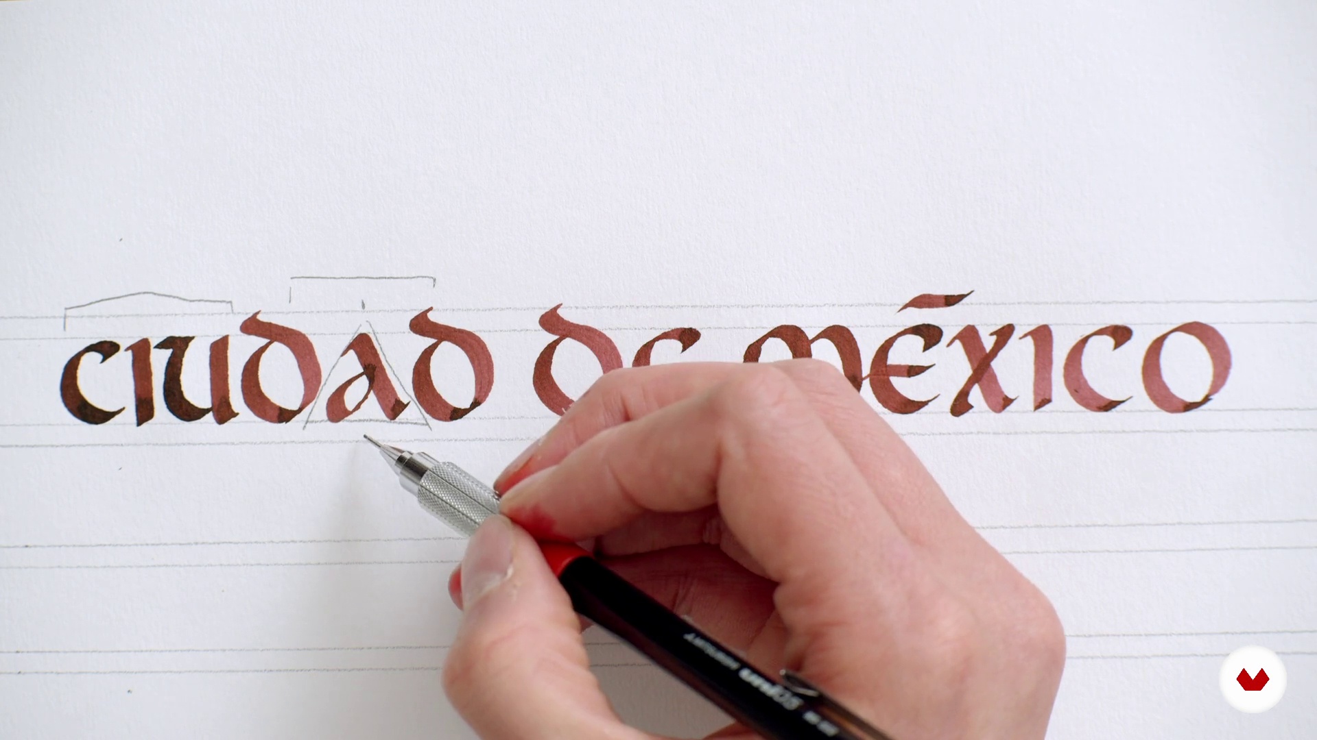
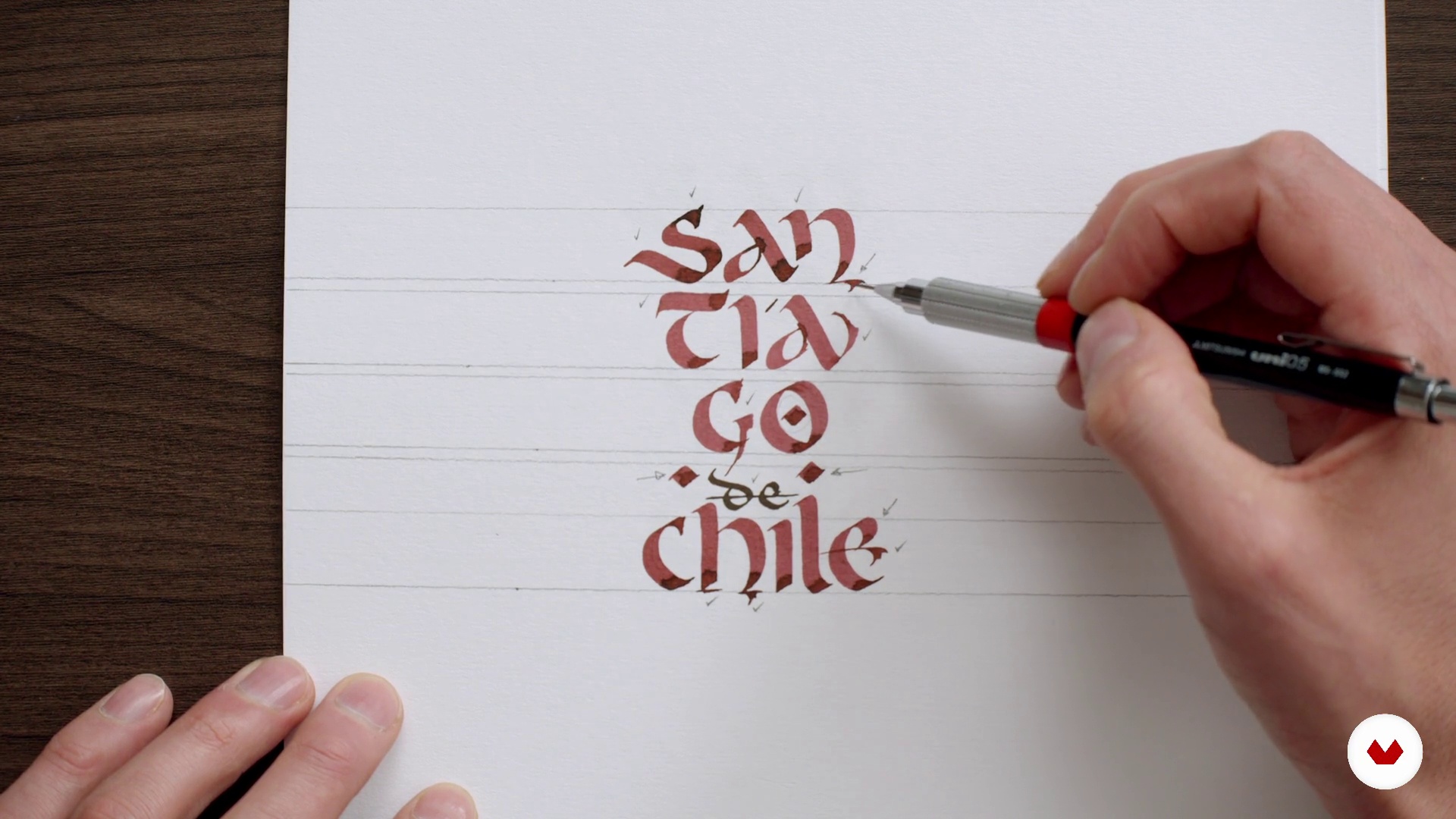
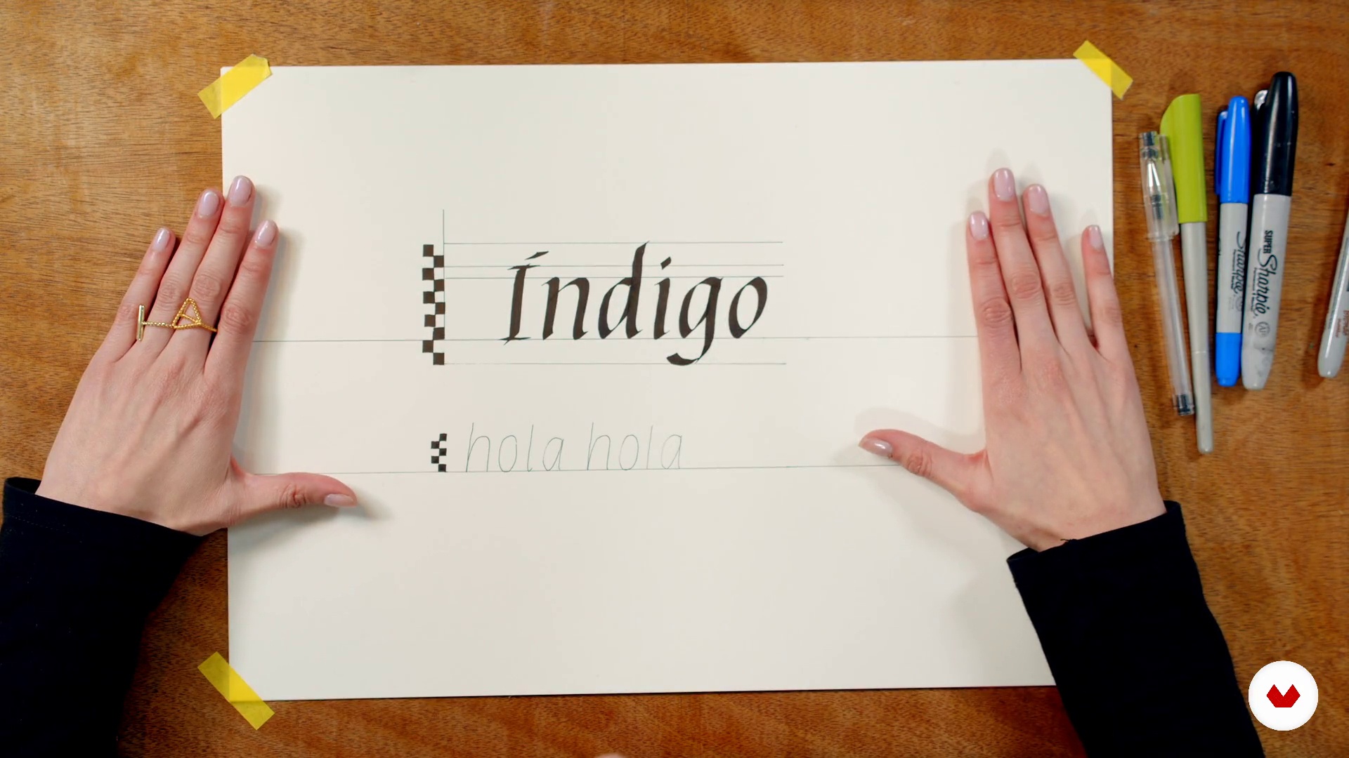
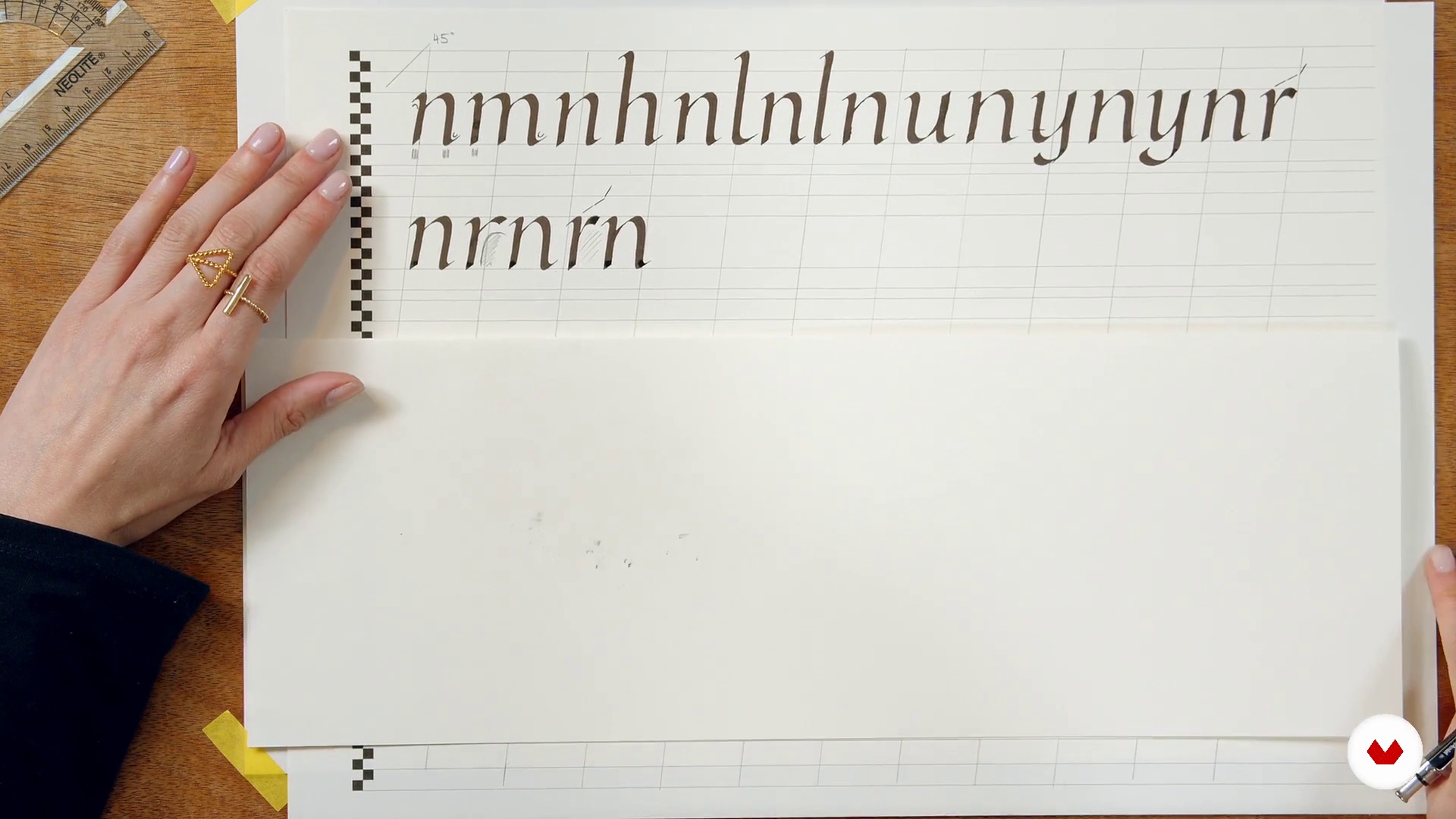
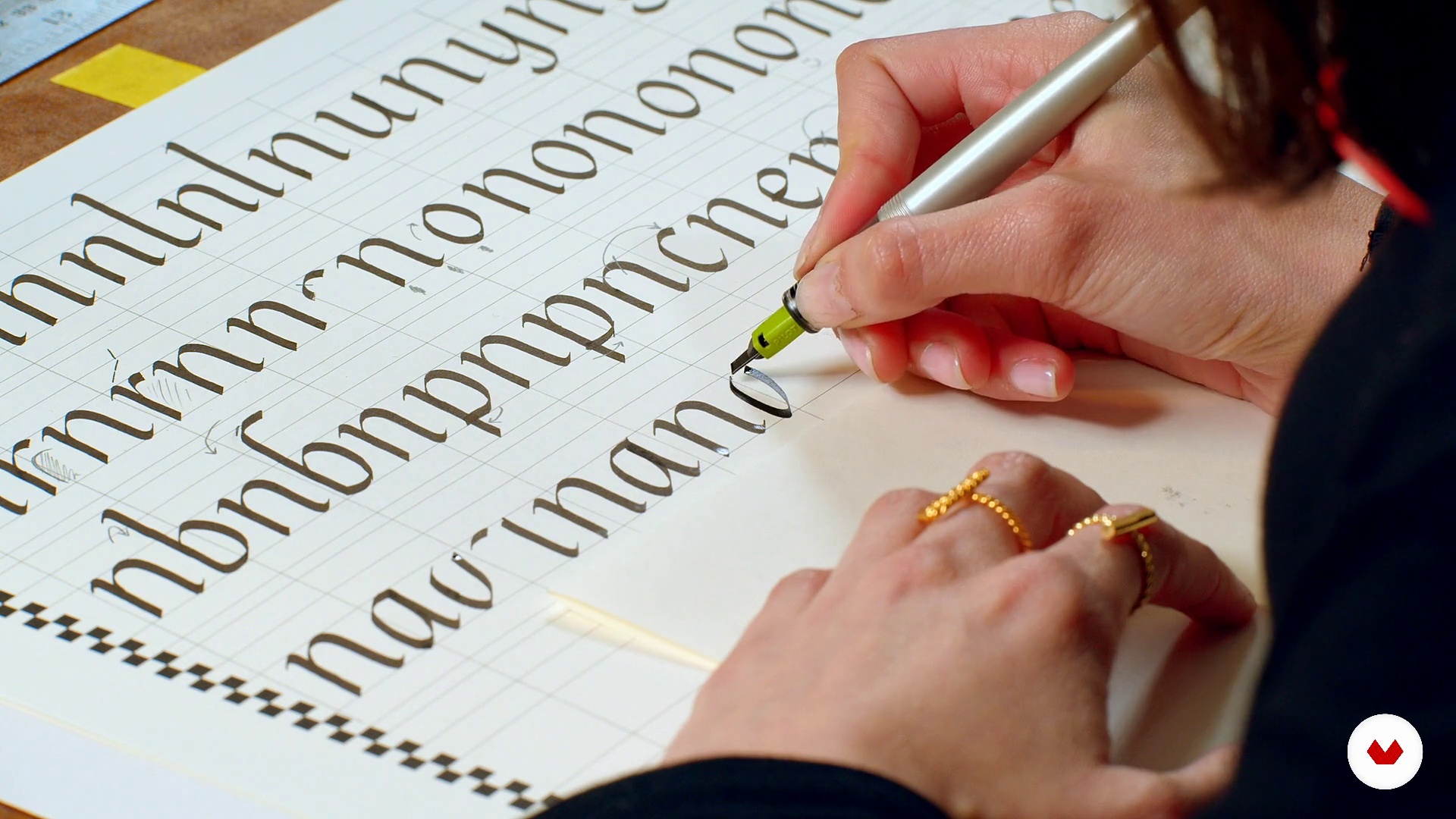
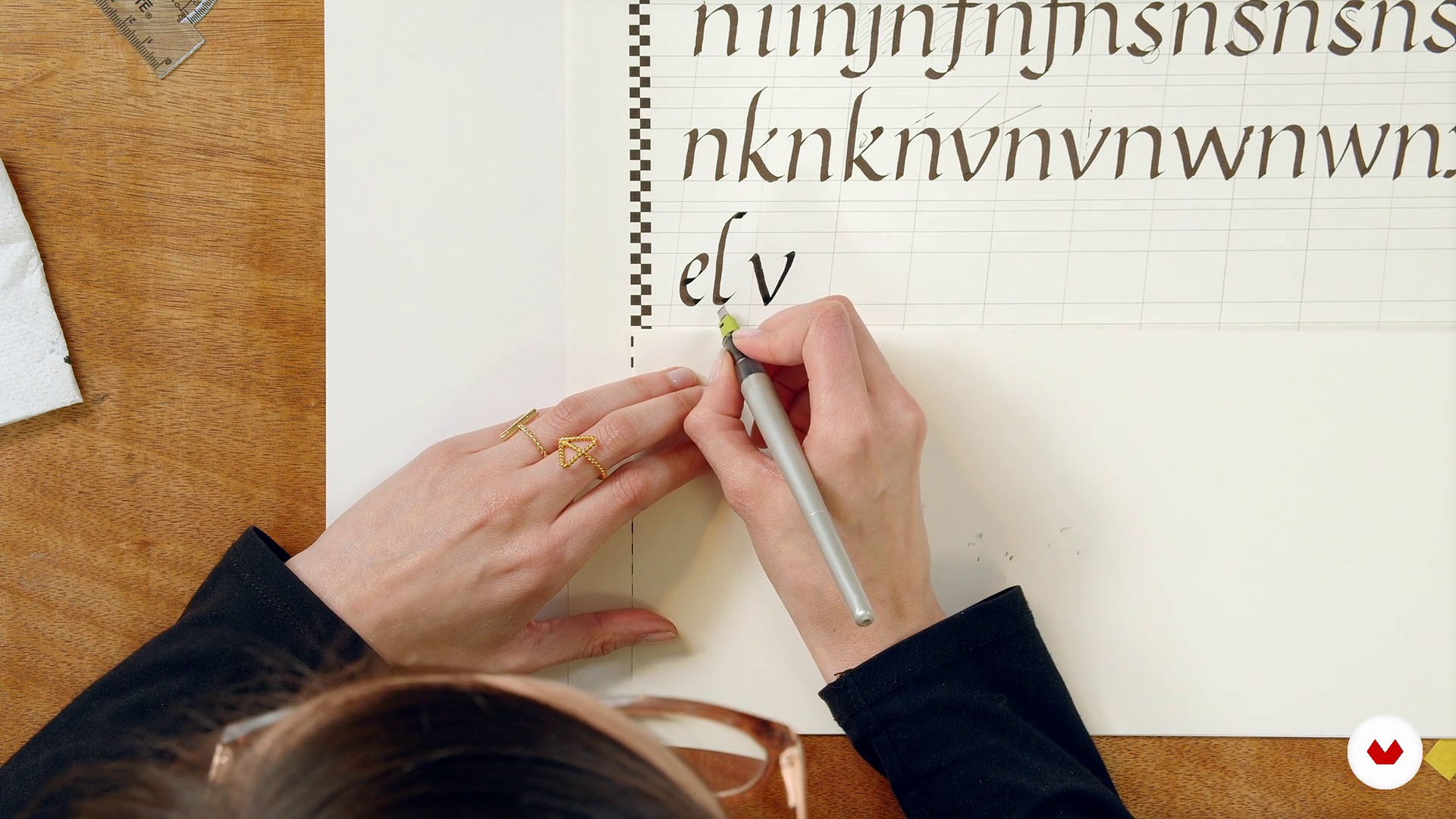
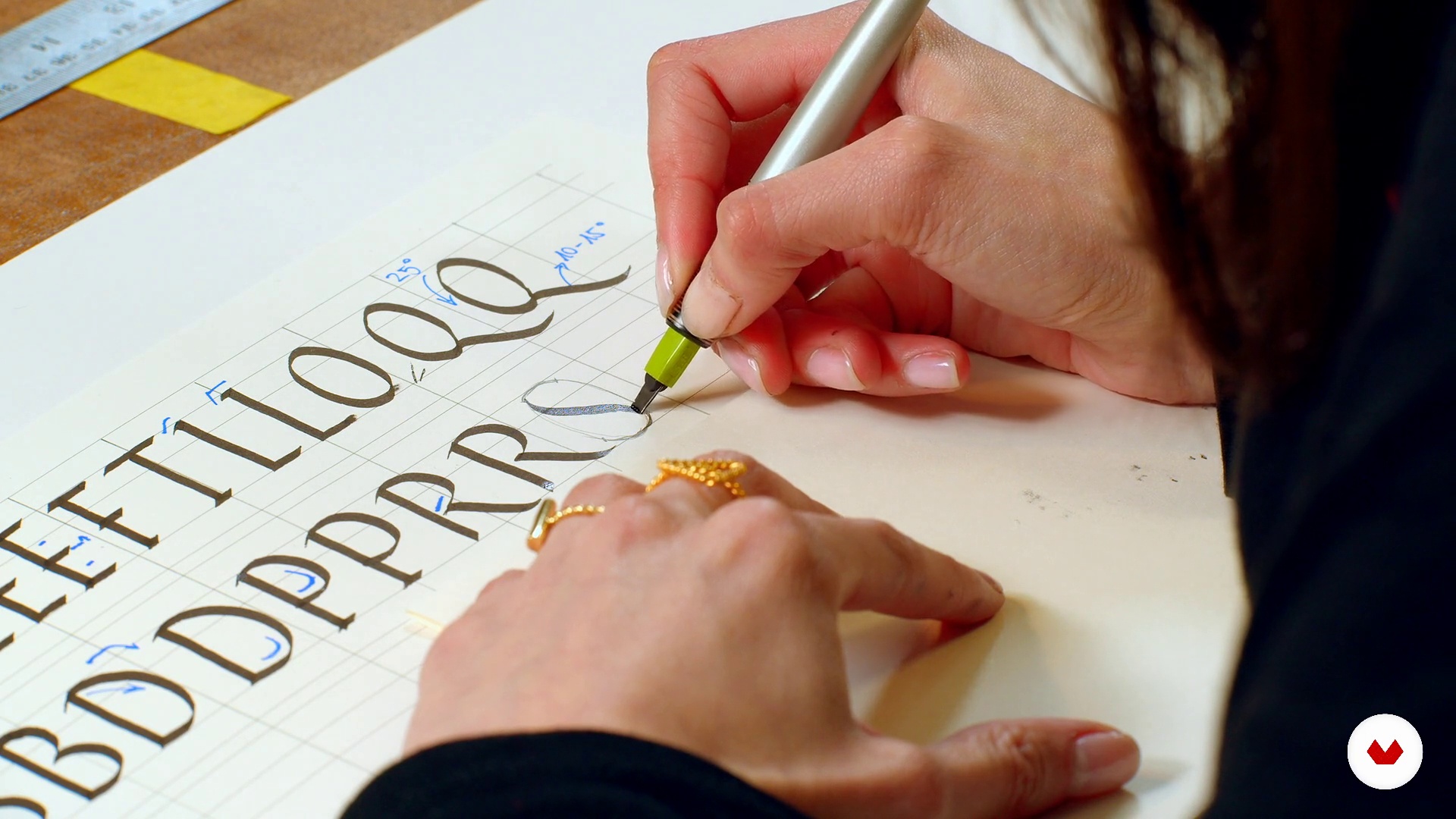
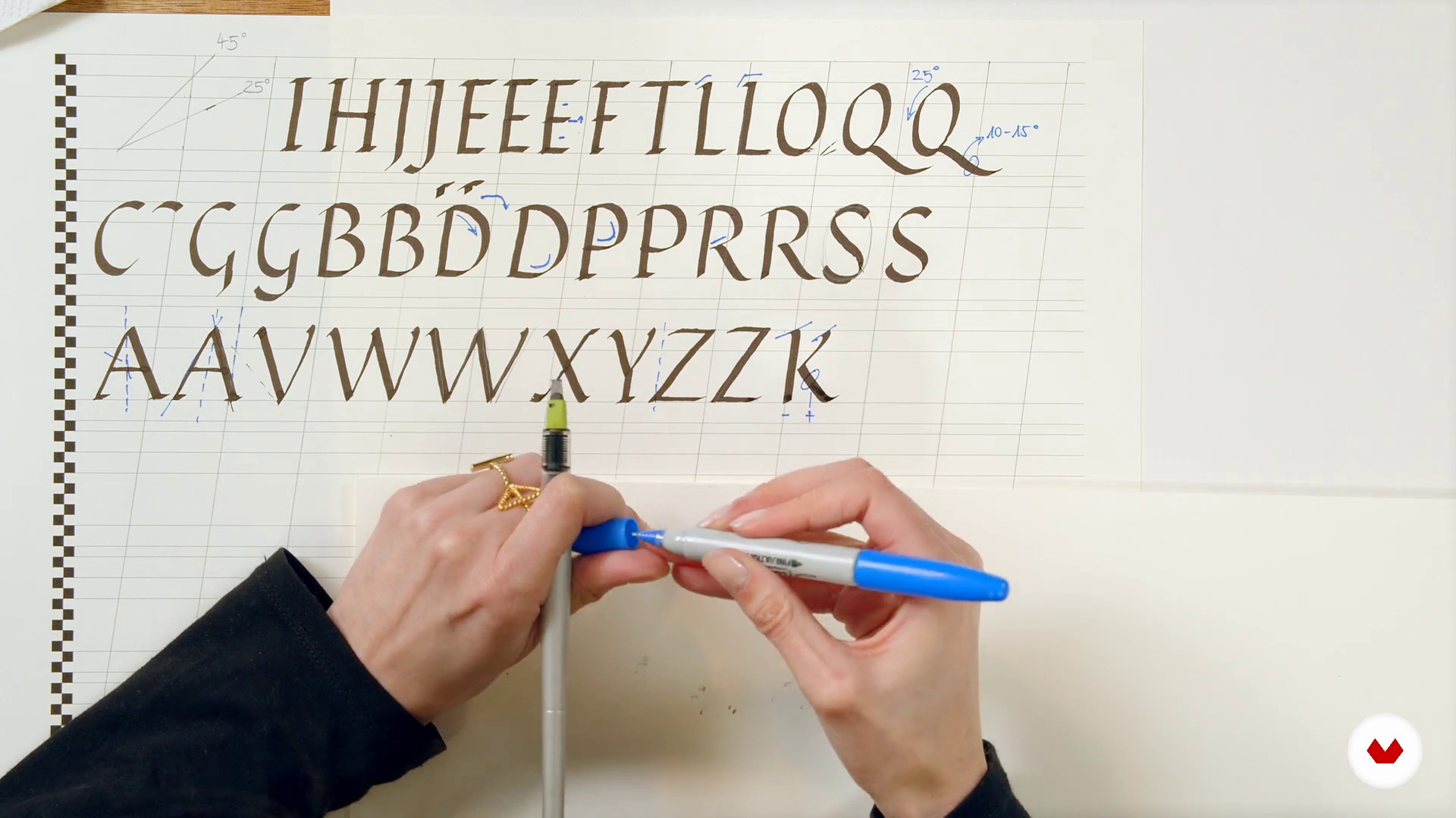
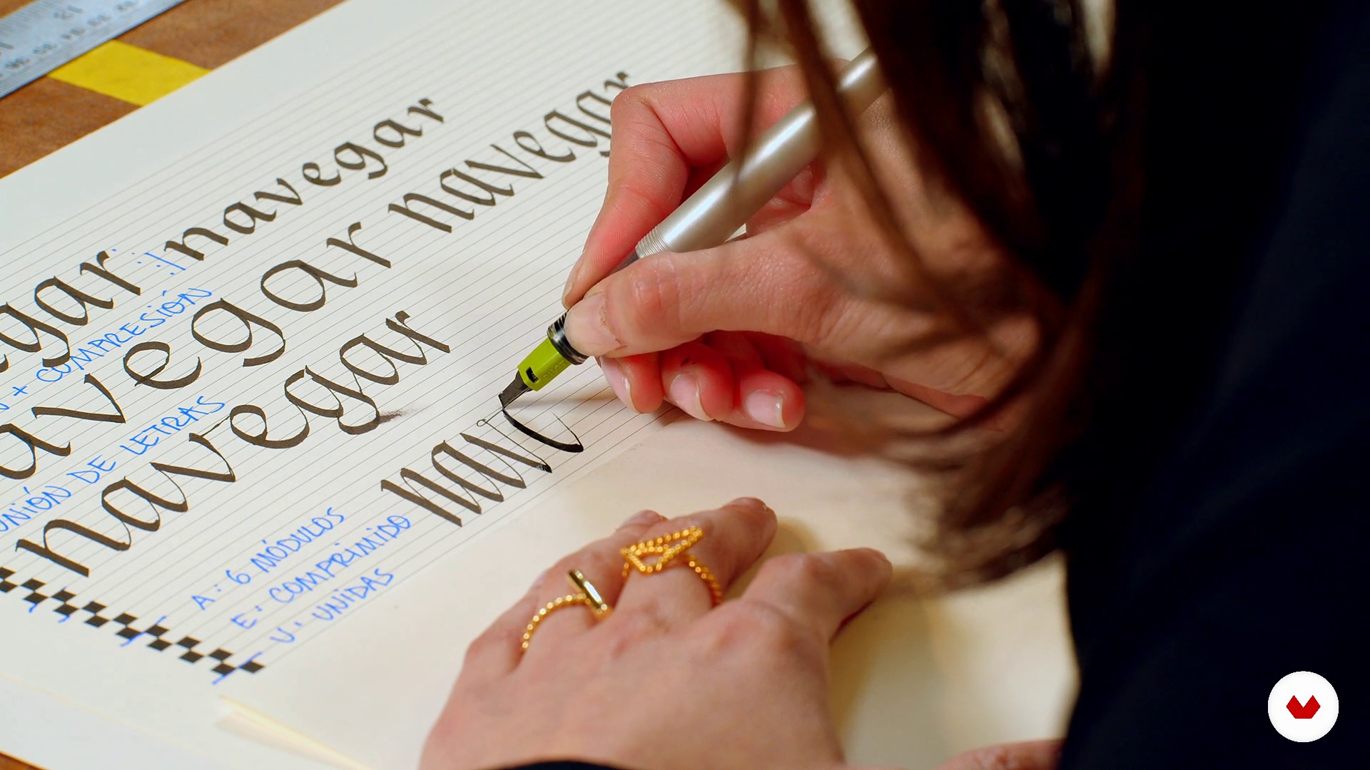
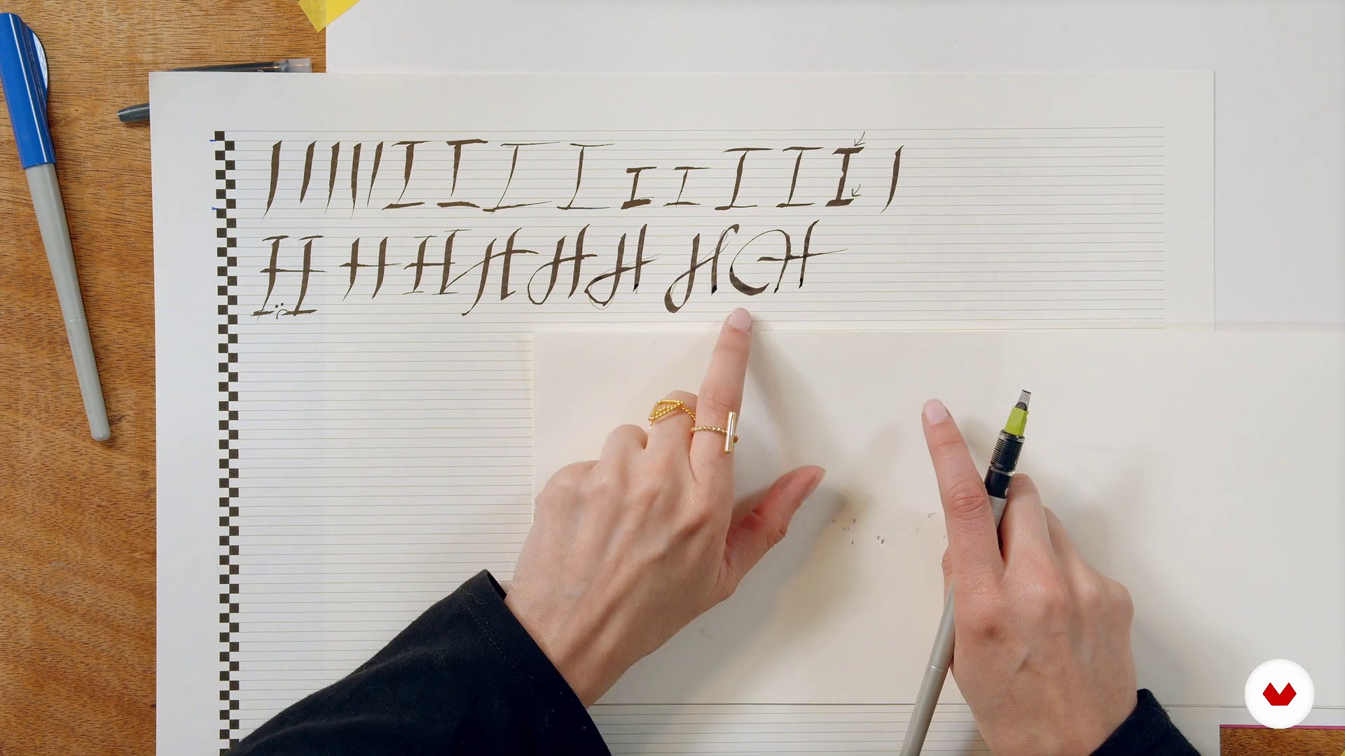
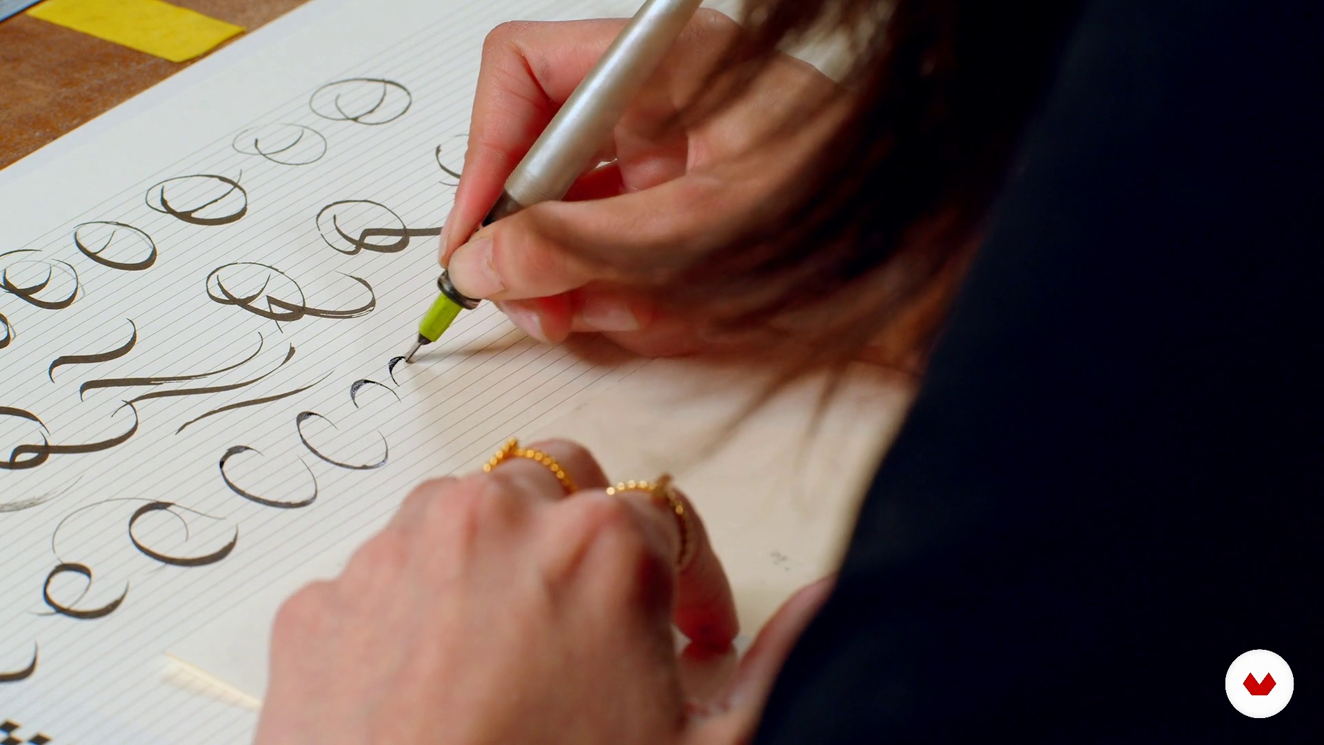
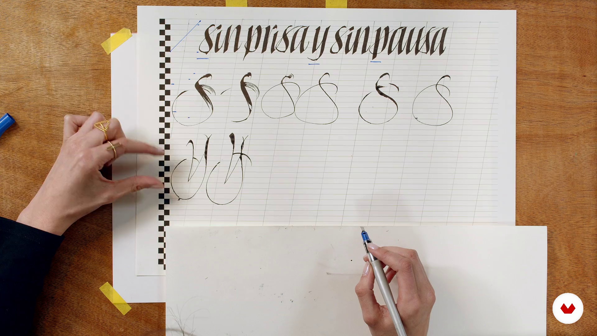
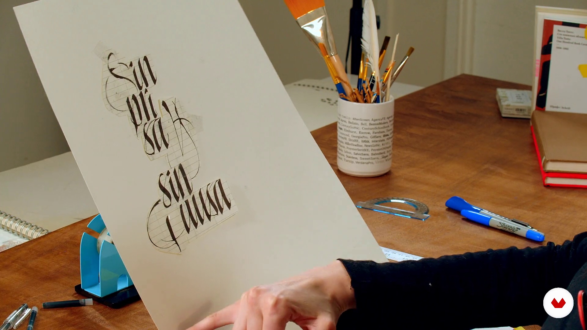
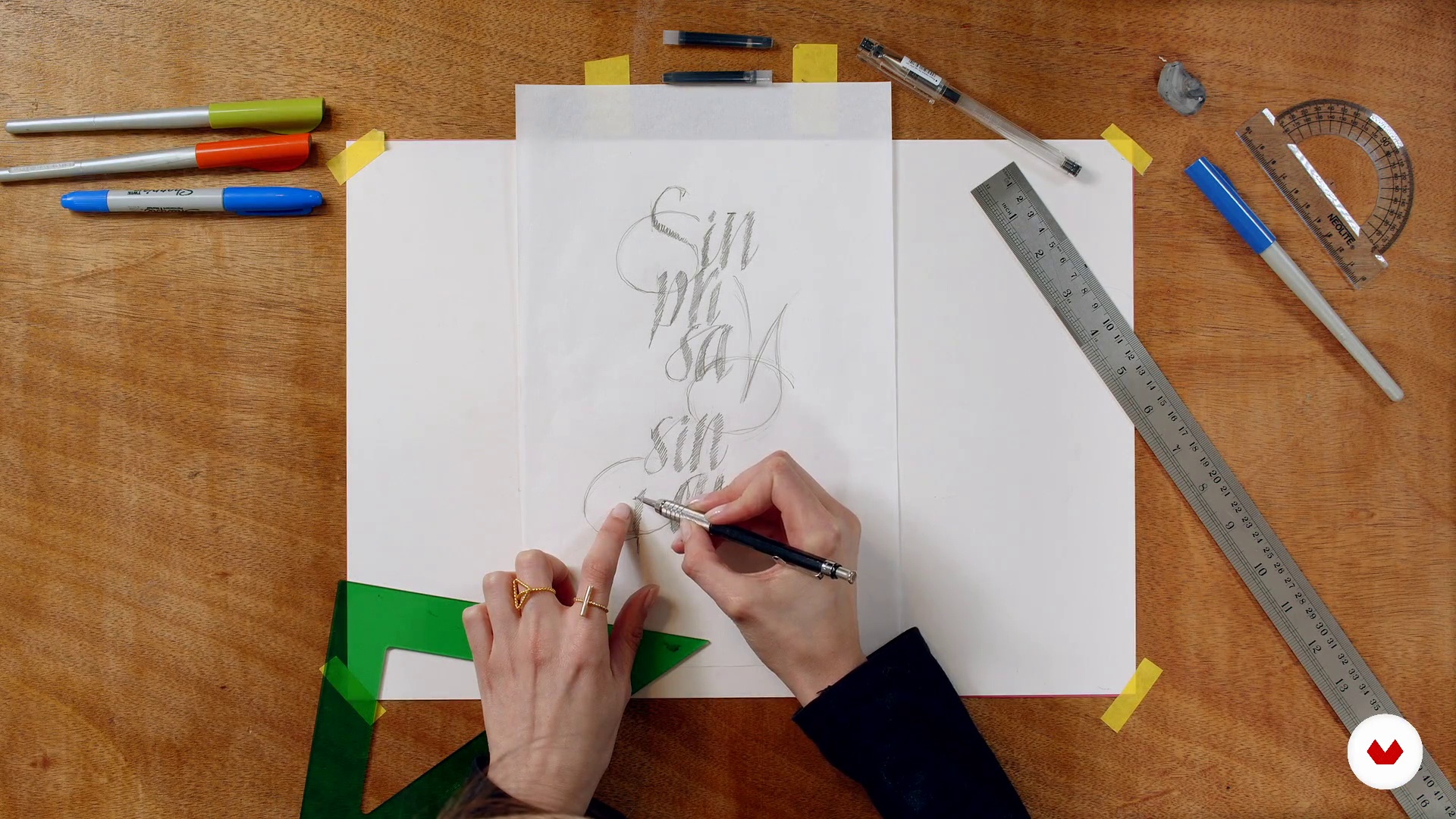
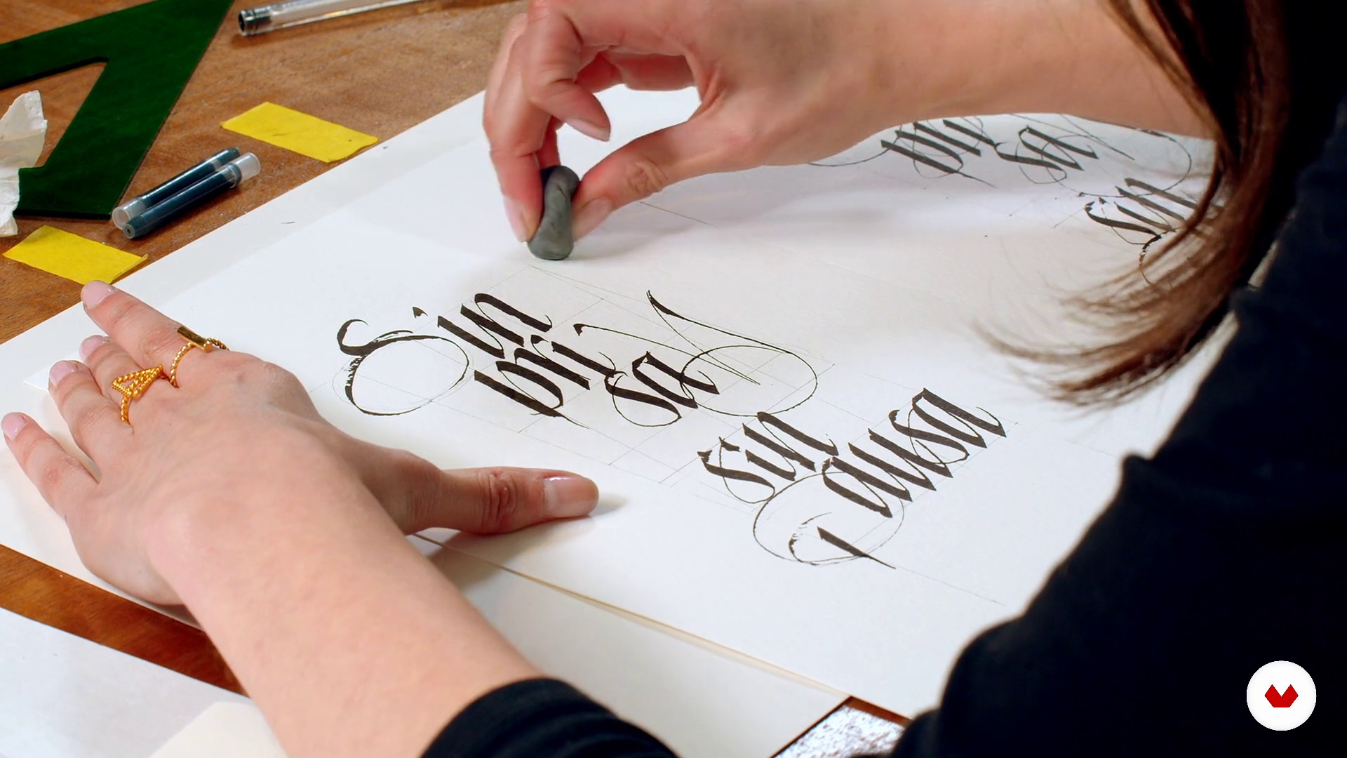
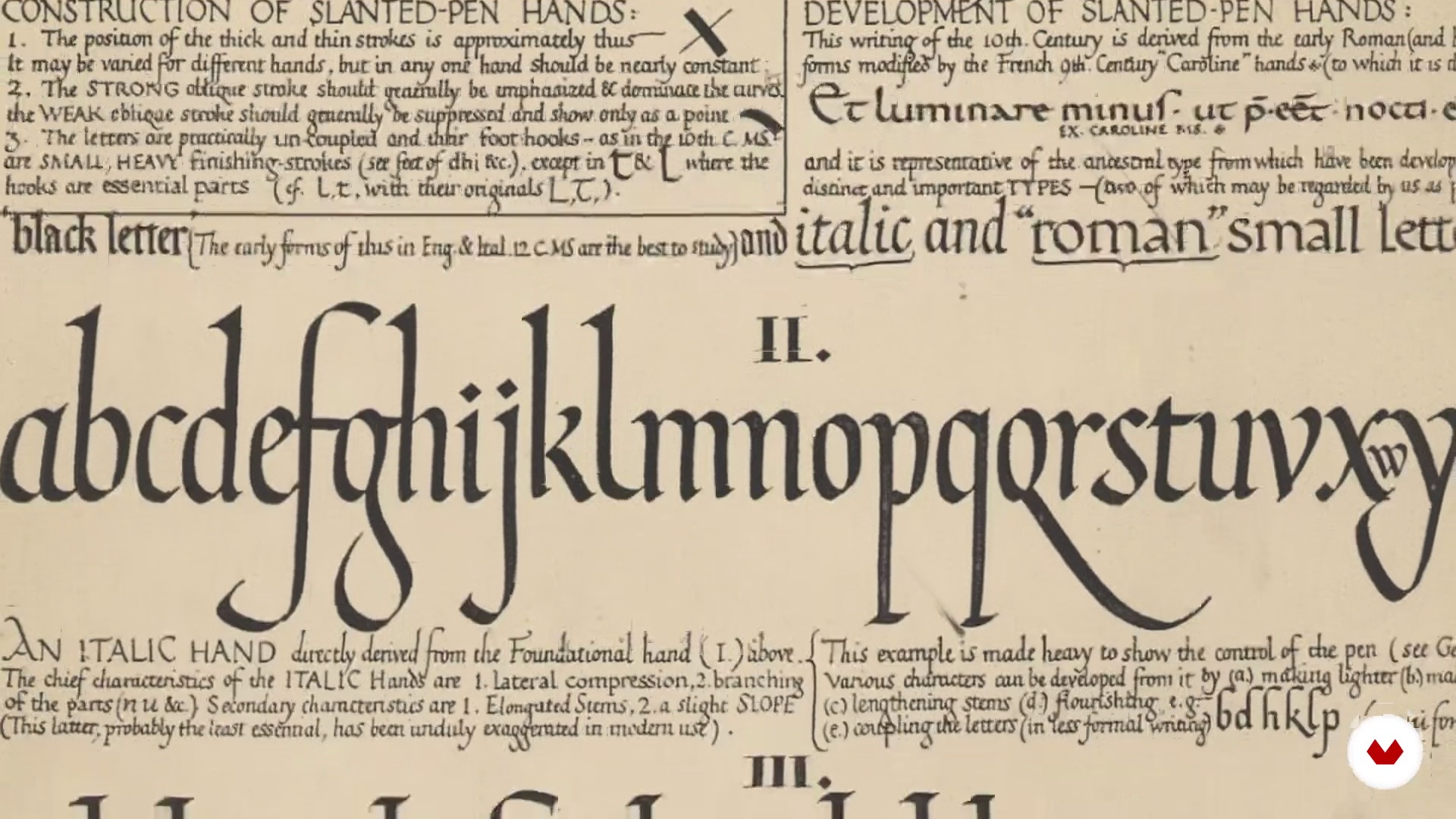
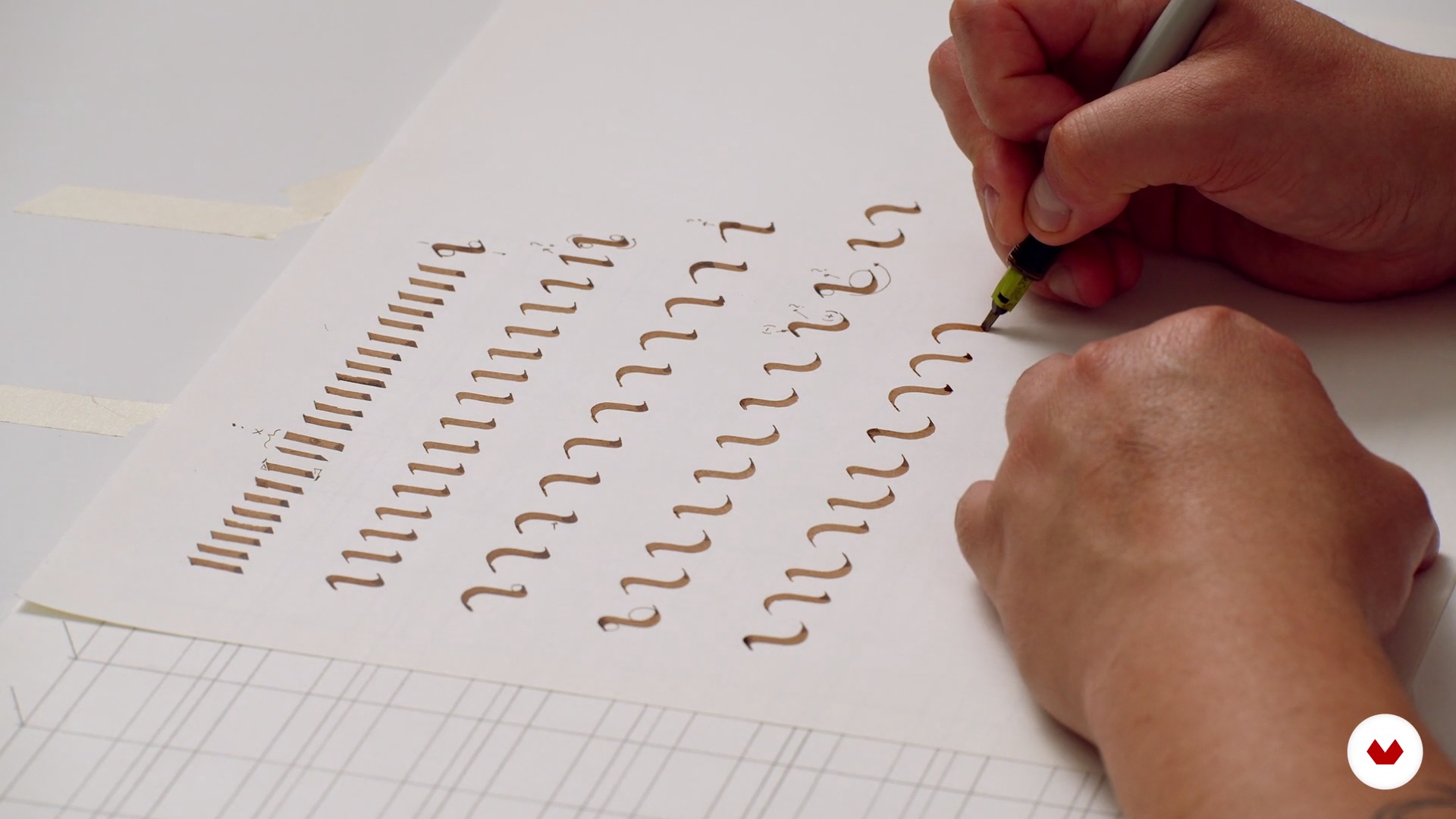
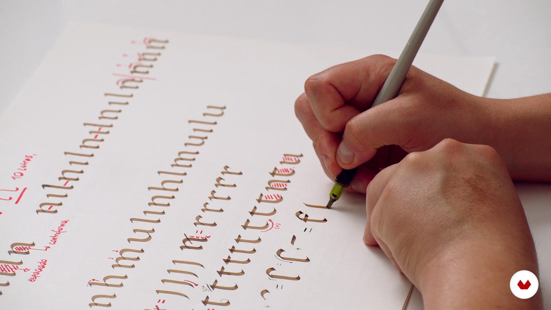
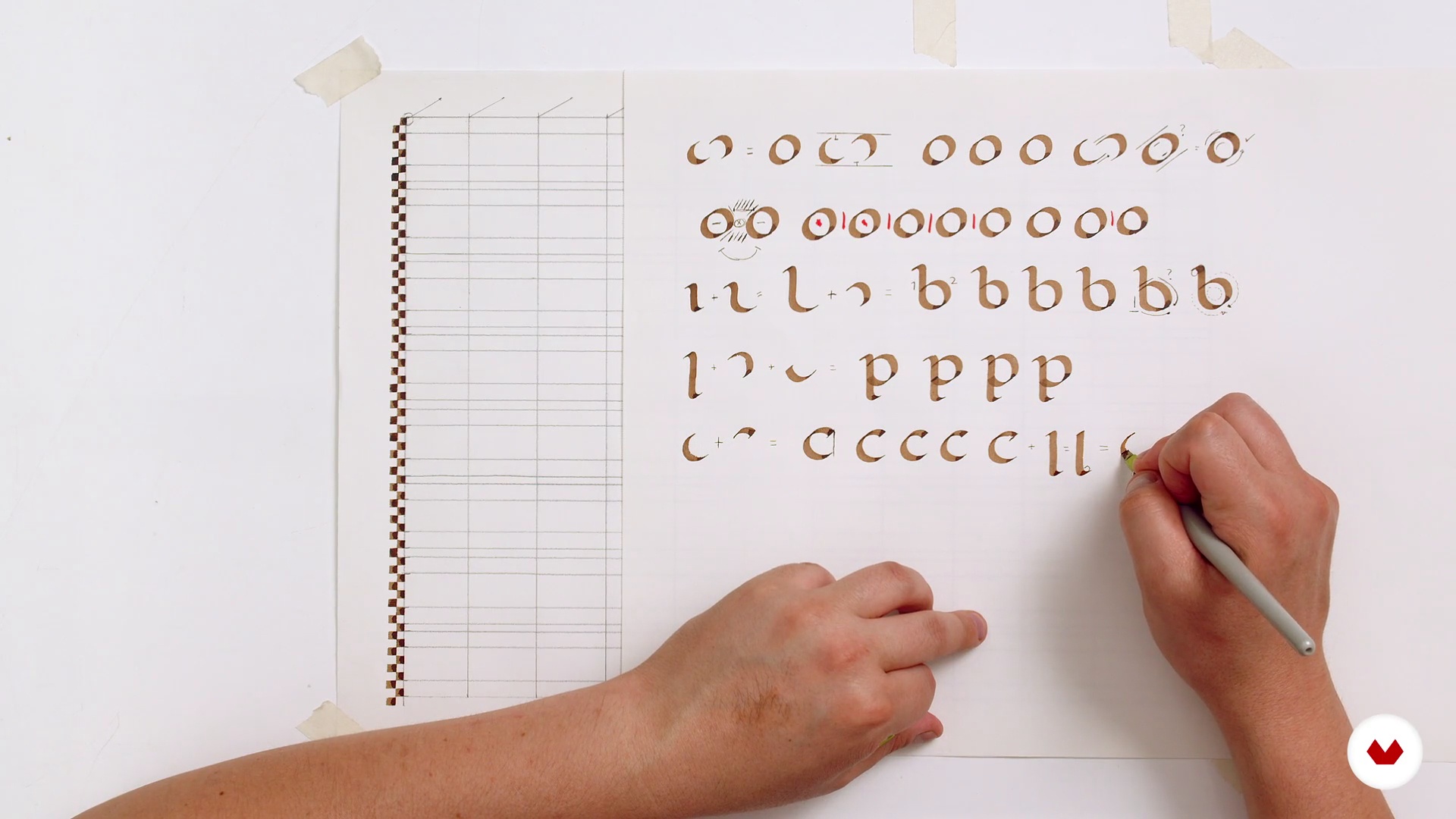
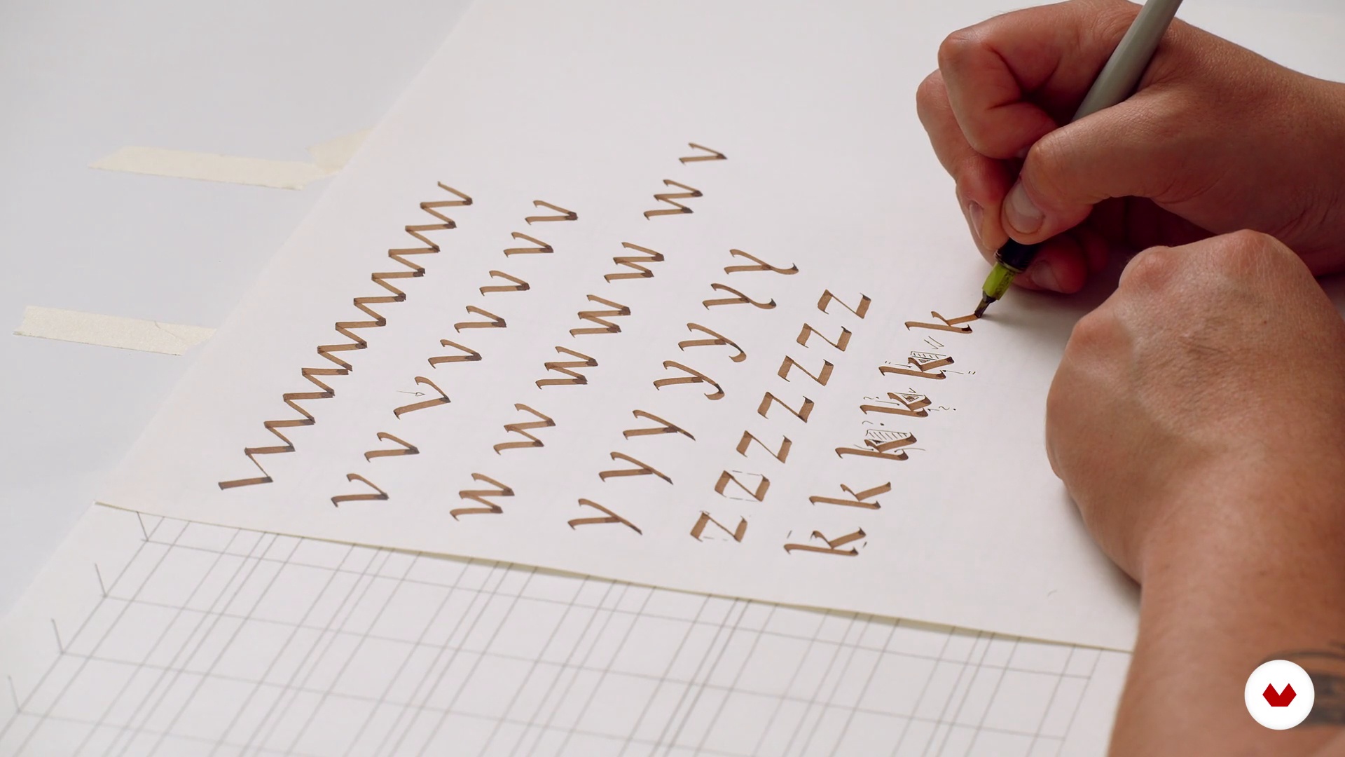
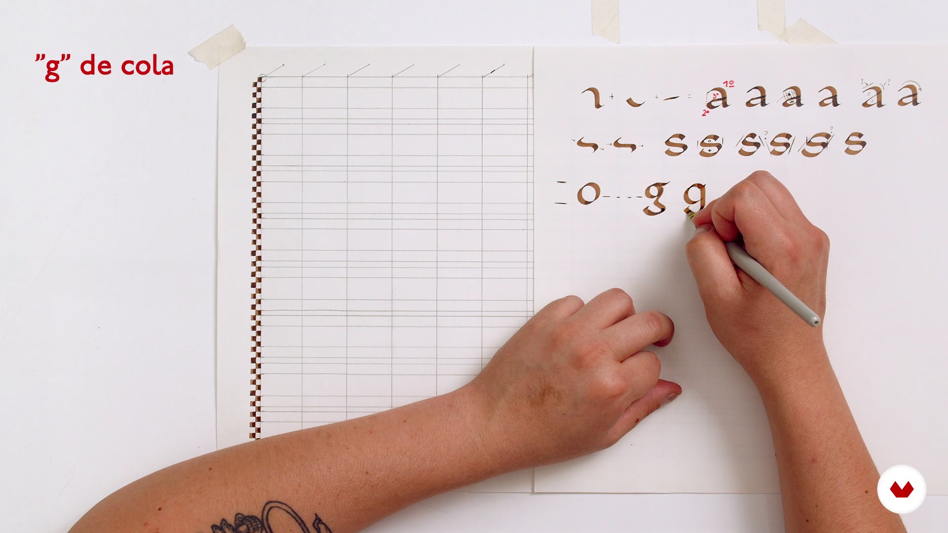
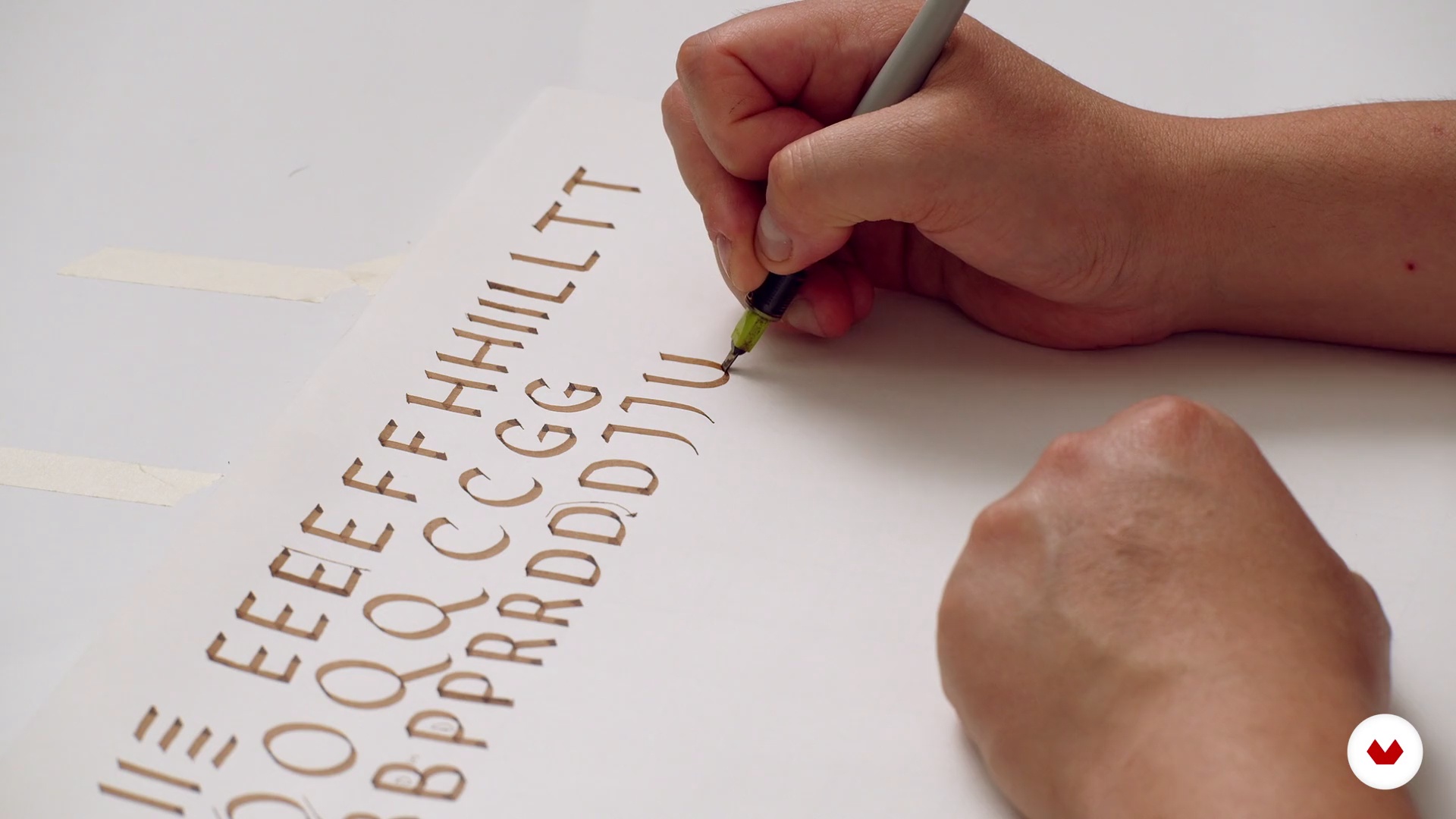
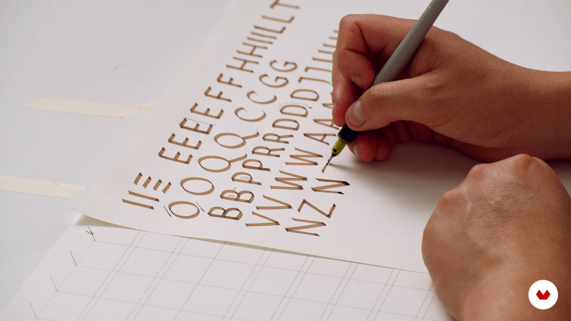
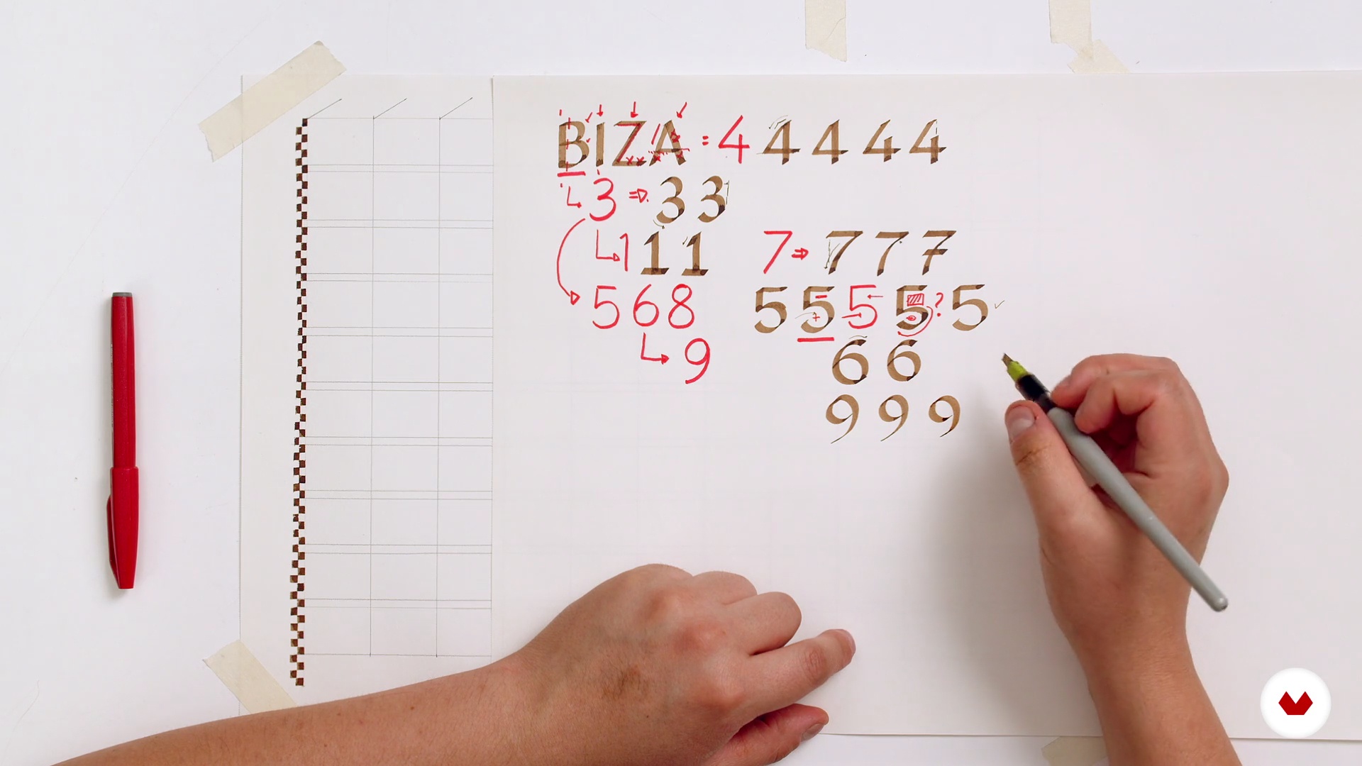
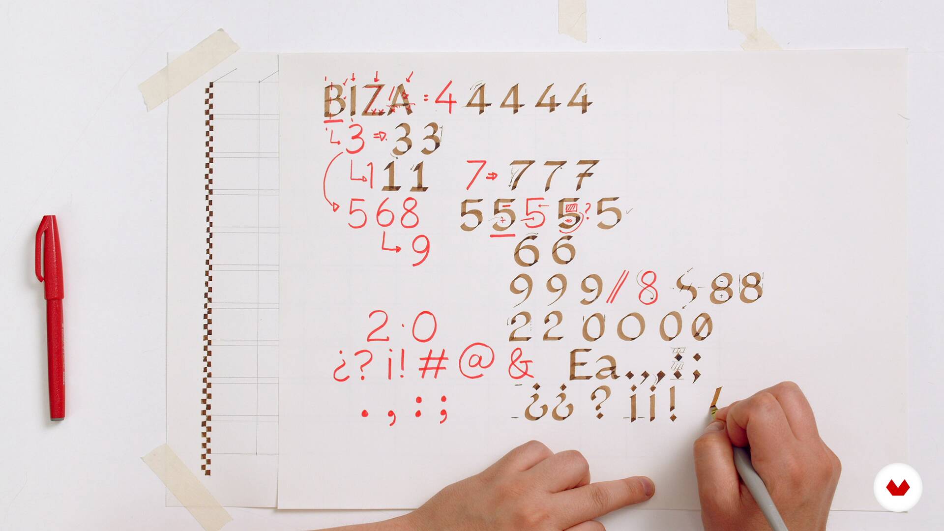
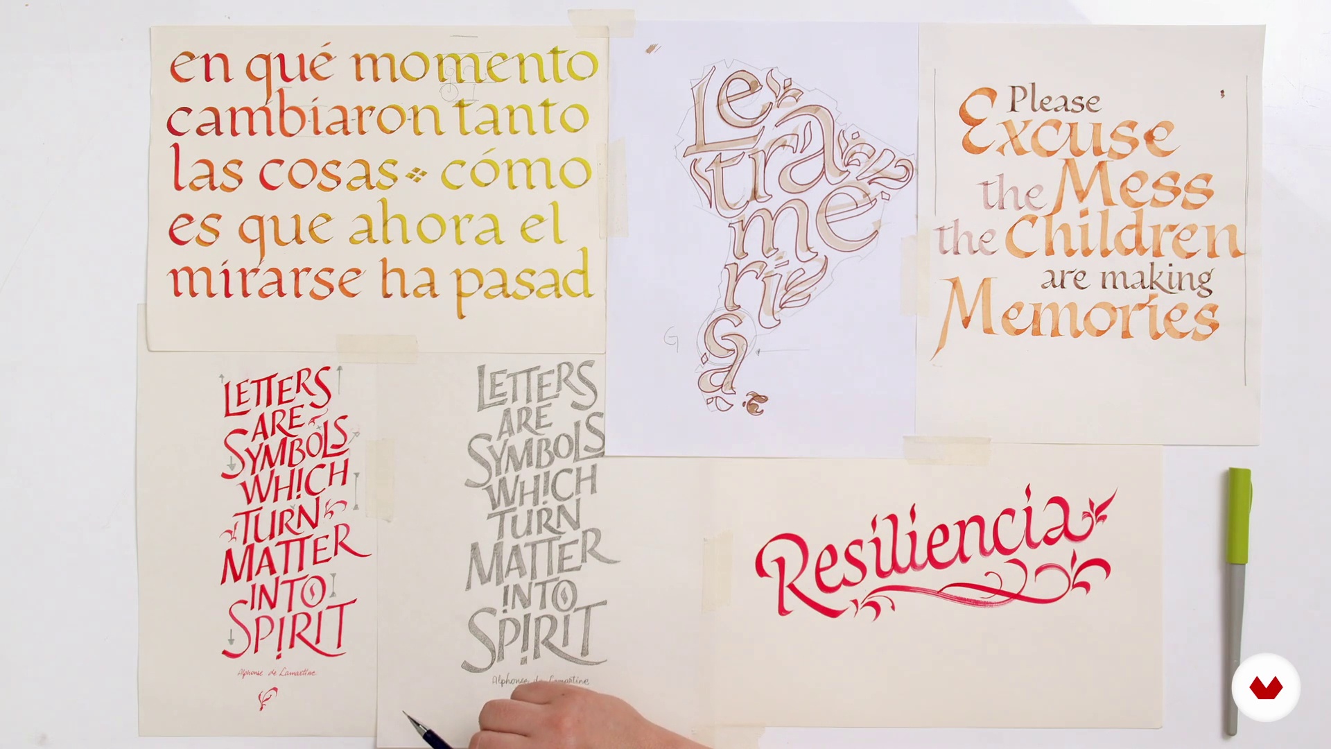
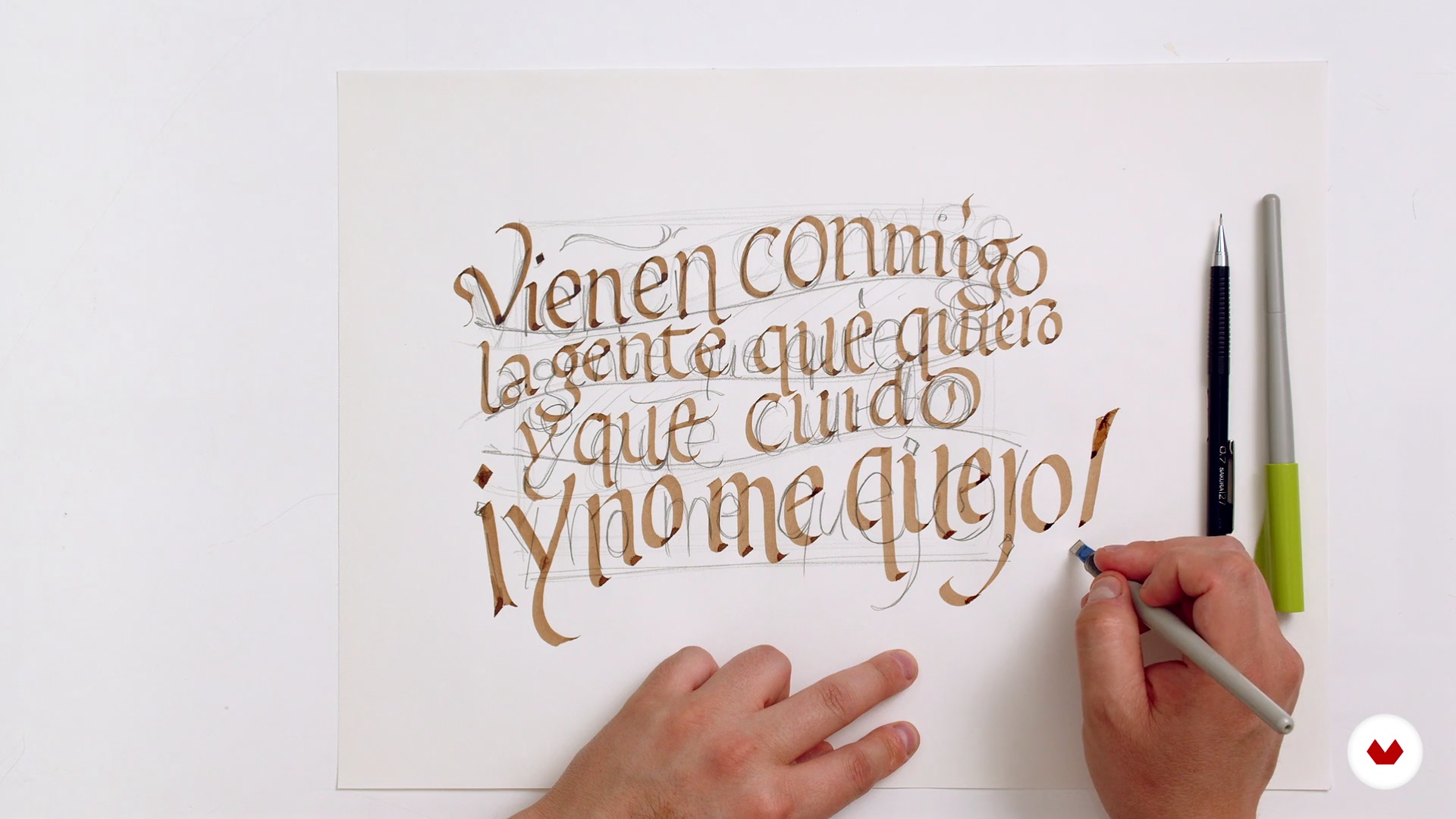
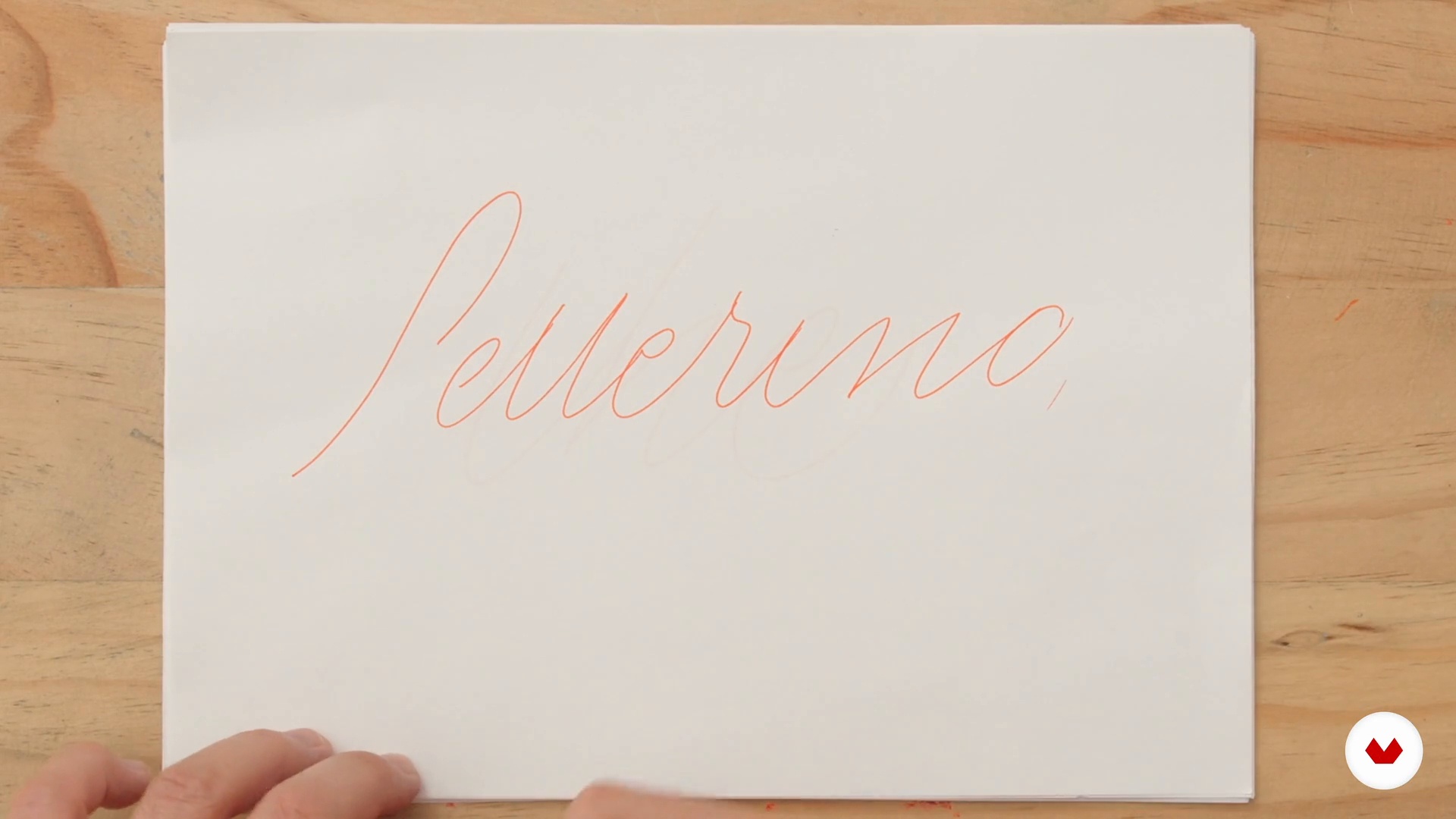
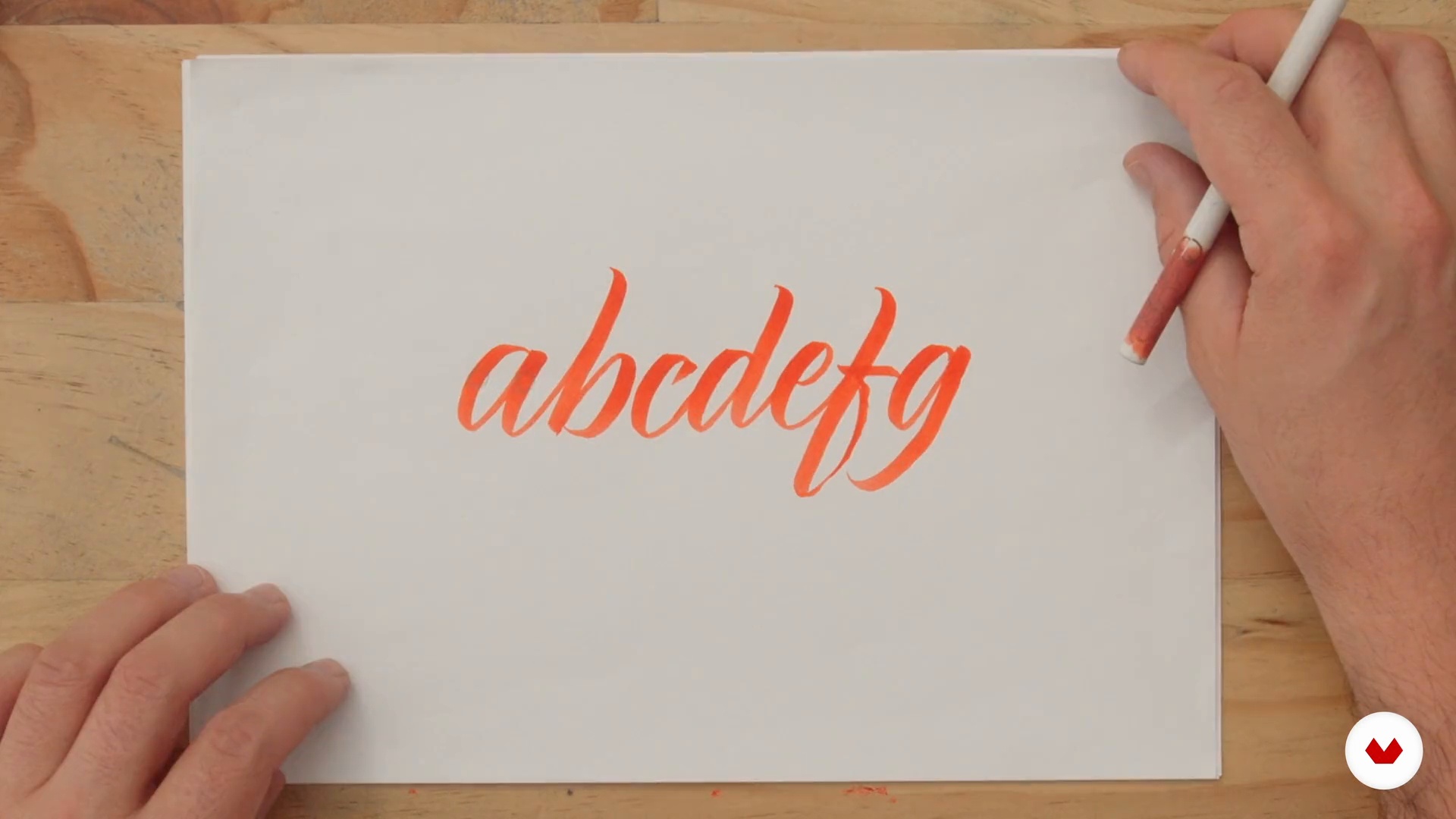
Discover the fascinating world of classical and contemporary calligraphy with a specialization that ranges from the most historical styles to the most sophisticated ornamental techniques. Learn to master English calligraphy, characterized by its elegance and precision, and the uncial style, known for its use in medieval manuscripts. Immerse yourself in the refined art of italic calligraphy, exploring both its formal and cursive versions, and delve into the foundational style, which combines classical aesthetics with modern functionality.

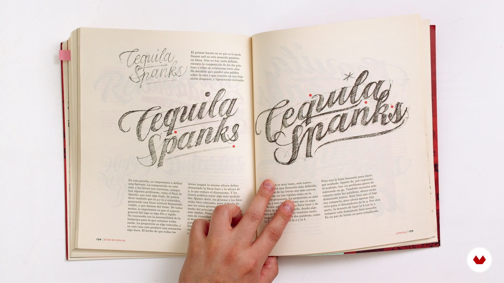
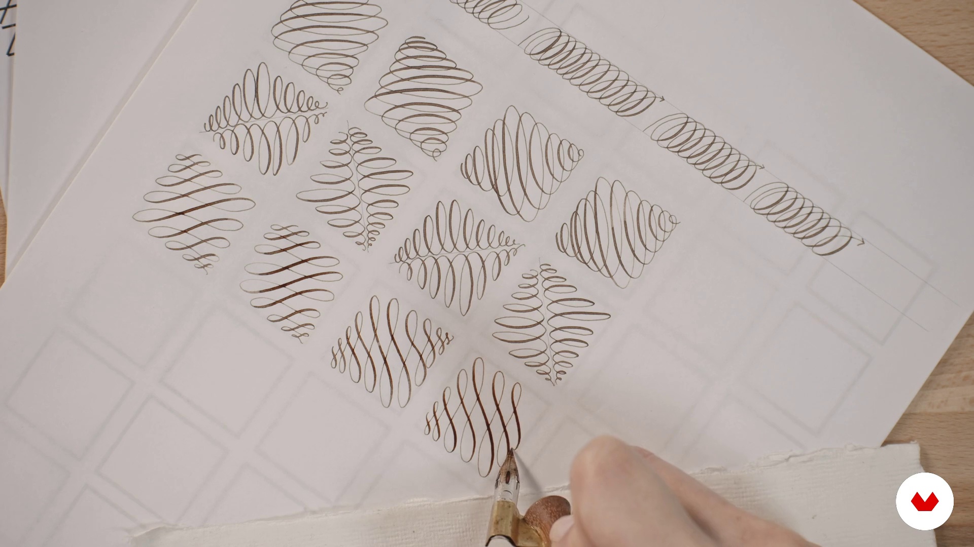
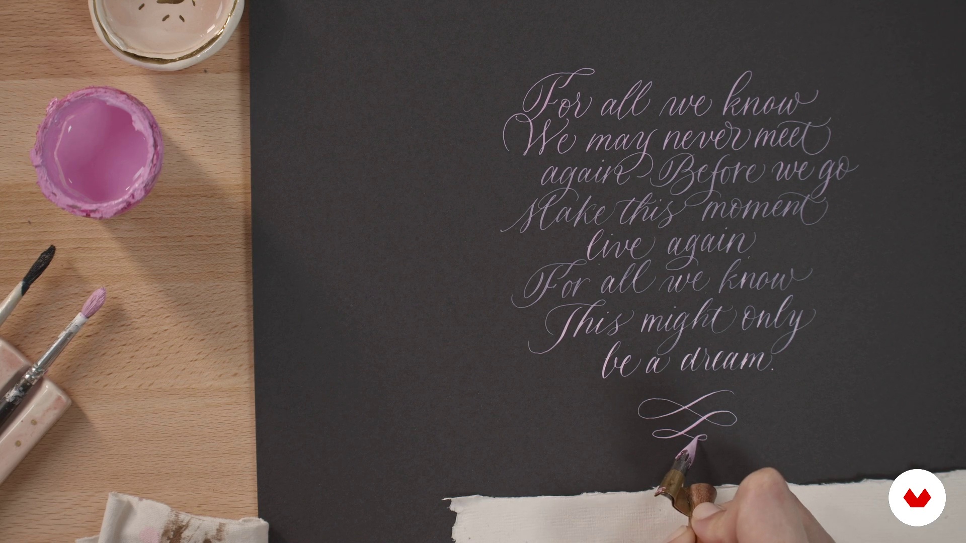
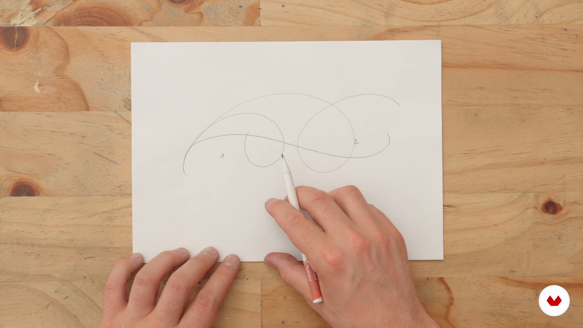
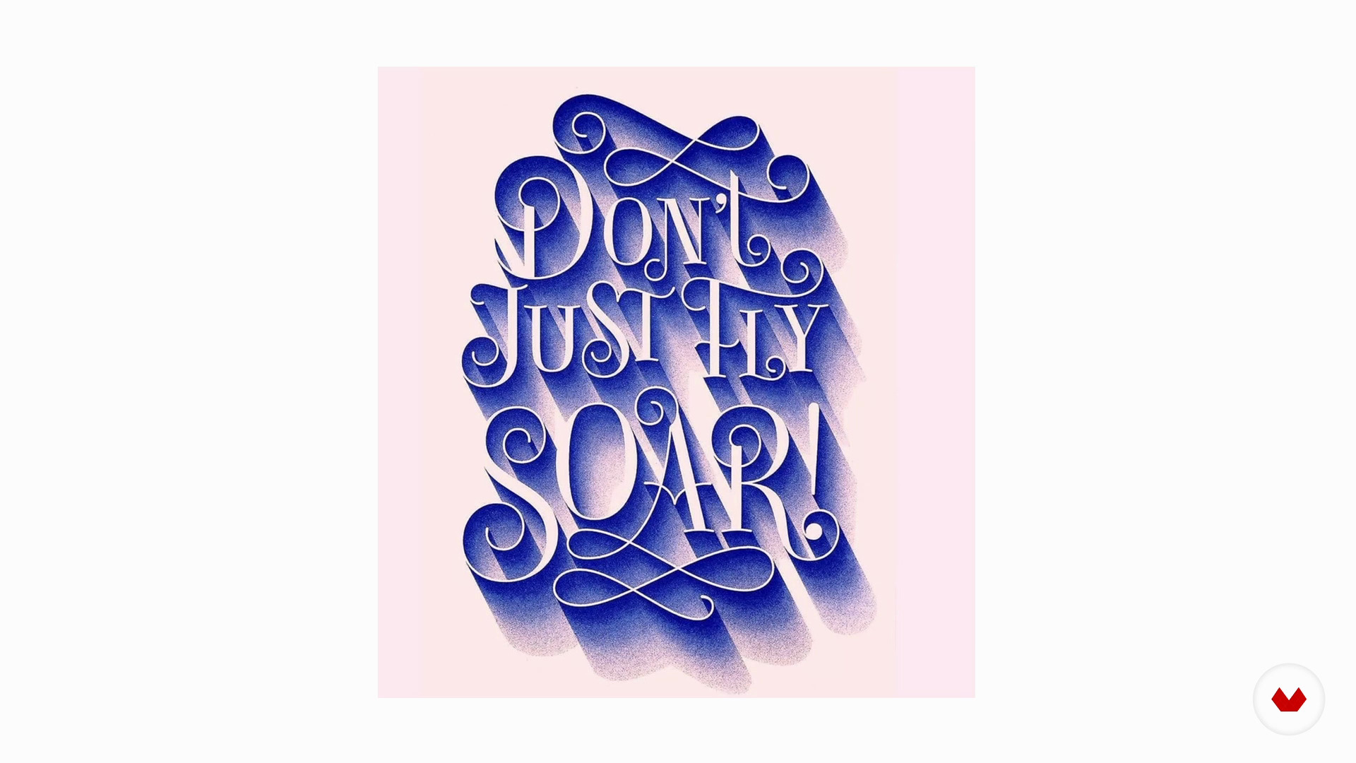
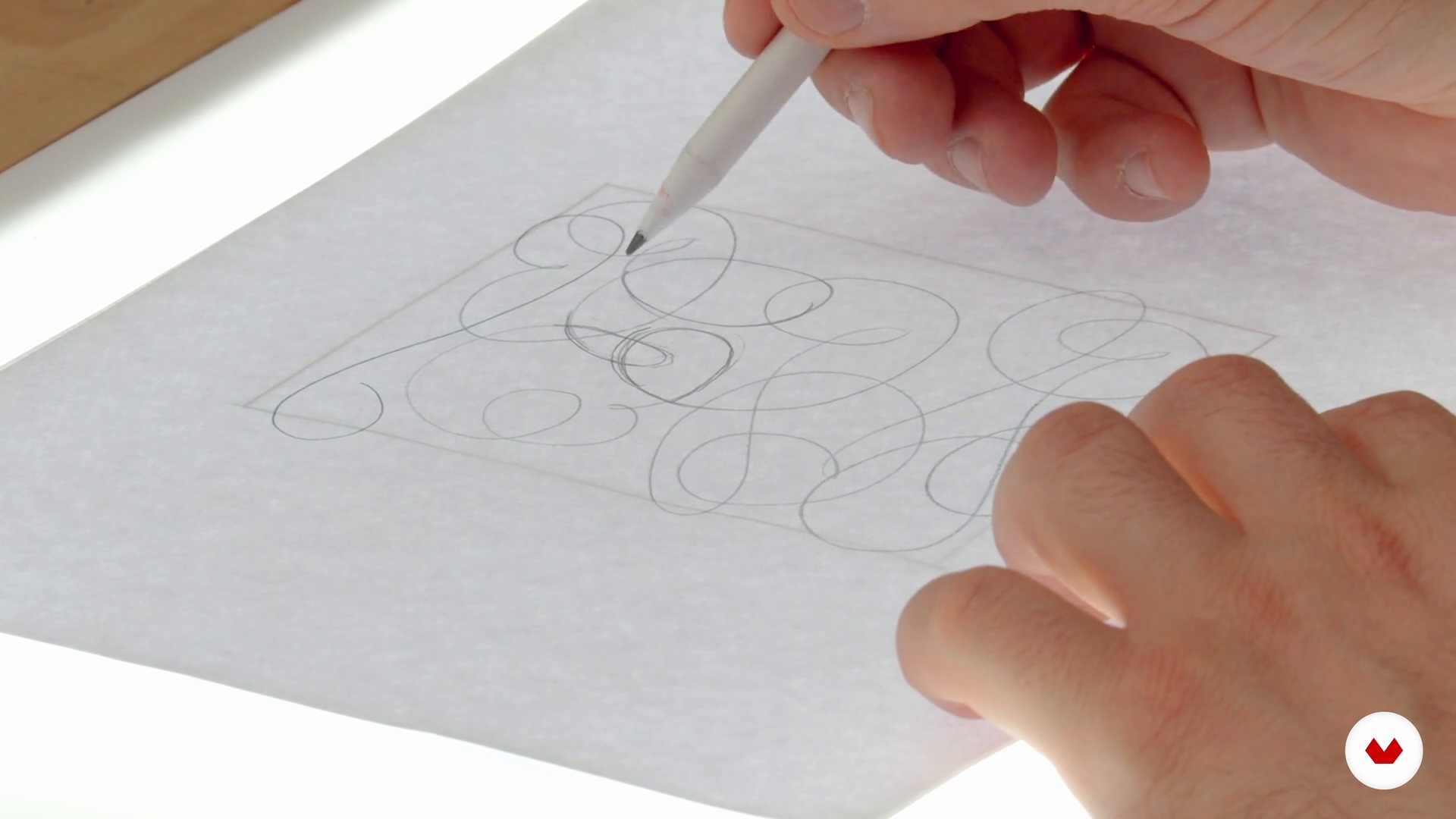
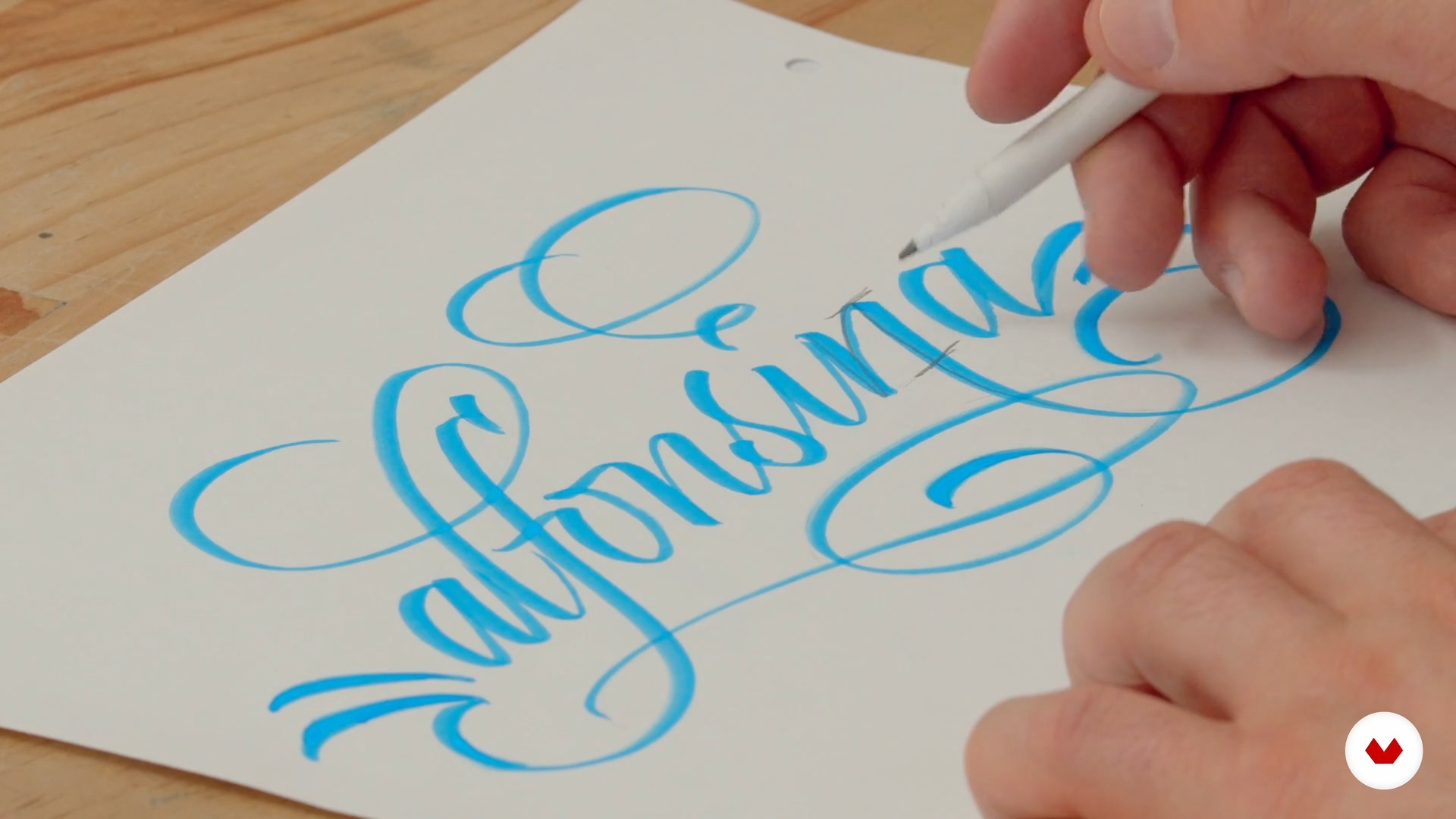
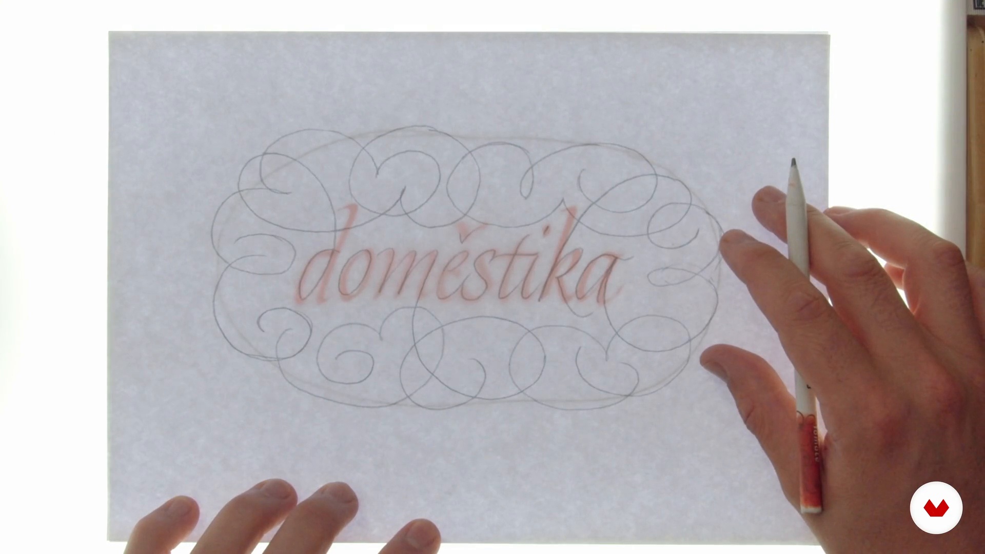
Plus, hone your skills by incorporating flourishes and ornamentation that add a unique artistic dimension to any piece. Each instructor—from Bego Viñuela Galarraga with her mastery of copperplate, Joaquín Seguí with his expertise in uncial, Belén La Rivera with its italic art, Leo Calderón with foundational calligraphy, and Panda, a specialist in flourishes—will guide you step by step. By the end, you'll have a portfolio that demonstrates your technical skill and creativity, opening doors to new opportunities in graphic design and visual communication.

Read more ↓

What will you learn in this specialization?

A total of 6 modules and 83 lessons
A total of 14h 21m of vídeo lessons
Taught by 5 selected expert teachers
image
1
Introducción
Calligraphy is much more than beautiful writing: it's a way to preserve ideas, intensify meaning, and transform the everyday into something extraordinary. In this lesson, you'll explore its evolution across cultures, its expressive power in design, and the joy of creating with your own hands. All you need is paper, ink, and curiosity.
1m
image
2
Influences | Bego Viñuela Galarraga
In this lesson, I'll talk about my influences, what I like, and what inspires me, which may or may not be related to lyrics.
5m
image
3
Influences | Joaquín Seguí
I'll talk about my calligraphy influences. Current influences like Luca Barcelona, Silvia Cordero Vega, and Joan Quirós. And others from the old school, from Hermann Zapf to Denis Brown.
8m
image
4
Influencias | Belén La Rivera
I'll show you my favorite influences! I'll also show you the work of the teachers who taught and shaped me (and whose work is beautiful). Many aren't as popular on social media, so with the help of used books, we'll explore their work in images I've prepared for you.
14m
image
5
Influences | Leo Calderón
Influences always shape us and motivate us to practice tirelessly; this is where I'll share my tastes and inspirations, which don't always come from writing. I'll introduce you to references such as Joan Quiros, Iván Castro, Luca Barcellona, Chiara Riva, Francesca Biassetón, and Ricardo Rousellot. In this section, I'll reinforce the list of references with some of their books, as well as a selection of their works.
8m
image
6
Inspiration | Panda
No one is born knowing, which is why I want to tell you about some of the role models who still inspire me with their work.
1m
image
3
History of English calligraphy
In this first lesson I will tell you the origin and use of this calligraphy.
2m
image
4
Materials and tools
In this lesson I will show you the necessary and basic tools for the practice.
9m
image
5
Guidelines and ergonomics
In this lesson, I'll explain how the pattern works and give you some ergonomic tips.
6m
image
6
Basic lowercase traits
I will explain what the basic features of lowercase letters are and how they are drawn.
6m
image
7
Lowercase
I will explain, by groups of families, the lowercase letters.
16m
image
8
Union of lowercase
I will explain the general rules and exceptions of lowercase conjunction.
7m
image
9
Basic Features Uppercase
Just like I taught you with lowercase letters, capital letters also have a basic common trait that is repeated in almost all letters. Mastering this trait is essential—let's see how good you are at drawing the beauty line!
3m
image
10
Warming the hand
I'll explain some exercises to warm up your hand. These types of exercises are very useful, and I recommend you do them whenever you can.
6m
image
11
Capital letters
I'll explain capital letters by family group. By grouping, you'll see that it's much easier to learn the letters, since they share the same stroke characteristics.
16m
image
12
Capitalization
Do you think capital letters always go together with lowercase letters? Maybe so. Let's see what the rules are...
6m
image
13
Alternative letters
In this lesson, I'll give you a brief introduction to what a more expressive copperplate can be. These little tricks will help you make your composition more dynamic and personal.
5m
image
14
Numbers and signs
Numbers and symbols can be just as important as letters, so we're going to dedicate a short lesson to helping you learn them and complete your texts and compositions.
4m
image
15
Composition
Who said we always have to write horizontally and linearly? We can take risks and play with the composition whenever we want. I'll show you some little tricks to give your composition more dynamism. You'll see how easy it is!
6m
image
16
Write about dark backgrounds
You may have wondered if calligraphy can only be written in dark ink on a light background. We can work on any color of background paper, but to do so, we must know the technique. In this lesson, I'll teach you the procedure.
8m
image
17
Write with watercolor
In calligraphy, we can write with almost any colored liquid. From coffee, tea, prepared pigments, fountain pen inks, and even watercolors. Using watercolors is super simple and allows you to create your own color palette. You'll see how beautiful it looks.
7m
image
4
Notions about calligraphy
I'll tell you about the different types of calligraphy that exist in general and what types of tools are used for each one (flat quill, cursive, and gestural). Within this melting pot of possibilities, we'll identify where uncials are found.
8m
image
5
Tools and materials
I'll list the materials we'll need during the course. I'll give you some tips on choosing the right ones and how to prepare them for work. Ink, flat pens, sleeve, protractor, paper...
14m
image
6
Construction of a calamus
The quill pen is an ancient tool used for calligraphy. Let's see what it takes to make one and the step-by-step instructions for doing so.
11m
image
7
Practical concepts for making calligraphy
I'll explain the concept of stroke angle and how to hold the pen correctly. I'll execute some strokes on paper at different angles, and we'll review the results. I'll also trace some letters, and we'll review the results to explain the differences in proportions.
14m
image
8
Brief history of uncial calligraphy
I'll give you a brief overview of the history of the uncial style and its origins. I'll discuss the different types of uncials throughout history; how they were used and for what purpose, who used them around the world, their historical context, their transition to Gothic script, and the most important contributions they made to writing.
5m
image
9
Round Letters Ductus
First, I'll explain how to read a calligraphy pattern and then trace part of the alphabet, explaining general considerations and pointing out some specific features of some letters. In this lesson, we'll look at the rounded letter group (CDEGOQT).
11m
image
10
Ductus of vertical letters and with bow
I'll trace part of the uncial alphabet, explaining what to keep in mind in general and for each letter. In this lesson, we'll look at two groups of letters: with a vertical stroke (BFIJKLPR) and with an arch (HMNU).
14m
image
11
Ductus of special letters
Finally, we'll look at the rest of the letters: the special letters (ASVWXYZ). You'll learn why they're considered special and how to draw them correctly.
9m
image
12
Word and sentence construction
We'll do a short exercise in which I'll write words on a single line to explain how letter spacing and letter spacing work, and we'll also look at some generalities when combining different groups of letters.
11m
image
13
Stroke modulation and flourishes
I'll give you some tips for modulating your strokes and achieving more gestural finishes. We'll briefly list some examples of flourishes for some letters.
17m
image
14
Build your arsenal of letters
Let's do a quick reference search for the specific letters we need to work with. This will help you discover various ways to write each of the letters and how to combine them.
10m
image
15
Sketches and composition
With our search in mind, we'll begin sketching the name of your hometown or a city you like and want to work with in your project. Once we've decided which composition to use from the ones achieved in the draft stage, we'll begin refining it for the final version.
20m
image
16
Digitize
We'll cover what you should keep in mind when scanning the original handwritten calligraphy. You'll learn some tricks for retouching and working with the digitized version of the calligraphy phrase so you can apply it to your design.
8m
image
17
From the old to the modern
With the final version now digitized, I'll give you some quick tips to give that calligraphy a modern touch that will make it fit in with any design from this century.
10m
image
18
BONUS: Elements and production of a postcard
Let's review the essential elements of a postcard, along with some measurements and details you'll need to design your own version. I'll give you some tips on how to print your postcards and which media are best for creating a version worthy of mail delivery.
7m
image
4
Un poco de historia
I will briefly explain where and how chancery writing, italic, and the two most widely taught historical styles were created: formal and cursive.
4m
image
5
Conceptos caligráficos y tipográficos
Throughout the course, you'll hear different calligraphic and typographic concepts mentioned. To help you understand them, I'll introduce them one by one in this lesson.
10m
image
6
Presentación de las herramientas
In this lesson, I'll introduce you to a series of materials; some that I'll use in the course and others that you can easily use if you wish.
14m
image
7
Cómo hacer guías caligráficas
The construction of guides will always depend on the tool you want to use and the expressive style of the piece. In this lesson, I'll teach you how to build a classic grid to begin the exercises, so you can rest on it while you practice your lettering.
13m
image
8
Familiarización con las herramientas
The only way to learn tools is to use them! In this lesson, I'll show you some exercises to help you feel more comfortable using them.
16m
image
9
Construcción de minúsculas I (primera parte)
There are letters that help build the lowercase alphabet: the letters "n" and "o." I'll teach you how to draw them and then deduce other letters from this pair.
12m
image
10
Construcción de minúsculas I (segunda parte)
In this lesson I will continue to show you how to draw lowercase letters starting with "n" and "o".
11m
image
11
Construcción de minúsculas II
We still have more letters to learn! In this video, I group the remaining letters by shape so you can practice along with the ones you've already reviewed.
18m
image
12
Mayúsculas con pluma (primera parte)
The world of capital letters works very differently from that of lowercase letters. For this reason, they deserve to be viewed independently, following the logic used previously: they'll be grouped by shape, so you can become familiar with those with vertical, diagonal, and curved lines.
12m
image
13
Mayúsculas con pluma (segunda parte parte)
We continue reviewing italic capital letters.
10m
image
14
Exploremos las itálicas
You already know the structure of lowercase italics—now it's time to experiment with their shapes! I'll show you three variables you can incorporate into your drawing, so you can experiment and find a style that suits you and that you'll want to keep practicing.
17m
image
15
Juguemos con las mayúsculas (primera parte)
Capital letters are a territory you can explore, since there aren't many of them present in a piece or paragraph (at least in Spanish). In this lesson, I'll show you what's essential when experimenting so your capital letters shine, look beautiful, and are well-made.
13m
image
16
Juguemos con las mayúsculas (segunda parte)
We continue with Capital Letters and the different elements you can modify to give it more personality.
19m
image
17
Selección de frase y su concepto gráfico
There are dreamy, romantic, humorous, elegant, ironic phrases... In this lesson, we'll see some examples through a pen demonstration of how the variables already reviewed help emphasize certain emotional narratives.
18m
image
18
Bocetos para la composición de la frase
I like to experiment with ideas until I get to the point! Here I'll show you how to quickly visualize, diagram, and compose a calligraphy poster.
15m
image
19
Preparación del papel y las herramientas para la pieza final
With the sketch ready, it's time to make the special grid that will go on the final paper and prepare everything necessary to create our final design.
5m
image
20
Desarrollo de la pieza final
It's time to write the final piece: here you'll see that ink surprises and spontaneous movements are welcome.
8m
image
21
Digitalización, Retoque y paso a otros formato
And that's it! Once your calligraphy poster is complete, I'll give you tips for aftercare, as well as show you other ways you can apply your calligraphy design.
3m
image
4
Foundational Calligraphy History
In this lesson, I'll talk about Edward Johnston, the creator of foundational calligraphy. His work has influenced both our typographic and calligraphic studies. You'll also learn how this style has become a fundamental tool for various platforms, from everyday products to font bases. We will review some of his bibliography and research carried out by other calligraphic references, such as Foundations of Calligraphy , by Sheila Waters, or Making and Composing , by Francisco Gálvez. This sample of references will support the narrative of the research that Johnston developed to achieve the Foundational.
7m
image
5
Characteristics of Foundational Calligraphy
For this lesson, I'll present the basic technical characteristics of foundational calligraphy, from its architecture and visual hierarchies to the formation of fundamental strokes for both the exercises and the final work. We'll first focus on understanding the basic architecture of letters and defining the easiest parts to learn. We'll then learn about visual weights, scale and width variations, letter spacing, lines of text, and paragraphs, among other things.
13m
image
6
Let's prepare and take care of our tools
In this lesson, we'll learn in detail about the tools to use: from using flat-tipped calligraphy pens and calligraphy markers to making a simple craft tool that I offer as an alternative.
15m
image
7
No grids, no party!
To create disorder, we must first organize our ideas; the same thing happens in calligraphy. While it's great to practice a new style on blank paper, using calligraphy guides will always help us better understand the distribution of spaces, widths, and heights of letters. That's why, in this lesson, I'll teach you how to create and use our own grids.
13m
image
8
Initial strokes: sticks and curvitas
We'll begin this lesson with initial line exercises, taking into account factors such as angles, heights, and various shapes; all based on module or puzzle piece exercises. We'll see how joining groups of straight and curved lines will form the first sets of letters that I'll show you in the following lessons.
14m
image
9
A letter as a puzzle
With the first modules completed, you'll be able to advance to the first group of letters: the lowercase straight sisters (h, i, j, l, m, n, r, t, u, f); you'll learn ways to work with them, based on the combination of the initial strokes seen in the previous lesson. Later, we'll play with words associated with this group of letters, which will help us adjust spaces, shapes, and their structures.
14m
image
10
Curved sister letters
Now it's the turn of the lowercase curved sisters (obpq d- ce); just like in the previous lesson, you'll learn ways to work with them and you'll be able to expand the level of words to perfect the level of letter-spacing and counterforms . That is, base the construction of the rest of the letters on the example of the shape of the O, mixed with some straight modules, to give shape to the rest of the sisters.
14m
image
11
Diagonal sister letters
If straight lines and curves weren't enough, now we have the lowercase diagonal sisters (v, w, y, z, k, x); with this group, you can fine-tune details of shapes and spaces to work with all kinds of words, without limitations, while maintaining the spacing exercises you've practiced previously.
16m
image
12
Demon Sister Letters
If you thought this style was easy after all the exercises seen above, I challenge you to try the demonic sisters! (a, g, s). These letters have a slightly higher degree of difficulty, which is why we will focus on practicing these forms to add them to our alphabet. We will emphasize the care these letters must take in their construction, looking at examples of optimal results and common mistakes made when practicing with these modules.
10m
image
13
Capital letters and not die trying 1
In this lesson, we'll begin working on the same initial strokes and shapes that will help us build our set of capital letters. We'll learn their heights, counterforms, and letter spacing, as well as their correct and incorrect forms, always starting with the base letters: N and O.
15m
image
14
Capital letters and not die trying 2
In this video, we'll finish learning capital letters in foundational calligraphy.
14m
image
15
Numbers, signs and symbols 1
Another important group to practice in foundational learning is numbers and intonation marks, punctuation, basic accents, and other fundamental symbols, such as parentheses and brackets. We'll learn how to construct them and add them to our character set to further enhance the development of paragraphs in texts.
14m
image
16
Numbers, signs and symbols 2
In this video we will continue working on numbers, signs, and symbols in foundational calligraphy.
9m
image
17
Continuous writing
In this lesson you'll learn the importance of the angle of the stroke in letters and how words are written continuously. I'll teach you the meaning of calligraphic color and how it influences the development of good word composition. To do this we'll do simple exercises like the famous MINIMUM, as well as the creation of pangrams (sentences that contain all the letters of the alphabet).
10m
image
18
Choosing, diagramming, sketching our phrase
In this lesson, I'll teach you how to experiment with different ways of presenting a text in Foundational. I'll present examples of possible options that will help us develop our final composition. The important thing is to try different combinations.
11m
image
19
Gesture
If you're looking to further enhance your work with foundational calligraphy, even going so far as to work on the gestures of your pieces, in this lesson I'll give you details on the correct use of gestures, strokes, and shapes that won't affect the legibility of your work.
13m
image
20
You live in colors 1
With the sketch ready, in this lesson I'll choose the colors to create an optimal palette. We'll also focus on the correct choice of paper and inks for this case. Everything will depend on what we want to communicate in our sentence. All of these elements will help us better reproduce and visually communicate our foundational alphabet; all based on what we learned in Lesson 3 of Unit 1.
16m
image
21
You live in colors 2
In this lesson I will continue with the construction of the calligraphic piece, working according to the previously chosen color palette.
13m
image
22
Details and care
From the options or layouts that we have sketched, it is necessary to select the best options and reproduce them with our favorite pens, repeating as many times as necessary, and accompanying it with tips on lighting colors, textures and paper backgrounds, among others; all this to further enhance our composition.
7m
image
3
The flourishes
We'll define what a flourish is, the tools needed to draw one, and other useful classifications.
2m
image
4
Types of flourishes
A key detail for achieving successful flourishes is knowing the characteristics of the tools we use to draw them, understanding how they adapt to different calligraphic styles, and understanding the origins of ornamentation in a composition. In this lesson, I'll teach you everything you need to know before drawing flourishes in your composition.
3m
image
5
Analyze the applications
In this lesson, I'll look at some flourish designs that will help educate and train your eye for future applications.
4m
image
6
Basic exercises: spirals, changes of direction and crossovers
You'll see some simple exercises that will help you loosen your hand and practice basic movements to become more precise and spontaneous when drawing flourishes.
9m
image
7
Rules of flourishes
In the world of calligraphic flourishes, there are certain rules to follow. We'll take a closer look at compound curves, learning general rules about what can and shouldn't be done in different situations you may face when applying them.
7m
image
8
Putting the rules into practice
I'll show you a simple and fun exercise to put into practice the rules we saw in the previous lesson.
5m
image
9
Characteristics of flourishes
As you know, there are some variations in flourishes across alphabets, as we already mentioned. These variations are influenced by the shape of the tool and the characteristics of the letter.
4m
image
10
How to beautify words
In this lesson, you'll see what features to consider when adding flourishes to your letters.
6m
image
11
Sketching
In this lesson, we'll explore the possible flourishes that emerge from a calligraphed word and make decisions about which ones to incorporate and which ones not.
6m
image
12
Calligraphing the project
Once you've decided on the flourishes that will be part of the final composition, I'll give you some tips for inking them.
8m
  • 68 students
  • 83 lessons (14h 21m)
  • 79 additional resources (44 files)
  • Online and at your own pace
  • Audio: Spanish, German, English, Spanish (Latam), French, Italian, Dutch, Polish, Portuguese, Turkish
  • Spanish · English · Portuguese · German · French · Italian · Polish · Dutch · Turkish
  • Level: Beginner
  • Unlimited access forever

What is this course's project?

You'll create a professional portfolio that demonstrates technical mastery in English, uncial, italic, and foundational calligraphy styles, culminating in a masterful ornamental composition. You'll integrate classical and modern techniques, creating unique artistic and commercial pieces.

Who is this specialization for?

Graphic designers looking to incorporate authenticity into their projects; artists wishing to develop traditional craft skills with contemporary applications; branding professionals creating unique visual identities; and aspiring calligraphers interested in comprehensive training from fundamentals to masterful ornamentation.

Requirements and materials

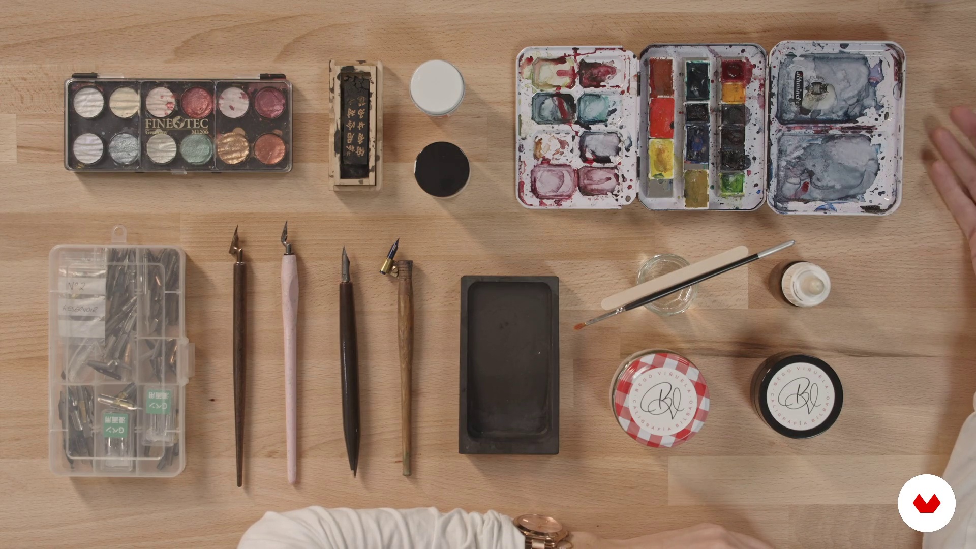
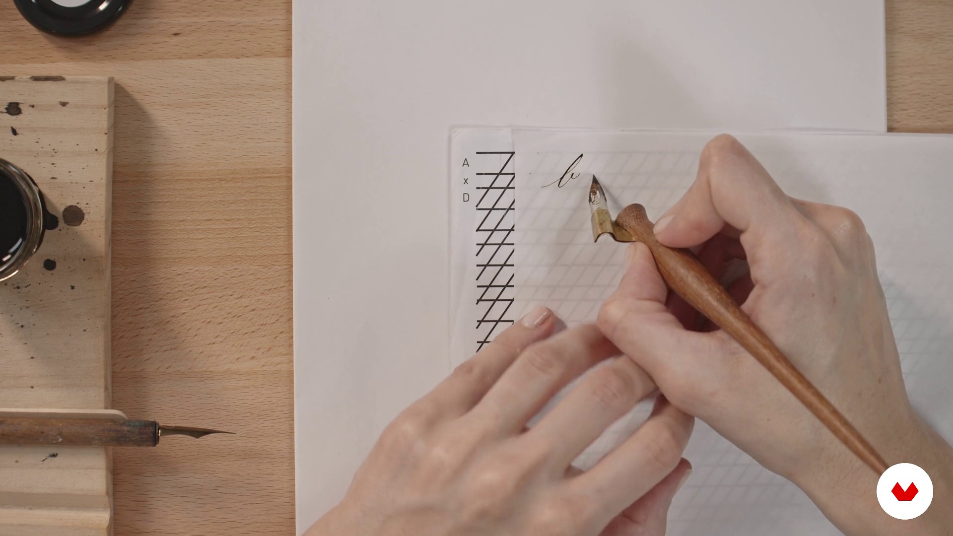
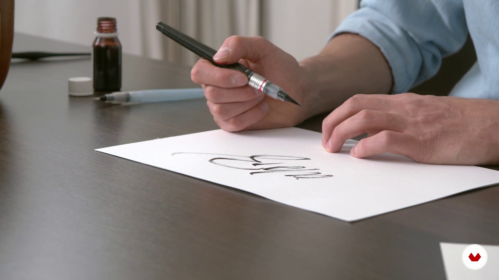
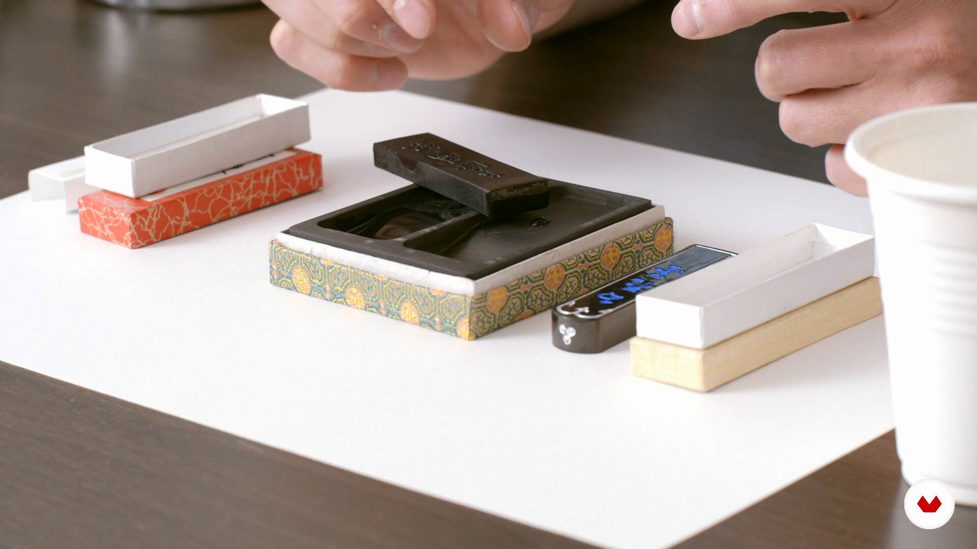
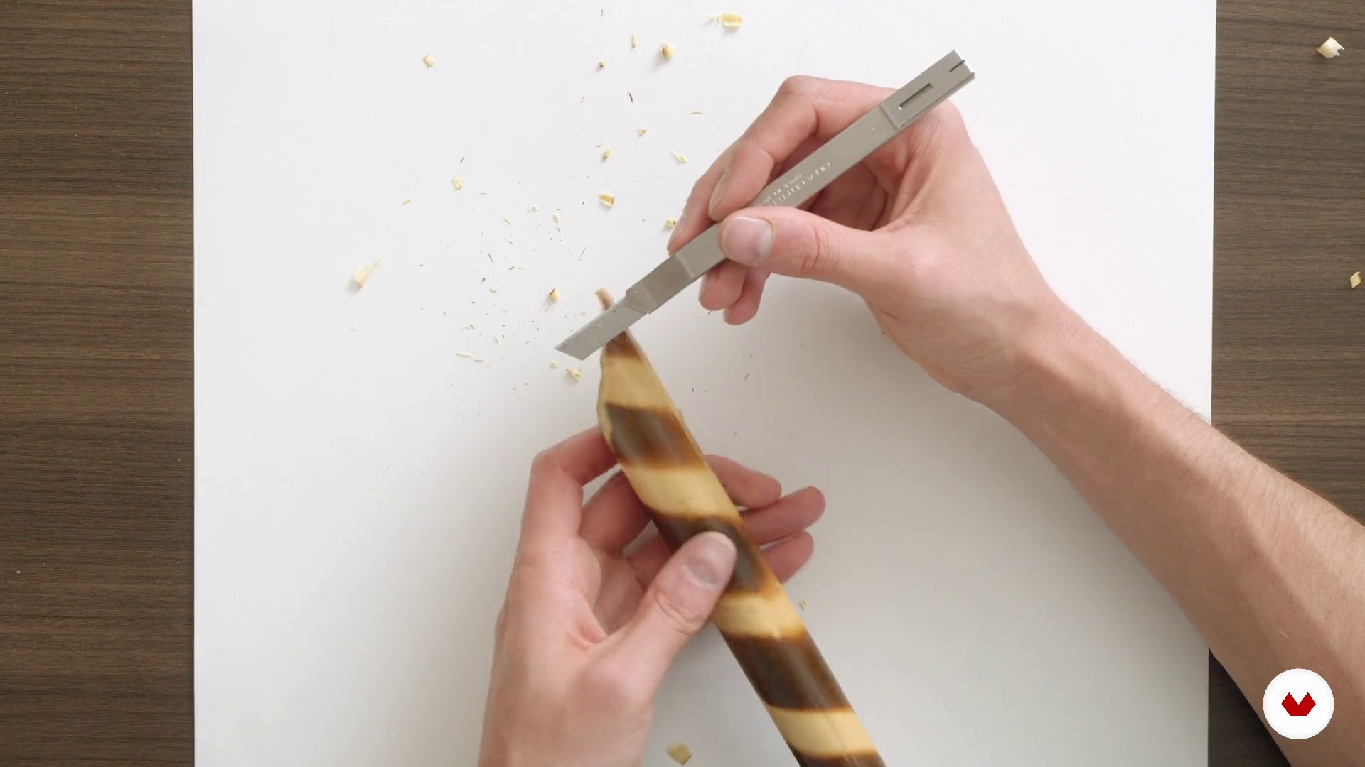
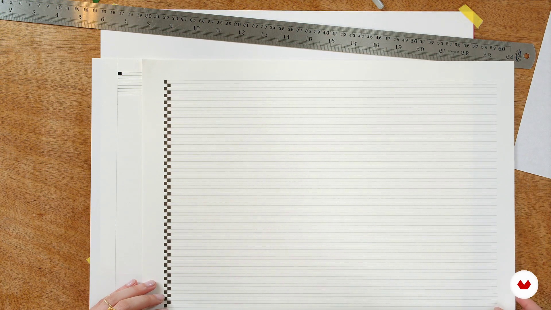
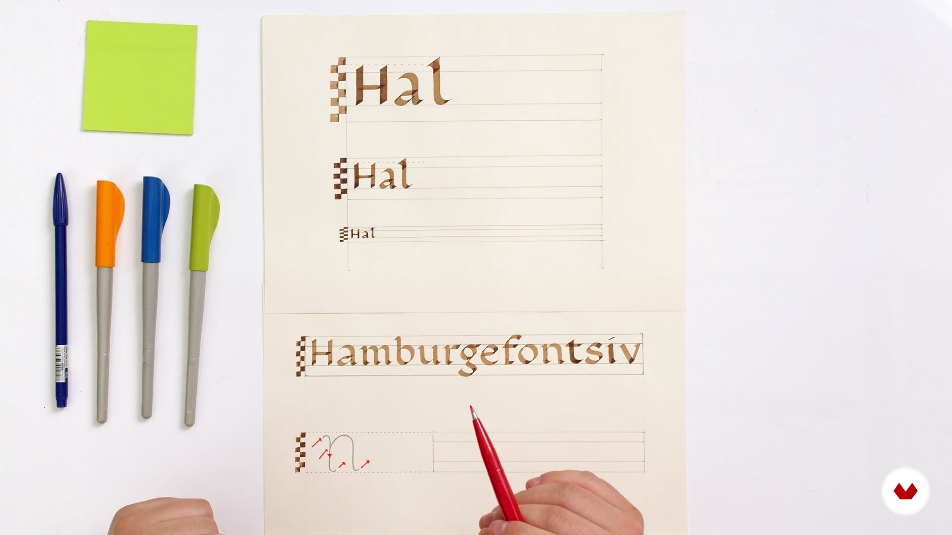
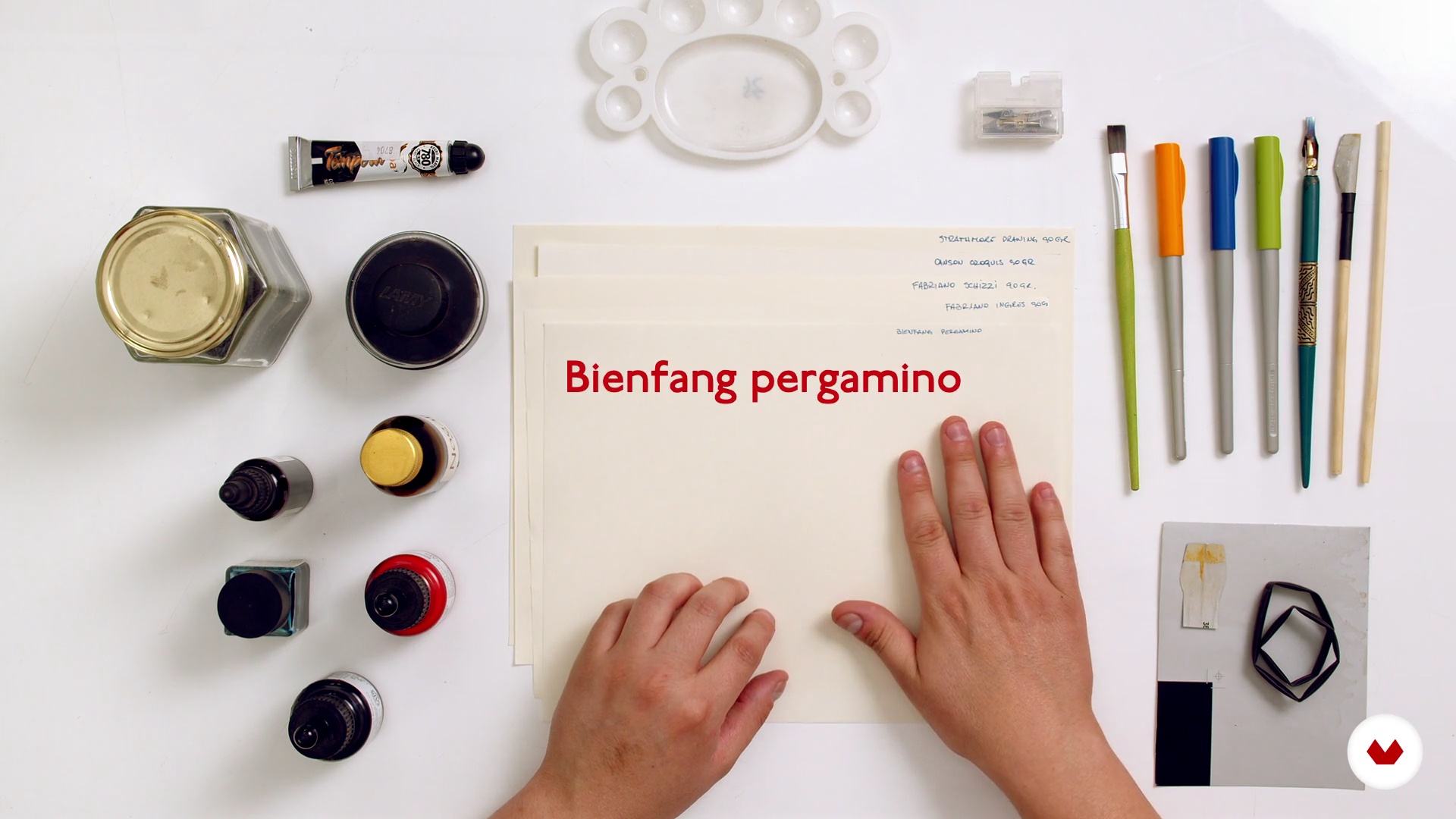
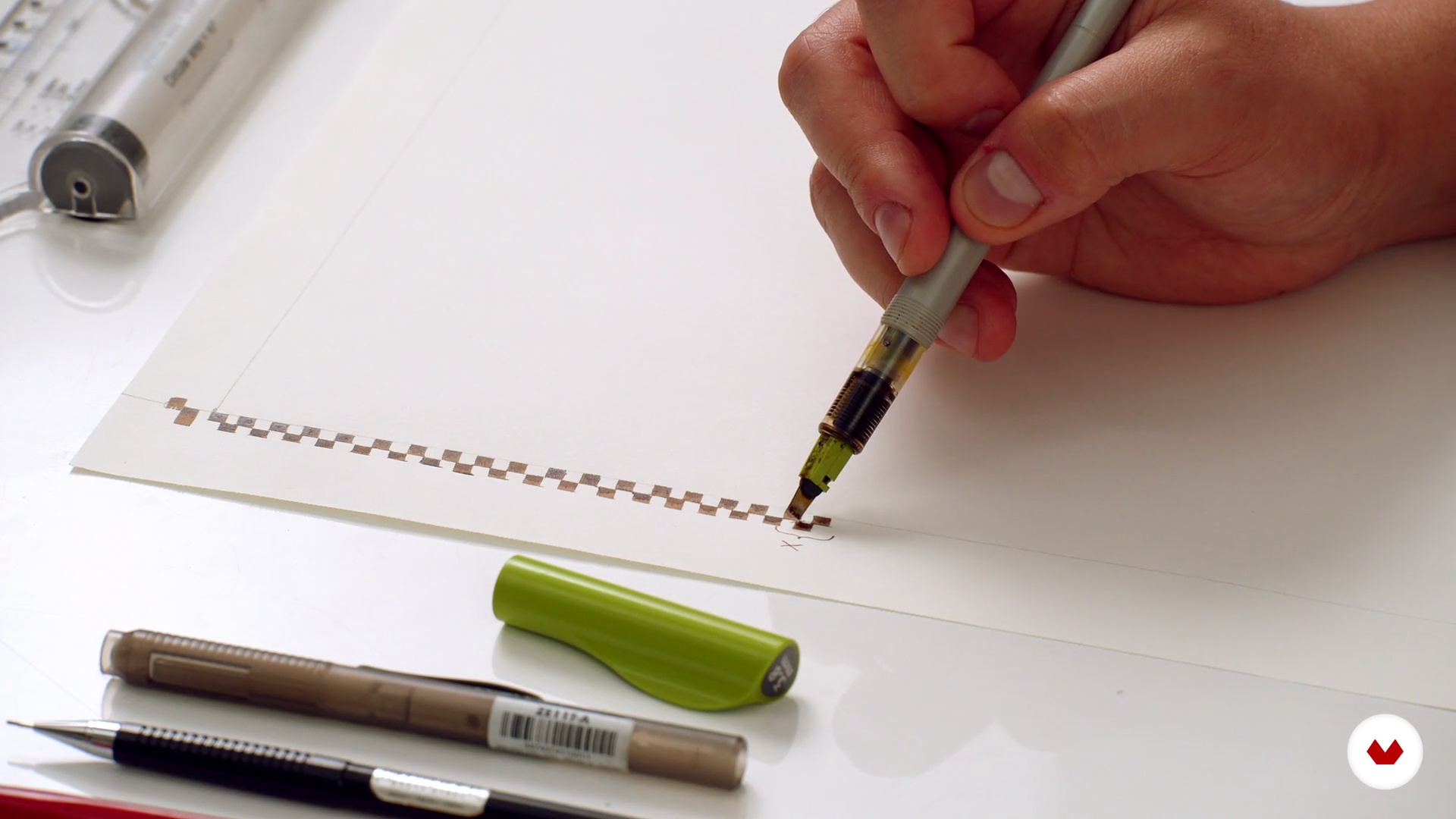
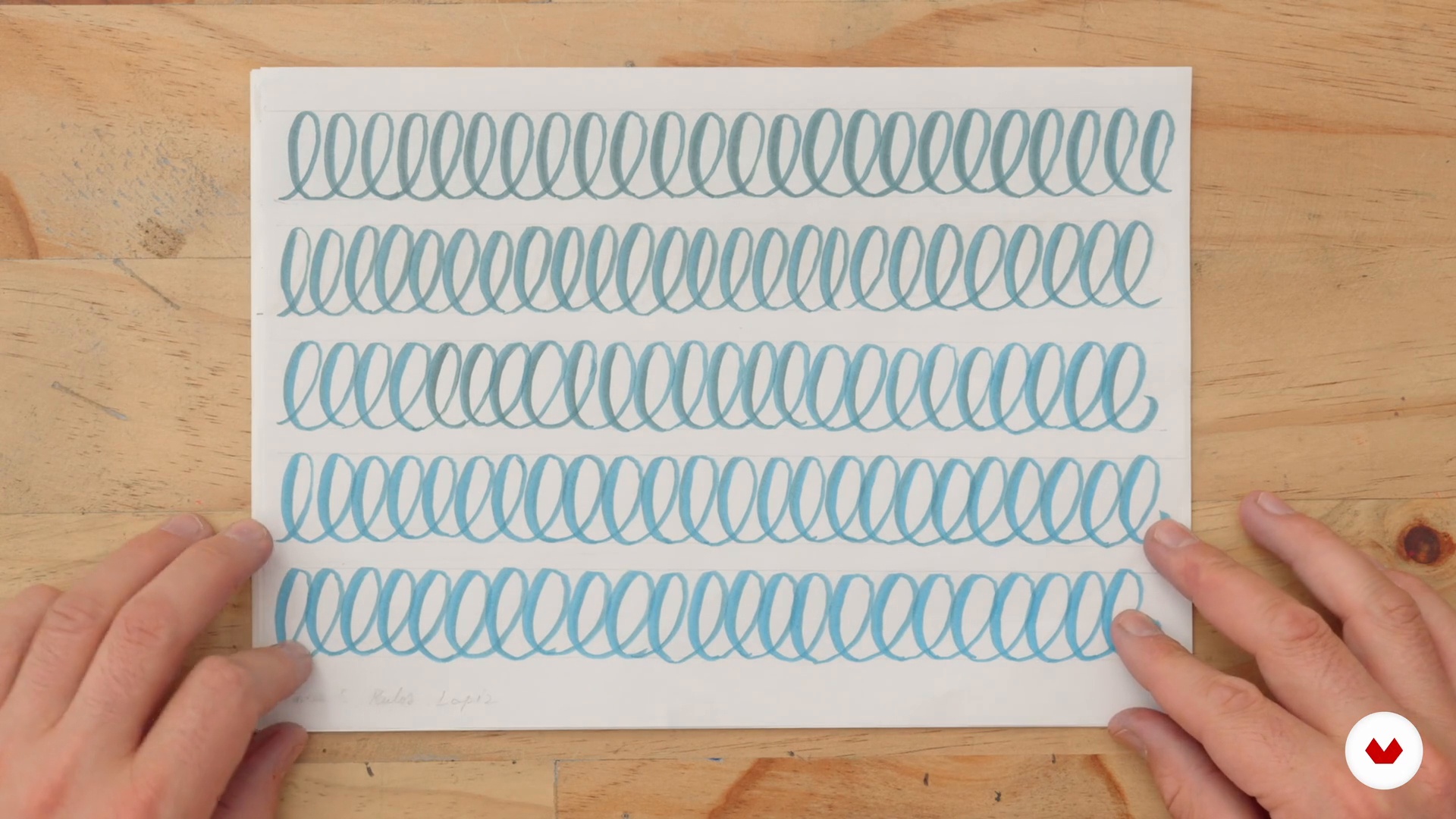
No extensive prior knowledge is required, but it's helpful to have a quill pen, a brush pen, calligraphy paper, a pencil, an eraser, and masking tape. Regular practice and patience are essential to mastering calligraphy techniques and developing artistic skills.

Select to get to know your teachers in this specialization course
Read more ↓

What to expect from this specialization course

  • Learn at your own pace

    Enjoy learning from home without a set schedule and with an easy-to-follow method. You set your own pace.

  • Learn from the best professionals

    Learn valuable methods and techniques explained by top experts in the creative sector.

  • Meet expert teachers

    Each expert teaches what they do best, with clear guidelines, true passion, and professional insight in every lesson.

  • Certificates
    Plus

    If you're a Plus member, get a custom certificate for every specialization course. Share it on your portfolio, social media, or wherever you like.

  • Get front-row seats

    Videos of the highest quality, so you don't miss a single detail. With unlimited access, you can watch them as many times as you need to perfect your technique.

  • Share knowledge and ideas

    Ask questions, request feedback, or offer solutions. Share your learning experience with other students in the community who are as passionate about creativity as you are.

  • Connect with a global creative community

    The community is home to millions of people from around the world who are curious and passionate about exploring and expressing their creativity.

  • Watch professionally produced courses

    Domestika curates its teacher roster and produces every course in-house to ensure a high-quality online learning experience.


FAQs

Domestika courses are online classes that allow you to learn new skills and create incredible projects. All our courses include the opportunity to share your work with other students and/or teachers, creating an active learning community. We offer different formats:
Original Courses: Complete classes that combine videos, texts, and educational materials to complete a specific project from start to finish.
Basics Courses: Specialized training where you master specific software tools step by step.
Specialization Courses: Learning paths with various expert teachers on the same topic, perfect for becoming a specialist by learning from different approaches.
Guided Courses: Practical experiences ideal for directly acquiring specific skills.
Intensive Courses (Deep Dives): New creative processes based on artificial intelligence tools in an accessible format for in-depth and dynamic understanding.

All specialization courses are 100% online, so once they're published, specialization courses start and finish whenever you want. You set the pace of the class. You can go back to review what interests you most and skip what you already know, ask questions, answer questions, share your projects, and more.

The specialization courses are divided into different modules. Each one includes lessons, informational text, tasks, and practice exercises to help you carry out your project step by step, with additional complementary resources and downloads. You'll also have access to an exclusive forum where you can interact with other students, as well as share your work and your final project, creating a community around the specialization courses.

You can redeem the specialization courses you received by accessing the redeeming page and entering your gift code.

If you're a Plus member, when you complete a course you've purchased, you'll instantly get your personalized certificate. You can see all your certificates in the Certificates section of your profile. You can download your certificates as PDFs and share the link online. Learn more about certificates.
Specialization in calligraphy: art from fundamentals to ornamentation. Calligraphy, and Typography course by Domestika

Specialization in calligraphy: art from fundamentals to ornamentation

A specialization by multiple teachers
Berkeley, United States.
Joined April 2002
  • 68 students