Creating your own typography
A course by WeteGraphic Designer and Typography Artist
A course by Wete, Graphic Designer and Typography Artist

Learn to design your own typeface and create graphic artwork with personality
Have you ever stopped to look at a font—with its sharp lines, flowing curves, and impeccable precision—and wondered how this modern-day work of art was created? Better yet, have you ever toyed with the idea of designing your own? Perhaps the thought has crossed your mind, but you've never dared to take the first step. While the path ahead may seem daunting, graphic designer and typography specialist Wete is here to guide you. With his typography-driven approach to graphic design, he has spent years creating his own display typefaces and sharing them on his website, Ultra Types. He has also worked with renowned clients such as Adobe, HP, Mobile World Congress, and W Hotels, among many others.
In this course, embark on an adventure through the world of typography, learning to create your own typeface step by step. Wete walks you through the entire process, from analyzing historical examples for inspiration to sketching out a design and capturing it digitally in the form of a fully functional typeface that will make your graphic artwork stand out.
What will you learn in this online course?
24 lessons & 18 downloads
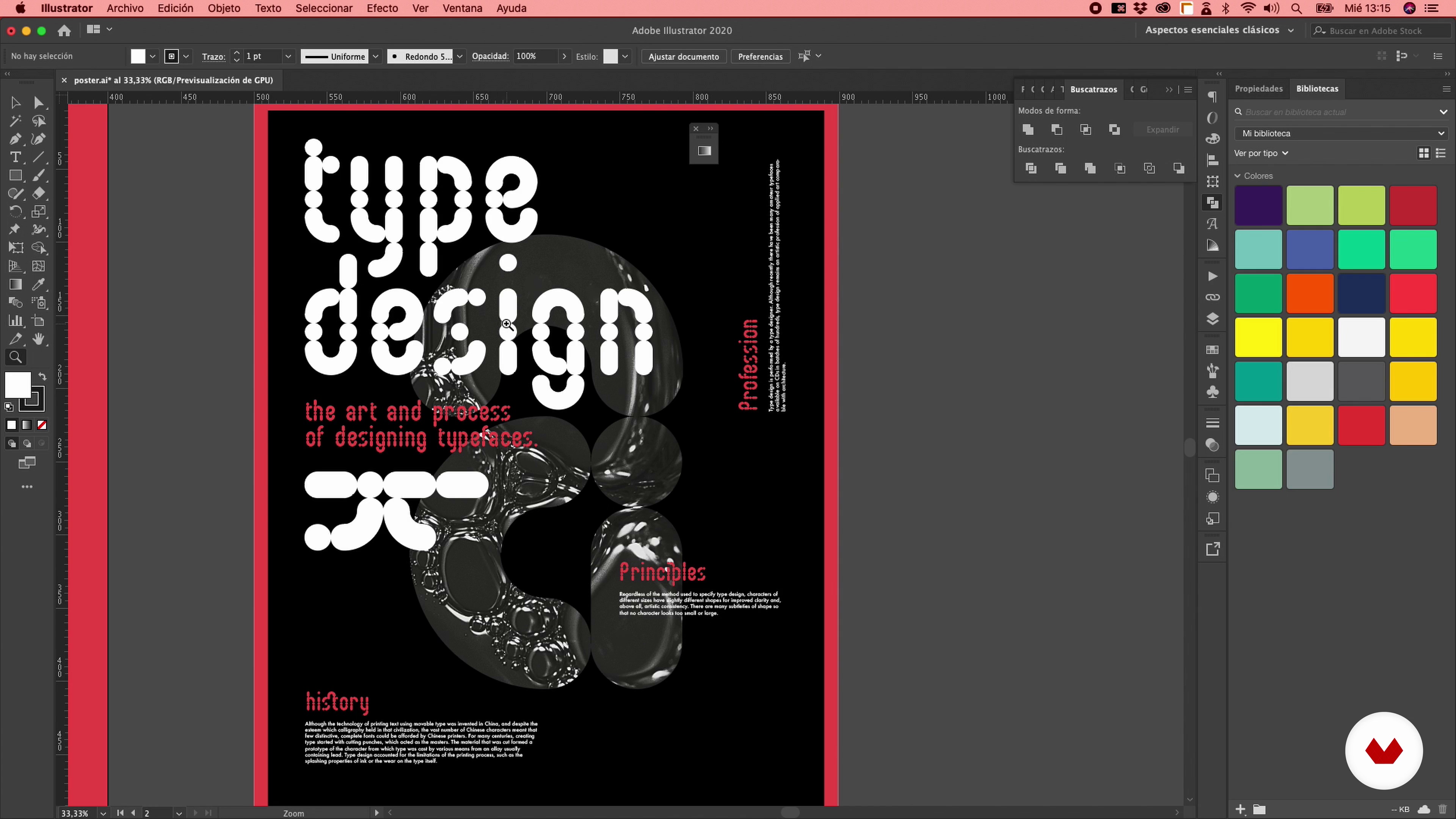
What are we going to see in the course?
1 minute, 41 seconds
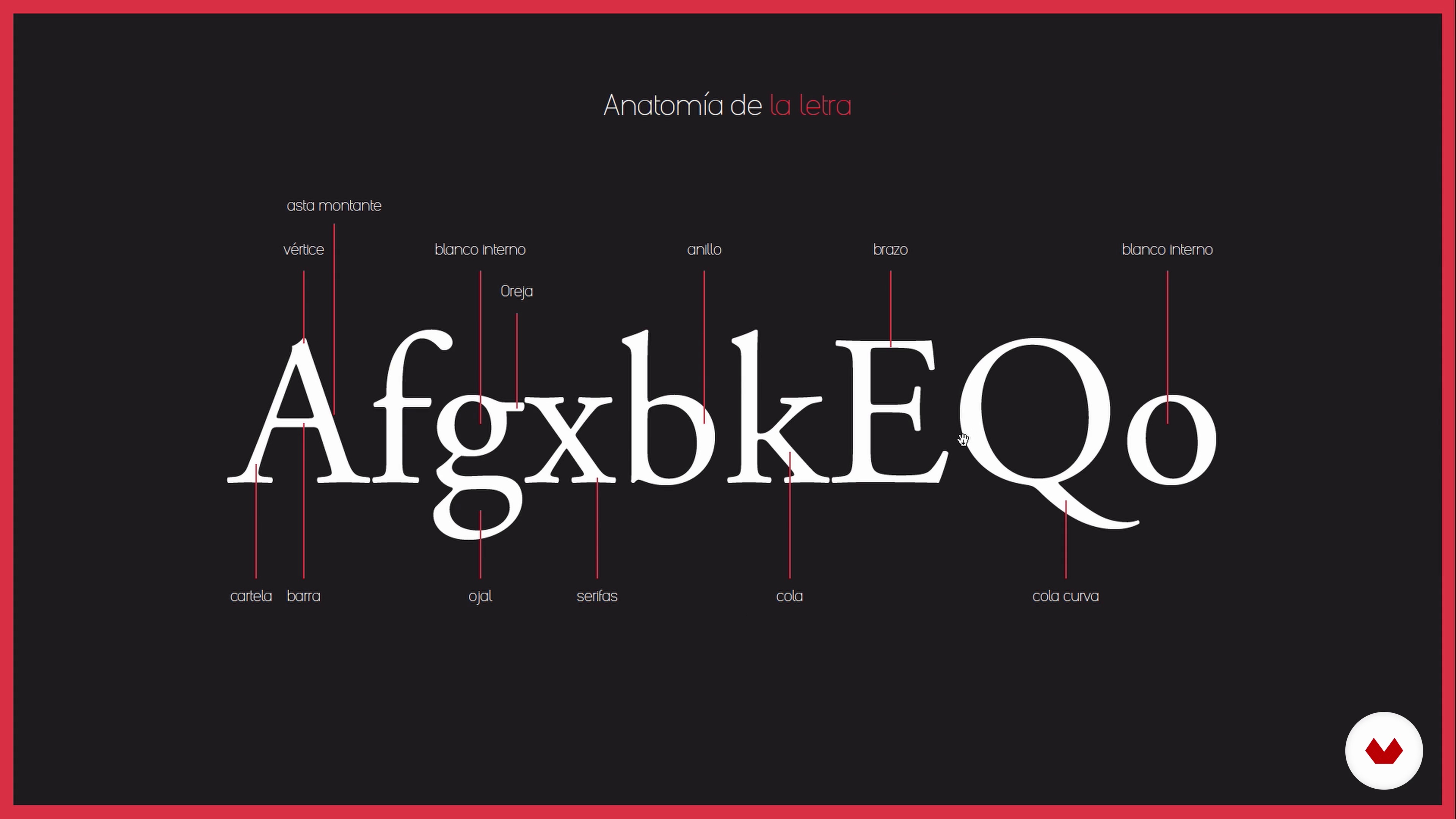
The letter
8 minutes, 44 seconds
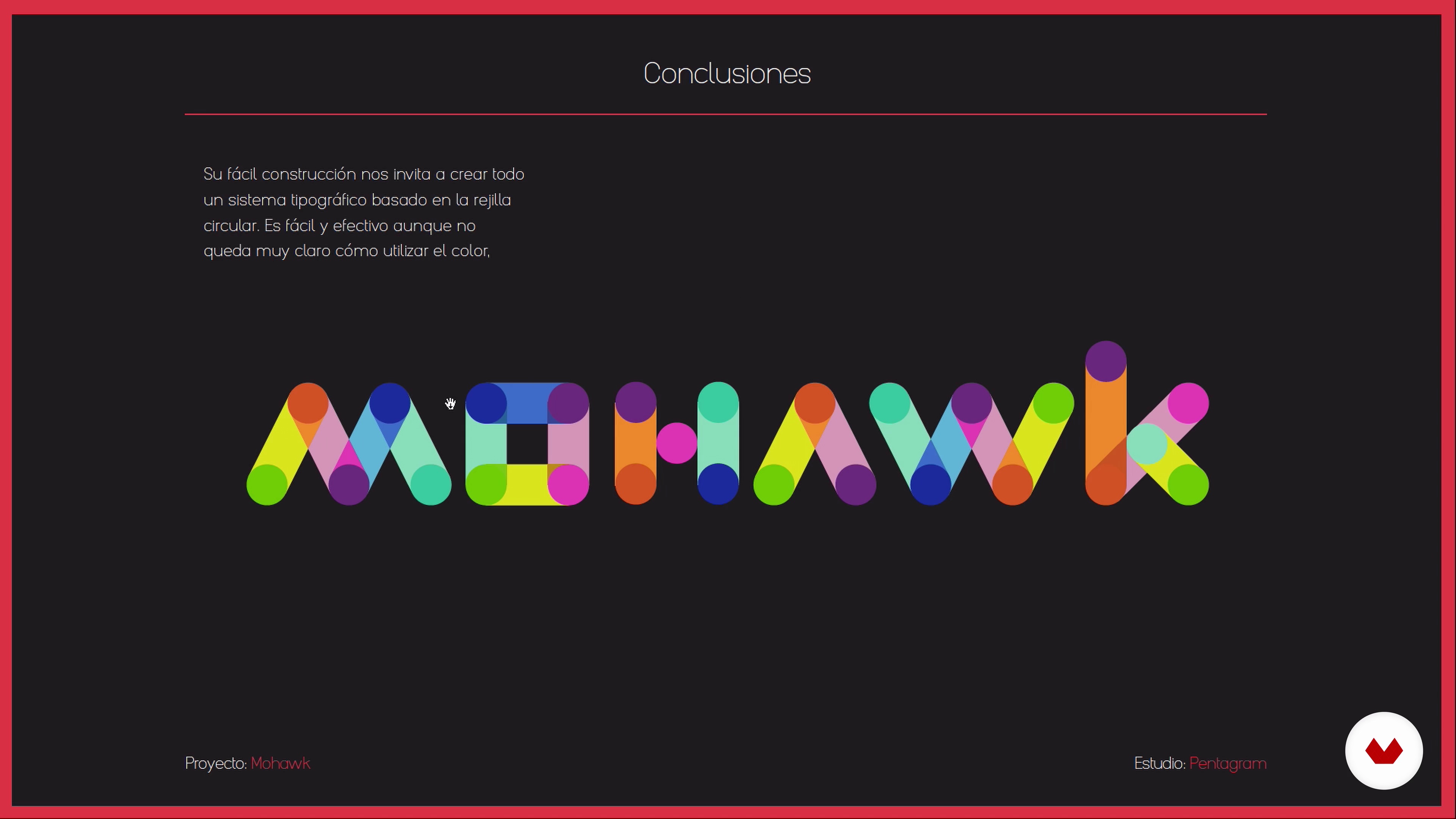
Geometric typography and modular systems
4 minutes, 26 seconds
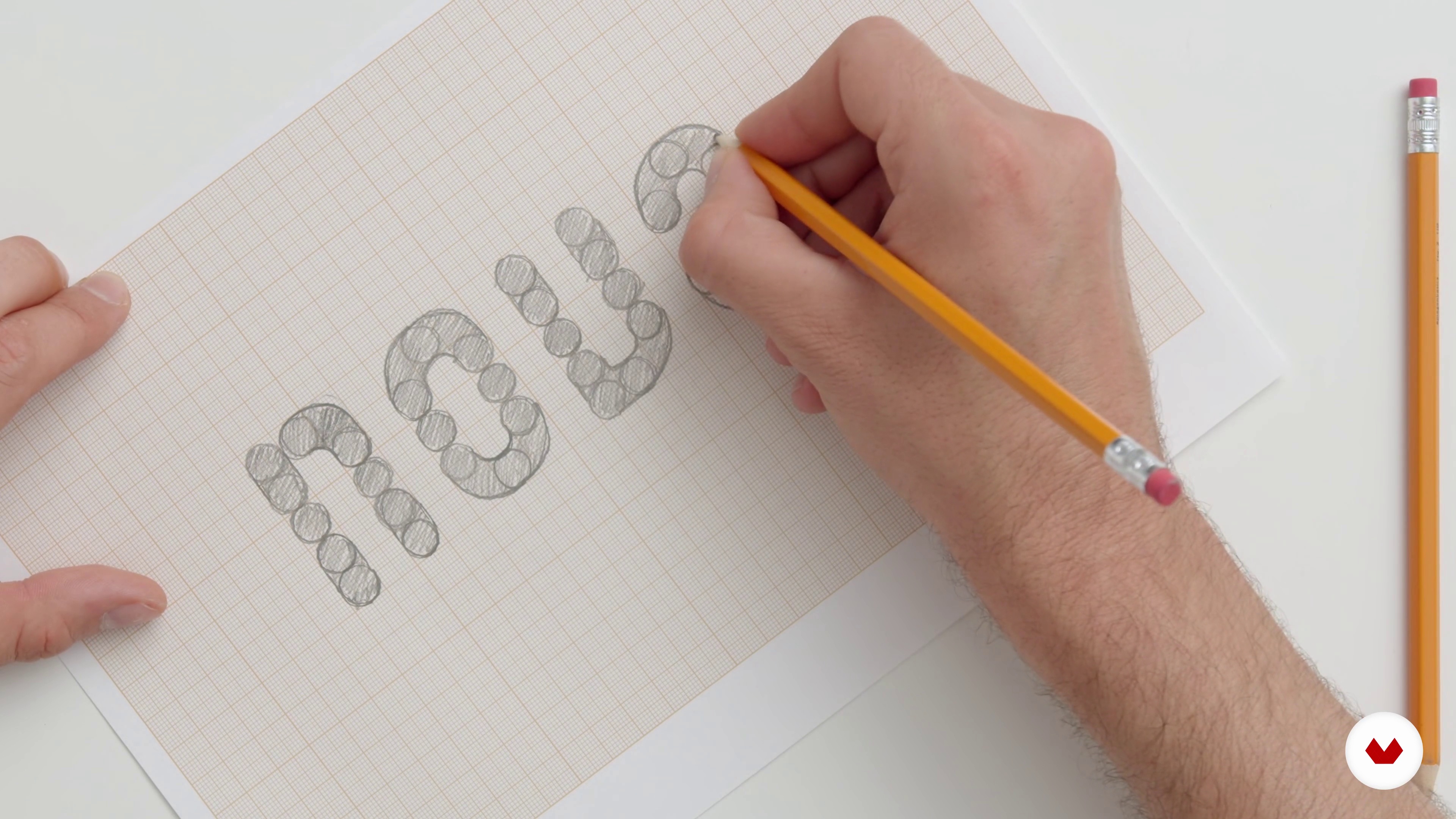
Sketching methods
14 minutes, 13 seconds
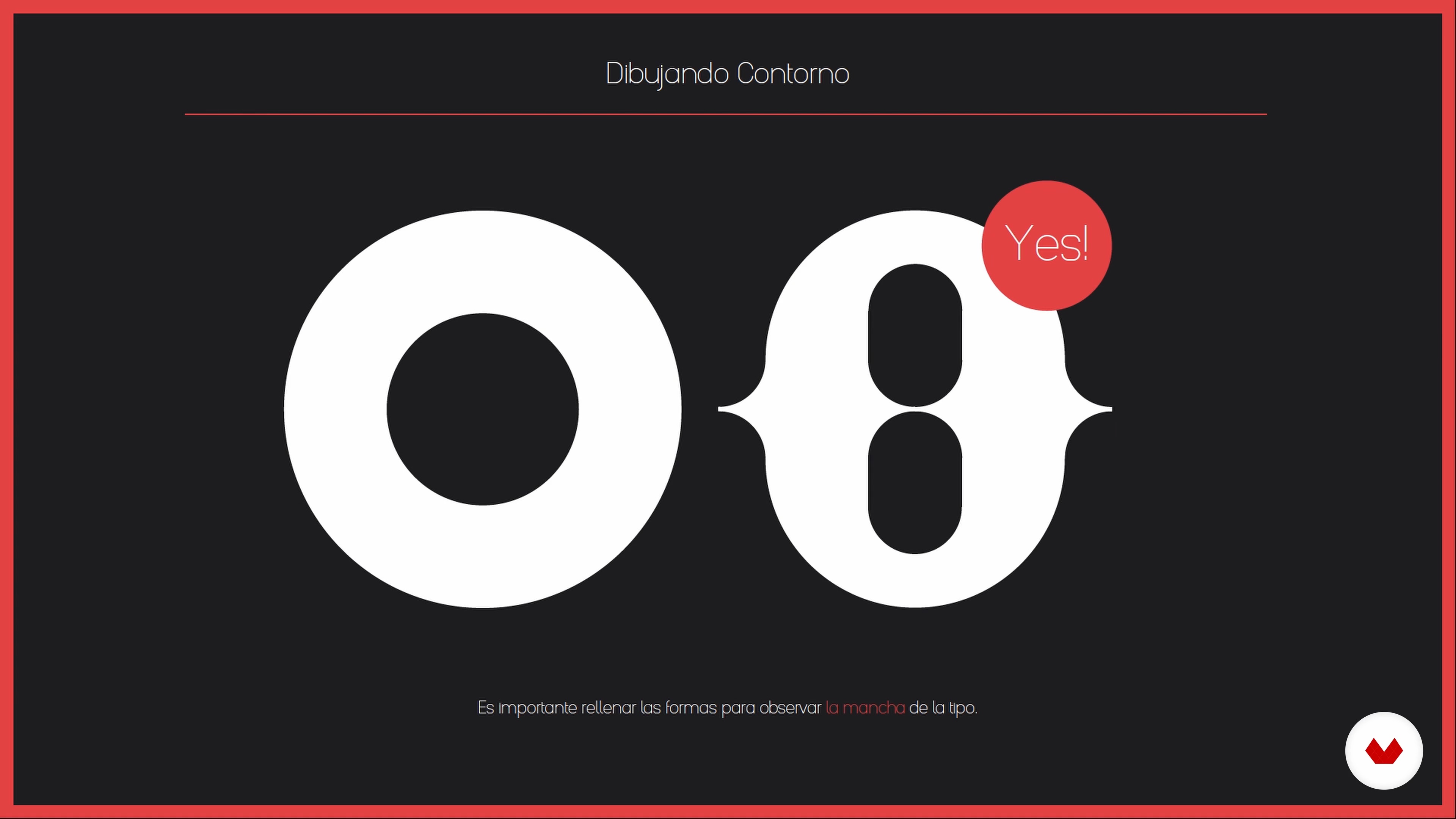
Digitization
6 minutes, 3 seconds
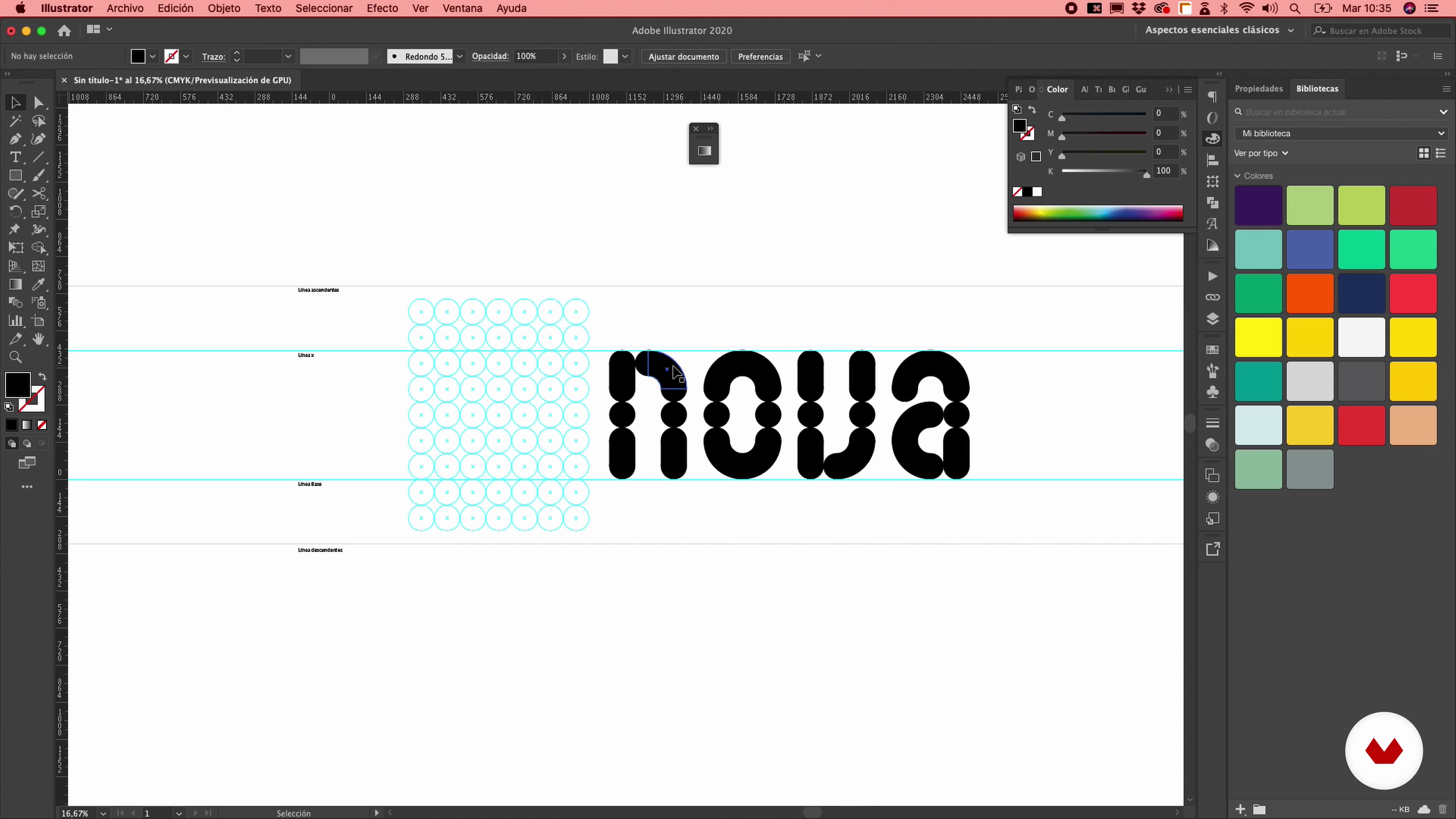
Grid construction
15 minutes, 10 seconds
What's included in this course?
Start the course by getting to know Wete as he discusses his career, his influences, and his sources of inspiration from the field of graphic design.
He then gives you a brief overview of typography, explaining how fonts are classified and breaking down the structural elements that make up a letter.
Next, find inspiration as you explore different historical examples of typefaces and determine what kind you want to make. Prepare to tackle your project by analyzing various geometric fonts and modular typefaces.
Dive right in by sketching out your ideas using the methods Wete teaches you. Once you've finished your pencil sketches, move on to the digital phase of your project. Use Illustrator to put together an entire alphabet on the basis of four initial letters.
Then find out how to export your design to Glyphs and experiment with the software's essential tools to develop your typeface one character at a time.
Finally, download your file and install the font you've created, applying it to enhance any graphic design you can dream up.
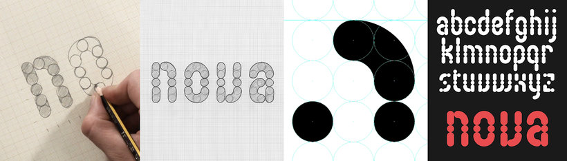
Recommended software & tools for this course
What is this course's project?
Create a poster for a movie or music festival with your very own font.
Projects by course students


Who is this online course for?
Graphic designers and all typography lovers who want to create their own typeface.
Requirements and materials
Basic knowledge of graphic design and typography is recommended. You also need paper and pencil, an eraser, a ruler, and a computer with Adobe Illustrator and Glyphs installed.

Reviews
- 7 months ago
Todavía no acabo pero hasta dodnde voy me fue útil
- 10 months ago
A very practical course, that does not make you drown in theory. Before you know it you are looking on your own alphabet and can jump to create graphics with letters that the world has never seen.
- 11 months ago
Es un curso muy bien ejemplificado para principiantes con técnicas intereantes.
- 1 year ago
Pude hacer mis primeras tipografias gracias a este curso, muy claro y conciso. Recomiendo 100%
- 1 year ago
Muy buen curso
He has worked on projects for top brands like Adobe, HP, Reebok, Desigual, W Hotels, and Mobile World Congress, among others. His work has also been featured in The Complete Guide to Designing Handmade Type by Charlotte Rivers, Page Unlimited (Sandu 360 Japan), Typodarium, Étapes, Computer Arts, and many more.
Content
- U1
Introduction
- Introduction
- References and designers of interest
- What are we going to see in the course?
- U2
The letter
- The letter
- Geometric typography and modular systems
- Sketching methods
- U3
Create fonts with Illustrator
- Digitization
- Grid construction
- Derivation of the alphabet: theory
- Derivation of the alphabet: application
- U4
Working with Glyphs
- Menus and work tools
- Technical aspects
- Place our characters
- Metrics and Kernings: explanation
- Metrics and Kernings: application
- Accents
- U5
Export and Apply
- Export the final file
- Application of our typography
- U6
Appendix: course Fontlab
- We open Fontlab and take a look around 1
- We open Fontlab and take a look around 2
- Place our characters
- Metrics and Kernings: application
- Accents
- Export the final file
- FP
Final project
- Creating your own typography
What to expect from a Domestika course
Learn at your own pace
Enjoy learning from home without a set schedule and with an easy-to-follow method. You set your own pace.
Learn from the best professionals
Learn valuable methods and techniques explained by top experts in the creative sector.
Meet expert teachers
Each expert teaches what they do best, with clear guidelines, true passion, and professional insight in every lesson.
Certificates
PLUSIf you're a Plus member, get a custom certificate signed by your teacher for every course. Share it on your portfolio, social media, or wherever you like.
Get front-row seats
Videos of the highest quality, so you don't miss a single detail. With unlimited access, you can watch them as many times as you need to perfect your technique.
Share knowledge and ideas
Ask questions, request feedback, or offer solutions. Share your learning experience with other students in the community who are as passionate about creativity as you are.
Connect with a global creative community
The community is home to millions of people from around the world who are curious and passionate about exploring and expressing their creativity.
Watch professionally produced courses
Domestika curates its teacher roster and produces every course in-house to ensure a high-quality online learning experience.
FAQs
You’ll learn how to analyze, sketch, digitize, and export geometric and modular typefaces using tools like Illustrator and Glyphs, applying structural, spacing, and composition principles to craft professional, functional fonts.
This is an intermediate-level course; having basic graphic design skills and familiarity with software like Illustrator is recommended to get the most out of it.
You’ll need basic design knowledge, access to software like Illustrator and Glyphs, graph paper, pencils, and a willingness to explore sketching and digitizing techniques.
First, you sketch the typeface by hand, then transfer it to Illustrator to vectorize the characters, and finally import it into Glyphs to fine-tune, generate accents, and export the digital font.
Geometric typography is defined by using basic shapes like circles and rectangles to build letters, setting it apart from more organic or serif styles.
The course uses Adobe Illustrator for vector design and Glyphs for digitizing, refining, and exporting fonts in formats like OpenType.
The modular system builds letters from repeatable modules, ensuring visual consistency and design efficiency. The course teaches you how to create modular alphabets inspired by Josef Albers.