Graphic Visualization: Telling Complex Stories through Simple Images
A course by Katya KovalenkoPresentation and Data Designer
A course by Katya Kovalenko, Presentation and Data Designer

Learn the techniques to present information in a simple and compelling way through visuals and infographics
To better present your ideas and projects, it’s essential to know how our minds perceive information. Only by understanding this can we develop solutions to decode complex information in simple and beautiful ways. Katya Kovalenko specializes in creating graphic visualizations that help companies articulate what their product is about.
In this course, you'll learn basic design and hierarchy principles for creating graphs, charts, diagrams, and other visual tools to help you visualize an idea or a concept.
This is Katya’s second course on Domestika, after Principles of Presentation Design, in which she teaches how to design beautiful and effective presentations from scratch.
What will you learn in this online course?
15 lessons & 19 downloads
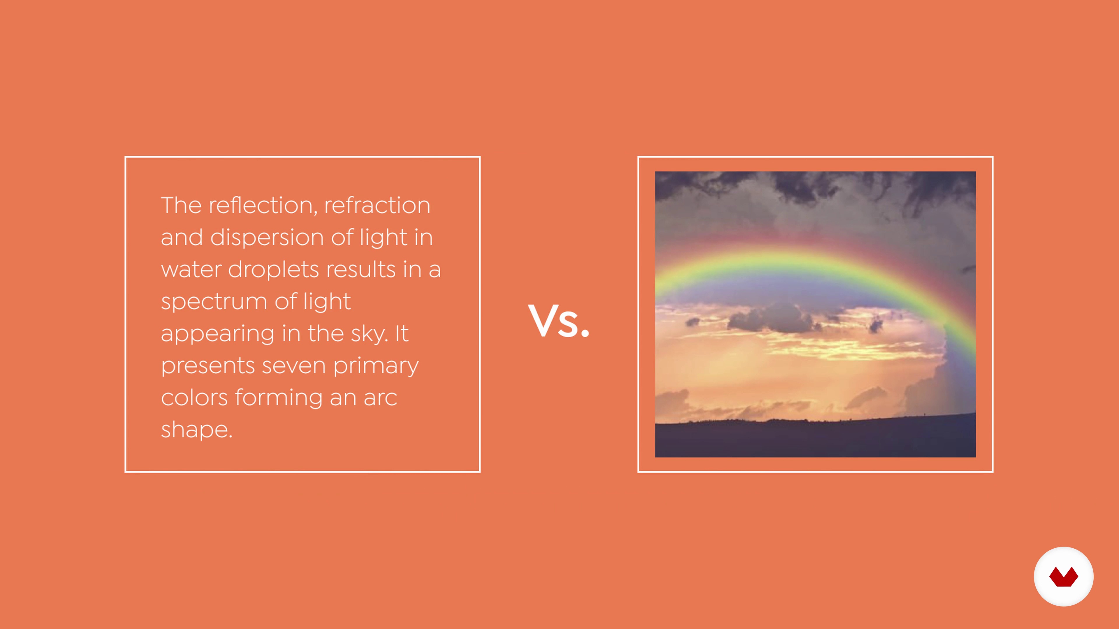
How We Perceive Information
3 minutes, 19 seconds

Visual Hierarchy Principles
4 minutes, 40 seconds
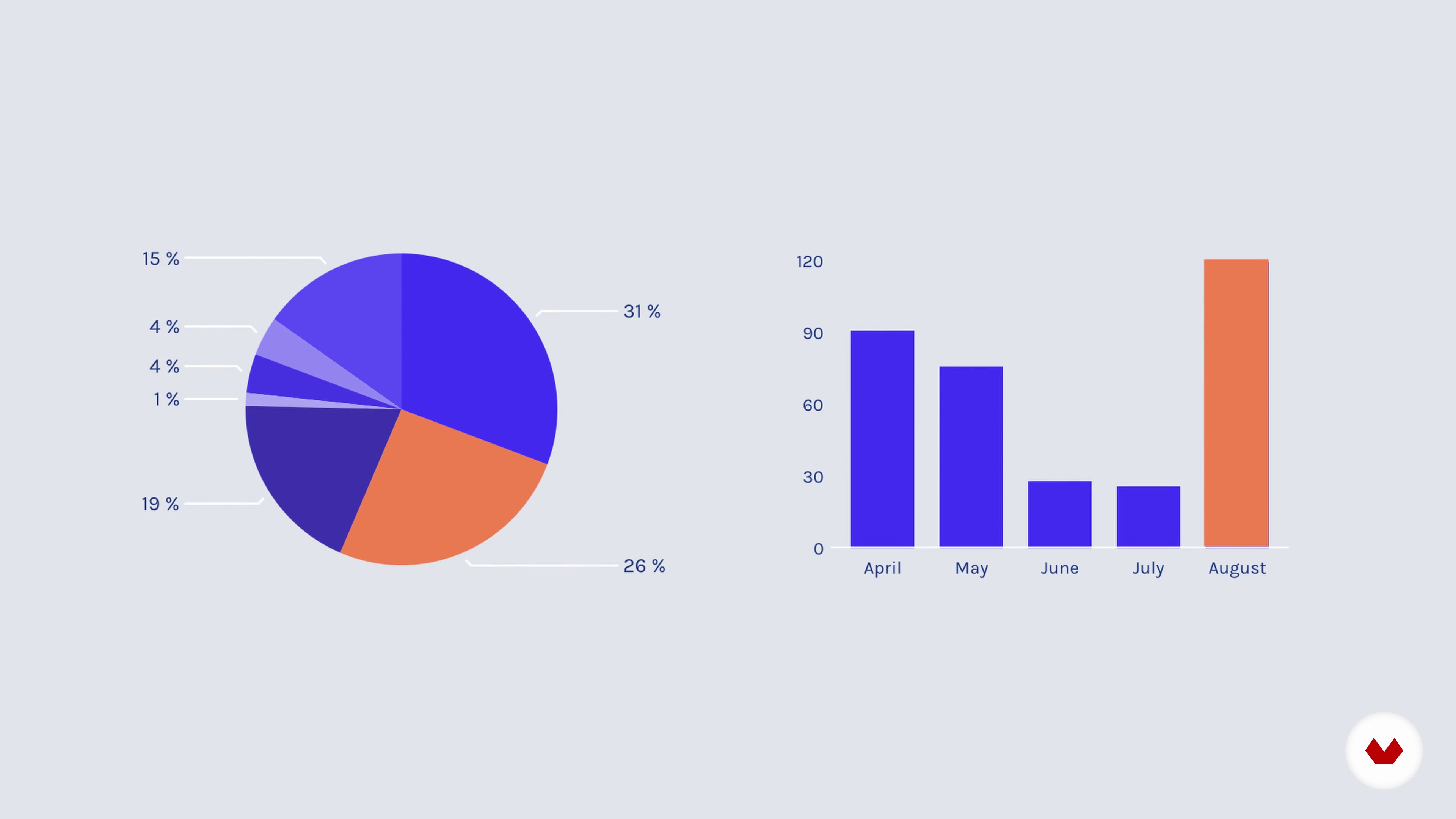
Quantitative Visuals
4 minutes, 53 seconds
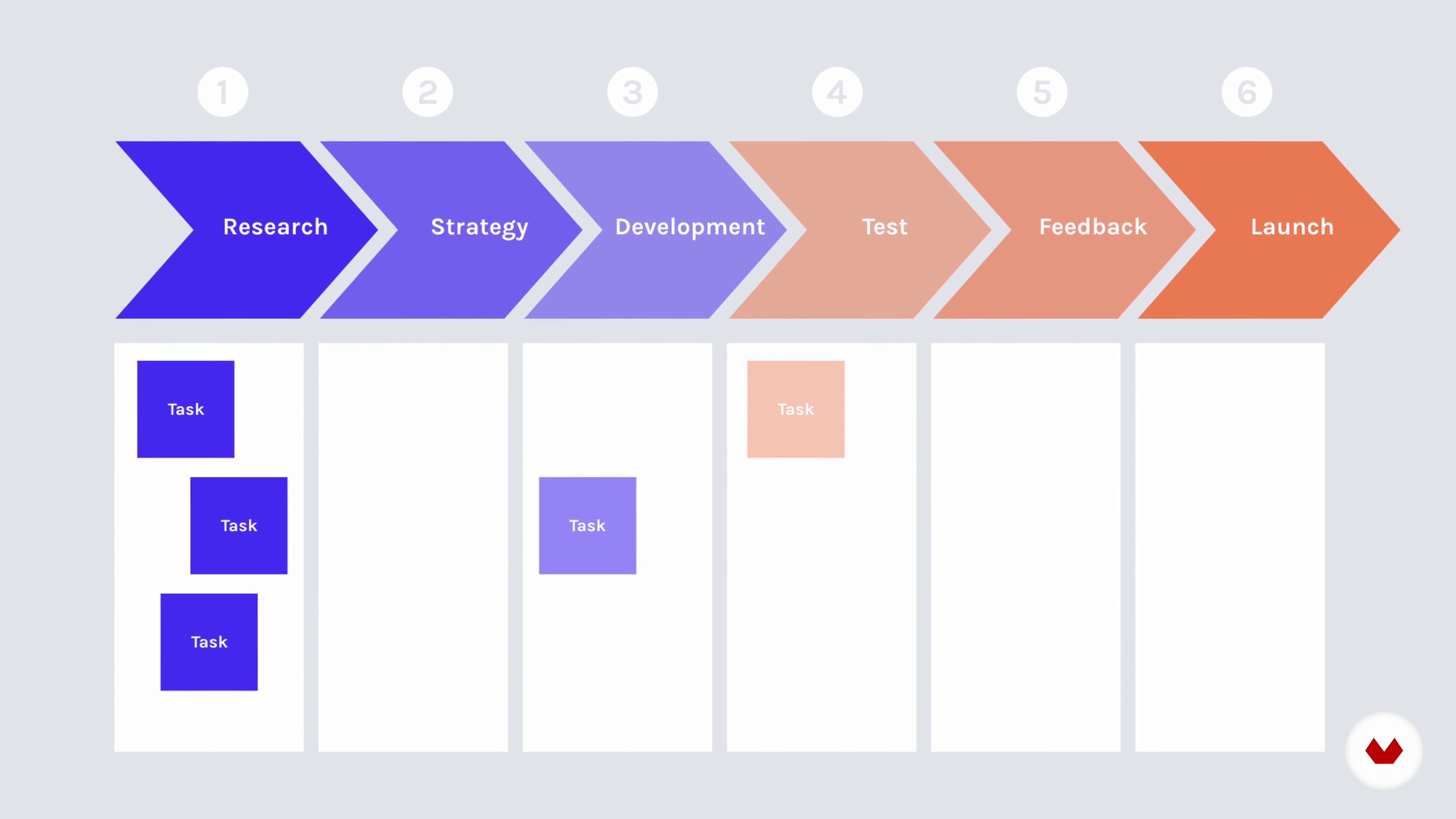
Qualitative Visuals
5 minutes, 52 seconds

Sketching 1
14 minutes, 3 seconds
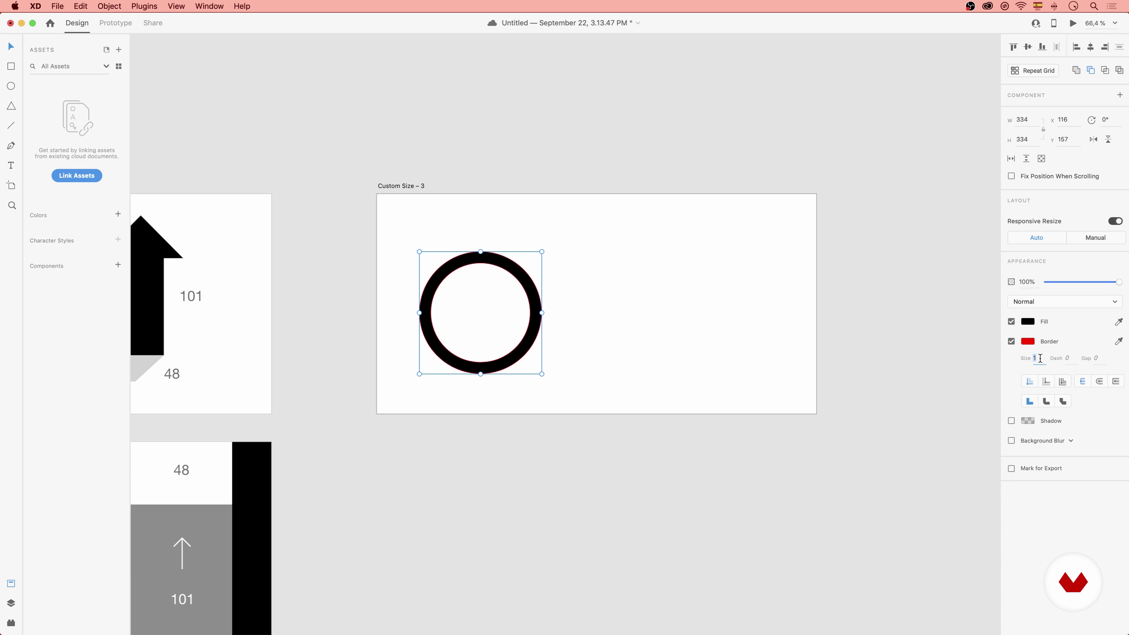
Prototyping 1
10 minutes, 24 seconds
What's included in this course?
Start by getting to know Katya, her background as a designer, and some of the things that inspired her to choose her path.
You'll take a close look at how human brains perceive information. Then, you'll get to know some general design and alignment principles.
Constantly being in contact with visual languages has made us understand them very well, but make it challenging to speak fluently. To solve this, learn about some different types of graphs and diagrams that are commonly used to visualize information.
Learn about the process of creating a visualization in three essential steps: sketching, prototyping, and refining.
Finish the course by understanding how to apply your designs to other creative projects.
What is this course's project?
Creating a series of images with graphic visualizations and sharing them on social media. Choose whether you want to be informative by creating infographics with qualitative types of visuals, or to illustrate an inspirational quote.
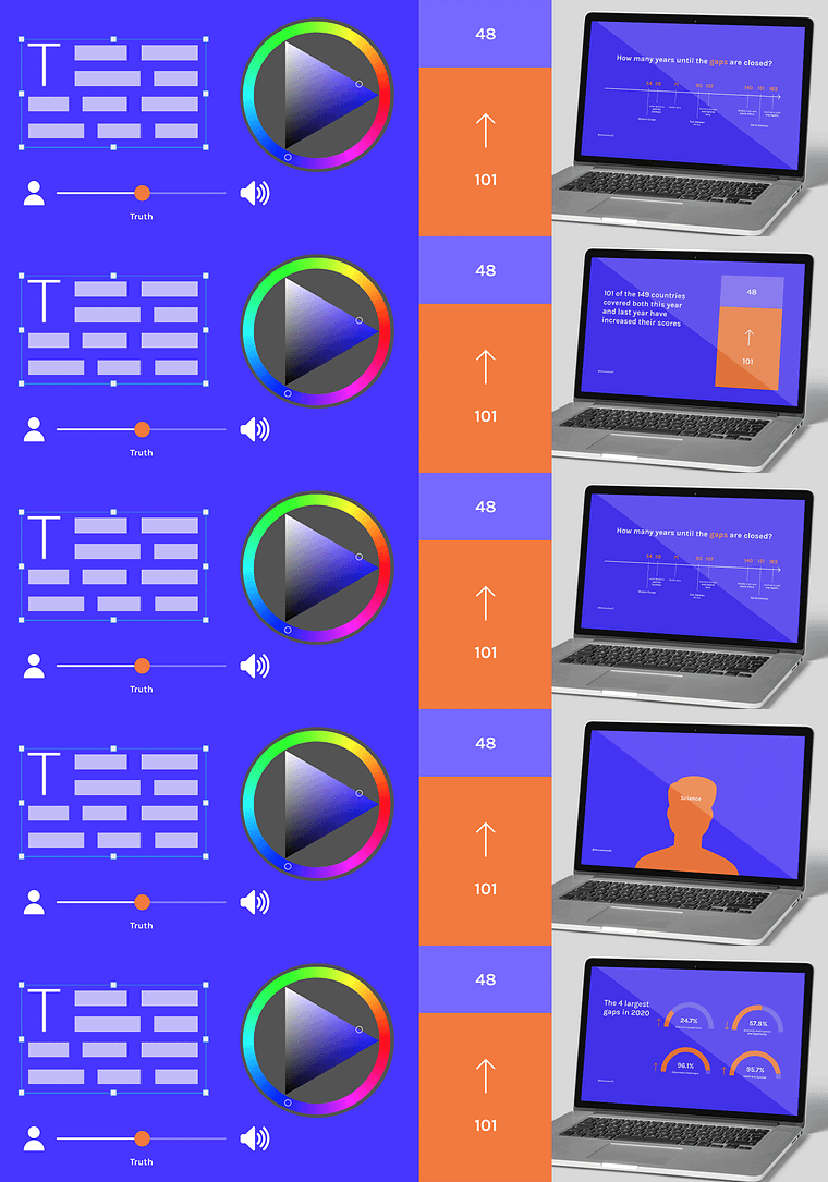
Projects by course students


Who is this online course for?
Teachers, marketers, journalists, scientists, and other professionals who work with information and want to create better presentations and reports.
Requirements and materials
You’ll need a computer, a notepad and a pen for sketching, and basic knowledge of any of the following software: Keynote, Adobe XD, Figma, Sketch, or Adobe Illustrator.

Reviews
- 1 month ago
Excellent course
- 5 months ago
Excellent course
- 6 months ago
Recomiendo este curso: me gusta como esta profesora da sus clases y, de hecho, es el segundo curso que tomo con ella.
- 8 months ago
Excellent course
- ali_shammary100PLUS9 months ago
Nice course I really enjoyed it

Her passion for effective communication is matched only by her commitment to equipping you with the skills needed to leverage the potential of AI in presentation design. You'll explore this transformative field under Katya's guidance, setting the stage for your creative journey.
Content
- U1
Introduction
- Presentation
- Influences
- What We Will Do in the Course?
- U2
Basic Principles
- How We Perceive Information
- Why Do We Need Visual Content?
- Visual Hierarchy Principles
- U3
Types of Visuals
- Quantitative Visuals
- Qualitative Visuals
- How To Decide Which One To Use
- U4
The Creative Process
- Sketching 1
- Sketching 2
- Prototyping 1
- Prototyping 2
- Refining
- U5
The Output
- Where To Use Visualizations
- FP
Final project
- Graphic Visualization: Telling Complex Stories through Simple Images
What to expect from a Domestika course
Learn at your own pace
Enjoy learning from home without a set schedule and with an easy-to-follow method. You set your own pace.
Learn from the best professionals
Learn valuable methods and techniques explained by top experts in the creative sector.
Meet expert teachers
Each expert teaches what they do best, with clear guidelines, true passion, and professional insight in every lesson.
Certificates
PLUSIf you're a Plus member, get a custom certificate signed by your teacher for every course. Share it on your portfolio, social media, or wherever you like.
Get front-row seats
Videos of the highest quality, so you don't miss a single detail. With unlimited access, you can watch them as many times as you need to perfect your technique.
Share knowledge and ideas
Ask questions, request feedback, or offer solutions. Share your learning experience with other students in the community who are as passionate about creativity as you are.
Connect with a global creative community
The community is home to millions of people from around the world who are curious and passionate about exploring and expressing their creativity.
Watch professionally produced courses
Domestika curates its teacher roster and produces every course in-house to ensure a high-quality online learning experience.
FAQs
Yes, this course is designed for beginners and does not require any previous experience in design or data visualization. All foundational concepts and tools are introduced from scratch.
You only need basic computer skills and access to a computer. The course introduces all required tools such as Adobe XD, Figma, and Excel, with no prior experience necessary.
You’ll learn to simplify complex information, extract key insights, create compelling infographics, apply visual hierarchy and design principles, and use software tools to produce clear, memorable visuals for presentations, reports, and social media.
The course teaches strategies for filtering content, organizing insights, and designing visuals that make complex information easy to understand and engaging for any audience.
Yes, you’ll learn to create and select appropriate charts, diagrams, and visual metaphors for both numerical and non-numerical information.
Yes, the course includes step-by-step guidance on using Adobe XD and Figma for sketching, prototyping, and refining data visualizations and infographics.
Absolutely. The course covers techniques and formats for crafting effective visuals for presentations, reports, websites, and social media platforms.