Effective Data Visualization: Transform Information into Art
A course by Sonja KuijpersData Illustrator
A course by Sonja Kuijpers, Data Illustrator

Learn to effectively bring data to life with creative shapes, colors, and layouts
For many people, images are the most effective way to communicate information. Whether it be a social issue, a personal story, or something you find joy in, any subject can inspire a visualization. Data illustrator Sonja Kuijpers specializes in turning numbers and information into accessible works of art. She has worked with clients including Philips, the Dutch government, and Frankfurter Allgemeine Zeitung.
In this course, she gives you the tools you need to transform data into captivating illustrations using colors, shapes, and images. Discover how to collect and analyze data sets, as well as how to transform them into a unique poster that tells a story. Are you ready to create your own data art?
What will you learn in this online course?
14 lessons & 22 downloads

The Subject of Your Visualization
2 minutes, 31 seconds

Looking for Data
7 minutes, 10 seconds

Harvesting the Data
11 minutes, 3 seconds

Sketching and Storyline
10 minutes, 8 seconds
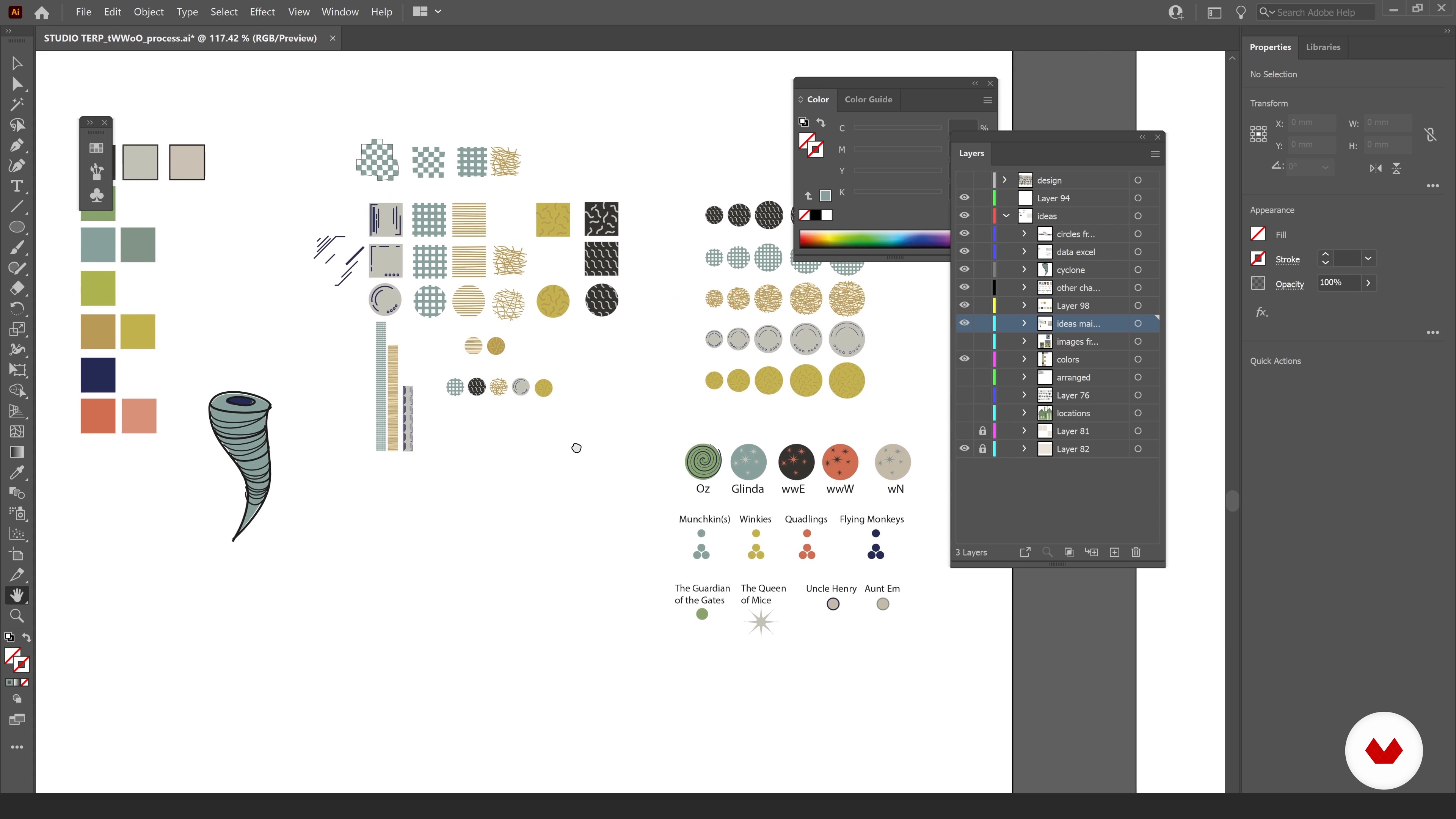
Method and Colours
12 minutes, 2 seconds
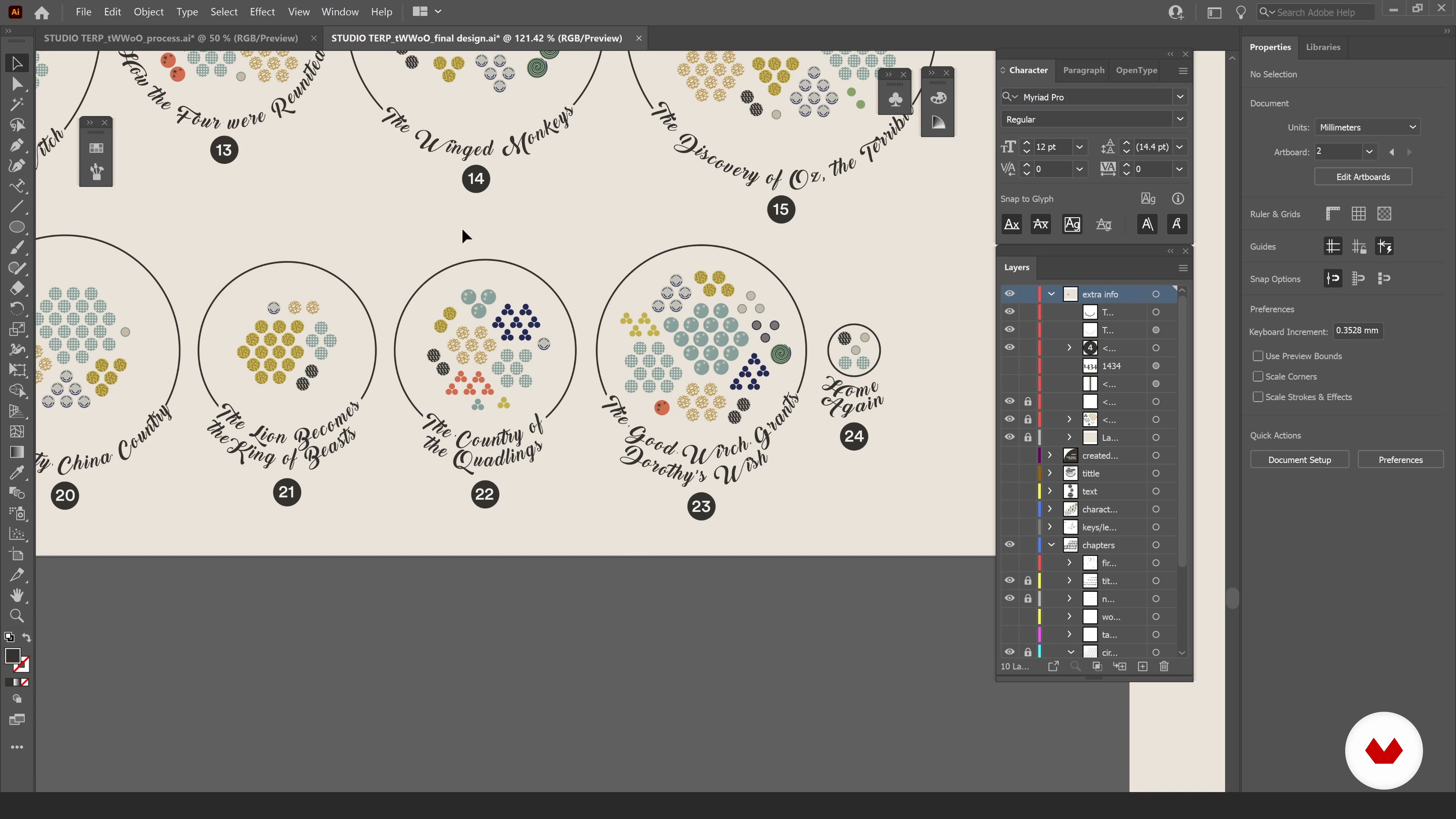
Incorporating the Elements into Your Design 1
18 minutes, 44 seconds
What's included in this course?
Begin the course by getting to know data illustrator Sonja Kuijpers. She discusses how she turned her childhood love of drawing into a full-time career, along with the influences and artists that she admires.
Learn how to search for a subject you want to translate into a data illustration. Sonja explains the importance of having an emotional relationship with your chosen topic before diving into how to find data and harvest it in Excel, in preparation for your visualization. Review your data for any storylines that could guide the layout of your illustration.
Time to create your poster! Begin sketching your ideas, experimenting with colors, shapes, and layout. Sonja guides you through her design process in Adobe Illustrator before showing you how to incorporate graphs from Excel. Then, add annotations and a title to support your data design.
Find out how to ask for feedback on your work to make sure your audience understands it. Then make any final adjustments before learning how to share your work with the world. Sonja finishes the course by providing her tips on how to present your project to the public via platforms like your website and social media.
What is this course's project?
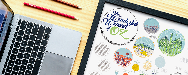
Collect a data set of your choice and turn it into a visually-appealing poster using shapes, colors, and a layout that reflects your subject.
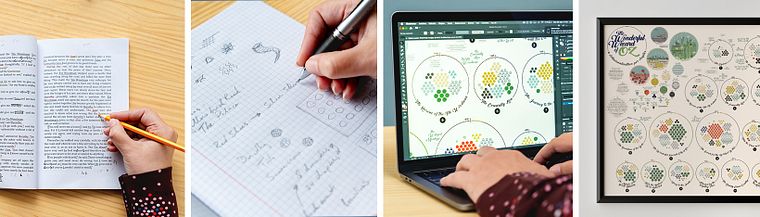
Projects by course students


Who is this online course for?
This course is for anyone with an interest in transforming challenging datasets into engaging visuals.
Requirements and materials
No previous experience is needed for this course.
You will need a computer with access to Microsoft Excel and Adobe Illustrator, or similar programs.
Reviews
- 7 months ago
много добро
- 7 months ago
GOOD
- 7 months ago
muy buen curso
- 1 year ago
Es buen curso, hay herramientas muy simpáticas e interesantes para aplicar
- 2 years ago
Cours très intéressant, très engageant. Les démonstrations sont très intéressantes. Niveau maîtrise de données, il demande un peu d'expérience, ce qui me l'a rendu un peu difficile d'accès. Malgré tout, il a réussi à m'intéresser au monde de l'analyse de données, et à me donner envie de creuser.

Sonja currently runs STUDIO TERP, a one-woman data illustration studio where she specializes in making challenging data easy to understand as well as visually engaging. She has worked with clients such as Philips, the Dutch government, Scientific American, Frankfurter Allgemeine Zeitung, Friends of the High Line in New York, and F19 Digital Reporting, and has also been recognized multiple times by the Information is Beautiful Awards.
Content
- U1
Introduction
- About Me
- Influences
- U2
Data and Emotional Subject
- The Subject of Your Visualization
- Looking for Data
- Harvesting the Data
- The ‘Data’ for Your Visualization
- U3
Creating a Poster
- Sketching and Storyline
- Method and Colours
- Workflow
- Incorporating the Elements into Your Design 1
- Incorporating the Elements into Your Design 2
- Title and Explanation
- U4
Finishing and Sharing Your Work
- Feedback and Final Edits
- Sharing Your Work
- FP
Final project
- Effective Data Visualization: Transform Information into Art
What to expect from a Domestika course
Learn at your own pace
Enjoy learning from home without a set schedule and with an easy-to-follow method. You set your own pace.
Learn from the best professionals
Learn valuable methods and techniques explained by top experts in the creative sector.
Meet expert teachers
Each expert teaches what they do best, with clear guidelines, true passion, and professional insight in every lesson.
Certificates
PLUSIf you're a Plus member, get a custom certificate signed by your teacher for every course. Share it on your portfolio, social media, or wherever you like.
Get front-row seats
Videos of the highest quality, so you don't miss a single detail. With unlimited access, you can watch them as many times as you need to perfect your technique.
Share knowledge and ideas
Ask questions, request feedback, or offer solutions. Share your learning experience with other students in the community who are as passionate about creativity as you are.
Connect with a global creative community
The community is home to millions of people from around the world who are curious and passionate about exploring and expressing their creativity.
Watch professionally produced courses
Domestika curates its teacher roster and produces every course in-house to ensure a high-quality online learning experience.
FAQs
Yes, this course is designed for beginners and requires no prior experience in data visualization or design. It covers foundational skills and guides you step-by-step through the creative and technical processes.
You will need access to Excel and Adobe Illustrator or a similar vector graphics tool. Basic art supplies for sketching and a computer for digital work are recommended. No specialized equipment is required.
You’ll learn data collection, dataset preparation, manual and digital data extraction, storytelling through data art, visual design principles, and how to create compelling infographics, posters, and online portfolios.
No advanced statistics or programming knowledge is needed. The course introduces basic statistical concepts for visualization and focuses on accessible, creative methods using Excel and design tools.
Data art transforms datasets into expressive visual artworks, blending design, emotion, and narrative. Unlike traditional charts or graphs, data art often emphasizes storytelling and personal or emotional resonance.
Yes, the course teaches manual and digital techniques for extracting and organizing data from literary works, stories, and visual references, including character mapping, annotation, and creating original datasets.
The course covers techniques for combining color and shape to communicate information, highlight patterns, and evoke emotions, enhancing both the clarity and aesthetic appeal of your data visualizations.